25 The Bias-Variance Tradeoff
Quote
The best way to predict the future is to create it.
25.1 Introduction
The bias-variance tradeoff in statistical learning is a fundamental concept that helps us to choose between statistical estimators and statistical learning models. The term bias refers not to the bias that results from flawed samples or from applying models to data fundamentally different from the training data. We discuss those forms of bias in Module VII. The bias and variance in the bias-variance tradeoff refer to statistical properties, the proximity of an estimator from the target value it is estimating and its variability.
Suppose you are trying to estimate the mean \(\mu\) of a population based on a random sample \(Y_1, \cdots, Y_n\) from the population. We know that the sample mean \[ \overline{Y} = \frac{1}{n} \sum_{i=1}^n Y_i \] is an unbiased estimator of \(\mu\) in this case; it is easy to prove: \[ \text{E}[\overline{Y}] = \frac{1}{n}\text{E}\left[\sum_{i=1}^n Y_i \right] = \frac{1}{n}\sum_{i=1}^n \text{E}[Y_i] = \frac{1}{n}\sum_{i=1}^n \mu = \frac{n\mu}{n} = \mu \] The fact that we are dealing with a random sample was important here, because of it we have \(\text{E}[Y_i] = \mu\). Just as easy we can establish the variance of \(\overline{Y}\), \[ \text{Var}[\overline{Y}] = \frac{\sigma^2}{n} \] where \(\sigma^2\) is the variance in the population.
The sample mean is said to be unbiased for \(\mu\), because its expected value equals \(\mu\). The sample mean would be a biased estimator for \(\exp\{\mu\}\), however. We like \(\overline{Y}\) as an estimator of \(\mu\) because it has no bias and its variance decreases with the sample size. It is a great estimator. Is it the best estimator, however? Under what situations could we devise estimators with better statistical properties?
For example, if we allow for a small bias in the estimator, would that be preferable if it reduces the variance of the estimator by a large amount? If we accept only unbiased estimators, this will not be a consideration. If only unbiased estimators are considered worthy, then the choice of selecting an estimator turns into a variance minimization problem: pick the unbiased estimators that varies the least—there is no tradeoff.
If we allow the consideration of both bias and variability of an estimator, then we need a performance criterion that combines both, and we need to somehow balance between the two. The mean squared error is that criterion when modeling a continuous target and we will see in Section 25.3 that it can be decomposed into the sum of a variance and a squared bias component. The tradeoff comes into play because there are situations where estimators that have no (low) bias tend to have large variability. For example, a linear regression model in high dimensions, where the number of inputs is large, can exhibit large variability despite being unbiased. The predictions of a regularized Ridge regression or LASSO model exhibit some bias but much smaller variability in this situation.
In Section 23.4 we discussed the following rules in order to avoid the common pitfalls of bad predictions:
- Build models that are useful abstractions, not too complicated and not too simple
- Find the signal that the data are trying to convey about the problem under study, allowing for generalization beyond the data at hand.
- Be honest about the quality of the data and the limitations to capture complex systems through quantification.
- Quantify the uncertainty in the conclusions drawn from the model.
The bias-variance tradeoff in statistical learning is the tension between models that are overly simple and those that are overly complex, finding models that generalize well and do not follow the training data too closely. Resolving the bias-variance tradeoff is our weapon to build models that satisfy 1. and 2. in the list.
To demonstrate the tradeoff we use a simulation.
25.2 A Simulation
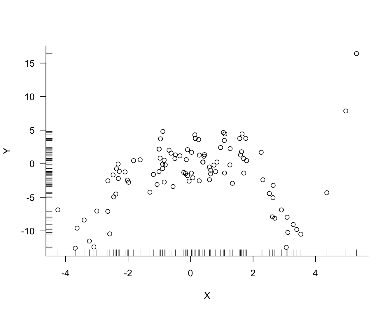
Suppose that one hundred observations on variables \(Y\) and \(X\) are sampled from a population. We suspect that the variables are related and wish to predict the difficult-to-measure attribute \(Y\) from the easy-to-measure attribute \(X\). Figure Figure 25.1 displays the data for the random sample, inspired by Notes on Predictive Modeling by Eduardo García-Portugués at Carlos III University of Madrid.
There is noise in the data but there is also a signal, a systematic change in \(Y\) with \(X\). How should we go about extracting the signal? Figure 25.2 shows three possible models for the signal.
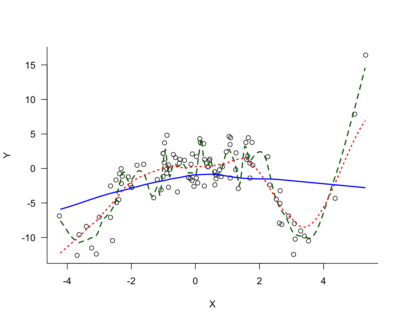
The three models differ in their degree of smoothness. The solid (blue) line is the most smooth, followed by the dotted (red) line. The dashed (green) line is the least smooth, it follows the observed data points more closely. The solid (blue) line is probably not a good representation of the signal, it does not capture the trend in the data for small or large values. This model exhibits bias; it overestimates for small values of \(X\) and underestimates for large values of \(X\). On the other hand, the dashed (green) model exhibits a lot of variability.
The question in modeling these data becomes: what is the appropriate degree of smoothness? In one extreme case the model interpolates the observed data points the model reproduces the 100 data points. Such a model fits the observed data really well but you can imagine that it does not generalize well to a new data point that was not used in training the model. Such a model is said to be overfitting the data. The dashed (green) line in Figure 25.2 approaches this situation.
In another extreme case, the model is too rigid and does not extract sufficient signal from the noise. Such a model is said to be underfitting the data. The solid (blue) line in Figure 25.2 is likely a case in point.
More Simulations
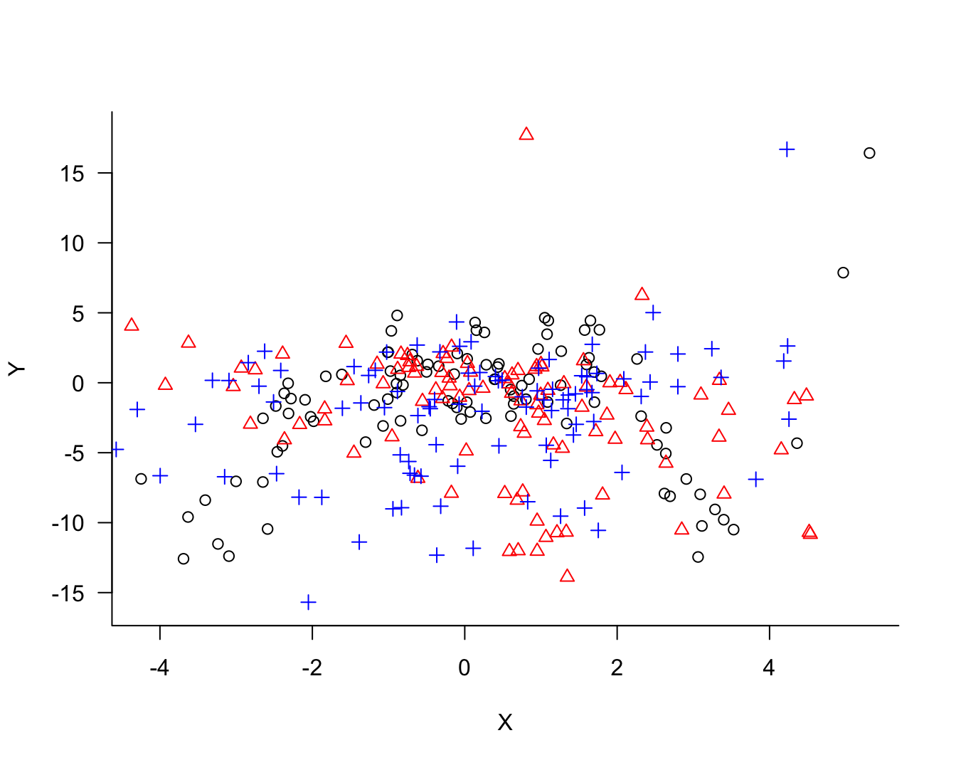
The concept of model bias and model variability relates not to the behavior of the model for the sample data at hand, although in practical applications this is all we have to judge a model. Conceptually, we imagine repeating the process that generated the sample. Imagine that we draw two more sets of 100 observations each. Now we have 300 observations, 3 sets of 100 each. Figure 25.3 overlays the three samples and identifies observations belonging to the same sample with colors and symbols.
The process of fitting the three models displayed in Figure 25.2 can now be repeated for the two other samples. Figure 25.4 displays the three versions of the solid (blue) model. Figure 25.4 displays the three versions of the dotted (red) model and Figure 25.6 the versions of the dashed (green) model.
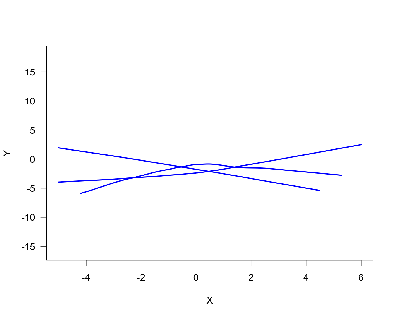
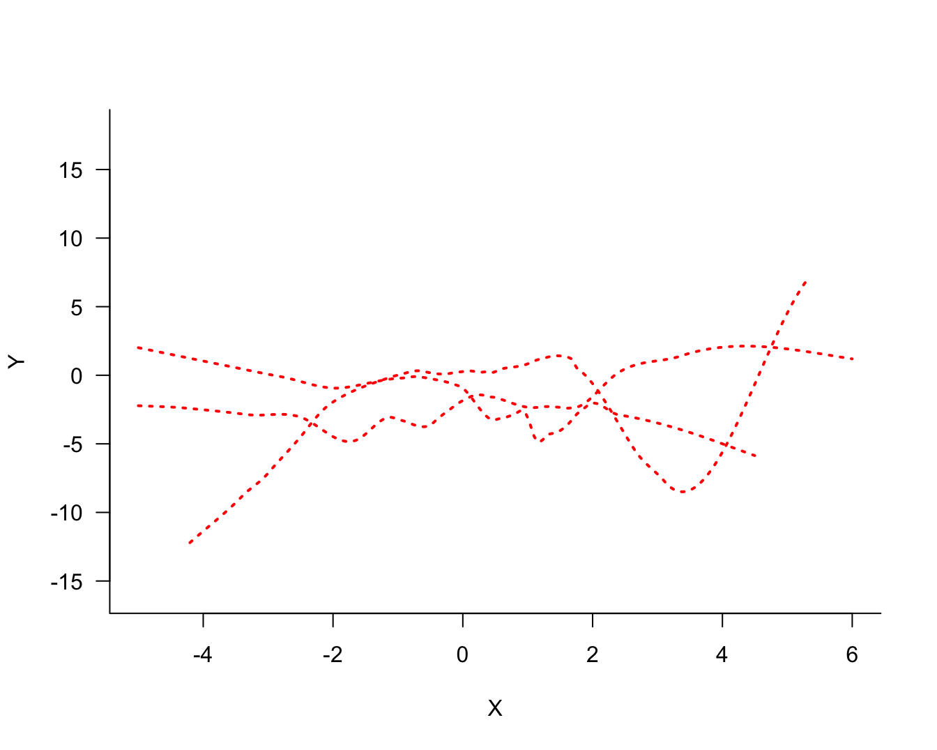
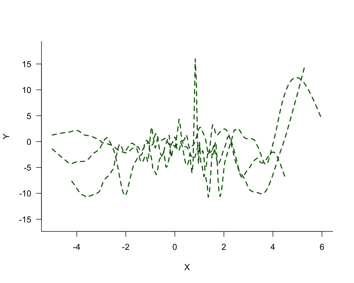
Comparing the same model type for the three sets of 100 observations, it is clear that the blue model shows the most stability from set to set, the green model shows the least stability (most variability), and the red model falls between the two.
We also see now why the highly variable green model would not generalize well to a new observation. It follows the training data too closely and is sensitive to small changes in the data.
The True Model
Since this is a simulation study we have the benefit of knowing the underlying signal around which the data were generated. This is the same signal for all three sets of 100 observations and we can compare the models in Figure 25.4 through Figure 25.6 against the true model (Figure 25.7 through Figure 25.9)
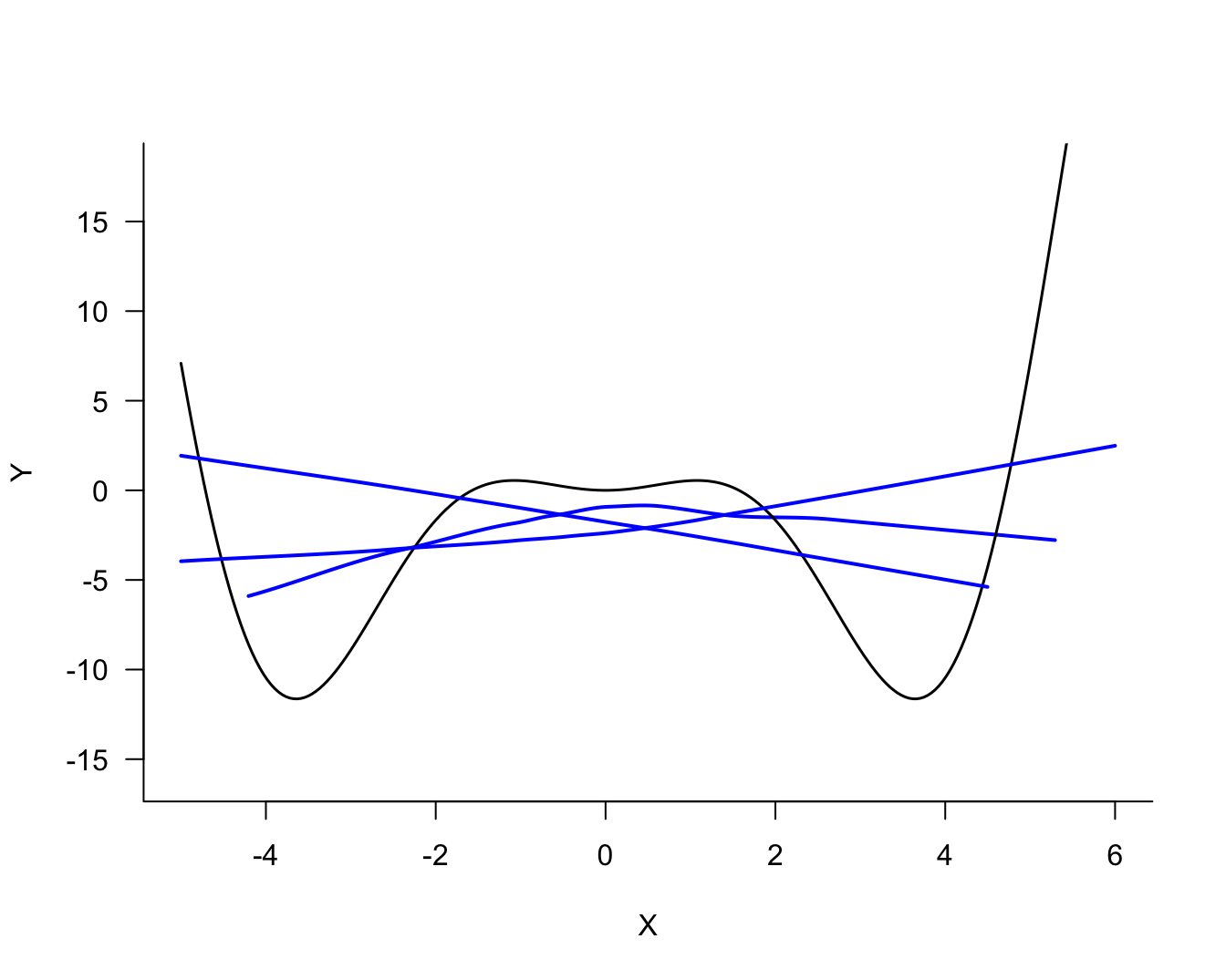
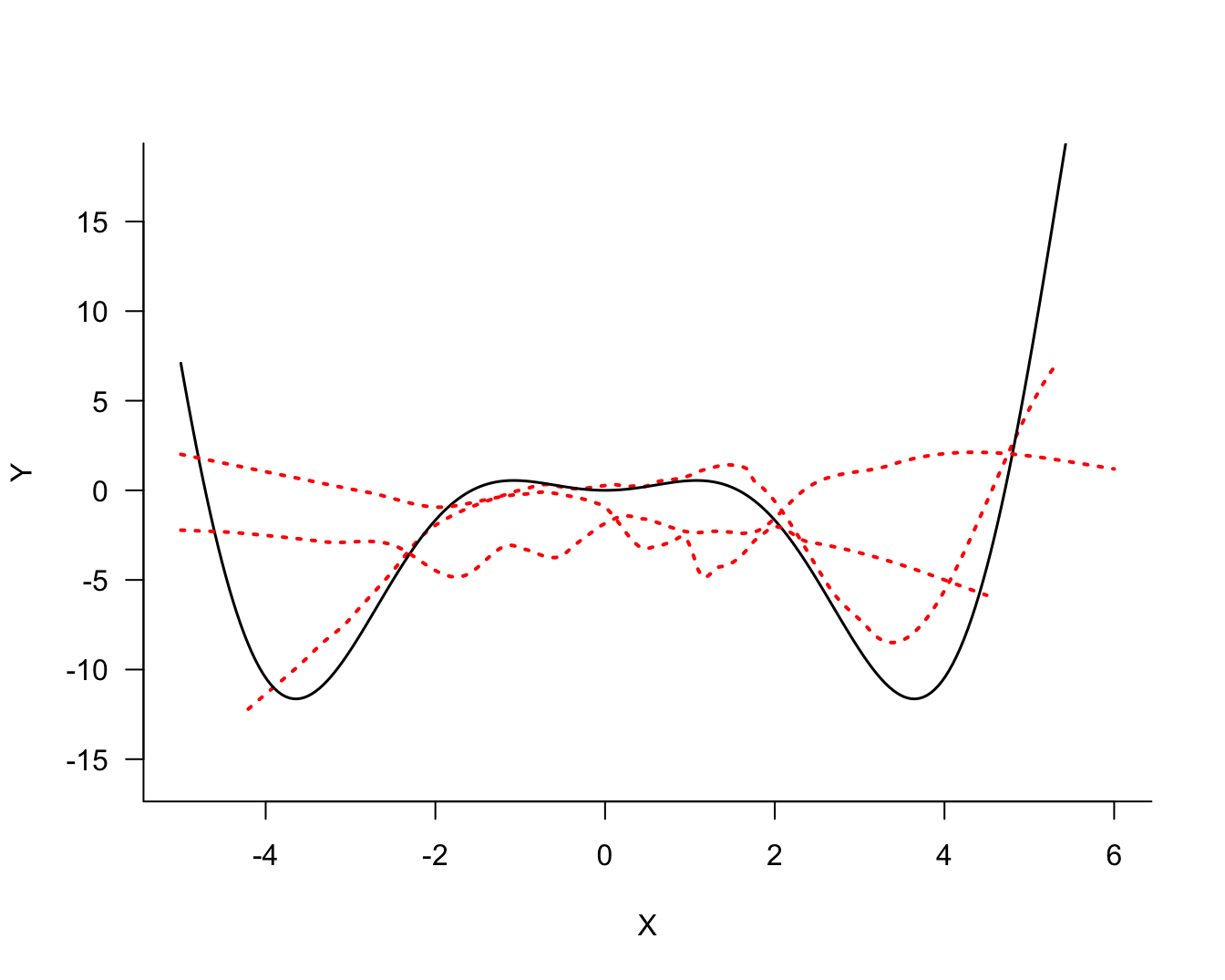
Against the backdrop of the true signal, the solid (blue) and dashed (green) models do not look good. The former is biased, it is not sufficiently flexible to capture the signal. The latter is too flexible and overfits the signal.
25.3 The Mean Squared Error
The simulation is unrealistic for two reasons:
- We do not know the true signal in practice, otherwise there would not be a modeling problem.
- We have only a single sample of \(n\) observations and cannot study the behavior of the model under repetition of the data collection process.
The considerations are the same, however. We do not want a model that has too much variability or a model that has too much bias. Somehow, the two need to be balanced based on a single sample of data. We need a method of measuring bias and variance of a model and to balance the two.
Mathematically, the problem of predicting a new observation can be expressed as follows. Since the true function is unknown, it is also unknown at the new data location \(x_{0}\). However, we observed a value \(y\) at \(x_{0}\). Based on the chosen model we can predict at \(x_{0}\). But since we do not know the true function \(f(x)\), we can only measure the discrepancy between the value we observe and the value we predicted; this quantity is known as the error of prediction (Table 25.1).
| Quantity | Meaning | Measurable |
|---|---|---|
| \(f(x)\) | The true but unknown function | No |
| \(f\left( x_{0} \right)\) | The value of the function at a data point \(x_{0}\) that was not part of fitting the model | No |
| \(\widehat{f}\left( x_{0} \right)\) | The estimated value of the function at the new data point \(x_{0}\) | Yes |
| \(f\left( x_{0} \right) - \widehat{f}\left( x_{0} \right)\) | The function discrepancy | No |
| \(y -\widehat{f}\left( x_{0} \right)\) | The error of prediction | Yes |
Multiple components contribute to the prediction error: the variability of the data \(y\), the discrepancy between \(f\left( x_{0} \right)\) and \(\widehat{f}\left( x_{0} \right)\), and the variability of the function \(\widehat{f}\left( x_{0} \right)\). The variability of \(y\) is also called the irreducible variability or the irreducible error because the observations will vary according to their natural variability. Once we have decided which attribute to observe, how to sample it, and how to measure it, this variability is a given. The other two sources relate to the accuracy and precision of the prediction; or, to use statistical terms, the bias and the variance.
Accuracy and Precision
In the context of measuring devices, accuracy and precision are defined as
- Accuracy: How close are measurements to the true value
- Precision: How close are measurements to each other
To demonstrate the difference between accuracy and precision, the dart board bullseye metaphor is helpful. The following figure shows four scenarios of shooting four darts each at a dart board. The goal is to hit the bullseye in the center of the board; the bullseye represents the true value we are trying to measure. A is the result of a thrower who is neither accurate nor precise. The throws vary greatly from each other (lack of precision), and the average location is far from the bullseye. B is the result of a thrower who is inaccurate but precise. The throws group tightly together (high precision) but the average location misses the bullseye (the average distance from the bullseye is not zero). The thrower with pattern C is not precise, but accurate. The throws vary widely (lack of precision) but the average distance of the darts from the bullseye is close to zero—on average the thrower hits the bullseye. Finally, the thrower in D is accurate and precise; the darts group tightly together and are centered around the bullseye.
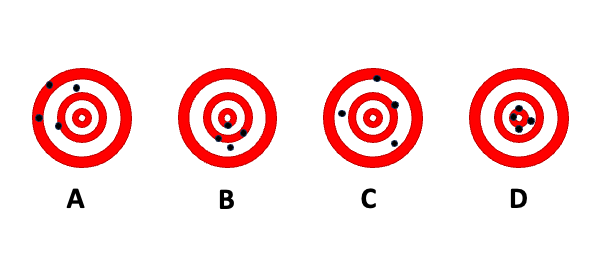
We see that both accuracy and precision describe not a single throw, but a pattern over many replications. The long-run behavior is described by the expected value. The accuracy of a statistical estimator is the proximity of its expected value from the target value. An estimator that is not accurate is said to be biased.
Definition: Bias
An estimator \(h\left( \textbf{Y} \right)\) of the parameter \(\theta\) is said to be biased if its expected value does not equal \(\theta\).
\[ \text{Bias}\left\lbrack h\left( \textbf{Y} \right);\theta \right\rbrack = \text{E}\left\lbrack h\left( \textbf{Y} \right) - \theta \right\rbrack = \text{E}\left\lbrack h\left( \textbf{Y} \right) \right\rbrack - \theta \]
The last equality in the definition follows because the expected value of a constant is identical to the constant. In the dartboard example, \(\theta\) is the bullseye and \(h\left( \text{Y} \right)\) is the distance of the dart from the bullseye. The bias is the expected value of that distance, the average across many repetitions (dart throws).
Combining Accuracy and Precision
We can now combine the concepts of accuracy and precision of a prediction into a single statistic, the mean squared error. But first we have to take another small detour to be clear about what we want to predict.
Now consider a generic model of the form \[ Y = f(x) + \epsilon \]
\(\epsilon\) is a random variable with mean 0 and variance \(\sigma^{2}\), the irreducible variability. For a new observation with input value \(x_0\) the model looks the same \[ Y_{0} = f\left( x_{0} \right) + \epsilon \] but only \(x_{0}\) is known.
If we make predictions under this model there are two possible targets:
- \(f\left( x_{0} \right)\)
- \(f\left( x_{0} \right) + \epsilon\).
The first is the expected value of \(Y_{0}\): \[ \text{E}\left\lbrack Y_{0} \right\rbrack = f\left( x_{0} \right) + \text{E}\lbrack\epsilon\rbrack = f\left( x_{0} \right) \]
This is a fixed quantity (a constant), not a random variable. The second is a random variable. Interestingly, the estimator of both quantities is the same, \(\widehat{f}\left( x_{0} \right)\). The difference comes into play when we consider the uncertainty associated with estimating \(f\left( x_{0} \right)\) or with predicting \(f\left( x_{0} \right) + \epsilon\)—more on this later.
Definition: Mean Squared Error (MSE)
The mean squared error of estimator \(h\left( \textbf{Y} \right)\) for target \(\theta\) is
\[\begin{align*} \text{MSE}\left\lbrack h\left( \textbf{Y} \right);\ \theta \right\rbrack &= \text{E}\left\lbrack \left( h\left( \textbf{Y} \right) - \theta \right)^{2} \right\rbrack \\ &= \text{E}\left\lbrack \left( h\left( \textbf{Y} \right) - \text{E}\left\lbrack h\left( \textbf{Y} \right) \right\rbrack \right)^{2} \right\rbrack + \left( \text{E}\left\lbrack h\left( \textbf{Y} \right) \right\rbrack - \theta \right)^{2}\\ &= \text{Var}\left\lbrack h\left( \textbf{Y} \right) \right\rbrack + \text{Bias}\left\lbrack h\left( \textbf{Y} \right);\theta \right\rbrack^{2} \end{align*}\]
The mean squared error is the expected square deviation between the estimator and its target. That is akin to the definition of the variance, but the MSE is only equal to the variance if the estimator is unbiased for the target. As the last line of the definition shows, the MSE has two components, the variability of the estimator and the squared bias. The bias enters in squared terms because the variance is measured in squared units and because negative and positive bias discrepancies should not balance out.
The mean squared error is neither a measure of dispersion (variance) or central tendency (bias), it is a measure of concentration; how concentrated is the distribution of the estimator around the target. A small variance or a small bias increases the concentration of the estimator. The greatest concentration is achieved by an unbiased estimator with small variance.
If we apply the MSE definition to the problem of using estimator \(\widehat{f}\left( x_{0} \right)\) to predict \(f\left( x_0 \right)\),
\[ \text{MSE}\left\lbrack \widehat{f}\left( x_{0} \right);f\left( x_{0} \right)\ \right\rbrack = \text{Var}\left\lbrack \widehat{f}\left( x_{0} \right) \right\rbrack + \text{Bias}\left\lbrack \widehat{f}\left( x_{0} \right);f\left( x_{0} \right) \right\rbrack^{2} \]
we see how the variability of the estimator and its squared bias contribute to the overall MSE. Similarly, if the target is to predict the new observation, rather than its mean, the expression becomes
\[ \text{MSE}\left\lbrack \widehat{f}\left( x_{0} \right);Y_{0} \right\rbrack\text{ = MSE}\left\lbrack \widehat{f}\left( x_{0} \right);f\left( x_{0} \right) + \epsilon\ \right\rbrack = \text{Var}\left\lbrack \widehat{f}\left( x_{0} \right) \right\rbrack + \text{Bias}\left\lbrack \widehat{f}\left( x_{0} \right);f\left( x_{0} \right) \right\rbrack^{2} + \sigma^{2} \]
You now see why \(\sigma^{2}\) is called the irreducible error. Even if the estimator \(\widehat{f}\left( x_{0} \right)\) would have no variability and be unbiased, the mean squared error in predicting \(Y_{0}\) can never be smaller than \(\sigma^{2}\).
Example: \(k\)-Nearest Neighbor Regression
The \(k\)-nearest neighbor (\(k\)-NN for short) regression estimator is a simple estimator of the local structure between a target variable \(y\) and an input variable \(x\). The value \(k\) represents the number of values in the neighborhood of some target input \(x_{0}\) that are used to predict \(y\). The extreme case is \(k = 1\), the value of \(f\left( x_{0} \right)\) is predicted as the \(y\)-value of the observation closest to \(x_{0}\).
Suppose our data come from a distribution with mean \(f(x)\) and variance \(\sigma^{2}\). The mean-square error decomposition for the \(k\)-NN estimator is then
\[ \text{MSE}\left\lbrack \widehat{f}\left( x_{0} \right);Y_{0} \right\rbrack\text{ = }\frac{\sigma^{2}}{k}{+ \left\lbrack f\left( x_{0} \right) - \frac{1}{k}\sum_{}^{}Y_{(i)} \right\rbrack}^{2} + \sigma^{2} \]
where \(y_{(i)}\) denotes the \(k\) observations in the neighborhood of \(x_{0}\).
The three components of the MSE decomposition are easily identified:
\(\sigma^{2}/k\) is the variance of the estimator, \(\text{Var}\left\lbrack \widehat{f}\left( x_{0} \right) \right\rbrack\). Not surprisingly, it is the variance of the sample mean of \(k\) observations drawn at random from a population with variance \(\sigma^{2}\).
\(\left\lbrack f\left( x_{0} \right) - \frac{1}{k}\sum Y_{(i)} \right\rbrack^{2}\) is the squared bias component of the MSE.
\(\sigma^2\) is the irreducible error, the variance in the population from which the data are drawn.
While we cannot affect the irreducible error \(\sigma^{2}\), we can control the magnitude of the other components through the choice of \(k\). The variance contribution will be largest for \(k = 1\), when prediction relies on only the observation closest to \(x_{0}\). The bias contribution for this 1-NN estimator is \(\left\lbrack f\left( x_{0} \right) - Y_{(1)} \right\rbrack^{2}\).
As \(k\) increases, the variance of the estimator decreases. For a large enough value of \(k\), all observations are included in the “neighborhood” and the estimator is equal to \(\overline{Y}\). If \(f(x)\) changes with \(x\), the nearest neighbor method will then have smallest variance but large bias.
Striking the Balance
If we want to minimize the mean-squared error, we can strive for estimators with low bias and low variance. If we cannot have both, how do we balance between the bias and variance component of an estimator? That is the bias-variance tradeoff.
Statisticians resolve the tension with the UMVUE principle. Uniformly minimum-variance unbiased estimation requires to first identify unbiased estimators, those which \[ \text{Bias}\left\lbrack \widehat{f}\left( x_{0} \right);f\left( x_{0} \right) \right\rbrack = 0 \] and to select the estimator with the smallest variance among the unbiased estimators. According to the UMVUE principle, a biased estimator is not even considered. It is comforting to know that on average the estimator will be on target. This principle would select estimator C in the dartboard example over estimator B because the latter is biased. But: if you have only one dart left and you need to get as close to the bullseye as possible, would you ask player B or player C to take the shot for your team?
UMVU estimators are not necessarily minimum mean-squared error estimators. It is possible that a biased estimator has a sharply reduced variance so that the sum of variance and squared bias is smaller than the variance of the best unbiased estimator. If we want to achieve a small mean-square error, then we should consider estimators with some bias and small variance. Resolving the bias-variance tradeoff by eliminating all biased estimators does not lead to the “best” predictive models. Of course, this depends on our definition of “best”.
Estimated Mean Squared Error
In practice, \(f\left( x_{0} \right)\) is not known and the bias component \(\text{Bias} \lbrack \widehat{f}\left( x_{0} \right);f\left( x_{0} \right) \rbrack\) cannot be evaluated by computing the difference of expected values. For many modeling techniques we can calculate—or at least estimate— \(\text{Var}\lbrack \widehat{f}\left( x_{0} \right) \rbrack\), the variance component of the MSE. Those derivations depend on strong assumptions about distributional properties and the correctness of the model. So, we essentially need to treat the MSE as an unknown quantity. Fortunately, we can estimate it from data.
Definition: Mean Squared Prediction Error (MSPE)
The mean squared prediction error (MSPE) is the average squared prediction error in a sample of \(n\) observations,
\[ \widehat{\text{MSE}} = \frac{1}{n}\sum_{i=1}^n\left( y_i - \widehat{f}\left( x_i \right) \right)^{2} \tag{25.1}\]
Taking the sample average replaces taking formal expectations over the distribution of \(( Y - \widehat{f}(x) )^2\).
We have one more complication to resolve. By increasing the flexibility of the model the difference between observed and predicted values can be made arbitrarily small. In the extreme case where the model interpolates the observed data points the differences \(y_i - \widehat{y}_i\) are all zero and \(\widehat{\text{MSE}}\) computed for the training data is zero. If we were to choose to minimize Equation 25.1, we would end up with highly variable models. And this defeats the purpose.
The remedy is to compute the estimated MSE not by comparing observed and predicted values based on the values in the training data set, but to predict the values of observations that did not participate in training the model. This test data appears to the algorithm as new data it has not seen before and is a true measure for how well the model generalizes:
\[ \widehat{\text{MSE}}_\text{Test} = \frac{1}{m} \sum (\text{Observed} - \text{Predicted})^2 \tag{25.2}\]
The main difference between Equation 25.1 and Equation 25.2 is that the former is computed based on the \(n\) observations in the training data and the latter is computed based on \(m\) observations in a separate test data set. We refer to mean squared errors calculated on test data sets as the test error. This quantity properly balances accuracy and precision, choosing the model with the smallest test error resolves the bias-variance tradeoff.
Cross-validation
Because it is expensive to collect a separate data set to compute the test error, the collected data is often split randomly into a training set and a test set. For example, you might split the data 50:50 or 80:20 or 90:10 into training:test sets. If you have a lot of data, then splitting into separate training and test sets is reasonable.
There is a clever way in which the same observations can be used sometimes for training and sometimes for testing, that uses the collected information more economically. This procedure is called cross-validation.
We give here a brief introduction to a specific cross-validation method, \(k\)-fold cross-validation to round up the application in this chapter. More details about test and validation data sets and about cross-validation follow in the next chapter.
During cross-validation, an observation is either part of the test set or part of the training set. The process repeats until each observation was used once in a test set. One technique of cross-validation randomly assigns observations to one of \(k\) groups, called folds. Figure 25.11 is an example of creating 5 folds from 100 observation for 5-fold cross-validation.
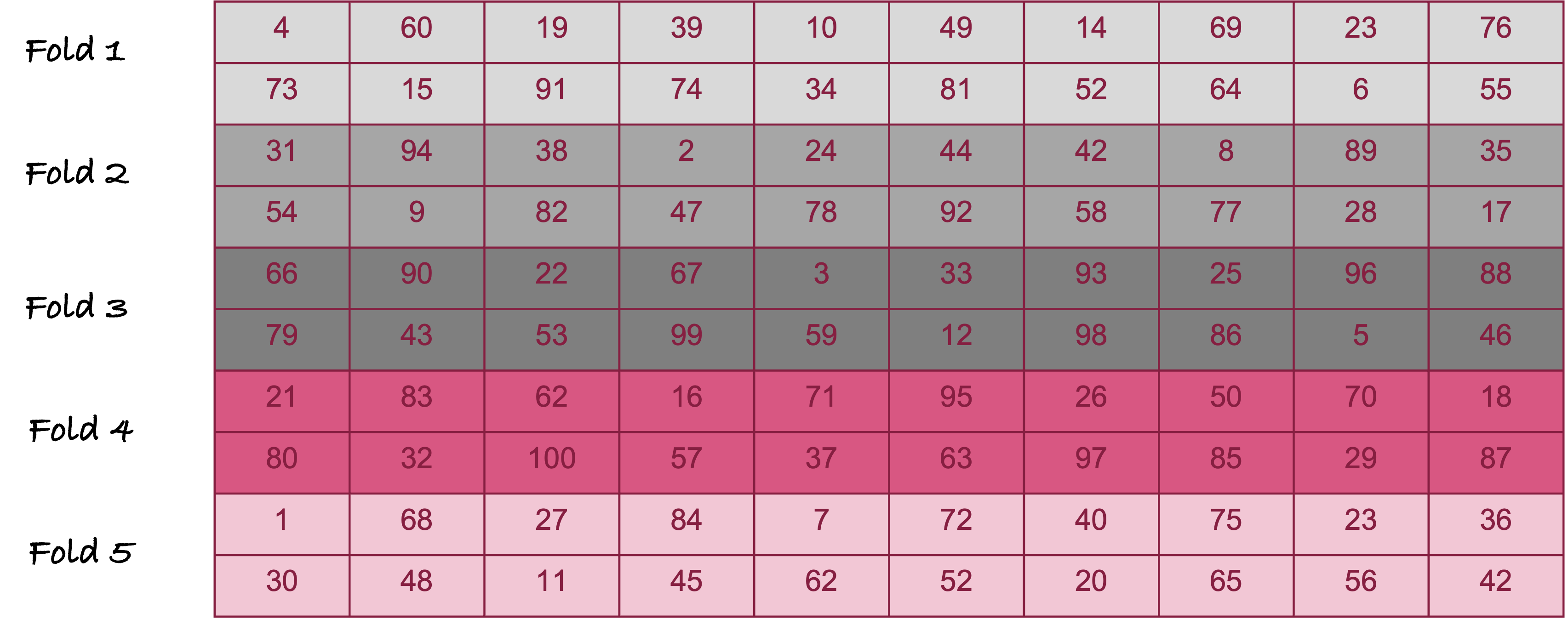
The numbers in the cells of Figure 25.11 are the observation numbers. For example, the first fold includes observations #4, #60, #19, etc. The second fold includes observations #31, #94, #38, etc.
The process of calculating the test error through \(k\)-fold cross-validation is as follows (Figure 25.12):
- Set aside the data in the first fold. It serves as the test data.
- Fit the model to the remaining data.
- Using the model trained in step 2., predict the values in the test data and calculate the test error
- Return the set-aside fold to the training data and set aside the next fold as the test data. Return to step 2. and continue until each fold has been set aside once.
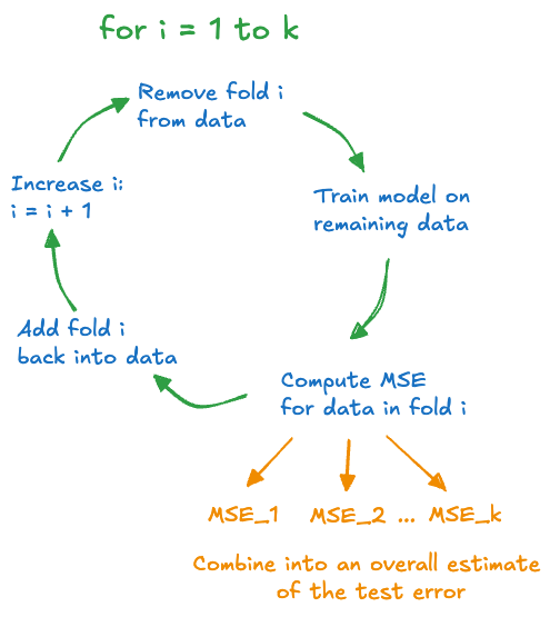
At the end of the \(k\)-fold cross-validation procedure, the model has been trained \(k\) times, and we have \(k\) estimates of the test error, one for each of the folds. These test errors are then combined into one overall test error.
Example: Estimating Mean in the Presence of Outliers
The sample mean is an unbiased estimator in a random sample. However, we know that it is sensitive to extreme (outlying) observations. When outliers are present in one of the tails of the distribution—annual income data, for example—the median is often the preferred estimator of the average tendency in the population.
When extreme values appear on both ends of the distribution, a more robust estimator of the central tendency is the trimmed mean (truncated mean). A 10% trimmed mean simply means to compute the sample mean after removing the 10% of the largest and smallest values in the sample. This begs the question: does the trimmed mean lead to a smaller mean squared error than the sample mean if the data have many outliers?
The following code simulates 10,000 observations from a mixture of three Gaussian distributions. With probability 0.1 the observations come from a \(G(-5,1)\), with probability 0.1 from a \(G(5,1)\) and with probability 0.8 they come from a \(G(0,1)\) distribution. The boxplot shows a large number of outlying observations on either end of the distribution (Figure 25.13).
The simulated data are also assigned to \(k\) folds for cross-validation.
library(tidyverse)

set.seed(332)
make_data <- function(n=1000,k=10){
  xn <- rnorm(n,mean=0)
  xe1 <- rnorm(n,mean=5)
  xe2 <- rnorm(n,mean=-5)
  ru <- runif(n)
  x <- ifelse(ru < 0.1, xe2,
              ifelse(ru < 0.9,xn,xe1))
  x <- data.frame(x=x)
  x <- x %>% mutate(fold = sample(1:k, size=n, replace=T))
  return(x)
}

x <- make_data(n=10000,k=10)
boxplot(x$x, horizontal=TRUE)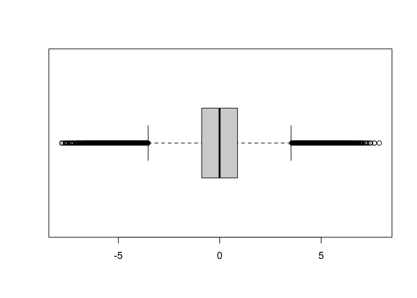
The following code computes the trimmed mean for each of the folds, computes the average mean squared error in each fold, and averages those after evaluating all \(k\) folds. We see that the sample mean (trim_frac=0) has a cross-validated mean squared error of 6.076. The smallest mean squared error is achieved at a trim rate of 0.1.
cv_error <- function(train_data=x,trim_frac=0.1) {
    k <- length(unique(train_data$fold))
    cv_err = rep(0, k)
    for (i in 1:k) {
        in_data <- filter(train_data, fold!=i)
        out_data <- filter(train_data, fold==i)
        est <- mean(in_data$x,trim=trim_frac)
        cv_err[i] <- mean((out_data$x - est)^2)
    }
    cat(k,"-fold CV error at trim=",trim_frac,": ",mean(cv_err),"\n")
}

for (f in seq(0,0.6,0.05)) { cv_error(trim_frac=f) }
10 -fold CV error at trim= 0 : 6.076049
10 -fold CV error at trim= 0.05 : 6.076046
10 -fold CV error at trim= 0.1 : 6.07595
10 -fold CV error at trim= 0.15 : 6.076028
10 -fold CV error at trim= 0.2 : 6.076079
10 -fold CV error at trim= 0.25 : 6.076062
10 -fold CV error at trim= 0.3 : 6.07606
10 -fold CV error at trim= 0.35 : 6.076059
10 -fold CV error at trim= 0.4 : 6.076061
10 -fold CV error at trim= 0.45 : 6.075996
10 -fold CV error at trim= 0.5 : 6.0761
10 -fold CV error at trim= 0.55 : 6.0761
10 -fold CV error at trim= 0.6 : 6.0761 25.4 Overfitting and Underfitting
The preceding discussion might suggest that flexible models such as the smoothing spline have high variability and that rigid models such as the simple linear regression model have large bias. This generalization does not necessarily hold although in practice it often works out this way. The reason for this is not that simple linear regression models are biased—they can be unbiased. The reason why flexible models tend to have high variance and low bias and rigid models tend to have low variance and high bias has to do with overfitting and underfitting.
An overfit model follows the observed data \(Y_{i}\) too closely and does not capture the mean trend \(f(x)\). The overfit model memorizes the training data too much. When you predict a new observation with an overfit model that memory causes high variability. Remember that the variability we are focusing on here is the variability across repetitions of the sample process. Imagine drawing 1,000 sets of \(n\) observations, repeating the model training and predicting from each model at the new location \(x_{0}\). We now have 1,000 predictions at \(x_{0}\). Because the overfit model follows the training data too closely, its predictions at \(x_{0}\) will be highly variable.
An underfit model, on the other hand, lacks the flexibility to capture the mean trend \(f(x)\). Underfit models result, for example, when important predictor variables are not included in the model.
The solid (blue) model in the simulation was underfit, the dashed (green) model was overfit. Compare Figure 25.4 (blue model) through Figure 25.6 (green model). Choose any point \(x_0\) on the horizontal axis. The fitted values from the solid (blue) model are more similar to each other (low variability) than the values from the dashed (green) model (high variability). The low variability of the simpler model comes at the expense of greater bias, unless that model is correct.
An extreme case of overfitting is the saturated model. It perfectly predicts the observed data. Suppose you collect only two pairs of \((x,y)\) data: (1,0) and (2,1) (Figure 25.14). A two-parameter straight line model will fit these data perfectly. The straight line has an intercept of \(-1\) and a slope of \(+1\). It passes through the observed points and the MSPE is zero.
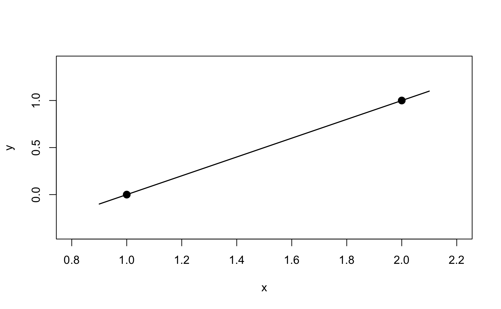
Saturated models are not very interesting, they are just a re-parameterization of the data, capturing both signal \(f(x)\) and noise \(\epsilon\) in the predictions. A useful model separates the signal from the noise. Saturated models are used behind the scenes of some statistical estimation methods, for example to measure how much of the variability in the data is captured by a model—this type of model metric is known as the deviance. Saturated models are never the end goal of data analytics.
On the other extreme lies the constant model; it does not use any input variables. It assumes that the mean of the target variable is the same everywhere:
\[ Y_{i} = \beta_0 + \epsilon_{i} \]
This model, also known as the intercept-only model, is slightly more useful than the saturated model. It is rarely the appropriate model in data science applications; it expresses the signal as a flat line, the least flexible model of all.
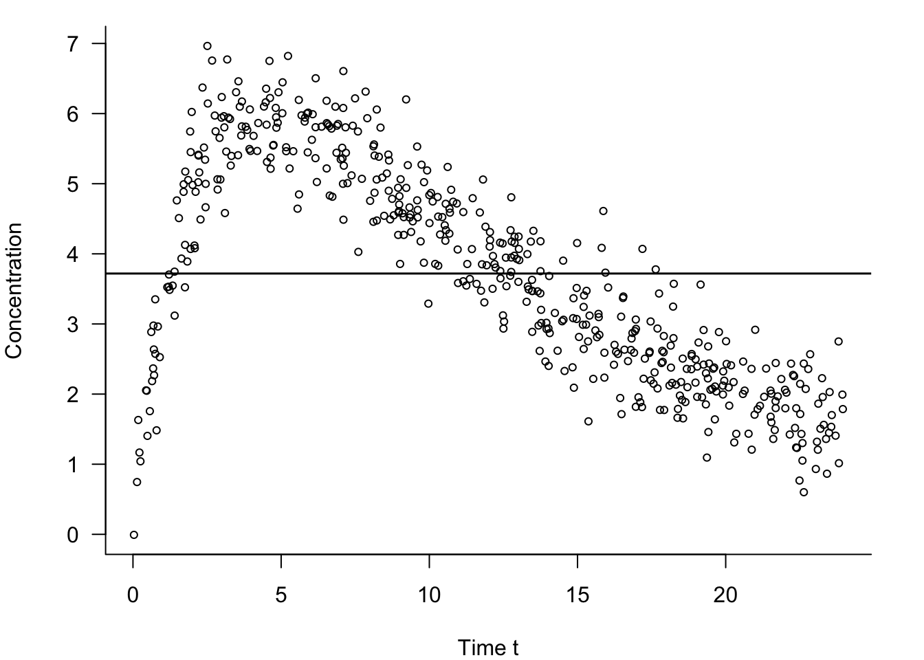
In our discussion of the model building process during the data science project life cycle in Section 3.4.3 we encountered an example of pharmacokinetic data. The data set comprised 500 observations on how a drug is absorbed and eliminated by the body over time (\(t\)). The data are replayed in Figure 25.15 along with the fit of the constant model. The constant model under-predicts the drug concentration between times \(t = 3\) and \(t = 12\) and overpredicts everywhere else.
Suppose we draw 1,000 sets of \(n = 500\) observations, fit the constant model to each, and predict at the new time \(t_{0}\). Because the constant model does not depend on time, we get the same predicted value regardless of the value of \(t_{0}\). In each sample of size \(n\), the predicted value will be the sample mean, \(\overline{y} = \frac{1}{500}\sum_{}^{}y_{i}\). The variability of the 1,000 predictions will be small; it is the variance of the sample mean:
\[ \text{Var}\left\lbrack \widehat{f}\left( x_0 \right) \right\rbrack = \frac{\sigma^2}{500} \]
If the true model does depend on \(t\)—and Figure 25.15 suggests this is the case—the bias of the predictions will be large. The mean squared prediction error is dominated by the squared bias component in this case.
Figure 25.16 also shows an overfit model for these data. It is not a saturated model as it does not interpolate the data points, but it is clearly too flexible—it is trying to chase the data points.
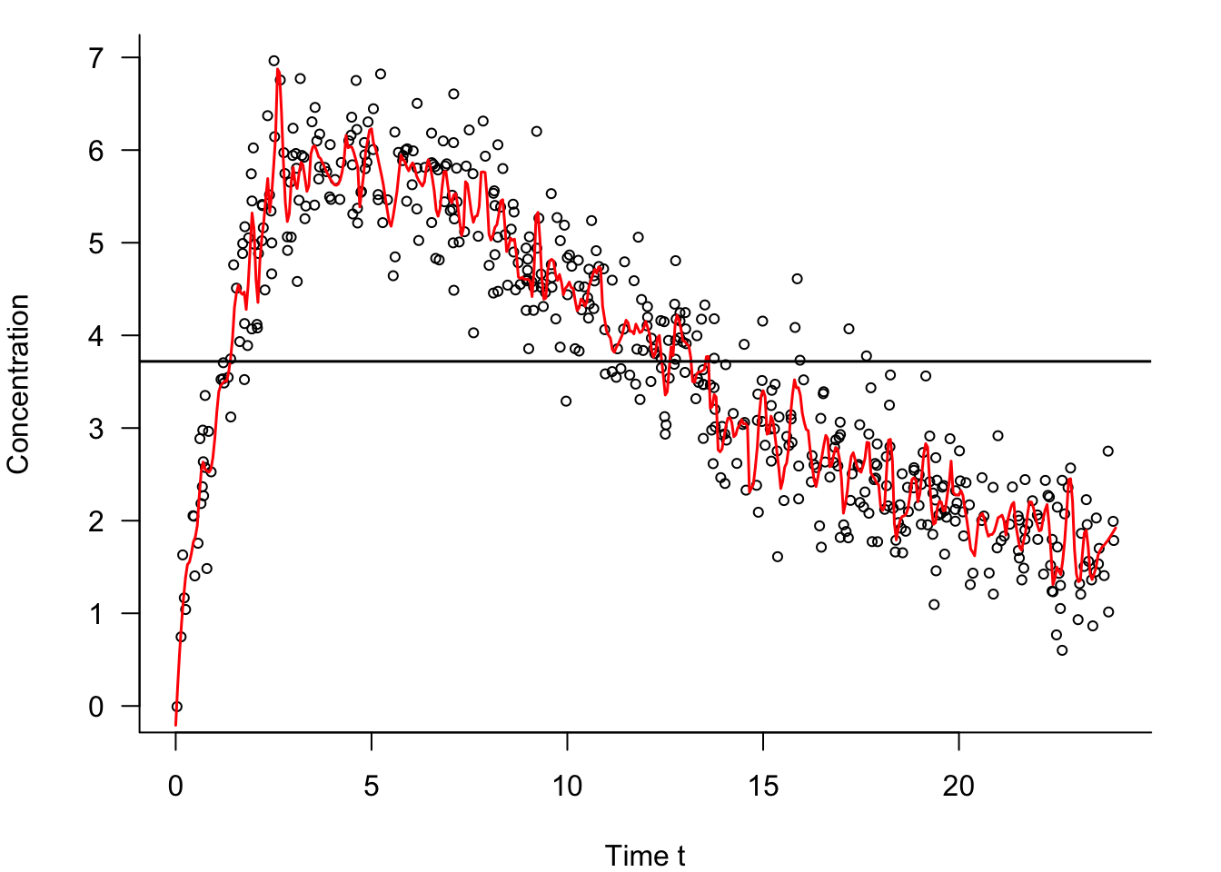
Somewhere between the extremes of a hopelessly overfit model and an extremely underfit constant model are models that capture the signal \(f(x)\) well enough without chasing the noisy signal \(f(x) + \epsilon\) too much. Those models permit a small amount of bias if that results in a reduction of the variance of the predictions.
To summarize,
Overfit models do not generalize well because they follow the training data too closely. They tend to have low bias and a large variance.
Underfit models do not generalize well because they do not capture the salient trend (signal) in the data. They tend to have high bias and low variance.
A large mean squared prediction error can result in either case but is due to a different reason.
To achieve a small mean squared prediction error you need to have small bias and small variance.
In practice, zero-bias methods with high variance are rarely the winning approaches. The best MSPE is often achieved by allowing some bias if the variance of the method is decreased.
Remedies
The danger of overfitting is large when models contain many parameters, and when the number of parameters \(p\) is large relative to the sample size \(n\). When many attributes (inputs) are available and you throw them all into the model, the result will likely be an overfit model that does not generalize well. It will have a large prediction error. In other words, there is a cost to adding unimportant information to a model. Methods for dealing with such high-dimensional problems play an important role in statistics and machine learning and are discussed in detail in a more advanced section. We mention here briefly:
Feature Selection: Structured approaches that use algorithms to determine which subset of the inputs should be in the model. The decision is binary in that an input is either included or excluded. Also known as variable selection.
Regularization: Deliberately introducing some bias in the estimation through penalty terms that control the variability of the model parameters which in turn controls the variability of the predictions. The parameters are shrunk toward zero in absolute value compared to an unbiased estimator—regularization is thus also known as shrinkage estimation. The Lasso methods can shrink parameters to zero and thus combines regularization with feature selection. The Ridge regression methods also applies a shrinkage penalty but allows all inputs to contribute.
Ensemble Methods: Ensemble methods combine multiple methods into an overall, averaged prediction or classification. Ensembles can be homogeneous, where the methods are the same, or heterogeneous. An example of a homogeneous ensemble is a bagged decision tree, where several hundred individual trees are trained independently and the predictions from the trees are averaged to obtain an overall predicted value. Due to averaging, the variance of the ensemble estimator is smaller than any individual estimator. Bagging and boosting are common ensemble methods to reduce variance.
Choosing Model Complexity
Regularization imposes penalties on parameter estimates that grow too large, effectively shrinking them toward zero. By limiting the range of the parameter estimates, the range of the predicted values is limited. This raises an important question: what is the appropriate amount of regularization penalty?
Ensemble methods also depend on hyperparameters that affect the bias-variance tradeoff. How do you choose the depth of trees, the number of boosting iterations, learning rates, etc?
Cross-validation and train:test data sets play an important role in determining the appropriate model complexity through the selection of hyperparameters. The philosophy is to determine values of the hyperparameters by evaluating the model on a test set, whether that is a separate set of data, or a fold (group) of the training data held back.
Another philosophy chooses model complexity based on the training data only. For example, feature selection in regression models can apply statistical tests to determine the significance level (\(p\)-value) as variables are added to or removed from models. Model building stops whenever all variables outside of a model do not “significantly” improve the model when added, or whenever the model would be made “significantly” worse by removing any variables in the model. The quotes around “significantly” are justified because usual thresholds for hypothesis testing do not apply in this case; the thresholds are usually higher than the .05 or 0.01 level.
Measures of model performance based on the training data can be misleading when the goal is to predict well unseen data points. That is why we use test data or perform cross-validation. Statistics such as SSE or \(R^2\) or \(\text{MSE}_{\text{Train}}\) can be made arbitrarily small or large by adding input variables that do not really improve the model. Adjustments to goodness-of-fit statistics can be made to account for model complexity. For example, the adjusted \(R^2\) statistic in a regression model with \(p\) inputs is \[ R^2_{\text{Adj}} = 1-(1-R^2)\frac{n-1}{n-p-1} \]
The value of \(R^2_{\text{Adj}}\) will always be less than or equal to \(R^2\). Unlike \(R^2\), which increases (or stays constant) when a variable is added to a model, \(R^2_{\text{Adj}}\) increases only if the contribution of the variable exceeds that expected by pure chance. One approach to choosing model complexity is to find the model with the largest \(R^2_{\text{Adj}}\)—it is not necessarily the model with the most input variables.
Other goodness-of-fit statistics that take into account the model complexity are Mallow’s \(C_p\) statistic, and the likelihood-based Akaike’s Information Criterion (AIC) and Bayesian (Schwarz) Information Criterion (BIC).
25.5 Putting It All Together
Let us now put together everything we have covered in this chapter about building a predictive model based on data for the simulated data set in Figure 25.1.
We build a model that captures the relationship between \(Y\) and \(X\).
The result should be an algorithm that we can use to predict \(Y\) based on values of \(X\) (\(Y\) is the target variable, \(X\) is the input variable).
The model should generalize well to new observations, that is, it should not overfit or underfit. Use cross-validation to determine the appropriate amount of flexibility in the model.
We should be able to quantify the uncertainty in predictions from the model.
Creating the Data (Quantification)
The following R code creates the data frame shown in Figure 25.1.
1set.seed(12345)
2n <- 100
3eps <- rnorm(n, sd = 2)
4X <- rnorm(n, sd = 2)
5Y <- X^2 * cos(X) + eps

6simData <- data.frame(X=X, Y=Y)- 1
-
Setting a seed for the random number generator ensures that the program generates the same values every time it is run. The value for the seed is chosen here as
12345and can be any integer. - 2
- The number of observations drawn is set to \(n = 100\).
- 3
-
epsis a vector of Gaussian (normal) random variables with mean 0 and variance 4 (std. dev 2). This represents the noise in the system. - 4
- The values of \(X\) are drawn randomly from a Gaussian distribution with mean 0 and variance 4
- 5
-
The signal is \(x^2 \, \cos(x)\). The noise (
eps) is added to the signal. - 6
- A data frame is constructed from X and Y.
Cross-validating the Model
The steps of training the model and selecting the best flexibility by cross-validation can be done in a single computational step using the train function in the caret package. We need to decide on the general family of model we are going to entertain. Here we choose what is known as a regression spline. These model the relationship between two variables and their flexibility is governed by a single parameter, called the degrees of freedom of the model. With increasing degrees of freedom the models become more flexible. Cross-validation is used to determine the best value for the degree of freedom parameter in this model family.
1library(caret)

2cv_results <- train(Y ~ X,
3                    data     =simData,
4                    method   ="gamSpline",
5                    tuneGrid =data.frame(df=seq(2, 25, by=1)),
6 trControl=trainControl(method="cv", number=10))- 1
-
The
caretlibrary is loaded into theRsession. Ifcaretis not yet installed in your system, execute the commandinstall.packages("caret")once from the Console prompt. - 2
-
The
train()function in thecaretlibrary is called.Y ~ Xspecifies the model we wish to train. The target variable is placed on the left side of the~symbol and the input variable is placed on the right side. - 3
- The data frame where the variables in the model specifications can be found.
- 4
-
The
method=parameter specifies the model family we wish to train.gamTrainis the specification for the regression spline family. - 5
-
The
tuneGridparameter provides a list of the values to be considered in the cross-validation. We vary only the degrees of freedom parameter (df) of thegamSplinefunction and we evaluate all values from 2 to 25. - 6
-
The
trControl=parameter specifies the computational nuances of thetrainfunction. Here we choose 10-fold cross-validation.
After running the code above we can examine the results:
print(cv_results)Generalized Additive Model using Splines
100 samples
1 predictor
No pre-processing
Resampling: Cross-Validated (10 fold)
Summary of sample sizes: 90, 91, 89, 89, 90, 89, ...
Resampling results across tuning parameters:
df RMSE Rsquared MAE
2 3.948383 0.2468568 3.021822
3 3.583394 0.4016653 2.751121
4 3.264671 0.5176447 2.559835
5 2.967739 0.5996185 2.371416
6 2.732739 0.6454729 2.218233
7 2.573920 0.6688788 2.107661
8 2.474458 0.6808445 2.036267
9 2.413180 0.6873204 2.001114
10 2.375289 0.6911981 1.983925
11 2.351995 0.6938019 1.976452
12 2.338419 0.6957038 1.971334
13 2.331878 0.6970928 1.970695
14 2.330844 0.6979920 1.971182
15 2.334393 0.6984189 1.972935
16 2.342029 0.6983416 1.975561
17 2.353220 0.6978141 1.978418
18 2.367892 0.6968446 1.981459
19 2.385770 0.6954992 1.984928
20 2.406903 0.6938330 1.990501
21 2.431180 0.6919134 1.998484
22 2.458785 0.6897954 2.007296
23 2.489828 0.6875293 2.017593
24 2.524311 0.6851669 2.028585
25 2.562596 0.6827171 2.041443
RMSE was used to select the optimal model using the smallest value.
The final value used for the model was df = 14.The output lists the values of the cross-validation parameter (df) along with three statistics computed for each. The statistic of interest to us is RMSE, the cross-validation root mean square error, the square root of our measure of test error. Note that caret reports the square root of the \(\widehat{\text{MSE}}_\text{Test}\). In order to find the df with the smallest test error it does not matter whether we look at \(\widehat{\text{MSE}}_\text{Test}\) or its square root. The minimum is achieved at the same value.
We can see that the smallest value in the RMSE column occurs at df=14. This is confirmed in the sentence at the bottom of the output.
It is customary to graph the cross-validation criterion (RMSE) against the values of the parameter. Figure 25.17 shows a typical pattern. The test error decreases to an optimal value and increases afterwards.
plot(cv_results)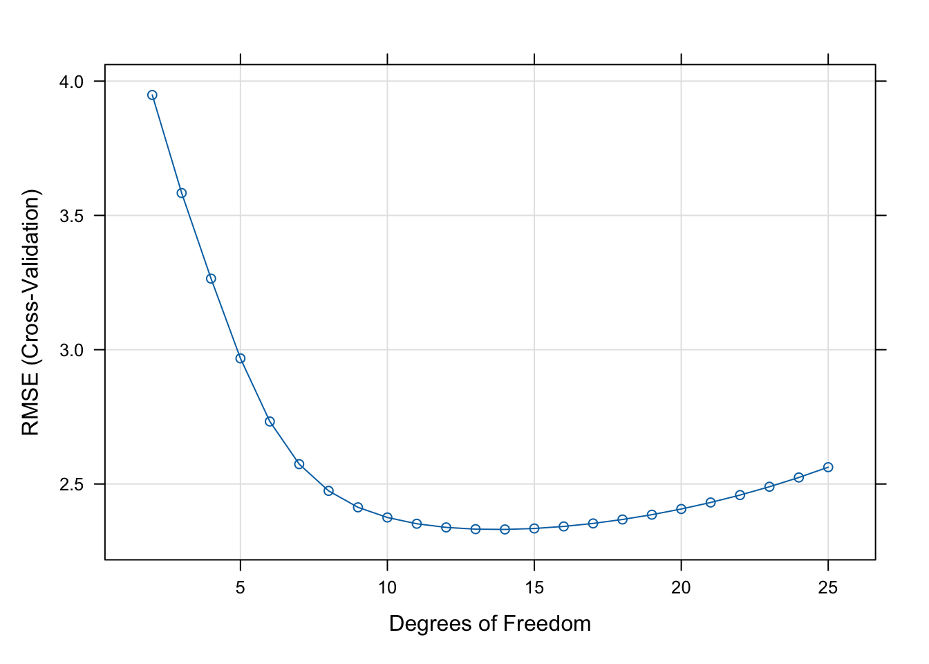
Training the Final Model
One final step remains. Now that we have chosen df=14 as the optimal parameter for this combination of data set and class of model, we train the model with those degrees of freedom on all the data to obtain the final model.
final_model <- train(Y ~ X,
                     data     =simData,
                     method   ="gamSpline",
1                     tuneGrid =data.frame(df=cv_results$bestTune[1]),
2 trControl=trainControl(method="none"))- 1
-
Instead of a list of
dfvalues, we now pass only one value. The best value from cross-validation was stored automatically in thebestTunefield of the result object in the previous step. - 2
-
Instead of cross-validation we request
noneas the training nuance.trainwill simply train the requested model on the data frame.
Making a Prediction
Suppose we want to predict \(Y\) (or more precisely the mean of \(Y\)) for a series of \(X\) values, say from \(-5\) to \(6\).
Computing the predicted values is easy with the predict function in R. You simply pass it the model object and a data frame with the values for which you need predictions.
1xGrid <- data.frame(X=seq(-5, 6, length.out = 250))
2predvals <- predict(final_model,newdata=xGrid)

3predvals[1:10]- 1
- Create a data frame with 250 values for \(X\) ranging from \(-5\) to \(6\).
- 2
- Compute the 250 predicted values.
- 3
- Display the first 10 predicted values.
1 2 3 4 5 6 7 8
-2.658016 -2.947193 -3.236370 -3.525547 -3.814724 -4.103901 -4.393078 -4.682255
9 10
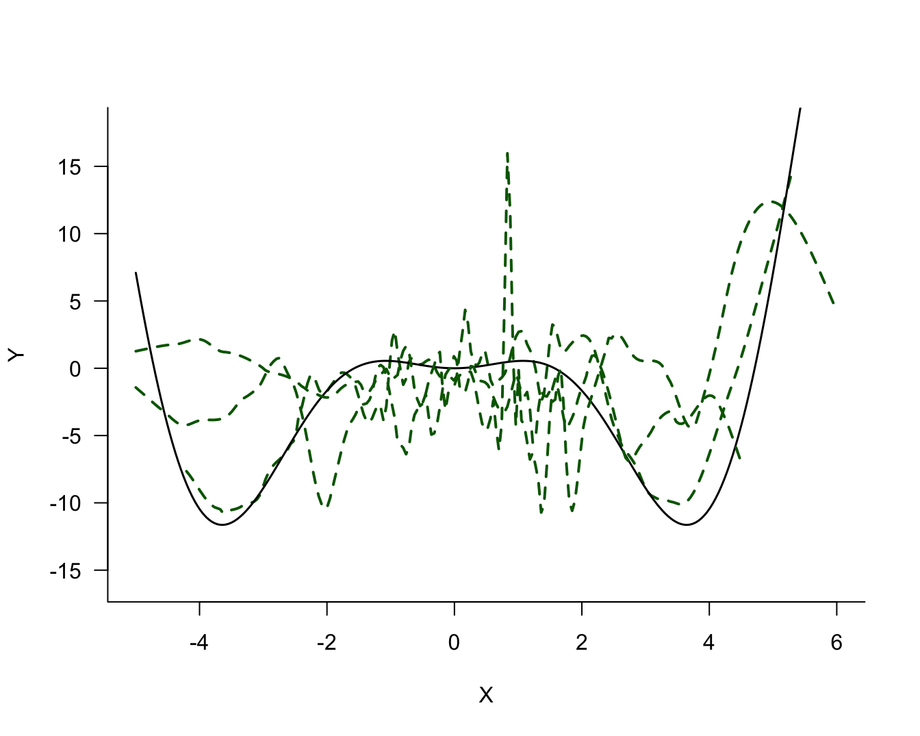
-4.971432 -5.260609 At this point we would like to see how the predicted values of the signal compare to the observed noisy data. Figure 25.18 overlays the predicted values and the data. Also displayed is the true signal. The model derived from the data does an excellent job capturing the signal without following the data points too closely or being too inflexible.
plot(simData$X, simData$Y,
     type="p",
     las =1,
     bty ="l",
     xlab="X",
     ylab="Y")
lines(xGrid$X,predvals,col="red",lwd=2)
lines(xGrid$X,m(xGrid$X),col="black",lwd=2,lty="dashed")
legend("topleft",
       legend=c("Cross-validated","True"),
       lty   =c("solid","dashed"),
       col   =c("red","black"),
       lwd   =2)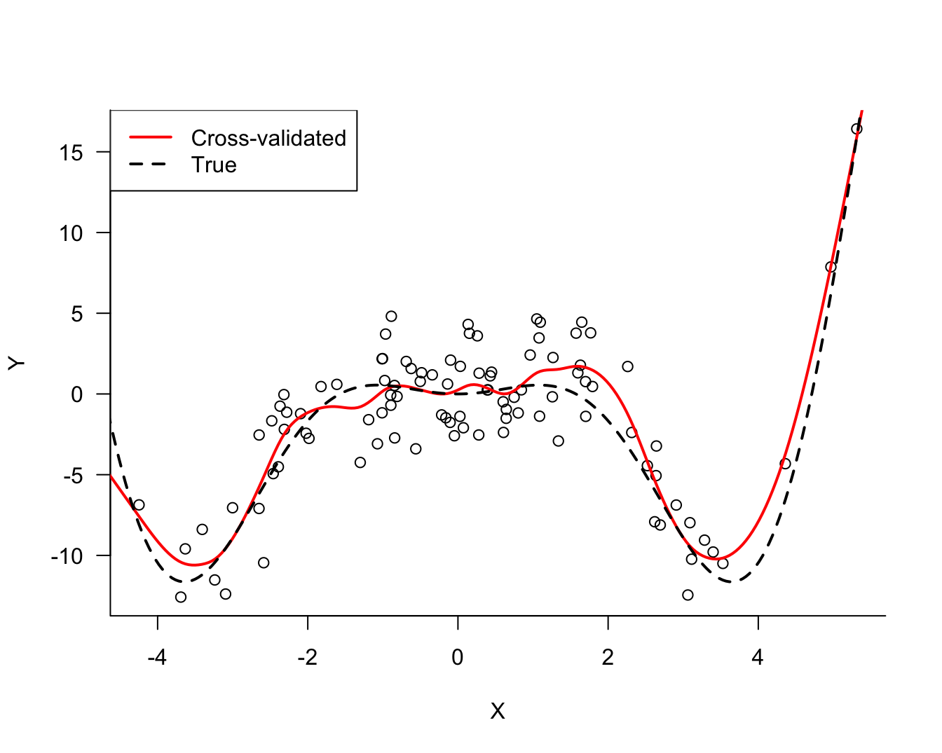
Quantifying Uncertainty
Recall the fourth antidote against bad predictions:
- Quantify the uncertainty in the conclusions drawn from the model.
Conceptually, we think of the bias and variability of the model under repetition of the data collection. In an earlier section we looked at models for three data sets of 100 observations each. There are several factors contributing to our uncertainty about the predicted values in this analysis.
We are not sure whether the regression spline is the correct model family to capature the relationship between \(Y\) and \(X\). Although the results of the cross-validation and the comparison with the true signal (which in practice we would not know) give us comfort that this model family does a good job here.
The second source of uncertainty comes from the fact that there is noise in the data. As we saw earlier, another set of data drawn from the same process gives slightly different data points that lead to a different best model. Fortunately, we can quantify this uncertainty by computing confidence intervals for the predicted values.
A 95% confidence interval for a parameter is a range that with 95% probability will cover the value of the parameter. For example, a 95% confidence interval for the predicted value at \(X=2.5\) is the range into which the mean value of \(Y\) will fall in 95% of the sample repetitions.
The predict functions in R can compute the basic ingredients for confidence intervals for many models. Unfortunately, the predict.train function invoked by caret cannot do this. However, since we know that we fit a gamSpline model, and the predict.Gam function does compute the uncertainty of the predicted values for the values in the training data, we can repeat the final model fit with gam and use its predict function:
1library(gam)

2final <- gam(Y ~ s(X,df=14), data=simData)

3predvals <- predict(final,se.fit=TRUE)

4round(predvals$fit[1:10],4)

5round(predvals$se.fit[1:10],4)- 1
-
Load the
gamlibrary. - 2
-
Fit the final model with the
gamfunction.Y ~ s(X,df=14)is the formulation for a regression spline model with 14 degrees of freedom. - 3
- Compute the predicted values and request that the standard errors of the predicted values are also computed.
- 4
- The predicted values for the first 10 observations.
- 5
- The standard errors of the predicted values for the first 10 observations.
      1       2       3       4       5       6       7       8       9      10
 0.2388 -2.4706  0.5433 -5.7746  0.5378 -0.0852  0.4096 -9.5366  0.4262  0.0101
 [1] 0.6535 0.7064 0.7128 0.8453 0.6418 0.6865 0.7142 0.8642 0.5838 0.6757
For example, the first predicted value is 0.2388 with a standard error of 0.6535.
To compute the 95% confidence interval for the predicted values, add and subtract qnorm(0.975) times the standard error from the predicted value. This is done in the following code and the results are plotted.
pred_df <- data.frame(X=simData$X,
                      pred=predvals$fit,
                      se=predvals$se.fit)
pred_df_sorted <- pred_df[order(pred_df$X),]
pred_df_sorted$ci_up <- pred_df_sorted$pred + qnorm(0.975)*pred_df_sorted$se
pred_df_sorted$ci_lo <- pred_df_sorted$pred - qnorm(0.975)*pred_df_sorted$se

plot(simData$X, simData$Y,
     type="p",
     las =1,
     bty ="l",
     xlab="X",
     ylab="Y")
lines(xGrid$X,m(xGrid$X),col="black",lwd=2,lty="dashed")
lines(pred_df_sorted$X,
      pred_df_sorted$pred,col="red",lwd=2)
lines(pred_df_sorted$X,
      pred_df_sorted$ci_up,col="blue",lty="dotted",lwd=1.5)
lines(pred_df_sorted$X,
      pred_df_sorted$ci_lo,col="blue",lty="dotted",lwd=1.5)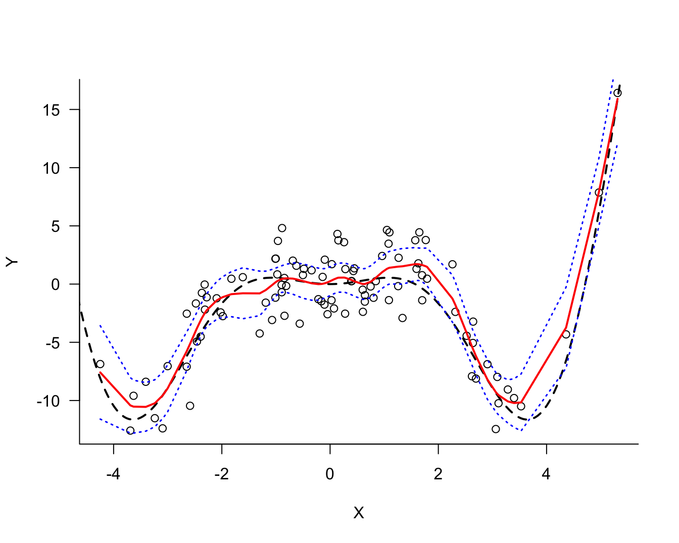
The confidence intervals (dotted blue) are tracing the predicted values and are narrower in the center of the \(X\)-data than near the edges. The further out we move the more uncertain our predictions will be. The dashed black line shows the true signal in the data, the 95% confidence interval covers it.