The data scientist takes on different roles and personas throughout the project. Whether you are writing analytic code or communicating with team members or working with the IT department on implementation, you always think like a data scientist. What does that mean?
Working on a data science project combines computational thinking and quantitative thinking in the face of uncertainty.
5.1 Computational Thinking
In the broad sense, computational thinking (CT) is a problem-solving methodology that develops solutions for complex problems by breaking them down into individual steps. Well, are not most problems solved this way? Actually, yes. We all apply computational thinking methodology every day. As we will see in the example below, cooking a pot of soup involves computational thinking.
In the narrow sense, computational thinking is problem solving by expressing the solution in such a way that it can be implemented through a computer—using software and hardware. The term computational in CT derives from the fact that the methodology is based on core principles of computer science. It does not mean that all CT problems are solved through coding. It means to solve problems by thinking like a computer scientists.
Elements of CT
What is that like? The five elements of computational thinking are
Problem Definition
This should go without saying, before attempting to build a solution one should know what problem the solution solves. However, we often get things backwards, building solutions first and then looking for what problems to solve with them. The world of technology is littered with solutions looking for a problem.
Decomposition (Factoring)
This element of computational thinking asks to break the complex problem into smaller, manageable parts and by doing so helps to focus the solution on the aspects that matter, eliminating extraneous stuff.
Smaller problems are easier to solve and can be managed independently. A software developer decomposes a task into several functions, for example, one that takes user input, one that sorts data, one that displays results. These functions can be developed separately and are then combined to produce the solution. Sorting can further be decomposed into sub-problems, for example, the choice of data structure (list, tree, etc.), the sort algorithm (heap, quicksort, bubble, …) and so on.
To understand how something works we can factor it into its parts and study how the individual parts work by themselves. A better understanding of the whole results when we reassemble the components we now understand. For example, to figure out how a bicycle works, decompose it into the frame, seat, handle bars, chain, pedals, crank, derailleurs, brakes, etc.
Pattern recognition
Pattern recognition is the process of learning connections and relationships between the parts of the problem. In the bicycle example, once we understand the front and rear derailleurs, we understand how they work together in changing gears. Pattern recognition helps to simplify the problem beyond the decomposition by identifying details that are similar or different.
Carl Friedrich Gauss
Carl Friedrich Gauss (1777–1855) was one of the greatest thinkers of his time and widely considered one of the greatest mathematicians and scientists of all time. Many disciplines, from astronomy, geodesy, mathematics, statistics, and physics list Gauss as a foundational and major contributor.
In The Prince of Mathematics, Tent (2006) tells the story of an arithmetic assignment at the beginning of Gauss’ third school year in Brunswick, Germany. Carl was ten years old at the time. Herr Büttner, the teacher wanted to keep the kids quiet for a while and asked them to find the sum of the first 100 integers, \[
\sum_{i=1}^{100}i
\] The students were to work the answer out on their slates and place them on Herr Büttner’s desk when done. Carl thought about the problem for a minute, wrote one number on his slate and placed it on the teacher’s desk. He was the first to turn in a solution and it took his classmates much longer. The slates were placed on top of the previous solutions as students finished. Many of them got the answer wrong, messing up an addition somewhere along the way. Herr Büttner, going through the slates one by one found one wrong answer after another and expected Gauss’ answer also to be wrong, since the boy had come up with it almost instantly. To his surprise Gauss’ slate showed no work, Carl had written on it just one number, 5,050, the correct answer.
Carl explained
Well, sir, I thought about it. I realized that those numbers were all in a row, that they were consecutive, so I figured there must be some pattern. So I added the first and the last number: 1 + 100 = 101. Then I added the second and the next to last numbers: 2 + 99 = 101. […] That meant I would find 50 pairs of numbers that always add up to 101, so the whole sum must be 50 x 101 = 5,050.
Carl had recognized a pattern that helped him see the connected parts of the problem: a fixed number of partial sums of the same value.
Generalization (Abstraction)
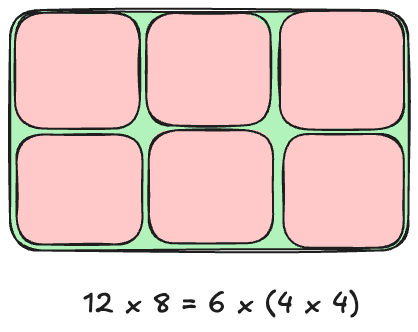
Once the problem is decomposed and the patterns are recognized, we should be able to see the relevant details of the problem and how we go about solving the problem. This is where we derive the core logic of the solution, the rules. For example, to write a computer program to solve a jigsaw puzzle, you would not want to write code specific to one particular puzzle image. You want code that can solve jigsaw puzzles in general. The specific image someone will use for the jigsaw puzzle is an irrelevant detail.
A rectangle can be decomposed into a series of squares (Figure 5.1). Calculating the area of a rectangle as width x height is a generalization of the rule to calculate the area of a square as width-squared.
Figure 5.1: Decomposing a 12 x 8 rectangle into six 4 x 4 squares to generalize computation of the area.
Algorithm design
The final element of CT involves another form of thinking, algorithmic thinking. Here we define the solution as a series of steps to be executed. Algorithmic thinking does not mean the solution has to be implemented by a computer, although this is the case in the narrow sense of CT. The point of the algorithm is to arrive at a set of repeatable, step-by-step instructions, whether these are implemented by humans, machines, or a computer. Capturing the solution in an algorithm is a step toward automation.
Figure 5.2 shows an algorithm to produce pumpkin soup, repeatable instructions that lay out the ingredients and how to process them in steps to transform them into soup.
Figure 5.2: A recipe for pumpkin soup is an algorithm.
In data science solutions the steps to be executed are themselves algorithms. During the data preparation step, you might use one algorithm to de-duplicate the data and another algorithm to impute missing values. During the model training step you rely on multiple algorithms to train a model, cross-validate a model, and visualize the output of a model.
Making Pumpkin Soup
Let’s apply the elements of computational thinking to the problem of making pumpkin soup.
Decomposition
Decomposition is the process of breaking down a complex problem into smaller, more manageable parts. In the case of making pumpkin soup, we can break it down into several steps:
Ingredients: Identify the key ingredients required for the soup.
Pumpkin
Onion or Leek
Garlic
Stock (vegetable or chicken)
Cream (optional)
Salt, pepper, and spices (e.g., nutmeg, cinnamon)
Olive oil or butter for sautéing
Preparation: Break down the actions involved in preparing the ingredients.
Peel and chop the pumpkin
Chop the onion and garlic
Prepare spices and seasoning
Cooking: Identify the steps in cooking the soup.
Sauté the onion and garlic
Add the pumpkin and cook it
Add stock and bring to a simmer
Puree the mixture
Add cream and season to taste
Final Steps: Focus on finishing touches.
Garnish (optional)
Serve and taste for seasoning adjustments
Pattern recognition
What are the similar elements or repeating steps in the problem?
Common cooking steps: Many soups follow a similar structure: sautéing vegetables, adding liquid, simmering, and then blending or pureeing.
Ingredient variations: While the exact ingredients for pumpkin soup may vary (e.g., adding coconut milk instead of cream), the basic framework of the recipe remains the same.
Timing patterns: There’s a pattern to the cooking times: first sautéing for a few minutes, then simmering the soup for about 20-30 minutes, followed by blending.
Generalization
We can generalize (abstract) the process of making pumpkin soup into a more general recipe for making any pureed vegetable soup, regardless of the specific ingredients.
Essential components:
A base (onions, garlic, or other aromatics)
A main vegetable (in this case, pumpkin)
Liquid (stock, broth, or water)
Seasoning and optional cream
General process:
Sauté aromatics.
Add the main vegetable and liquid.
Simmer until the vegetable is tender.
Blend until smooth.
Adjust seasoning and add cream if desired.
Algorithm design
Here is a simple algorithm for making pumpkin soup:
Prepare ingredients:
Peel and chop the pumpkin into cubes.
Chop the onion and garlic.
Sauté aromatics:
In a pot, heat oil or butter over medium heat.
Add chopped onion and garlic, sauté for 5 minutes until softened.
Cook pumpkin:
Add chopped pumpkin to the pot and sauté for 5 minutes.
Add stock to cover the pumpkin (about 4 cups) and bring to a boil.
Simmer:
Lower the heat, cover, and let the soup simmer for 20-30 minutes until the pumpkin is tender.
Blend the soup:
Use an immersion blender or transfer the soup to a blender. Puree until smooth.
Add cream and seasoning:
Stir in cream (optional) and season with salt, pepper, and spices to taste (e.g., nutmeg or cinnamon).
Serve:
Pour into bowls and garnish with optional toppings (e.g., a swirl of cream, roasted seeds, or fresh herbs).
Figure 5.2 is a specific implementation of the algorithm.
By applying computational thinking, we decomposed the task of making pumpkin soup into smaller steps, recognized patterns in the cooking process, abstracted the general process for making soups, and designed an algorithm to efficiently make pumpkin soup. This method helps streamline the cooking process, ensures nothing is overlooked and provides a clear, repeatable procedure.
5.2 Quantitative Thinking
Quantitative thinking (QT) is a problem-solving technique, like computational thinking. It views the world through measurable events, and approaches problems by analyzing quantitative evidence. At the heart of QT lies quantification, representing things in measurable quantities. The word quantification is rooted in the Latin word quantus, meaning “how much”. The purpose of quantification is to express things in numbers. The result is data in its many forms.
When dealing with inherently measurable attributes such as height or weight, quantification is simple. We need an agreed-upon method of measuring and a system to express the measurement in. The former might be an electronic scale or an analog scale with counterweights for weight measurement, a ruler, yardstick, or laser device for height measurements. As long as we know what units are used to report a weight, we can convert it into whatever system we want to use. So we could say that this attribute is easily quantifiable.
Caution
It seems obvious to report weights in metric units of milligrams, grams, pounds (500 grams), kilograms, and tons or in U.S. Customary units of ounces, pounds (16 ounces), and tons. As long as we know which measurement units apply, we can all agree on how heavy something is. And we need to keep in mind that the same word can represent different things: a metric pound is 500 grams, a U.S. pound is 453.6 grams.
But wait, there is more: Apothecaries’ weights are slightly different, a pound a.p. is 12 ounces. And in some fields, weights are measured entirely differently, diamonds are measured in carats (0.2 grams). In the International System of Units (SI), weight is measured in Newtons, which is gravitational force on a mass, equivalent to kg * m /s2.
Nothing is ever simple.
Other attributes are difficult to quantify. How do you measure happiness? Finland has been declared the happiest country on earth for seven years running. This must involve some form of quantification otherwise we could not rank countries and declare one as “best”. How did they come up with that? The purpose of the World Happiness Report is to review the science of measuring well-being and to use survey measures of life satisfaction across 150 countries. Happiness according to the World Happiness Report is a combination of many other measurements. For example, a rating of one’s overall life satisfaction, the ability to own a home, the availability of public transportation, etc. Clearly, there is a subjective element in choosing the measurable attributes that are supposed to allow inference about the difficult to measure attribute happiness. Not all attributes weigh equally in the determination of happiness, the weighing scheme itself is part of the quantification. Norms and values also must play a role. The availability of public transportation affects quality of life differently in rural Arkansas and in downtown London. In short, the process of quantifying a difficult-to-measure attribute should be part of the conversation.
This is a common problem in the social sciences: what we are interested in measuring is difficult to quantify and the process of quantification is full of assumptions. Instead of getting at the phenomenon directly, we use other quantities to inform about all or parts of what we are really interested in. These surrogates are known by different names: we call them an indicator, an index (such as the consumer price index), a metric, a score, and so on.
Example: Net Promoter Score (NPS)
Building on the theme of “happiness”, a frequent question asked by companies that sell products or services is “are my customers satisfied and are they loyal?”
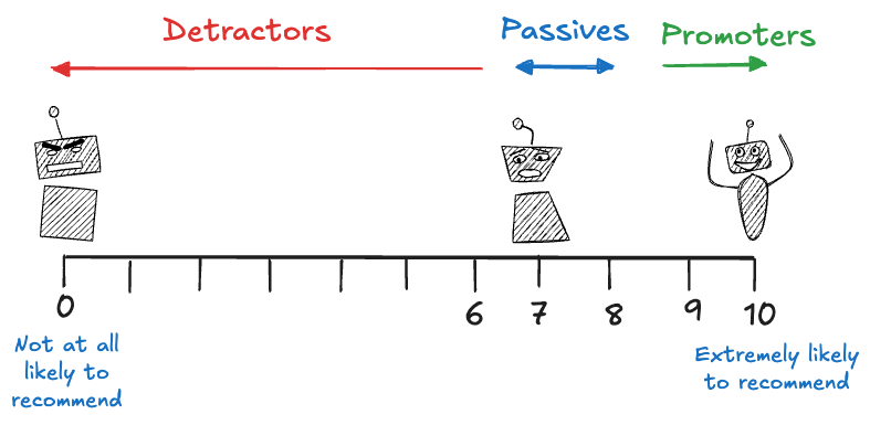
Rather than an extensive survey with many questions as in the World Happiness Report, the question of customer satisfaction and loyalty is often distilled into a single metric in the business world, the Net Promoter Score (NPS). NPS is considered by many the gold standard customer experience metric. It rests on a single question: “How likely are you to recommend the companies products or services?”
The calculation of NPS is as follows (Figure 5.3):
Customers answer the question on a scale of 0–10, with 0 being not at all likely to recommend and 10 being extremely likely to recommend.
Based on their response, customers are categorized as promoters, passives, or detractors. A detractor is someone whose answer was between 0 and 6. A promoter is someone whose answer is 9 or 10. The others, which responded with a 7 or 8 are passives.
The NPS is calculated by subtracting the percentage of detractors from the percentage of promoters.
The NPS ranges from -100 to 100, higher scores imply more promoters. A NPS of 100 is achieved if everyone scores 9 or 10. A score of -100 is achieved if everyone scores 6 or below.
Figure 5.3: Net promoter score
The NPS has many detractors, pun intended. Some describe it as “management snake oil”. Management touts it when the NPS goes up, nobody reports it when it goes down. It continues to be widely used. Forbes reported that in 50 earnings calls of S&P 500 companies NPS was mentioned 150 times in 2018.
Indicators
An indicator is a quantitative or qualitative factor or variable that offers a direct, simple, unique and reliable signal or means to measure achievements.
The economy is a complex system for the distribution of goods and services. Such a complex system defies quantification by a single number. Instead, we use thousands of indicators to give us insight into a particular aspect of the economy: inflation rates, consumer price indices, unemployment numbers, gross domestic product, economic activity, etc.
An indicator is called leading if it is predictive, informing us about what might happen in the future. The job satisfaction in an employee survey is a leading indicator of employee attrition in the future. Unhappy employees are more likely to quit and to move on to other jobs. A lagging indicator is descriptive, it looks at what has happened in the past. Last month’s resignation rate is a lagging indicator for the human resources department.
Types of Data
Data, the result of quantification, can be classified in a number of ways. We consider here classifications by variable (feature) type and the level of data structuring.
Variable (Feature) type
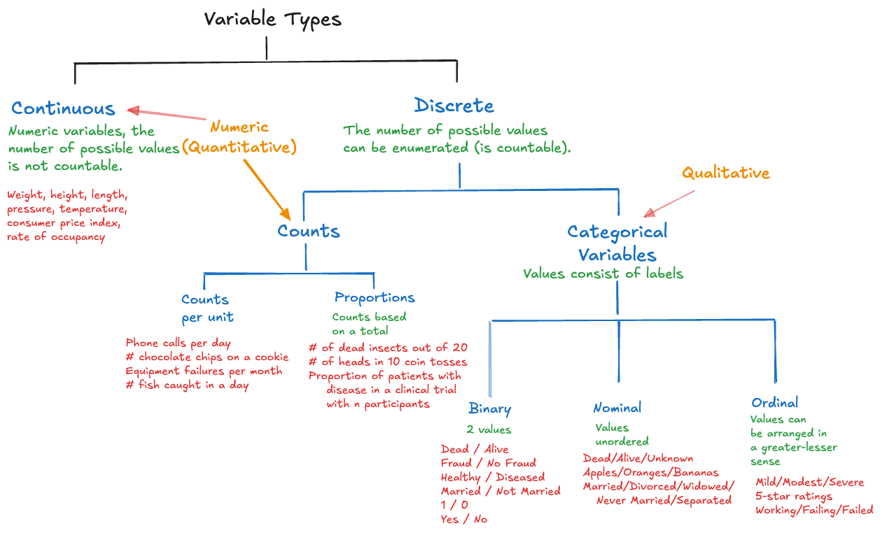
The first distinction of quantified variables is by variable type (Figure 5.4).
Figure 5.4: Classification of data by variable types. (Click to enlarge)
Continuous The number of possible values of the variable is not countable.
Examples are physical measurements such as weight, height, length, pressure, temperature. A continuous variable can have upper and/or lower limits of its range and it can be a fraction or proportion. For example, the proportion of disposable income spent on food and housing is continuous; it ranges from 0 to 100 and the number of possible values between the limits cannot be enumerated. Attributes that have many—but not infinitely many—possible values are often treated as if they are continuous, for example, age in years, income in full dollars. In the food-and-housing example, even if expressed as a percentage and rounded to full percentages, we still would treat this as a continuous variable.
Discrete The number of possible values is countable.
Even if the number of possible values is infinite, the variable is still discrete. The number of fish caught per day does not have a theoretical upper limit, although it is highly unlikely that a weekend warrior will catch 1,000 fish. A commercial fishing vessel might.
Discrete variables are further divided into the following groups:
Count Variables The values are true counts, obtained by enumeration. There are two types of counts:
Counts per unit: the count relates to a unit of measurement, e.g., the number of fish caught per day, the number of customer complaints per quarter, the number of chocolate chips per cookie, the number of cancer incidences per 100,000.
Proportions (Counts out of a total): the count can be converted to a proportion by dividing it with a maximum value. Examples are the number of heads out of 10 coin tosses, the number of larvae out of 20 succumbing to an insecticide.
Categorical Variables The values consist of labels, even if numbers are used for labeling.
Nominal variables: The labels are unordered, for example the variable “fruit” takes on the values “apple”, “peach”, “tomato” (yes, tomatoes are fruit but do not belong in fruit salad).
Ordinal variables: the category labels can be arranged in a natural order in a lesser-greater sense. Examples are 1—5 star reviews or ratings of severity (“mild”, “modest”, “severe”).
Binary variables: take on exactly two values (dead/alive, Yes/No, 1/0, fraud/not fraud, diseased/not diseased)
Categorical variables are also called qualitative variables. They encode a quality, namely to belong to one of the categories. All other variables are also called quantitative variables. Note that quantifying something through numbers does not imply it is a quantitative variable. Highway exits might have numbers that are simple identifiers not related to distances. The number of stars on a 5-star rating scale indicates the category, not a quantified amount. The numeric values of quantitative variables, on the other hand, can be used to calculate meaningful differences and ratios. 40 kg is twice as much as 20 kg, but a 4-star review is not twice as much as a 2-star review—it is simply higher than a 2-star review.
Structured data
Structured data is organized in a predefined format defined through a rigid layout and relationships. The structure makes it easy to discover, query, and analyze the data. Data processing for modeling often involves increasing the structuring of the data, placing it into a form and format that can be easily processed with computers.
The most common form of structuring data in data science is the row-columnar tabular layout. The tabular data we feed into R or Python functions is even more structured than that; it obeys the so-called tidy data set rules: a two-dimensional row-column layout where each variable is in its own column and each observation is in its own row.
Example: Gapminder Data
The Gapminder Foundation is a Swedish non-profit that promotes the United Nations sustainability goals through use of statistics. The Gapminder data set tracks economic and social indicators like life expectancy and the GDP per capita of countries over time.
The following programming statements read the Gapminder data set into a data frame. The data is represented in a wide row-column format. The continent and country columns contain information about continent and country. The other columns are specific to a variable x year combination. For example, life expectancy in 1952 and 1957 appear in separate columns.
  continent       country  gdpPercap_1952  ...    pop_1997  pop_2002  pop_2007
0    Africa       Algeria     2449.008185  ...  29072015.0  31287142  33333216
1    Africa        Angola     3520.610273  ...   9875024.0  10866106  12420476
2    Africa         Benin     1062.752200  ...   6066080.0   7026113   8078314
3    Africa      Botswana      851.241141  ...   1536536.0   1630347   1639131
4    Africa  Burkina Faso      543.255241  ...  10352843.0  12251209  14326203

[5 rows x 38 columns]
The desired (“tidy”) way of structuring the data is a row-column tabular layout with variables
Continent
Country
Year
GDP
Life Expectancy
Population
We are wrangling the wide format of the Gapminder data into the tidy format later in Chapter 30.
Relational databases also contain highly structured data. The data is not in a single table, but defined through relationships between tables. Transactional (OLTP) and analytical (OLAP) database systems are discussed in Section 13.2.
Markup languages such as XML (eXtensible Markup Language) and serialization formats such as JSON (JavaScript Object Notation) and Google’s protobuf (Protocol Buffers) are structured data sources, although they do not arrange data in tabular form. More on JSON in Section 13.1.2.
Unstructured data
Unstructured data lacks a predefined format or organization, requiring processing and transformation prior to analysis. Examples of unstructured data sources are text data, multimedia content, social media and web data.
Text Data
Documents
Research papers and publications
Legal documents and contracts
News articles
Books and literature
Technical manuals and documentation
Web Content
Blog posts
Forum discussions and comments
Product reviews and ratings
Social media posts
Wiki pages
Communication Data
Email correspondence
Chat logs, instant messages
Customer support tickets
Meeting transcripts
Open-ended survey responses
Multimedia Content
Image Data
Photographs and digital images
Medical imaging (X-rays, MRIs, CT scans)
Satellite and aerial imagery
Computer-generated graphics
Handwritten documents and forms
Video Data
Streaming content and movies
Security camera footage
Educational and training videos
User-generated content
Live broadcasts and webinars
Audio Data
Music and sound recordings
Podcast episodes
Voice calls and voicemails
Radio broadcasts
Natural sound environments
Social Media and Web Data
Platform-Specific Content
Posts, metadata and interactions from Twitter/X, Facebook, TikTok, Instagram, …
LinkedIn professional content
YouTube videos and comments
User-Generated Content
Product reviews on e-commerce sites
Restaurant reviews (Yelp, Google Reviews)
Travel reviews (TripAdvisor)
App store reviews
Community forum posts (Reddit, Stack Overflow)
Log Files and System Data
Application Logs
Web server access logs
Database query logs
Error and exception logs
Application performance logs
User activity logs
System Monitoring Data
Network traffic logs
Security event logs
System resource usage
Configuration files
Backup and recovery logs
Experimental and observational data
We can also distinguish data based on whether they were gathered as part of a designed experiment or whether they were collected by observing and recording events, behaviors, or phenomena as they naturally occur. In a designed experiment factors that affect the outcome are purposely controlled—either through manipulation, randomization, or assignment of treatment factors. Data from correctly designed experiments enable cause–and–effect conclusions. If, on the other hand, we simply observe data that naturally occur, it is much more difficult—often impossible—to establish what factors cause the effects we observe.
In research studies, experimentation is common, provided that the systems can be manipulated in meaningful ways. When studying the economy, the weather, earthquakes, we cannot manipulate the system to see how it reacts. Conclusions are instead based on observing the systems as they exist.
Experimental data is less common in commercial data science applications than observational data. Experimentation is applied when comparing models through A/B testing, a simple method where two data science solutions are randomly presented to some users and their response is measured to see whether the solutions differ with respect to business metrics.
Surrogacy
Surrogate, Indicator, Index
Quantification is the process to represent the world in measurable quantities. We have seen that some attributes are difficult to quantify, and quantification relies on surrogates and indicators. A surrogate metric (proxy metric) is one that is used in the place of another. An indicator is a quantitative or qualitative factor or variable that offers a direct, simple, unique and reliable signal or means to measure achievements.
Indicator and Index
When multiple indicators are combined, we sometimes call it an index, although the distinction is not precise. Indicators can also be the result of aggregation so that the distinction between indicator and index becomes one of degree of combining information (with an index being more aggregated or combining more individual pieces of information). In some domains, the word index is simply used more frequently than indicators, and vice versa.
Economic indicators, for example, are used to describe aspects of the economy:
The consumer price index is a surrogate metric for cost of living and inflation.
The unemployment rate and inflation are surrogates for the strength of the economy.
The GDP is a measure for the economic health of a nation.
The net promoter score is a surrogate metric for customer loyalty.
When quantifying a variable of interest is difficult, time consuming, expensive, or destructive, and a surrogate variable is easy to quantify, the surrogate can take the place of the variable of interest. You will come across many surrogates during feature engineering. Here are some examples:
Healthcare
Cholesterol levels as a proxy for heart health.
BMI has a proxy for obesity-related risks.
Education
Standardized test scores as surrogates for student achievement.
Graduation rates as a proxy for work force preparation.
Manufacturing
Force to pull a nail through a gypsum board as a surrogate for dry wall quality.
Economy
Gross Domestic Product as a surrogate for societal well-being.
Consumer Price Index as a surrogate for purchasing power.
Unemployment rate as a surrogate for economic strength.
Environmental Science
CO2 levels as proxy for climate change.
Tree canopy cover as a proxy for biodiversity.
Human Resources
Measuring employee productivity by number of hours worked.
Employee attrition as a surrogate for employee satisfaction.
Technology
Number of downloads of an app as a measure of market share.
Likes and shares as a measure of social media engagement
Academia
Citation count as a surrogate for research impact.
Surrogate measurements are very often necessary, but they are not without issues:
They might not capture all factors influencing the attribute of interest.
They can lead to oversimplification and misinterpretation.
The surrogate might not measure what is most relevant. For example, standardized test scores do not measure critical thinking.
They can lead to surrogation.
Body Mass Index (BMI), the Bogus Index
A great example of a surrogate-gone-mad is the body mass index (BMI). It is a medical screening tool for certain health conditions; it has become the standard indicator for obesity. Colloquially, it is understood as a measure of “fatness”. That is not quite correct, in most people, BMI only correlates with body fat.
The popularity of BMI is related to its easy derivation, it involves only two variables, a person’s weight and height, both of which can be measured precisely. With weight measured in kilograms (kg) and height in meters (m), the formula is simply \[
\text{BMI} = \frac{\text{Weight in kg}}{(\text{Height in m})^2}
\]
Notice that the height is squared in the denominator. If you prefer to work in U.S. pounds and inches, the calculation is \[
\text{BMI} = \frac{\text{Weight in lbs} \times 703}{(\text{Height in inches})^2}
\]
In my case (6’3” tall, 208 lbs), the BMI is (208 )/(75^2) = 25.9. According to BMI charts such as this one at the Cleveland Clinic, I am in the overweight range.
BMI is used widely by medical professionals. People with low BMI values might be at risk for developing anemia, osteoporosis, infertility, malnutrition, and a weakened immune system. High values can indicate a higher risk for heart disease, high blood pressure, type 2 diabetes, gallstones, osteoarthritis, sleep apnea, depression, and certain cancers.
Geez. It seems that unless you are in the optimal BMI range you are either bound for osteoporosis or osteoarthritis. No wonder folks are obsessing over their BMI.
It’s important to remember that you could have any of the above health conditions without having a high BMI. Similarly, you could have a high BMI without having any of these conditions.
…
It’s important to remember that body fatness isn’t the only determiner of overall health. Several other factors, such as genetics, activity level, smoking cigarettes or using tobacco, drinking alcohol and mental health conditions all affect your overall health and your likelihood of developing certain medical conditions.
And
The standard BMI chart has limitations for various reasons. Because of this, it’s important to not put too much emphasis on your BMI.
People who are muscular can have a high BMI and still have very low fat mass. The BMI does not distinguish between lean body mass and fat body mass. BMI charts do not distinguish between males and females, although females tend to have more body fat (says the Cleveland Clinic!). People today are taller than when the BMI was developed. The BMI charts do not apply to athletes, children, pregnant people, or the elderly.
Even though the BMI chart can be inaccurate for certain people, healthcare providers still use it because it’s the quickest tool for assessing a person’s estimated body fat amount.
Ah, so it is used because it is easy to calculate, not because it is particularly useful or accurate.
A January 2025 article in the medical journal The Lancet states (Rubino et al. 2025)
Current BMI-based measures of obesity can both underestimate and overestimate adiposity and provide inadequate information about health at the individual level, which undermines medically-sound approaches to health care and policy.
Based on this article, Business Insider went a step further, calling BMI bogus. Having “obesity” according to the BMI scale does not mean a person is unhealthy. In fact, BMI does not tell you anything about the health of a person.
Figure 5.5: Dwayne “The Rock” Johnson has a BMI of 34.3, which is classified as obese.
Origin of BMI
It is worthwhile to examine how BMI came about. The comment above about the increasing height of people suggests that BMI was developed some time ago. Indeed. It was invented for an entirely different reason, to describe a population average man in Western Europe in the 19th century.
To make this connection we need to introduce Adolphe Quetelet (1796–1847), who invented the BMI to quantify a population according to the weight of its persons. It was initially called the Quetelet index. Quetelet was a Belgian astronomer, statistician, and mathematician—not a medical professional. He studied the distribution of physical attributes in populations of French and Scottish people. Quetelet determined that the normal, the most representative value of an attribute, is its average. Prior to Quetelet, the idea of “norm” and “normality” was associated with carpentry and construction. The carpenter square is also called the norm and in normal construction everything is at right angles. The classical notion of ideal as an unattainable beauty up to this time was reflected in great works of art.
Quetelet focused on the middle of the distribution as the “new normal” and saw l’homme moyen, the average man, as the ideal (Grue and Heiberg 2006).
There is no association with health, and there is no association with the individual. The BMI as developed by Quetelet was supposed to describe the average in a population, not obesity of the individual. The population it was intended to describe is French and Scottish of the 19th century. Leaping from that application and that data to near universal measure of obesity since the 1970s is quite the stretch.
Surrogation
Surrogation occurs when people or organizations substitute a metric for the underlying concept or goal that the metric is intended to represent. Instead of treating the metric as a proxy or tool to measure progress, they treat it as the ultimate goal itself. The metric has become the goal. Surrogates are good. Surrogation is bad.
When standardized test scores are a surrogate for student achievement, surrogation means to focus on driving up the test scores rather than focusing on driving actual student achievement.
Someone can obsess over BMI (body mass index), trying to improve their BMI but not getting any healthier. Well, we now know why.
Surrogation of net promoter scores occurs when companies focus on driving up NPS by only asking customers that repeatedly buy their product. The goal is to increase customer satisfaction and loyalty, the NPS should increase as a result. Surrogation focuses on the NPS, not the actual customer satisfaction. The first mistake in surrogation is to assume that the surrogate is exactly what it is a proxy for. To assume that the net promoter score is a proxy for customer satisfaction it is not customer satisfaction.
Sales people are often incentivized on number of deals or deal volume (revenue). The underlying goal is to drive success for the company. Surrogation can lead to closing of deals that are bad for the company (losing money on the deal) but work in favor of the sales person’s metric to hit a revenue target.
When metrics are tied to performance evaluation, resource assignment, advancement, surrogation is common. It leads to distorted priorities and bad behavior (gaming the system): people try to meet the metric without achieving the underlying goal.
Another negative aspect of surrogation is to prioritize the simple fixes and quick wins instead of the deeper but more expensive and difficult corrections. A hospital might focus on amenities or quick ER service rather than improving health outcomes for its patients. A social media content creator generates click bait in order to increase clicks rather than focusing on meaningful engagement.
5.3 Dealing with Uncertainty
In “Think Like a Data Scientist”, Brian Godsey lists awareness in the face of uncertainty as one of the biggest strengths of a data scientist (Godsey 2017). Once source of uncertainty is the inherent complexity of data science projects that involve many parts of the organization. A data science project is full of problems, the real-world problem that needs to be solved and problems that arise during the projects. Deadlines will be missed. Data will not be as available as expected or of lower quality as expected. Budgets can change and goals are re-prioritized. Models that work well on paper fall apart when they get in contact with reality. The list goes on and on. The data scientist thinks through problems not from the perspective of the data but from the perspective what data can help us to accomplish. What matters is that we solve the business problem, not that we build a neural network.
Another source of uncertainty is the inherent variability of the raw material, data. Variability is contagious, it makes everything produced from data also variable. The point of data processing is to separate the signal from the noise and to find the systematic patterns and relationships in the data, the insights that help make decisions.
Data scientists are sometimes compared to software developers. They do share certain traits; both are using tools, languages, and frameworks to build complex systems with software. But analytic code is different from non-analytic code in that it is processing an uncertain input. A JSON parser also processes variability, each JSON document is different from the next. Does it not also deal with uncertain input? If the parser is free of bugs, the result of parsing is known with certainty. For example, we are convinced that the sentence “this book is certainly concerned with uncertainty” has been correctly extracted from the JSON file. Assessing the sentiment of the sentence, however, is a data science task: a sentiment model is applied to the text and returns a set of probabilities indicating how likely the model believes the sentiment of the text is negative, neutral, or positive. Subsequent steps taken in the software are based on interpreting what is probable.
There is uncertainty about which method to use. Whether a software developer uses a quicksort or merge sort algorithm to order an array has impact on the performance of the code but not on the result. Whether you choose a decision tree or a support vector machine to classify the data in the array impacts the performance and the result of the code. A chosen value for a tuning parameter, e.g., the learning rate, can produce stable results with one data set and highly volatile results with another.
Further uncertainty is introduced through analytic steps that are themselves random. Splitting data into training and test data sets, creating random folds for cross-validation, drawing bootstrap samples to estimate variability or to stabilize analytics through bagging, random starting values in clustering or neural networks, selecting the predictors in random forests, Monte Carlo estimation, are some examples where data analysis involves drawing random numbers. The data scientist needs to ensure that random number sequences that create different numerical results do not affect the quality of the answers. The results are frequently made repeatable by fixing the seed or starting value of the random number generator. While this makes the program flow repeatable, it is yet another quantity that affects the numerical results. It is also a potential source for misuse: “let me see if another seed value produces a smaller prediction error.”
Data are messy and possibly full of errors. It contains missing values. There is uncertainty about how disparate data sources represent a feature (a customer, a region, a temperature) that affects how you integrate the data sources. These sources of uncertainty can be managed through proper data quality and data integration. As a data scientist you need to be aware and respectful of these issues; they can doom a project if not properly addressed. In an organization without a dedicated data engineering team resolving data quality issues might fall on your shoulders. If you are lucky to work with a data engineering team you still need to be mindful of these challenges and able to confirm that they have been addressed or deal with some of them (missing values).
Example: Imputation through Principal Component Analysis (PCA)
A missing value pattern.
ID
Type
X1
X2
X3
1
A
3.71
5.93
55
2
B
.
4.29
32
3
A
0.98
5.86
55
4
B
.
4.28
29
5
A
6.04
5.94
48
6
B
.
5.25
18
7
A
1.52
4.01
61
8
B
.
5.55
30
The table above shows eight observations on four features: Type, X1, X2, and X3.
Whatever types A and B represent, we notice that values for X1 are missing whenever Type equals B. A complete-case analysis based on X1 through X3 would eliminate observations with missing values and leave us only with observations for Type A. This makes a comparison between the two types impossible. To facilitate such a comparison, we could limit any analysis to rely on only X1 and X2, or we could impute the missing values for X3.
Such an imputation could be based on a matrix completion algorithm that uses principal component analysis (PCA) to iteratively fill in the missing information for X1 based on the observed data for X1, X2, and X3. That sounds awesome. But what if there are systematic differences between the two types? Does it then make sense to fill in values for X1, Type B with information derived from Type A? Could this possibly bias the analysis and be worse than not using X1 in the analysis at all?
5.4 Perspective about Data
Maintaining proper perspective about data means knowing where the important issues are. This can be a moving target.
The volume of data can be unproblematic for one analytic method and a limiting factor if you want to derive prediction intervals by way of bootstrapping.
A large but highly accurate model is being developed on historical training data in an Internet of Things (IoT) application. Due to the complexity of the model the scoring engine that applies the model in real time to data flowing off sensors cannot keep up.
A stacked ensemble of classification models improves the ability to segment customers but is not interpretable.
There are many limiting factors in data-centric applications and many moving parts. The data scientist is in a unique position to have perspective and awareness of the factors related to data. It is unlikely that anyone else will have that 360-degree view about data.
As Brian Godsey puts it:
As a data scientist, I have as my goal to make sure that no important aspect of a project goes awry unnoticed. When something goes wrong–and something will–I want to notice it so that I can fix it.
5.5 Data Intuition
Intuition is the ability to draw conclusions through unconscious information, without requiring proof or analytical thinking. There is a bias against intuitive reasoning in the data disciplines, because of the narrative that data-driven decisioning can replace decisioning based on “gut feeling”. This narrative claims that data is the objective, unbiased container of truth, data science extracts that truth and enables decision makers to make better decisions. Using intuition in this belief model is the exact opposite of being data-driven—hence is bad.
It seems that intuition is the great enemy of data. Sandosham (2024) argues that we have this narrative wrong and that intuition is just another aspect of data analytics. Where we go wrong with the story is to misunderstand two types of intuition:
Intuition honed from repeated exposure
Intuition based on making decisions in the presence of weak information signals and significant uncertainty.
The first type of intuition works when things seem counter-intuitive to us, because a situation does not agree with our default thinking. Sandosham (2024) gives the example of being trained to think linearly when comparing items: 12 inches is less than 18 inches and 2 times 12 is larger than 18; however, a 18-inch pizza has more area than two 12-inch pizzas. This is counter-intuitive because our brain thinks the question about the surface area is similar to what we encountered before: comparing lengths.
This type of intuition in data science is helpful to recognize situations that appear similar but are in fact not.
Example: Regularization in Regression
Students learn in statistics that ordinary least squares (OLS) estimators have nice properties, and are even optimal in some situations. For example, among all unbiased estimators they have the smallest variance. It is easy to walk away from the intense focus on OLS believing that it should be the default.
In high-dimensional regression problems, when the number of inputs \(p\) is large compared to the number of observations \(n\), and possibly even larger than \(n\), ordinary least squares regression does not perform well; it can even crash and burn. The estimators become unstable and have large variance—counter-intuitive because they have the smallest variance among all unbiased estimators.
Regularization techniques such as Ridge regression induce some bias to improve the overall performance of the model. The counter-intuitive experience of OLS performing poorly leads to a re-evaluation of assumptions: unbiasedness is maybe not as important as we have believed.
The second type of intuition can be labeled “gut feeling”. That instinctive knowledge that something is off, the dots are not connecting. Sandosham (2024) states
The collated and distilled information signal presents a logical conclusion. But you have doubts about it […]
Some seemingly insignificant pieces don’t fit, but they are not insignificant to you, and you can’t quite explain why.
Developing intuition for data is one of the most valuable skills a data scientist can acquire. It will help to flag things that are surprising, curious, worth another look, or that do not pass the smell test. Developing intuition is helped by strong technical knowledge, it provides the foundation against which our conscious mind can judge surprise. Some intuition for data is innate, and it can be developed with experience and practice. Being curious, asking questions, requesting feedback, working with real data sets, and spending time exploring data go a long way in developing better intuition.
… a superb intuition for probabilistic variation becomes the basis for expert modeling of the variation [of data]
Let’s test our intuition for data with a few examples.
Outliers in Box and Whisker Plot
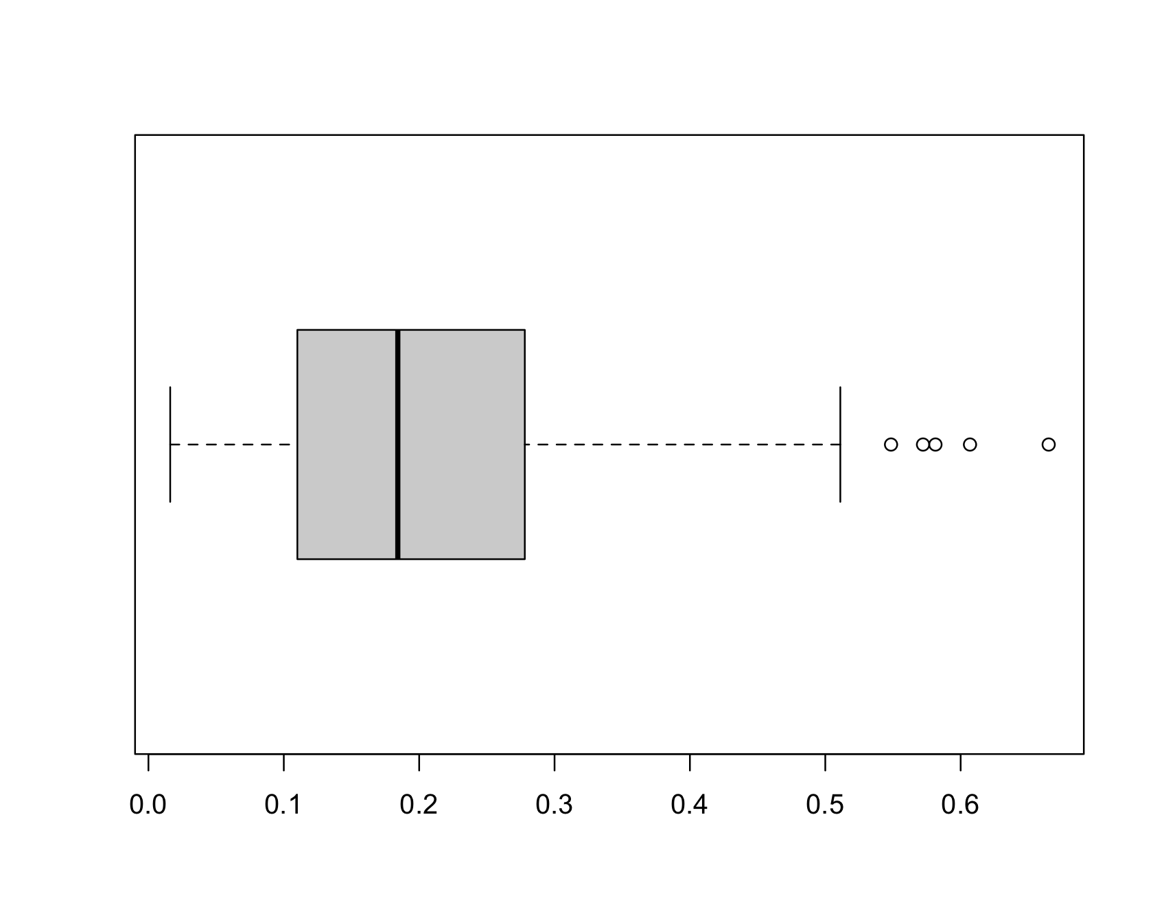
The following graph shows a box plot constructed from 200 observations on a variable. What does your intuition tell you about the five data points on the right side in of Figure 5.6?
Figure 5.6: Box plot of 200 observations for a variable.
Also called the box-and-whisker plot, this plot places a box that covers the central 50% of the data—called the interquartile range—and extends from the edge of the box whiskers to the observations within \(\pm 1.5\) times the interquartile range. Points that fall outside the whiskers are labeled as outliers. Does knowing the details of box plot construction change your intuition about the data points on the right?
After having seen many box plots you will look at this specimen as an example of a continuous random variable with a right-skewed (long right tail) distribution. Five “outliers” out of 200 is not alarming when the distribution has a long tail.
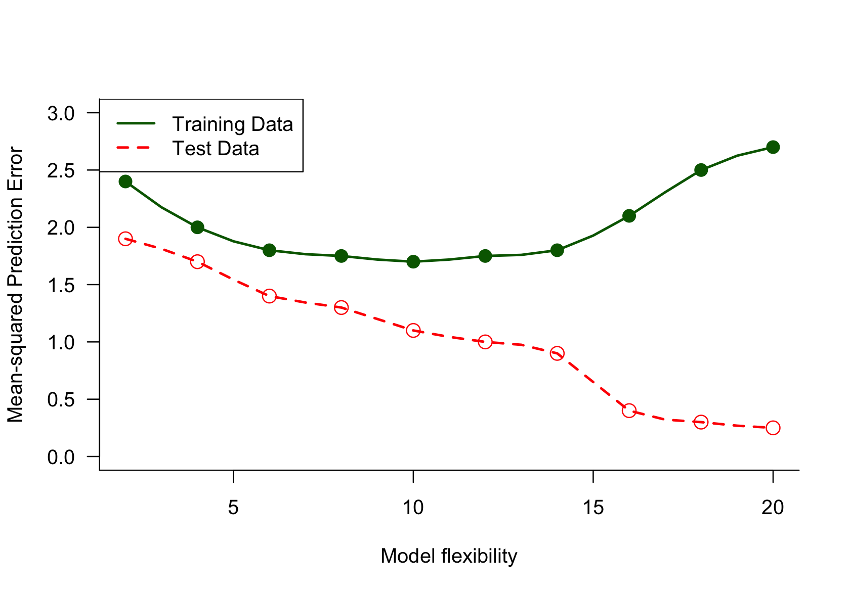
Prediction Error in Test and Training Data
Figure 5.7 shows graphs of the mean-squared prediction error, a measure of model performance, as a function of model complexity. The complexity is expressed in terms of the model’s ability to capture more wiggly structures (flexibility). The training data is the set of observations used to determine the model parameters. The test data is a separate set of observations used to evaluate how well the fitted (=trained) model generalizes to new data points.
Figure 5.7: The mean-squared prediction error for a set of training and test data as a function of model complexity.
Something is off here. The prediction error on the test data set should not decrease steadily as the model flexibility increases. The performance of the model on the test data will be poor if the model is too flexible or too inflexible. The prediction error on the training data on the other hand will decline with greater model flexibility. Intuition for data suggests that measures of performance are optimized on the training data set and should be lower for the test data set. It is worth checking whether the labels in the legend are reversed.
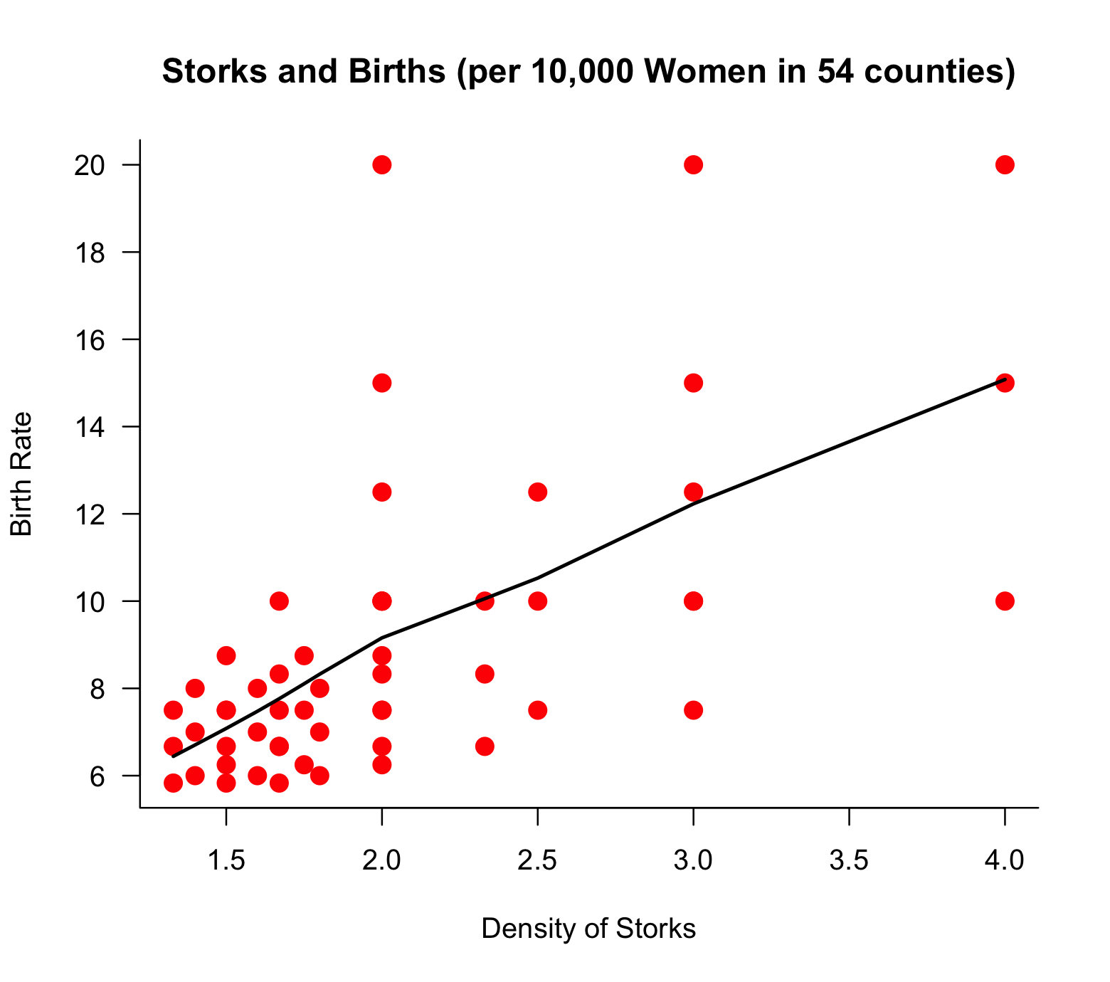
Storks and Babies
The next example of data intuition is shown in the following scatterplot based on data in Neyman (1952). Data on the birth rate in 54 counties, calculated as the number of babies born relative to the number of women of child-bearing age, and the density of storks, calculated as the number of storks relative to the same number of women, suggests a trend between the density of storks and the birth rate.
Figure 5.8: Scatterplot of stork density and birth rate along with a LOESS fit. The variables are calculated by dividing the number of babies and the number of storks in the county by the number of women of child-bearing age in the county (in 10,000).
Our intuition tells us that something does not seem quite right. The myth of storks bringing babies has been debunked—conclusively. The data seem to tell a different story, however. What does your data intuition tell you?
There must be a different reason for the relationship that appears in the plot. Both variables plotted are divided by the same quantity, the number of women of child-bearing age. This number will be larger for larger counties, as will be the number of babies and, if the counties are comparable, the number of storks. In the absence of a relationship between the number of babies and the number of storks, a spurious relationship is introduced by dividing both with the same denominator.
Cluster Assignment
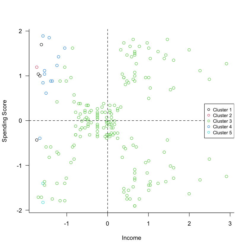
Clustering is an unsupervised learning technique where the goal is to find groups of observations (or groups of features) that are in some form alike. In statistical terms we try to assign data to groups such that the within-group variability is minimized, and the between-group variability is maximized. In this example of clustering, data on age, income, and a spending score were obtained for 200 shopping mall customers. The spending score is a value assigned by the mall, higher scores indicate a higher propensity of the customer to make purchases at the mall stores.
A cluster analysis was performed to group similar customers into segments, so that a marketing campaign aimed at increasing mall revenue can target customers efficiently. A few observations are shown in the next table.
Customer ID
Age
Income
Spending Score
1
19
15
39
2
20
16
6
3
35
120
79
4
45
126
28
Figure 5.9 shows a scatter plot of the standardized income and spending score attributes, overlaid with the customer assignment to one of five clusters.
Figure 5.9: Results of hierarchical clustering with five clusters.
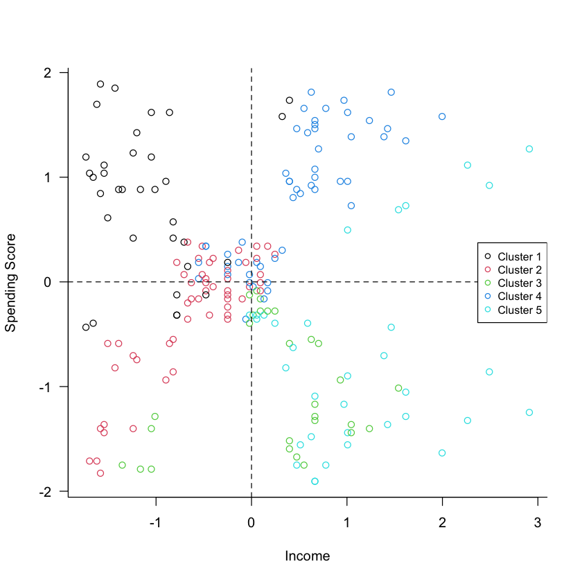
There are distinct groups of points with respect to (the standardized) spending and income. One group is near the center of the coordinate system, one group is in the upper-right quadrant, one group is in the lower-right quadrant. If the clustering algorithm worked properly, then these points should not be all assigned to the same cluster. This is an example where we need to take another look at the analysis. It turns out that the customer ID was erroneously included in the analysis. Unless that identifier is meaningful in distinguishing customers, it must be removed from the analysis. The results of the analysis without the customer ID are shown in Figure 5.10, confirming that the clustering algorithm indeed detected groups that have (nearly) distinct value ranges for spending score and income.
Figure 5.10: Corrected cluster analysis after removing the non-informative customer ID variable from the analysis. The detected clusters map more clearly to groups of points that are distinct with respect to spending and income.
Did Early Humans Live in Caves?
Most remains of early humans are found in caves. Therefore, we conclude that most early humans lived in caves.
This is an example of survivorship bias (or survivor bias), where we focus on successful outcomes while overlooking other possibilities. The presence of the dead does not necessarily imply where they lived. Is it possible that the living placed their dead in caves and that is why we find their bones there? We have a much greater chance to study the remains of people placed in caves than the remains of people outside of caves.
A similar survivorship bias leads to overestimates of the success of entrepreneurship by focusing on the successes of startup companies that “exit” (go public or are acquired) and ignoring the many startup companies that fail and just disappear.
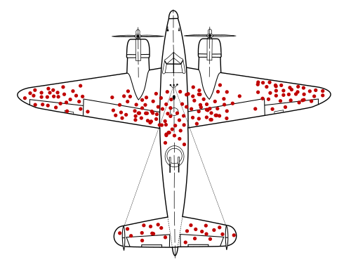
WWII Bomber Damage
Another example of survivorship bias is the study of World War II bombers returning from battle. Figure 5.11 is something cited in this context, ostensibly showing places where the returning planes had been shot. The figure goes back to a study by statistician Abraham Wald, marking areas on the plane with a 95% survival rate when shot. The white areas had a 65% survival rate.
However, the story told when this image is produced is typically this: engineers studied the damage on the planes that returned from battle and decided to reinforce with armor the areas with red dots.
Figure 5.11
Another group analyzed the report and came to a different conclusion: rather than placing more armor in areas where the planes had been shot, the additional armor should be placed in the areas not touched on the returning planes. The group concluded that the data was biased since only planes that returned to base were analyzed. The untouched areas of returning aircraft were probably vital areas, which, if hit, would result in the loss of the aircraft.
Cleveland, William S. 2001. “Data Science: An Action Plan for Expanding the Technical Areas of the Field of Statistics.”International Statistical Review / Revue Internationale de Statistique 69 (1): 21–26. http://www.jstor.org/stable/1403527.
Grue, Lars, and Arvid Heiberg. 2006. “Notes on the History of Normality–Reflections on the Work of Quetelet and Galton.”Scandinavian Journal of Disability Research 8 (4): 232–46.
Rubino, Francesco, David E Cummings, Robert H Eckel, Ricardo V Cohen, John P H Wilding, Wendy A Brown, Fatima Cody Stanford, et al. 2025. “Definition and Diagnostic Criteria of Clinical Obesity.”The Lancet Diabetes & Endocrinology. https://doi.org/10.1016/S2213-8587(24)00316-4.