import pandas as pd
import polars as pl

import duckdb
con = duckdb.connect(database="../ads.ddb", read_only=True)

pd_df = con.sql('select * from iris').df()
pd_dl = con.sql('select * from iris').pl()17 Summarization
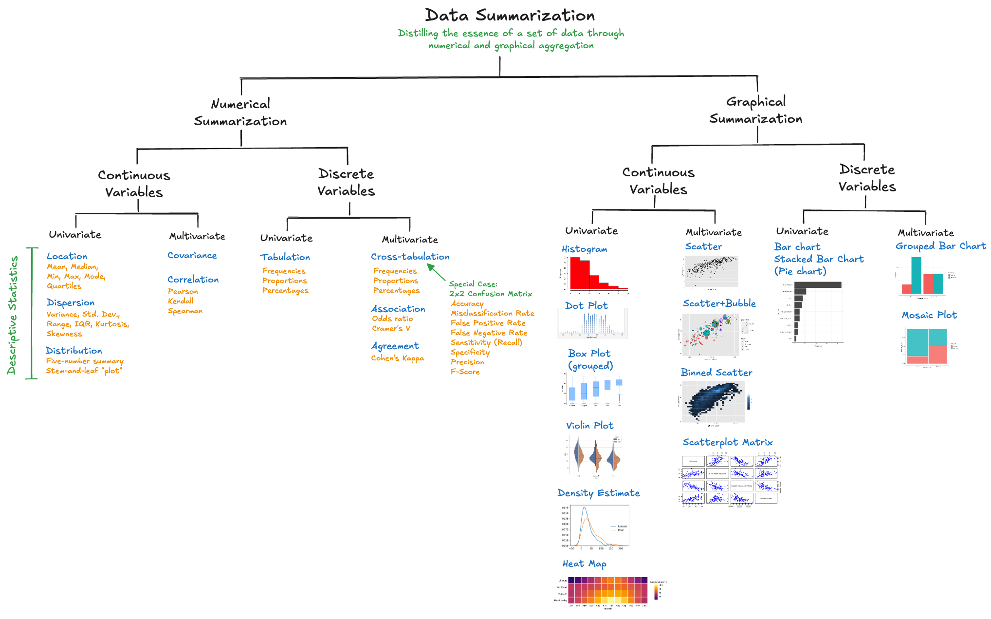
We encountered quantitative data summaries in the discussion of data profiling; describe() in pandas or the sweetviz visualization produced a number of quantities that summarize properties of the variables in the data set. In this chapter we take a closer look at location and dispersion statistics, important sufficient statistics, and how to summarize categorical data and associations.
The focus of summarization in this chapter is to produce numerical quantities and tabular output. Graphical summaries are covered in Chapter 18.
Definition: Data Summaries
Data summarization is the numerical, tabular, and graphical distillation of the essence of a data set and the relationships between its variables through aggregation.
Summarization reduces \(n\) data points to quantities that describe aspects of the variability in the data. These quantities are called descriptive statistics. For quantitative variables, the statistics measure aspects of the location and dispersion of the data. For qualitative variables, summaries describe unique values and frequencies.
Data summarization serves many purposes. For example:
Profiling. The “first date with the data” according to Borne (2021). See Section 16.2.
Description. What are the central tendencies and the dispersion of the variables? For example, what does the comparison of statistics measuring the central tendency tell us about the distribution of the data, the presence of outliers? What distributional assumptions are reasonable for the data. Are transformations in a feature processing step called for?
Aggregation. Suppose you could not store the raw data but you need to retain information for future statistical processing. What kind of information would you compute and squirrel away? A sufficient statistic is a function of the data that contains all information toward estimating a parameter of the data distribution. For example, the sample mean \(\frac{1}{n}\sum_{i=1}^n Y_i\) is sufficient to estimate the mean of a set of \(n\) independent and identically distributed random variables. If \(Y\) is uniform on \([0,\theta]\), then \(\max\{Y_i\}\) is sufficient for \(\theta\). The quantities we compute during summarization are frequently sufficient statistics; examples are sums, sums of squares, sums of cross-products.
Relationships. Summarization is not only about individual variables, but also about their relationship. The correlation matrix of \(p\) numerical variables is a frequent summary that describes the pairwise linear relationships in the data.
Dimension Reduction. In high-dimensional statistical problems the number of potential input variables is larger than what we can handle (on computational grounds) or should handle (on statistical grounds). Summarization can reduce a \(p\)-dimensional problem to an \(m\)-dimensional problem where \(m \ll p\). Principal component analysis (PCA) relies on matrix factorization (eigenvalue or singular value decomposition) of a crossproduct matrix to find a set of \(m\) linear combinations of the \(p\) input variables that explain a substantial amount of variability in the data. The \(m\) linear combinations summarize the essence of the relationships in the data.
17.1 Location and Dispersion
Table 60.1 shows important location statistics and Table 60.2 important dispersion statistics.
| Sample Statistic | Symbol | Computation | Notes |
|---|---|---|---|
| Min | \(Y_{(1)}\) | The smallest non-missing value | |
| Max | \(Y_{(n)}\) | The largest value | |
| Mean | \(\overline{Y}\) | \(\frac{1}{n}\sum_{i=1}^n Y_i\) | Most important location measure, but can be affected by outliers |
| Median | Med | \(\left \{ \begin{array}{cc} Y_{\left(\frac{n+1}{2}\right)} & n \text{ is even} \\ \frac{1}{2} \left( Y_{\left(\frac{n}{2} \right)} + Y_{\left(\frac{n}{2}+1\right)} \right) & n\text{ is odd} \end{array}\right .\) | Half of the observations are smaller than the median; robust against outliers |
| Mode | Mode | The most frequent value; not useful when real numbers are unique | |
| 1st Quartile | \(Q_1\) | \(Y_{\left(\frac{1}{4}(n+1) \right)}\) | 25% of the observations are smaller than \(Q_1\) |
| 2nd Quartile | \(Q_2\) = Med | See Median | 50% of the observations are smaller than \(Q_2\). This is the median |
| 3rd Quartile | \(Q_3\) | \(Y_{\left(\frac{3}{4}(n+1) \right)}\) | 75% of the observations are smaller than \(Q_3\) |
| X% Percentile | \(Y_{\left(\frac{X}{100}(n+1) \right)}\) | For example, 5% of the observations are larger than \(P_{95}\), the 95% percentile |
The most important location measures are the sample mean \(\overline{Y}\) and the median. The sample mean is the arithmetic average of the sample values. Because the sample mean can be affected by outliers—large values are pulling the sample mean up—the median is preferred in those situations. For example, in reporting central tendency of annual income, the median income is chosen over the arithmetic average.
Table 60.2 lists important statistics measuring variability (dispersion) of data.
| Sample Statistic | Symbol | Computation | Notes |
|---|---|---|---|
| Range | \(R\) | \(Y_{(n)} - Y_{(1)}\) | \(n\)th order statistic (largest) minus first (smallest) order statistic |
| Inter-quartile Range | IQR | \(Q_3 - Q_1\) | Used in constructing box plots; covers the central 50% of the data |
| Standard Deviation | \(S\) | \(\sqrt{\frac{1}{n-1}\sum_{i=1}^n\left( Y_i - \overline{Y}\right)^2}\) | Most important dispersion measure; in the same units as the sample mean (the units of \(Y\)) |
| Variance | \(S^2\) | \(\frac{1}{n-1}\sum_{i=1}^n \left( Y_i - \overline{Y} \right)^2\) | Important statistical measure of dispersion; in squared units of \(Y\) |
| Skewness | \(g_1\) | \(\frac{\frac{1}{n}\sum_{i=1}^n(Y_i - \overline{Y})^3}{S^3}\) | Measures the symmetry of a distribution |
| Kurtosis | \(k\) | \(\frac{\frac{1}{n}\sum_{i=1}^n(Y_i - \overline{Y})^4}{S^4}\) | Measures the peakedness of a distribution |
In the parlance of databases, the descriptive statistics in the previous tables are also called aggregates. Aggregation in a database management system (DBMS) is the process of combining records into meaningful quantities called aggregates.
We use the term aggregates in a more narrow sense, sufficient statistics that are used in the calculation of other quantities. If you know what you will use the data for, you can compute the necessary aggregates to perform the work later on. You do not need to access the raw data anymore. An application is the summarization of online or streaming data. Suppose you cannot rewind the data set and run through it again. If every data point can be seen just once, what aggregates do you need to compute to calculate means, variances, correlation coefficients?
Iris Data
We are now calculating basic summary statistics with pandas, polars, and with SQL for the famous Iris data set; a staple of data science and machine learning instruction. The data was used by R.A. Fisher, a pioneer and founder of modern statistics, in a 1936 paper “The use of multiple measurements in taxonomic problems.” The data set contains fifty measurements of four flower characteristics, the length and width of sepals and petals for each of three iris species: Iris setosa, Iris versicolor, and Iris virginica. The petals are the large leaves on the flowers, sepals are the smaller leaves at the bottom of the flower. You will likely see the iris data again, it is used to teach visualization, regression, classification, clustering, etc.

We can load the data from our DuckDB database into pandas and polars DataFrames with the following statements:
Alternatively, you can access the iris data through the scikit-learn library:
from sklearn.datasets import load_iris
iris = load_iris()
iris.data[1:10,]
array([[4.9, 3. , 1.4, 0.2],
[4.7, 3.2, 1.3, 0.2],
[4.6, 3.1, 1.5, 0.2],
[5. , 3.6, 1.4, 0.2],
[5.4, 3.9, 1.7, 0.4],
[4.6, 3.4, 1.4, 0.3],
[5. , 3.4, 1.5, 0.2],
[4.4, 2.9, 1.4, 0.2],
[4.9, 3.1, 1.5, 0.1]])iris.feature_names['sepal length (cm)', 'sepal width (cm)', 'petal length (cm)', 'petal width (cm)']iris.target_namesarray(['setosa', 'versicolor', 'virginica'], dtype='<U10')A basic set of statistical measures is computed with the describe() methods of these libraries:
pd_df.describe() sepal_length sepal_width petal_length petal_width
count 150.000000 150.000000 150.000000 150.000000
mean 5.843333 3.057333 3.758000 1.198667
std 0.828066 0.435866 1.765298 0.763161
min 4.300000 2.000000 1.000000 0.100000
25% 5.100000 2.800000 1.600000 0.300000
50% 5.800000 3.000000 4.350000 1.300000
75% 6.400000 3.300000 5.100000 1.800000
max 7.900000 4.400000 6.900000 2.500000pd_dl.describe()
shape: (9, 6)
| statistic | sepal_length | sepal_width | petal_length | petal_width | species |
|---|---|---|---|---|---|
| str | f64 | f64 | f64 | f64 | str |
| "count" | 150.0 | 150.0 | 150.0 | 150.0 | "150" |
| "null_count" | 0.0 | 0.0 | 0.0 | 0.0 | "0" |
| "mean" | 5.843333 | 3.057333 | 3.758 | 1.198667 | null |
| "std" | 0.828066 | 0.435866 | 1.765298 | 0.763161 | null |
| "min" | 4.3 | 2.0 | 1.0 | 0.1 | null |
| "25%" | 5.1 | 2.8 | 1.6 | 0.3 | null |
| "50%" | 5.8 | 3.0 | 4.4 | 1.3 | null |
| "75%" | 6.4 | 3.3 | 5.1 | 1.8 | null |
| "max" | 7.9 | 4.4 | 6.9 | 2.5 | null |
Pandas and polars produce very similar output statistics for the numeric variables. Polars adds a row for the number of missing observations (null_count) and some basic summaries for the qualitative species variable. Apart from formatting, the results agree. The output column std represents the sample standard deviation, 25%, 50%, and 75% are the first, second, and third quartile (the 25th, 50th, and 75th percentiles), respectively.
To produce this table of summary statistics with SQL requires a bit more work. To compute the statistics for a particular column, say, sepal_length,
con.sql("select count(sepal_length) as count, \
        mean(sepal_length) as mean,  \
        stddev(sepal_length) as std,\
        min(sepal_length) as min, \
        quantile(sepal_length,.25) as q1, \
        quantile(sepal_length,.50) as q2, \
        quantile(sepal_length,.75) as q3, \
        max(sepal_length) as max from iris")
┌───────┬───────────────────┬────────────────────┬────────┬────────┬────────┬────────┬────────┐
│ count │ mean │ std │ min │ q1 │ q2 │ q3 │ max │
│ int64 │ double │ double │ double │ double │ double │ double │ double │
├───────┼───────────────────┼────────────────────┼────────┼────────┼────────┼────────┼────────┤
│ 150 │ 5.843333333333335 │ 0.8280661279778637 │ 4.3 │ 5.1 │ 5.8 │ 6.4 │ 7.9 │
└───────┴───────────────────┴────────────────────┴────────┴────────┴────────┴────────┴────────┘And now we have to repeat this for other columns. In this case, SQL is much more verbose and clunky compared to the simple describe() call. However, the power of SQL becomes clear when you further refine the analysis. Suppose you want to compute the previous result separately for each species in the data set. This is easily done by adding a GROUP BY clause to the SQL statement (group by species) and listing species in the SELECT:
con.sql("select species, count(sepal_length) as count, \
        mean(sepal_length) as mean,  \
        stddev(sepal_length) as std,\
        min(sepal_length) as min, \
        quantile(sepal_length,.25) as q1, \
        quantile(sepal_length,.50) as q2, \
        quantile(sepal_length,.75) as q3, \
        max(sepal_length) as max from iris group by species")
┌────────────────────────┬───────┬───────────────────┬────────────────────┬────────┬────────┬────────┬────────┬────────┐
│ species │ count │ mean │ std │ min │ q1 │ q2 │ q3 │ max │
│ enum('setosa', 'vers… │ int64 │ double │ double │ double │ double │ double │ double │ double │
├────────────────────────┼───────┼───────────────────┼────────────────────┼────────┼────────┼────────┼────────┼────────┤
│ setosa │ 50 │ 5.005999999999999 │ 0.3524896872134513 │ 4.3 │ 4.8 │ 5.0 │ 5.2 │ 5.8 │
│ versicolor │ 50 │ 5.936 │ 0.5161711470638635 │ 4.9 │ 5.6 │ 5.9 │ 6.3 │ 7.0 │
│ virginica │ 50 │ 6.587999999999998 │ 0.635879593274432 │ 4.9 │ 6.2 │ 6.5 │ 6.9 │ 7.9 │
└────────────────────────┴───────┴───────────────────┴────────────────────┴────────┴────────┴────────┴────────┴────────┘Interpretation: The average sepal length increases from I. setosa (5.006) to I. versicolor (5.936) to I. virginica (6.588). The variability of the sepal length measurements also increased in that order. You can find I. versicolor plants with large sepal length for that species that exceed the sepal length of the I. virginica specimens at the lower end of the spectrum. That can be gleaned from the proximity of the sample means and the size of the standard deviation. It is confirmed by comparing max and min of the species.
Using SQL here has another important advantage, which we’ll explore further in the section on in-database analytics (Section 17.7). Briefly, rather than moving the raw data from the database to the Python session and performing the summarization there, the summaries are calculated by the database engine and only the results are move to the Python session.
Group-by Processing
A group-by analysis computes analytic results separately for each group of observations. It is a powerful tool to gain insight on how data varies within a group and between groups. Groups are often defined by the unique values of qualitative variables, but they can also be constructed by, for example, binning numeric variables. In the Iris example, the obvious grouping variable is species.
Going from an ungrouped to a grouped analysis is easy with SQL—just add a GROUP BY clause; we gave an example of this in the previous subsection. With pandas and polars we need to do a bit more work. Suppose we want to compute the min, max, mean, and standard deviation for the petal_width of I. setosa and I. virginica. This requires filtering records (excluding I. versicolor) and calculating summary statistics separately for the two remaining species.
The syntax for aggregations with group-by is different in pandas and polars. With pandas, you can use a statement such as this:
pd_df[pd_df["species"] != "versicolor"][["species","sepal_width"]] \
    .groupby("species").agg(['min','max','mean','std'])
sepal_width
min max mean std
species
setosa 2.3 4.4 3.428 0.379064
versicolor NaN NaN NaN NaN
virginica 2.2 3.8 2.974 0.322497The first set of brackets applies a filter (selects rows), the second set of brackets selects the species and sepal_width columns. The resulting DataFrame is then grouped by species and the groups are aggregated (summarized); four statistics are requested in the aggregation.
Eager and lazy evaluation
The pandas execution model is called eager evaluation. As soon as the request is made, the calculations take place. This is in contrast to lazy evaluation, where the execution of operations is delayed until the results are needed. For example, lazy evaluation of a file read delays the retrieval of data until records need to be processed.
Lazy evaluation has many advantages:
The overall query can be optimized.
Filters (called predicates in data processing parlance) can be pushed down as soon as possible, eliminating loading data into memory for subsequent steps.
Column selections (called projections) can also be done early to reduce the amount of data passed to the following step.
A lazily evaluated query can be **analyzed* prior to execution; restructuring the query can lead to further optimization.
Polars can support eager and lazy evaluation. You can find the list of lazy query optimizations in Polars here.
The Polars syntax to execute the group-by aggregation eagerly is:
pd_dl.filter(pl.col("species") != "versicolor").group_by("species").agg(
    pl.col("sepal_width").min().alias('min'),
    pl.col("sepal_width").max().alias('max'),
    pl.col("sepal_width").mean().alias('mean'),
    pl.col("sepal_width").std().alias('std')
    )
shape: (2, 5)
| species | min | max | mean | std |
|---|---|---|---|---|
| cat | f64 | f64 | f64 | f64 |
| "virginica" | 2.2 | 3.8 | 2.974 | 0.322497 |
| "setosa" | 2.3 | 4.4 | 3.428 | 0.379064 |
The Polars syntax should be familiar to users of the dplyr package in R. Operations on the DataFrame are piped from step to step. The .filter() method selects rows, the .group_by() method groups the filtered data, the .agg() method aggregates the resulting rows. Since variable sepal_width is used in multiple aggregates, we are adding an .alias() to give the calculated statistic a unique name in the output.
The following statements perform lazy evaluation for the same query. The result of the operation is what Polars calls a LazyFrame, rather than a DataFrame. A LazyFrame is a promise on computation. The promise is fulfilled—the query is executed—with q.collect(). Notice that we call the .lazy() method on the DataFrame pd_dl. Because of this, the object q is a LazyFrame. If we had not specified .lazy(), q would be a DataFrame.
q = (
    pd_dl.lazy()
    .filter(pl.col("species") != "versicolor")
    .group_by("species")
    .agg(
        pl.col("sepal_width").min().alias('min'),
        pl.col("sepal_width").min().alias('max'),
        pl.col("sepal_width").mean().alias('mean'),
        pl.col("sepal_width").min().alias('std'),
        )
)

q.collect()
shape: (2, 5)
| species | min | max | mean | std |
|---|---|---|---|---|
| cat | f64 | f64 | f64 | f64 |
| "setosa" | 2.3 | 2.3 | 3.428 | 2.3 |
| "virginica" | 2.2 | 2.2 | 2.974 | 2.2 |
The results of eager and lazy evaluation are identical. The performance and memory requirements can be different, especially for large data sets. Fortunately, the eager API in Polars calls the lazy API under the covers in many cases and collects the results immediately.
You can see the optimized query with
q.explain(optimized=True)'AGGREGATE[maintain_order: false]\n [col("sepal_width").min().alias("min"), col("sepal_width").min().alias("max"), col("sepal_width").mean().alias("mean"), col("sepal_width").min().alias("std")] BY [col("species")]\n FROM\n FILTER [(col("species")) != ("versicolor")]\n FROM\n DF ["sepal_length", "sepal_width", "petal_length", "petal_width", ...]; PROJECT["sepal_width", "species"] 2/5 COLUMNS'Streaming execution
Another advantage of lazy evaluation in Polars is the support for streaming execution—where possible. Rather than loading the selected rows and columns into memory, Polars processes the data in batches allowing you to process large data volumes that exceed the memory capacity. To invoke streaming on a LazyFrame, simply add engine="streaming" to the collection:
q.collect(engine="streaming")
shape: (2, 5)
| species | min | max | mean | std |
|---|---|---|---|---|
| cat | f64 | f64 | f64 | f64 |
| "virginica" | 2.2 | 2.2 | 2.974 | 2.2 |
| "setosa" | 2.3 | 2.3 | 3.428 | 2.3 |
Streaming capabilities in Polars are still under development and not supported for all operations. However, the operations for which streaming is supported include many of the important data manipulations, including group-by aggregation:
- filter, select,
- slice, head, tail
- with_columns
- group_by
- join
- sort
- scan_csv, scan_parquet
In the following example we are calculating the sample mean and standard deviation for three variables (num_7, num_8, num_9) grouped by variable cat_1 for a data set with 30 million rows and 18 columns, stored in a Parquet file.
import polars as pl
nums = ['num_7','num_8', 'num_9']

q3 = (
    pl.scan_parquet('../datasets/Parquet/train.parquet')
    .group_by('cat_1')
    .agg(
        pl.col(nums).mean().name.suffix('_mean'),
        pl.col(nums).std().name.suffix('_std'),
    )
)
q3.collect(engine="streaming")
shape: (4, 7)
| cat_1 | num_7_mean | num_8_mean | num_9_mean | num_7_std | num_8_std | num_9_std |
|---|---|---|---|---|---|---|
| i64 | f64 | f64 | f64 | f64 | f64 | f64 |
| 1 | 0.499961 | 0.499809 | 0.499931 | 0.288738 | 0.288651 | 0.2887 |
| 4 | 0.499922 | 0.500028 | 0.500063 | 0.288682 | 0.288736 | 0.288723 |
| 2 | 0.500114 | 0.500171 | 0.499994 | 0.288637 | 0.288664 | 0.288766 |
| 3 | 0.499942 | 0.499939 | 0.500096 | 0.288645 | 0.288696 | 0.288626 |
The scan_parquet() function reads lazily from the file train.parquet, .group_by() and .agg() functions request the statistics for a list of columns. The .suffix() method adds a string to the variable names to distinguish the results in the output.
The streaming polars code executes on my machine in 0.3 seconds. The pandas equivalent produces identical results in about 4 seconds—an order of magnitude slower with much higher memory consumption.
You can use lazy execution with data stored in other formats. Suppose we want to read data from a DuckDB database and analyze it lazily with minibatch streaming. The following statements do exactly that for the Iris data stored in DuckDB
qduck = (
    con.sql('select * from iris').pl().lazy()
    .select(["species", "sepal_width"])
    .filter(pl.col("species") != "versicolor")
    .group_by("species")
    .agg(
        pl.col("sepal_width").min().alias('min'),
        pl.col("sepal_width").min().alias('max'),
        pl.col("sepal_width").mean().alias('mean'),
        pl.col("sepal_width").min().alias('std'),
        )
)
qduck.collect(engine="streaming")
shape: (2, 5)
| species | min | max | mean | std |
|---|---|---|---|---|
| cat | f64 | f64 | f64 | f64 |
| "virginica" | 2.2 | 2.2 | 2.974 | 2.2 |
| "setosa" | 2.3 | 2.3 | 3.428 | 2.3 |
con.close()17.2 Categorical Data
Summarizing categorical data numerically is a simple matter of calculating absolute frequencies (counts) or relative frequencies (percentages or proportions) of the observations in each category.
We demonstrate with a messy data set from an online manager salary survey from 2021. These data present a number of interesting data management and data quality problems that we will revisit several times. At this time, let’s summarize some of the categorical variables in the data.
Example: Manager Salary Survey
library(duckdb)

con <- dbConnect(duckdb(),dbdir = "../ads.ddb",read_only=TRUE)
survey_df <- dbGetQuery(con, "SELECT * FROM SalarySurvey;")
dbDisconnect(con)

head(survey_df)
Timestamp AgeGroup Industry
1 2021-04-27 11:02:09 25-34 Education (Higher Education)
2 2021-04-27 11:02:21 25-34 Computing or Tech
3 2021-04-27 11:02:38 25-34 Accounting, Banking & Finance
4 2021-04-27 11:02:40 25-34 Nonprofits
5 2021-04-27 11:02:41 25-34 Accounting, Banking & Finance
6 2021-04-27 11:02:45 25-34 Education (Higher Education)
JobTitle AddlContextTitle Salary AddlSalary
1 Research and Instruction Librarian <NA> 55000 0.0
2 Change & Internal Communications Manager <NA> 54600 4000.0
3 Marketing Specialist <NA> 34000 <NA>
4 Program Manager <NA> 62000 3000.0
5 Accounting Manager <NA> 60000 7000.0
6 Scholarly Publishing Librarian <NA> 62000 <NA>
Currency OtherCurrency AddlContextSalary Country StateUS
1 USD <NA> <NA> United States Massachusetts
2 GBP <NA> <NA> United Kingdom <NA>
3 USD <NA> <NA> US Tennessee
4 USD <NA> <NA> USA Wisconsin
5 USD <NA> <NA> US South Carolina
6 USD <NA> <NA> USA New Hampshire
City ExperienceOverall ExperienceField EducationLevel Gender
1 Boston 5-7 years 5-7 years Master's degree Woman
2 Cambridge 8 - 10 years 5-7 years College degree Non-binary
3 Chattanooga 2 - 4 years 2 - 4 years College degree Woman
4 Milwaukee 8 - 10 years 5-7 years College degree Woman
5 Greenville 8 - 10 years 5-7 years College degree Woman
6 Hanover 8 - 10 years 2 - 4 years Master's degree Man
Race
1 White
2 White
3 White
4 White
5 White
6 WhiteSummarizing the AgeGroup variable in the survey data one is interested in the number of levels of the variable and the frequency distribution. The unique values of the variable are obtained with the unique function and the table function produces the frequency counts. The useNA= argument requests that observations for which the variable contains a missing value are also counted, if present.
unique returns the values in the order in which they are encountered in the data frame. table returns the values in sorted order (same as `sort(unique( ))).
unique(survey_df$AgeGroup)[1] "25-34" "45-54" "35-44" "18-24" "65 or over"
[6] "55-64" "under 18" table(survey_df$AgeGroup, useNA="ifany")
     18-24      25-34      35-44      45-54      55-64 65 or over   under 18
      1218      12657       9899       3188        992         94         14
We see that there are no missing values in AgeGroup, otherwise a NA column would appear in the table. We also see that the sorted order of the levels is not how we would order the categories. under 18 should be the first category. It appears last because the levels are arranged in the order in which they appear in the data. We notice that the level 18-24 also appears out of order if groups a re arranged by increasing age. To fix this, AgeGroup is converted into a factor and its levels are rearranged.
AgeGroupLevels <- levels(factor(survey_df$AgeGroup))
survey_df$AgeGroup <- factor(survey_df$AgeGroup,
                             c(AgeGroupLevels[7],
                               AgeGroupLevels[1],
                               AgeGroupLevels[2],
                               AgeGroupLevels[3],
                               AgeGroupLevels[4],
                               AgeGroupLevels[5],
                               AgeGroupLevels[6]))
levels(survey_df$AgeGroup)
[1] "under 18" "18-24" "25-34" "35-44" "45-54"
[6] "55-64" "65 or over"table(survey_df$AgeGroup)
  under 18      18-24      25-34      35-44      45-54      55-64 65 or over
        14       1218      12657       9899       3188        992         94
To calculate proportions, wrap the table in the proportions function.
round(proportions(table(survey_df$AgeGroup)),3)
  under 18      18-24      25-34      35-44      45-54      55-64 65 or over
     0.000      0.043      0.451      0.353      0.114      0.035      0.003
An example of a variable with missing values is EducationLevel:
table(survey_df$EducationLevel, useNA="ifany")
                    College degree                        High School
                             13519                                639
                   Master's degree                                PhD
                              8865                               1426
Professional degree (MD, JD, etc.)                       Some college
                              1324                               2067
                              <NA>
                               222
import pandas as pd
import duckdb
con = duckdb.connect(database="../ads.ddb", read_only=True)
survey_df = con.sql('SELECT * FROM SalarySurvey;').df()
con.close()
survey_df.head() Timestamp AgeGroup ... Gender Race
0 2021-04-27 11:02:09.743 25-34 ... Woman White
1 2021-04-27 11:02:21.562 25-34 ... Non-binary White
2 2021-04-27 11:02:38.125 25-34 ... Woman White
3 2021-04-27 11:02:40.643 25-34 ... Woman White
4 2021-04-27 11:02:41.793 25-34 ... Woman White
[5 rows x 18 columns]Summarizing the AgeGroup variable in the survey data one is interested in the number of levels of the variable and the frequency distribution. The unique method of pandas DataFrames returns the levels, value.counts returns the countsn.
survey_df["AgeGroup"].unique()array(['25-34', '45-54', '35-44', '18-24', '65 or over', '55-64',
'under 18'], dtype=object)survey_df["AgeGroup"].value_counts()AgeGroup
25-34 12657
35-44 9899
45-54 3188
18-24 1218
55-64 992
65 or over 94
under 18 14
Name: count, dtype: int64To return proportions rather than counts, use normalize=True:
survey_df["AgeGroup"].value_counts(normalize=True)AgeGroup
25-34 0.451037
35-44 0.352755
45-54 0.113606
18-24 0.043404
55-64 0.035350
65 or over 0.003350
under 18 0.000499
Name: proportion, dtype: float64By default the levels of the variable are sorted in descending order. That sort order is not how we would order the categories. under 18 should be the first category, followed by 18-24. It appears last because the levels are arranged in the order in which they appear in the data. We notice that the level 18-24 also appears out of order if groups are arranged by increasing age. To fix this, you can create a different index for the levels and call reindex()
new_order=['under 18', '18-24', '25-34', '45-54','55-64','65 or over']
survey_df["AgeGroup"].value_counts().reindex(new_order)
AgeGroup
under 18 14
18-24 1218
25-34 12657
45-54 3188
55-64 992
65 or over 94
Name: count, dtype: int64An example of a variable with missing values is EducationLevel. Set the dropna= option to False to count missing values. The default is dropna=True.
survey_df["EducationLevel"].value_counts(dropna=False)EducationLevel
College degree 13519
Master's degree 8865
Some college 2067
PhD 1426
Professional degree (MD, JD, etc.) 1324
High School 639
None 222
Name: count, dtype: int6417.3 Distribution
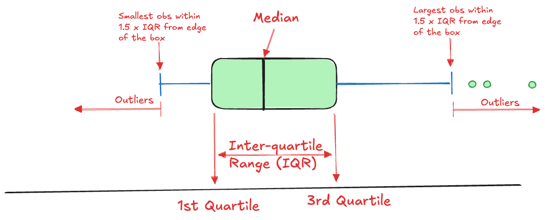
Summarizing the distribution of data typically uses graphics such as density plots, histograms, and box plots. The box plot is one of the most useful visual summaries of the distribution, it combines information about central tendency (location), dispersion, and extreme observations (Figure 17.3).
Five Number Summary
We cover this technique here, because a box plot is based on five summary statistics, sometimes called Tukey’s five-number summary. The five numbers are
- the lower whisker
- the lower hinge of the box (\(Q_1\))
- the median (\(Q_2\))
- the upper hinge of the box (\(Q_3\))
- the upper whisker
The lower and upper whiskers extend to the value of an observation within \(1.5\times \text{IQR}\), where IQR is the inter-quartile range, IQR = \(Q_3 - Q_1\).
Example: Manager Salary Survey (Cont’d)
The five-number summary can be obtained with the boxplot.stats function in R. The hinges in the five-number summary are versions of the first and third quartile. There are multiple ways in which percentiles (and thus quartiles) are calculated, depending on how ties are resolved and whether neighboring values are interpolated.
For the Salary column in the survey data we obtain the following:
bps <- boxplot.stats(survey_df$Salary)
bps$stats
[1] 0 54000 75000 110000 194000The lower whisker extends to 0, the smallest value and the upper whisker to 194000. The median salary is 75000.
# Number of outliers (total, below, above)
length(bps$out)
[1] 1186sum(bps$out < bps$stats[1])[1] 0sum(bps$out > bps$stats[5])[1] 1186# quantile(survey_df$Salary,c(1,3)/4)There are 1186 outliers, all of which lie beyond the upper whisker.
You can calculate the five-number summary in Python by either writing a custom function or by extracting the results from the matplotlib function that produces box plots.
Here is the first approach:
import numpy as np

def boxplot_stats_1(data):
    q1, median, q3 = np.percentile(data, [25, 50, 75])
    iqr = q3 - q1

    # Calculate fence boundaries
    lower_fence = q1 - 1.5 * iqr
    upper_fence = q3 + 1.5 * iqr

    # Find whisker extents (furthest points within the fences)
    lower_whisker = min([x for x in data if x >= lower_fence])
    upper_whisker = max([x for x in data if x <= upper_fence])

    return [lower_whisker, q1, median, q3, upper_whisker]

five_num = boxplot_stats_1(survey_df['Salary'])
print(five_num)
[0.0, 54000.0, 75000.0, 110000.0, 194000.0]Here is the version that extracts the five-number summary from the boxplot function in matplotlib.
import matplotlib.pyplot as plt
import numpy as np

def boxplot_stats_2(data):
    fig, ax = plt.subplots()
    bp = ax.boxplot(data, patch_artist=True)
    plt.close(fig)

    # Extract whisker extents
    whisker_bottom = bp['whiskers'][0].get_ydata()[1]
    whisker_top = bp['whiskers'][1].get_ydata()[1]

    # Extract quartiles and median
    q1, q3 = bp['boxes'][0].get_path().vertices[0:5, 1][[1, 2]]
    median = bp['medians'][0].get_ydata()[0]

    return [whisker_bottom, q1, median, q3, whisker_top]

five_num = boxplot_stats_2(survey_df['Salary'])
print(five_num)
[0.0, 54000.0, 75000.0, 110000.0, 194000.0]Stem and Leaf Plot
Another summary of the distribution that is both numerical and graphical, is the stem-and-leaf plot, introduced by Tukey (1977). The stem-and-leaf plot conveys information about the shape of the distribution while retaining the numerical information.
The stem function in the default graphics library produces the stem-and-leaf plot. The following code generates the display for the sepal length variable in the iris data set. Note that the sepal lengths range from 4.3 to 7.9 in the data.
summary(iris$Sepal.Length) Min. 1st Qu. Median Mean 3rd Qu. Max.
4.300 5.100 5.800 5.843 6.400 7.900 stem(iris$Sepal.Length)
  The decimal point is 1 digit(s) to the left of the |

  42 | 0
  44 | 0000
  46 | 000000
  48 | 00000000000
  50 | 0000000000000000000
  52 | 00000
  54 | 0000000000000
  56 | 00000000000000
  58 | 0000000000
  60 | 000000000000
  62 | 0000000000000
  64 | 000000000000
  66 | 0000000000
  68 | 0000000
  70 | 00
  72 | 0000
  74 | 0
  76 | 00000
  78 | 0
The values, up to the first decimal point, to the left of the “|” marker are the stem. The leafs on each stem represent a histogram of the values. The values on the stem are binned somewhat, since the smallest value is 4.3 and the largest is 7.9.
Changing the scale of the plot stretches (scale > 1) or compresses (scale < 1) the histogram.
stem(iris$Sepal.Length, scale=0.5)
  The decimal point is at the |

  4 | 3444
  4 | 566667788888999999
  5 | 000000000011111111122223444444
  5 | 5555555666666777777778888888999
  6 | 00000011111122223333333334444444
  6 | 5555566777777778889999
  7 | 0122234
  7 | 677779
With a scale of 0.5, the stem and leaf values are separated at the decimal point. The first row of the display represents the values 4.3, 4.4, 4.4, and 4.4. The last row represents the values 7.6, 7.7, 7.7, 7.7, 7.7, and 7.9.
The stemgraphic library produces stem-and-leaf plots in Python. The values are arranged in descending order. The left-most column is a cumulative observation count.
import stemgraphic
from sklearn.datasets import load_iris

iris = load_iris()

stemgraphic.stem_graphic(iris.data[:,0], scale=1)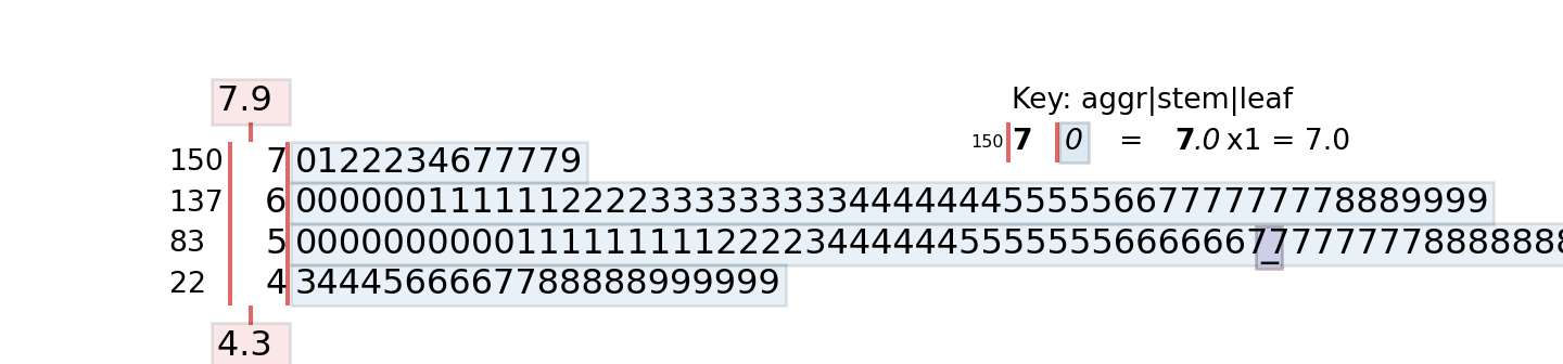
Applying a scaling factor changes the values displayed on the stem, in contrast to the R implementation.
stemgraphic.stem_graphic(iris.data[:,0], scale=0.5)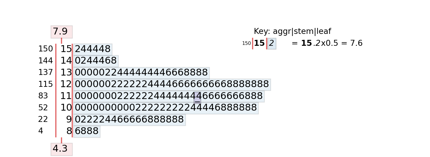
Notice that there is a also a stem plot method in matplotlib.pyplot, but that is a different plot type.
The stem-and-leaf plot is useful to get a quick view of the shape of the distribution as well as the values. With large data sets, the display is not as helpful as it might not be possible to display all the values on the stems. Here is the default stem-and-leaf plot for log salary in the survey data.
  The decimal point is at the |

   0 | 0
   1 | 46
   2 | 79
   3 | 3456666666677777788999999
   4 | 00000000000000111112222222223334444455566667777899
   5 | 000122569
   6 | 124899
   7 | 1344578888
   8 | 01333455566677888899
   9 | 00111222222333333333444444444444444445555555555555555555555556666666+173
  10 | 00000000000000000000000000000000000000000000000000000000000000000000+7437
  11 | 00000000000000000000000000000000000000000000000000000000000000000000+17383
  12 | 00000000000000000000000000000000000000000000000000000000000000000000+2397
  13 | 00000000000000000000111111111111111111111112222222222222223333333333+65
  14 | 000000000111111222345566678899
  15 | 00112223334445666999
  16 | 00139
  17 | 1456
  18 | 46
  19 | 0
  20 | 6
  21 |
  22 | 5
17.4 Relationships
Continuous Data
The usual statistic to express the relationship between two continuous variables is the Pearson product-moment correlation coefficient, or correlation coefficient for short: \[ r_{xy} = \frac{\sum_{i=1}^n (x_i-\overline{x})(y_i - \overline{y})} {\sqrt{\sum_{i=1}^n (x_i-\overline{x})^2\,\sum_{i=1}^n(y_i-\overline{y})^2}} \]
The correlation coefficient \(r_{xy}\) is an estimator of the correlation, a property of the joint distribution \(f(x,y)\) of two random variables: \[ \text{Corr}[X,Y] = \frac{\text{E}\left[(X-\text{E}[X])(Y-\text{E}[Y])\right]}{\sqrt{\text{Var}[X]\text{Var}[Y]}} \] The numerator of the correlation is the covariance \[ \text{Cov}[X] = \text{E}\left[(X-\text{E}[X])(Y-\text{E}[Y])\right] = \text{E}[X]\text{E}[Y] - \text{E}[XY] \]
Example: Fitness Data
The cor function in R computes pairwise correlations between all numerical columns of a matrix (or data frame) or between the columns of two matrices (or data frames) if you specify the x= and y= arguments.
con <- dbConnect(duckdb(),dbdir = "../ads.ddb",read_only=TRUE)
fitness <- dbGetQuery(con, "SELECT * FROM fitness;")
dbDisconnect(con)

round(cor(fitness),6)
Age Weight Oxygen RunTime RestPulse RunPulse MaxPulse
Age 1.000000 -0.233539 -0.304592 0.188745 -0.164100 -0.337870 -0.432916
Weight -0.233539 1.000000 -0.162753 0.143508 0.043974 0.181516 0.249381
Oxygen -0.304592 -0.162753 1.000000 -0.862195 -0.399356 -0.397974 -0.236740
RunTime 0.188745 0.143508 -0.862195 1.000000 0.450383 0.313648 0.226103
RestPulse -0.164100 0.043974 -0.399356 0.450383 1.000000 0.352461 0.305124
RunPulse -0.337870 0.181516 -0.397974 0.313648 0.352461 1.000000 0.929754
MaxPulse -0.432916 0.249381 -0.236740 0.226103 0.305124 0.929754 1.000000round(cor(x=fitness,y=fitness$Oxygen),6) [,1]
Age -0.304592
Weight -0.162753
Oxygen 1.000000
RunTime -0.862195
RestPulse -0.399356
RunPulse -0.397974
MaxPulse -0.236740To compute the matrix of all pairwise correlations between the numeric columns in a pandas DataFrame, you can use the pandas corr method. To compute the correlations between columns of one data frame and columns of another use the corrwith method. The latter is also convenient to compute correlations of one variable with all others in a DataFrame.
import pandas as pd
import duckdb
con = duckdb.connect(database="../ads.ddb", read_only=True)

fitness = con.sql('SELECT * FROM Fitness;').df()
con.close()

pd.set_option('display.max_columns', None)
fitness.corr()
Age Weight Oxygen RunTime RestPulse RunPulse \
Age 1.000000 -0.233539 -0.304592 0.188745 -0.164100 -0.337870
Weight -0.233539 1.000000 -0.162753 0.143508 0.043974 0.181516
Oxygen -0.304592 -0.162753 1.000000 -0.862195 -0.399356 -0.397974
RunTime 0.188745 0.143508 -0.862195 1.000000 0.450383 0.313648
RestPulse -0.164100 0.043974 -0.399356 0.450383 1.000000 0.352461
RunPulse -0.337870 0.181516 -0.397974 0.313648 0.352461 1.000000
MaxPulse -0.432916 0.249381 -0.236740 0.226103 0.305124 0.929754
MaxPulse
Age -0.432916
Weight 0.249381
Oxygen -0.236740
RunTime 0.226103
RestPulse 0.305124
RunPulse 0.929754
MaxPulse 1.000000 fitness.corrwith(fitness['Oxygen'])Age -0.304592
Weight -0.162753
Oxygen 1.000000
RunTime -0.862195
RestPulse -0.399356
RunPulse -0.397974
MaxPulse -0.236740
dtype: float64The correlation matrix is a symmetric matrix since \(r_{xy} = r_{yx}\) and the values of the diagonal are 1.0 since a variable is perfectly correlated with itself, \(r_{xx} = 1.\)
Categorical Data
Summarizing the relationship between two categorical variables uses cross-tabulations of counts and proportions.
Example: Manager Salary Survey
The table function in base R computes single tables as well as more complex cross-tabulations. The following statement requests a two-way table of overall professional experience level and AgeGroup in the survey data.
table(survey_df$ExperienceOverall,survey_df$AgeGroup)
                   under 18 18-24 25-34 35-44 45-54 55-64 65 or over
  1 year or less          4   314   185    16     3     1          0
  11 - 20 years           0     3  1898  6989   668    61          5
  2 - 4 years             5   746  2168    83    18     6          0
  21 - 30 years           2     1     6  1206  2107   302         13
  31 - 40 years           1     1     2     4   303   523         35
  41 years or more        1     1     1     1     0    81         39
  5-7 years               1   134  4307   404    28     7          1
  8 - 10 years            0    18  4090  1196    61    11          1
The levels of AgeGroup had been arranged previously to increase monotonically. The levels of ExperienceOverall have not been adjusted, they are listed in the order in which they appear in the data. The following code turns ExperienceOverall into a factor and rearranges the levels.
ExperienceLevels <- levels(factor(survey_df$ExperienceOverall))
ExperienceLevels
[1] "1 year or less" "11 - 20 years" "2 - 4 years" "21 - 30 years"
[5] "31 - 40 years" "41 years or more" "5-7 years" "8 - 10 years" survey_df$ExperienceOverall <- factor(survey_df$ExperienceOverall,
c(ExperienceLevels[1],
ExperienceLevels[3],
ExperienceLevels[7],
ExperienceLevels[8],
ExperienceLevels[2],
ExperienceLevels[4],
ExperienceLevels[5],
ExperienceLevels[6]))
levels(survey_df$ExperienceOverall)[1] "1 year or less" "2 - 4 years" "5-7 years" "8 - 10 years"
[5] "11 - 20 years" "21 - 30 years" "31 - 40 years" "41 years or more"table(survey_df$ExperienceOverall,survey_df$AgeGroup)
                   under 18 18-24 25-34 35-44 45-54 55-64 65 or over
  1 year or less          4   314   185    16     3     1          0
  2 - 4 years             5   746  2168    83    18     6          0
  5-7 years               1   134  4307   404    28     7          1
  8 - 10 years            0    18  4090  1196    61    11          1
  11 - 20 years           0     3  1898  6989   668    61          5
  21 - 30 years           2     1     6  1206  2107   302         13
  31 - 40 years           1     1     2     4   303   523         35
  41 years or more        1     1     1     1     0    81         39
When calculating the cross-tabulation of AgeGroup and overall experience level with pandas crosstab method, the rows and columns are arranged in the order in which they are encountered in the data.
ct = pd.crosstab(survey_df['ExperienceOverall'],survey_df['AgeGroup'])
ct
AgeGroup 18-24 25-34 35-44 45-54 55-64 65 or over under 18
ExperienceOverall
1 year or less 314 185 16 3 1 0 4
11 - 20 years 3 1898 6989 668 61 5 0
2 - 4 years 746 2168 83 18 6 0 5
21 - 30 years 1 6 1206 2107 302 13 2
31 - 40 years 1 2 4 303 523 35 1
41 years or more 1 1 1 0 81 39 1
5-7 years 134 4307 404 28 7 1 1
8 - 10 years 18 4090 1196 61 11 1 0This is not optimal and makes it difficult to read the information and to spot possible data problems. To change the order of the rows or columns, we can define the appropriate order and apply the reindex method to the cross-tabulation. To reindex the rows, use axis='index', to reindex the columns use axis='columns' (or use axis=0 and axis=1).
age_order=['under 18', '18-24', '25-34', '45-54','55-64','65 or over']
exp_order=['1 year or less', '2 - 4 years', '5-7 years','8 - 10 years',
'11 - 20 years','21 - 30 years','31 - 40 years', '41 years or more']

ct = ct.reindex(age_order, axis='columns').reindex(exp_order, axis="index")
ct
AgeGroup under 18 18-24 25-34 45-54 55-64 65 or over
ExperienceOverall
1 year or less 4 314 185 3 1 0
2 - 4 years 5 746 2168 18 6 0
5-7 years 1 134 4307 28 7 1
8 - 10 years 0 18 4090 61 11 1
11 - 20 years 0 3 1898 668 61 5
21 - 30 years 2 1 6 2107 302 13
31 - 40 years 1 1 2 303 523 35
41 years or more 1 1 1 0 81 39After rearranging the rows and columns we see immediately a data quality problem with the survey data. How can employees have more overall professional experience than they are years old? How does someone under 18 years of age have 21–30 years of experience? Employees age 55–64 with less than one year of professional experience also raises questions about the quality of the data.
17.5 Aggregates
Important aggregates that allow us to estimate other quantities are based on sums and sums of squares. Specifically,
| Aggregate | Formula | Symbol | Used For |
|---|---|---|---|
| Sum | \(\sum_{i=1}^n y_i\) | \(S_y\) | Mean, variance, std. deviation, … |
| Sum of squares | \(\sum_{i=1}^n y_i^2\) | \(S_{yy}\) | Variance, std. deviation |
| Sum of cross-products | \(\sum_{i=1}^n x_i y_i\) | \(S_{xy}\) | Covariance, correlation |
| Number of observations | \(n = \sum_{i=1}^n 1\) |
These quantities are called the raw sum, sum of squares, and sum of cross-products.
As mentioned previously, aggregates are handy summaries to pre-compute quantities based on which you can later compute other quantities of interest. Suppose you are processing data that is streamed to an application. Every record can be seen just once, you cannot rewind the stream and run through the data again. The stream consists of three variables, \(X\), \(Y\), and \(Z\). What are the quantities you need to aggregate while the stream is processed so that you can calculate the stream means \(\overline{x}\), \(\overline{y}\), \(\overline{z}\), the standard deviations \(s_x\), \(s_y\), \(s_z\), and the correlations \(r_{xy}\), \(r_{xz}\), \(r_{yz}\)?
If we were to calculate the sample standard deviation based on the formula \[ s_y = \sqrt{\frac{\sum_{i=1}^n \left(y_i - \overline{y}\right)^2}{n-1}} \tag{17.1}\]
we need two passes through the data. A pass to calculate \(\overline{y}\) (and \(n\)) and a pass to calculate the sum of the squared differences \((y_i-\overline{y})^2\). If you rewrite the formula as \[ s_y = \sqrt{\frac{1}{n-1}\left(\sum_{i=1}^n y_i^2 - \left(\sum_{i=1}^n y_i\right)^2/n\right)} \tag{17.2}\]
then we can calculate the aggregates \(S_y\), \(S_{yy}\), and \(n\), on a single pass through the data and assemble the standard deviation afterwards as \[ s_y = \sqrt{\frac{1}{n-1}\left(S_{yy}-S_y^2/n\right)} \]
Let’s simulate 1,000 observations from three independent Gaussian(0,4) distributions and compute the means \(\overline{x}\), \(\overline{y}\), \(\overline{z}\), the standard deviations \(s_x\), \(s_y\), \(s_z\), and the correlation coefficients \(r_{xy}\), \(r_{xz}\), \(r_{yz}\) in a single pass through the data.
library(Matrix)
set.seed(234)
dat <- matrix(rnorm(3000,mean=0,sd=2),ncol=3,nrow=1000)
colnames(dat) <- c("X","Y","Z")

# Compute the sufficient statistics in a single pass
# through the data
single_pass <- function(X) {
    n <- dim(X)[1]
    p <- dim(X)[2]
    S <- rep(0,p)
    S2 <- rep(0,p)
    Sxy <- rep(0,p*(p-1)/2)
    for (i in 1:n) {
        S <- S + X[i,]
        S2 <- S2 + X[i,]^2
        # Extracting the lower triangular values of the cross-product
        # matrix to compute Sxy.
        cp <- tcrossprod(X[i,])
        cp[upper.tri(cp,diag=T)]  <- NA
        Sxy <- Sxy + na.omit(as.vector(cp))
    }
    return(list(n=n,S=S,S2=S2,Sxy=Sxy))
}

s_st <- single_pass(dat)
s_st
$n
[1] 1000
$S
X Y Z
-43.22597 12.23111 -39.06777
$S2
X Y Z
3878.278 3965.424 3676.894
$Sxy
[1] -98.12442 70.45634 125.67237
attr(,"na.action")
[1] 1 4 5 7 8 9
attr(,"class")
[1] "omit"# Compute the statistics
means <- s_st$S/s_st$n
vars <- s_st$S2 - ((s_st$S)^2)/s_st$n
vars <- vars/(s_st$n-1)
sds <- sqrt(vars)
cat("Sample means from sufficient statistics" , round(means,4),"\n")Sample means from sufficient statistics -0.0432 0.0122 -0.0391 cat("Sample variances from sufficient statistics", round(vars,4) ,"\n")Sample variances from sufficient statistics 3.8803 3.9692 3.679 cat("Sample std. devs from sufficient statistics", round(sds,4) ,"\n")Sample std. devs from sufficient statistics 1.9698 1.9923 1.9181 #Verification
apply(dat,2,mean) X Y Z
-0.04322597 0.01223111 -0.03906777 apply(dat,2,var) X Y Z
3.880290 3.969244 3.679047 apply(dat,2,sd) X Y Z
1.969845 1.992296 1.918084 corxy <- (s_st$Sxy[1] - s_st$S[1]*s_st$S[2]/s_st$n)/
sqrt((s_st$S2[1]-s_st$S[1]^2/s_st$n)*(s_st$S2[2]-s_st$S[2]^2/s_st$n))
corxz <- (s_st$Sxy[2] - s_st$S[1]*s_st$S[3]/s_st$n)/
sqrt((s_st$S2[1]-s_st$S[1]^2/s_st$n)*(s_st$S2[3]-s_st$S[3]^2/s_st$n))
coryz <- (s_st$Sxy[3] - s_st$S[2]*s_st$S[3]/s_st$n)/
sqrt((s_st$S2[2]-s_st$S[2]^2/s_st$n)*(s_st$S2[3]-s_st$S[3]^2/s_st$n))
cat("Corr(X,Y)", round(corxy,4), "\n")Corr(X,Y) -0.0249 cat("Corr(X,Z)", round(corxz,4), "\n")Corr(X,Z) 0.0182 cat("Corr(Y,Z)", round(coryz,4), "\n")Corr(Y,Z) 0.033 # Verification
round(cor(dat),4) X Y Z
X 1.0000 -0.0249 0.0182
Y -0.0249 1.0000 0.0330
Z 0.0182 0.0330 1.0000import numpy as np
import pandas as pd
np.random.seed(234)
np.set_printoptions(suppress=True)
dat = np.random.normal(loc=0, scale=2, size=(1000, 3))
column_names = ["X", "Y", "Z"]
dat_df = pd.DataFrame(dat, columns=column_names)
def single_pass(X):
"""
Compute the sufficient statistics in a single pass through the data
"""
n, p = X.shape
S = np.zeros(p)
S2 = np.zeros(p)
Sxy = np.zeros(p * (p - 1) // 2)
for i in range(n):
row = X[i, :]
S += row
S2 += row**2
# Compute cross products for lower triangle
cp = np.outer(row, row)
# Get lower triangle indices (excluding diagonal)
lower_tri_indices = np.tril_indices(p, k=-1)
cross_products = cp[lower_tri_indices]
Sxy += cross_products
return {
'n': n,
'S': S,
'S2': S2,
'Sxy': Sxy
}
# Compute sufficient statistics
s_st = single_pass(dat)
print("Sufficient statistics:")Sufficient statistics:print(f"n: {s_st['n']}")n: 1000print(f"S: {s_st['S']}")S: [ 49.39470037 10.38558094 -39.33627905]print(f"S2: {s_st['S2']}")S2: [4295.34809822 4079.78232515 3701.10077859]print(f"Sxy: {s_st['Sxy']}")Sxy: [12.84973181 38.51039105 -1.4595958 ]# Compute the statistics
means = s_st['S'] / s_st['n']
vars = s_st['S2'] - (s_st['S']**2) / s_st['n']
vars = vars / (s_st['n'] - 1)
sds = np.sqrt(vars)
print(f"\nSample means from sufficient statistics: {np.round(means, 4)}")
Sample means from sufficient statistics: [ 0.0494 0.0104 -0.0393]print(f"Sample variances from sufficient statistics: {np.round(vars, 4)}")Sample variances from sufficient statistics: [4.2972 4.0838 3.7033]print(f"Sample std. devs from sufficient statistics: {np.round(sds, 4)}")Sample std. devs from sufficient statistics: [2.073 2.0208 1.9244]# Verification using numpy/pandas built-in functions
print(f"\nVerification:")
Verification:print(f"NumPy means: {np.round(np.mean(dat, axis=0), 4)}")NumPy means: [ 0.0494 0.0104 -0.0393]print(f"NumPy variances: {np.round(np.var(dat, axis=0, ddof=1), 4)}")NumPy variances: [4.2972 4.0838 3.7033]print(f"NumPy std devs: {np.round(np.std(dat, axis=0, ddof=1), 4)}")NumPy std devs: [2.073 2.0208 1.9244]# Compute correlations from sufficient statistics
n = s_st['n']
S = s_st['S']
S2 = s_st['S2']
Sxy = s_st['Sxy']
corxy = (Sxy[0] - S[0] * S[1] / n) / np.sqrt((S2[0] - S[0]**2 / n) * (S2[1] - S[1]**2 / n))
corxz = (Sxy[1] - S[0] * S[2] / n) / np.sqrt((S2[0] - S[0]**2 / n) * (S2[2] - S[2]**2 / n))
coryz = (Sxy[2] - S[1] * S[2] / n) / np.sqrt((S2[1] - S[1]**2 / n) * (S2[2] - S[2]**2 / n))
print(f"\nCorr(X,Y): {round(corxy, 4)}")
Corr(X,Y): 0.0029print(f"Corr(X,Z): {round(corxz, 4)}")Corr(X,Z): 0.0102print(f"Corr(Y,Z): {round(coryz, 4)}")Corr(Y,Z): -0.0003# Verification using numpy correlation
print(f"\nVerification - Correlation matrix:")
Verification - Correlation matrix:corr_matrix = np.corrcoef(dat.T)
print(np.round(corr_matrix, 4))[[ 1. 0.0029 0.0102]
[ 0.0029 1. -0.0003]
[ 0.0102 -0.0003 1. ]]17.6 Dimension Reduction
Tabular (row-column) data can be high-dimensional in two ways: many rows and/or many columns. The data summaries and aggregates discussed above essentially perform dimension reduction across rows of data. If you want to calculate the sample mean you do not need to keep \(Y_1, \cdots, Y_n\); two aggregates suffice: \(n\) and \(S_y\).
More often, dimension reduction refers to the elimination or aggregation of columns of data. Suppose we have \(p\) input columns in the data, and that \(p\) is large. Do we need all of the input variables? Can we reduce their number
without sacrificing (to much) information?
Two general approaches to reducing the number of input variables are feature selection and component analysis. Feature selection uses analytical techniques to identify which features are promising to be used in the analysis and eliminates the others. Principal component analysis uses information from all \(p\) inputs to construct a smaller set of \(m\) inputs that explain a sufficiently large amount of variability among the inputs.
Principal Component Analysis (PCA)
PCA is one of the oldest statistical techniques, it was developed by Karl Pearson in 1901. It still plays an important role in machine learning and data science today. Dimension reduction is just one of the applications of PCA; it is also used in visualizing high-dimensional data and in data imputation.
Suppose we have \(n\) observations on \(p\) inputs. Denote as \(x_{ij}\) the \(i\)th observation on the \(j\)th input variable. A principal component is a linear combination of the \(p\) inputs. The elements of the \(j\)th component score vector are calculated as follows:
\[ z_{ij} = \psi_{1j} x_{i1} + \psi_{2j} x_{i2} + \cdots + \psi_{pj} x_{ip} \quad i=1,\cdots,n; j=1,\cdots,p \] The coefficients \(\psi_{kj}\) are called the rotations or loadings of the principal components. The \(z_{ij}\) are called the PCA scores.
In constructing the linear combination, the \(x\)s are always centered to have mean zero and are usually scaled to have standard deviation one.
The scores \(z_{ij}\) are then collected into a score vector \(\textbf{z}_j = [z_{1j}, \cdots, z_{nj}]\) for the \(j\)th component. Note that for each observation \(i\) there are \(p\) inputs and \(p\) scores. So what have we gained? Instead of the \(p\) vectors \(\textbf{x}_1, \cdots, \textbf{x}_p\) we now have the \(p\) vectors \(\textbf{z}_1, \cdots, \textbf{z}_p\).
Because of the way in which the \(\psi_{kj}\) are found, the PCA scores have very special properties:
They have zero mean (if the data were centered):\(\sum_{i=1}^n z_{ij} = 0\)
They are uncorrelated: \(\text{Corr}[z_j, z_k] = 0, \forall j \ne k\)
\(\text{Var}\left[\sum_{j=1}^p z_j\right] = \sum_{j=1}^p \text{Var}[z_j] = p\) (if data was scaled)
The components can be ordered in terms of their variance \(\Rightarrow \text{Var}[z_1] > \text{Var}[z_2] > \cdots > \text{Var}[z_p]\)
This is useful in many ways:
The components provide a decomposition of the variability in the data. The first component explains the greatest proportion of the variability, the second component explains the next largest proportion of variability, and so forth.
The contributions of the components are independent, each component is orthogonal to the other components. For example the second component is a linear combination of the \(X\)s that models a relationship not captured by the first (or any other) component.
The loadings for each component inform about the particular linear relationship. The magnitude of the loading coefficients reflects which inputs are driving the linear relationship. For example, when all coefficients are of similar magnitude, the component expresses some overall, average trend. When a few coefficients stand out it suggests that the associated attributes explain most of the variability captured by the component.
To summarize high-dimensional data, we can ignore those components that explain a small amount of variability and turn a high-dimensional problem into a lower-dimensional one. Often, only the first two principal components are used to visualize the data and for further analysis.
(PCA) finds linear combinations of \(p\) inputs that explain decreasing amounts of variability among the \(x\)’s. Not any linear combination will do, the principal components are orthogonal to each other and project in the directions in which the inputs are most variable. That means they decompose the variability in the inputs into non-overlapping chunks.
Consider the following data set with \(n=10\) and \(p=4\).
| Obs | \(X_1\) | \(X_2\) | \(X_3\) | \(X_4\) |
|---|---|---|---|---|
| 1 | 0.344 | 0.364 | 0.806 | 0.160 |
| 2 | 0.363 | 0.354 | 0.696 | 0.249 |
| 3 | 0.196 | 0.189 | 0.437 | 0.248 |
| 4 | 0.200 | 0.212 | 0.590 | 0.160 |
| 5 | 0.227 | 0.229 | 0.437 | 0.187 |
| 6 | 0.204 | 0.233 | 0.518 | 0.090 |
| 7 | 0.197 | 0.209 | 0.499 | 0.169 |
| 8 | 0.165 | 0.162 | 0.536 | 0.267 |
| 9 | 0.138 | 0.116 | 0.434 | 0.362 |
| 10 | 0.151 | 0.151 | 0.483 | 0.223 |
| \(\overline{x}_j\) | 0.218 | 0.222 | 0.544 | 0.211 |
| \(s_j\) | 0.076 | 0.081 | 0.122 | 0.075 |
When the \(x\)s are centered with their means and scaled by their standard deviations, and the principal components are computed, the matrix of loadings is \[ \boldsymbol{\Phi} = \left [ \begin{array}{r r r r } -0.555 & 0.235 & 0.460 & -0.652\\ -0.574 &0.052 &0.336 & 0.745\\ -0.530 &0.208 &-0.821 &-0.053\\ 0.286 &0.948 &0.047 & 0.132\\ \end{array} \right] \tag{17.3}\]
This matrix can now be used, along with the data in Table 17.3 to compute the scores \(Z_{im}\). For example,
\[ Z_{11} = -0.555 \frac{0.344-0.218}{0.076} -0.574\frac{0.364-0.222}{0.081} - 0.530\frac{0.806-0.544}{0.122} + 0.286\frac{0.16-0.211}{0.075} = -3.248 \]
\[ Z_{32} = 0.235 \frac{0.196-0.218}{0.076} +0.052\frac{0.189-0.222}{0.081} + 0.208\frac{0.437-0.544}{0.122} +0.948\frac{0.248-0.211}{0.075} = 0.194 \]
Table 17.4 displays the four inputs and the four scores \(Z_1, \cdots Z_4\) from the PCA.
| Obs | \(X_1\) | \(X_2\) | \(X_3\) | \(X_4\) | \(Z_1\) | \(Z_2\) | \(Z_3\) | \(Z_4\) |
|---|---|---|---|---|---|---|---|---|
| 1 | 0.344 | 0.364 | 0.806 | 0.160 | -3.248 | 0.282 | -0.440 | 0.029 |
| 2 | 0.363 | 0.354 | 0.696 | 0.249 | -2.510 | 1.257 | 0.425 | -0.025 |
| 3 | 0.196 | 0.189 | 0.437 | 0.248 | 0.993 | 0.194 | 0.465 | 0.001 |
| 4 | 0.200 | 0.212 | 0.590 | 0.160 | -0.191 | -0.629 | -0.498 | -0.041 |
| 5 | 0.227 | 0.229 | 0.437 | 0.187 | 0.255 | -0.459 | 0.780 | -0.001 |
| 6 | 0.204 | 0.233 | 0.518 | 0.090 | -0.329 | -1.614 | 0.055 | 0.023 |
| 7 | 0.197 | 0.209 | 0.499 | 0.169 | 0.286 | -0.691 | 0.087 | 0.012 |
| 8 | 0.165 | 0.162 | 0.536 | 0.267 | 1.058 | 0.479 | -0.485 | 0.009 |
| 9 | 0.138 | 0.116 | 0.434 | 0.362 | 2.380 | 1.391 | -0.098 | 0.023 |
| 10 | 0.151 | 0.151 | 0.483 | 0.223 | 1.306 | -0.210 | -0.291 | -0.028 |
For each observation there is a corresponding component score and there are as many components as there are input variables. Although there is a 1:1 correspondence at the row level, there is no such correspondence at the column level. Instead, each PCA score \(Z_j\) is a linear combination of all \(p\) input variables. Even if we were to proceed with using only \(Z_1\) in a linear model \[ Y_i = \theta_0 + \theta_1 Z_{i1} + \epsilon_i \] the model contains information from \(X_1\) through \(X_4\) because \[ Z_{i1} = \sum_{j=1}^p \phi_{j1}X_{ij} \]
Table 17.5 shows sample statistics for the raw data and the principal component scores. The sample variances of the scores decreases from \(Z_1\) through \(Z_4\). The first principal component, \(Z_1\), explains \(2.957/4 \times 100\% = 73.9\%\) of the variability in the input variables. The sum of the sample variances of the \(Z_j\) in Table 17.5 is (within rounding error) \[ 2.957 + 0.844 + 0.199 + 0.0006 = 4 \]
| Statistic | \(X_1\) | \(X_2\) | \(X_3\) | \(X_4\) | \(Z_1\) | \(Z_2\) | \(Z_3\) | \(Z_4\) |
|---|---|---|---|---|---|---|---|---|
| Sample Mean | 0.218 | 0.222 | 0.544 | 0.211 | 0 | 0 | 0 | 0 |
| Sample Sd | 0.076 | 0.081 | 0.122 | 0.075 | 1.719 | 0.918 | 0.445 | 0.024 |
| Sample Var | 2.957 | 0.844 | 0.199 | 0.0006 | ||||
| % Variance | 73.9 % | 21% | 5% | \(<\) 1% |
If explaining 90% of the variability in the inputs is sufficient, then we would use only \(Z_1\) and \(Z_2\) in subsequent analyses–a reduction in dimension of 50%. If 2/3 of the variability is deemed sufficient, then we would use only \(Z_1\)–a reduction in dimension of 75%.
Eigenvalue Decomposition
How did we derive the matrix of PCA loadings in Equation 17.3? Mathematically, this is accomplished with a singular value decomposition (SVD) of the matrix \(\textbf{X}\) or an eigenvalue decomposition of the cross-product matrix \(\textbf{X}^\prime\textbf{X}\) or the correlation matrix of \(\textbf{X}\). Here, \(\textbf{X}\) is the \((n \times p)\) matrix with typical element \(x_{ij}\). Prior to SVD or eigenvalue decomposition the matrix is often centered and scaled.
Let’s apply that to the data in Table 17.3 to derive the PCA scores and loadings.
Example: Eigenanalysis of Correlation Matrix
You can obtain the eigenvectors and eigenvalues of a square matrix with the eigen function. Principal components can be computed with the prcomp or the princomp functions, both included in the base stats package. prcomp uses the singular-value decomposition of \(\textbf{X}\), princomp relies on the eigendecomposition of the covariance or correlation matrix.
First we create a data frame with the data in Table 17.3. There are ten observations of four variables.
data <- data.frame("x1"=c(0.344167 ,0.363478,0.196364,0.2     ,0.226957,
                          0.204348 ,0.196522,0.165   ,0.138333,0.150833),
                   "x2"=c(0.363625 ,0.353739,0.189405,0.212122,0.22927 ,
                          0.233209 ,0.208839,0.162254,0.116175,0.150888),
                   "x3"=c(0.805833 ,0.696087,0.437273,0.590435,0.436957,
                          0.518261 ,0.498696,0.535833,0.434167,0.482917),
                   "x4"=c(0.160446 ,0.248539,0.248309,0.160296,0.1869  ,
                          0.0895652,0.168726,0.266804,0.36195 ,0.223267)
                   )
data
x1 x2 x3 x4
1 0.344167 0.363625 0.805833 0.1604460
2 0.363478 0.353739 0.696087 0.2485390
3 0.196364 0.189405 0.437273 0.2483090
4 0.200000 0.212122 0.590435 0.1602960
5 0.226957 0.229270 0.436957 0.1869000
6 0.204348 0.233209 0.518261 0.0895652
7 0.196522 0.208839 0.498696 0.1687260
8 0.165000 0.162254 0.535833 0.2668040
9 0.138333 0.116175 0.434167 0.3619500
10 0.150833 0.150888 0.482917 0.2232670Let’s take as input for the eigendecomposition the correlation matrix of the data:
c <- cor(data)
c
x1 x2 x3 x4
x1 1.0000000 0.9832580 0.8359297 -0.2761887
x2 0.9832580 1.0000000 0.8539085 -0.4397088
x3 0.8359297 0.8539085 1.0000000 -0.2890121
x4 -0.2761887 -0.4397088 -0.2890121 1.0000000e <- eigen(c)
e$values [1] 2.9570820972 0.8438197077 0.1985106437 0.0005875513e$vectors [,1] [,2] [,3] [,4]
[1,] -0.5550620 0.23539598 -0.45961271 0.65211273
[2,] -0.5741828 0.05247306 -0.33623520 -0.74465196
[3,] -0.5297817 0.20752636 0.82067111 0.05256496
[4,] 0.2855723 0.94803382 -0.04691458 -0.13220959The eigen function returns the eigenvalues in e$values and the matrix of eigenvectors in e$vectors. The matrix of eigenvectors is identical to the matrix of PCA loadings in Equation 17.3.
The input matrix of the decomposition can be reconstructed from those:
A <- e$vectors %*% diag(e$values) %*% t(e$vectors)
round((c - A),4)
x1 x2 x3 x4
x1 0 0 0 0
x2 0 0 0 0
x3 0 0 0 0
x4 0 0 0 0What happens if we multiply the \(10 \times 4\) data matrix with the \(4\times 4\) matrix of eigenvectors of the correlation matrix? First, we center and scale the data. The result is a \(10 \times 4\) matrix of linear transformations. These are the scores of the PCA.
data_c <- scale(data,center=TRUE,scale=TRUE)
scores <- data_c %*% e$vectors
scores
[,1] [,2] [,3] [,4]
[1,] -3.2478623 0.2815532 0.43998889 -0.0292581389
[2,] -2.5101127 1.2574623 -0.42484650 0.0254701453
[3,] 0.9925370 0.1935176 -0.46544557 -0.0005376776
[4,] -0.1908526 -0.6286757 0.49817675 0.0413147515
[5,] 0.2550067 -0.4593212 -0.77973866 0.0014573403
[6,] -0.3285776 -1.6137133 -0.05490332 -0.0226596733
[7,] 0.2862026 -0.6907719 -0.08654684 -0.0123166161
[8,] 1.0581238 0.4785600 0.48496730 -0.0088830663
[9,] 2.3797940 1.3913628 0.09775326 -0.0229367993
[10,] 1.3057412 -0.2099739 0.29059469 0.0283497342The scores have mean 0, their variances equal the eigenvalues of the correlation matrix, their variances sum to \(p=4\), and they are uncorrelated.
round(apply(scores,2,mean),4)[1] 0 0 0 0round(apply(scores,2,var),4)[1] 2.9571 0.8438 0.1985 0.0006sum(apply(scores,2,var))[1] 4round(cor(scores),4) [,1] [,2] [,3] [,4]
[1,] 1 0 0 0
[2,] 0 1 0 0
[3,] 0 0 1 0
[4,] 0 0 0 1We use the linalg.eig function in numpy to compute the eigenvalue decomposition of the correlation matrix in Python. A similar function that gives you more control over the computation is scipy.linalg.eig. To compute the full PCA you can use the PCA function from sklearn.decomposition.
import numpy as np
import pandas as pd

data = pd.DataFrame({
    "x1": [0.344167, 0.363478, 0.196364, 0.2, 0.226957,
           0.204348, 0.196522, 0.165, 0.138333, 0.150833],
    "x2": [0.363625, 0.353739, 0.189405, 0.212122, 0.22927,
           0.233209, 0.208839, 0.162254, 0.116175, 0.150888],
    "x3": [0.805833, 0.696087, 0.437273, 0.590435, 0.436957,
           0.518261, 0.498696, 0.535833, 0.434167, 0.482917],
    "x4": [0.160446, 0.248539, 0.248309, 0.160296, 0.1869,
           0.0895652, 0.168726, 0.266804, 0.36195, 0.223267]
})

print(data)
x1 x2 x3 x4
0 0.344167 0.363625 0.805833 0.160446
1 0.363478 0.353739 0.696087 0.248539
2 0.196364 0.189405 0.437273 0.248309
3 0.200000 0.212122 0.590435 0.160296
4 0.226957 0.229270 0.436957 0.186900
5 0.204348 0.233209 0.518261 0.089565
6 0.196522 0.208839 0.498696 0.168726
7 0.165000 0.162254 0.535833 0.266804
8 0.138333 0.116175 0.434167 0.361950
9 0.150833 0.150888 0.482917 0.223267Let’s take as input for the eigendecomposition the correlation matrix of the data:
# Compute correlation matrix
c = data.corr()
print("\nCorrelation matrix:")
Correlation matrix:print(c) x1 x2 x3 x4
x1 1.000000 0.983258 0.835930 -0.276189
x2 0.983258 1.000000 0.853909 -0.439709
x3 0.835930 0.853909 1.000000 -0.289012
x4 -0.276189 -0.439709 -0.289012 1.000000# Compute eigenvalues and eigenvectors
eigenvalues, eigenvectors = np.linalg.eig(c)
print(eigenvalues)[2.9570821 0.84381971 0.00058755 0.19851064]print(eigenvectors)[[ 0.55506204 0.23539598 0.65211273 -0.45961271]
[ 0.57418284 0.05247306 -0.74465196 -0.3362352 ]
[ 0.52978172 0.20752636 0.05256496 0.82067111]
[-0.28557228 0.94803382 -0.13220959 -0.04691458]]The np.linalg.eig function returns the eigenvalues and the matrix of eigenvectors. Comparing these results to Equation 17.3 we notice a change in sign and a change in the order. The change in order stems from the fact that the eigenvalues are not ordered from largest to smallest. The change in sign is due to the fact that the eigenvectors are unique only up to sign.
The input matrix of the decomposition can be reconstructed from those:
A = eigenvectors @ np.diag(eigenvalues) @ eigenvectors.T

print(f"\nDifference between original and reconstructed correlation matrix:")
Difference between original and reconstructed correlation matrix:print(np.round(c - A, 4)) x1 x2 x3 x4
x1 0.0 0.0 0.0 -0.0
x2 0.0 0.0 0.0 -0.0
x3 0.0 0.0 0.0 -0.0
x4 -0.0 -0.0 -0.0 0.0What happens if we multiply the \(10 \times 4\) data matrix with the \(4\times 4\) matrix of eigenvectors of the correlation matrix? First, we center and scale the data. Because StandardScaler uses the biased estimator of the sample variance (dividing by \(n\) rather than \(n-1\)), we further adjust the scaled data to have sample standard deviation 1.
The result is a \(10 \times 4\) matrix of linear transformations. These are the scores of the PCA.
from sklearn.preprocessing import StandardScaler

scaler = StandardScaler()
data_c = scaler.fit_transform(data)
n = data_c.shape[0]
data_c = data_c * np.sqrt((n-1)/n)

# Compute principal component scores
scores = data_c @ eigenvectors

print(f"\nPrincipal component scores:")
Principal component scores:print(scores)[[ 3.24786231 0.28155323 -0.02925814 0.43998889]
[ 2.51011272 1.2574623 0.02547015 -0.4248465 ]
[-0.992537 0.19351765 -0.00053768 -0.46544557]
[ 0.19085256 -0.62867574 0.04131475 0.49817675]
[-0.2550067 -0.45932117 0.00145734 -0.77973866]
[ 0.32857764 -1.61371327 -0.02265967 -0.05490332]
[-0.28620258 -0.69077193 -0.01231662 -0.08654684]
[-1.05812379 0.47856002 -0.00888307 0.4849673 ]
[-2.379794 1.39136279 -0.0229368 0.09775326]
[-1.30574116 -0.20997387 0.02834973 0.29059469]]The scores have mean 0, their variances equal the eigenvalues of the correlation matrix, their variances sum to \(p=4\), and they are uncorrelated.
scores_means = np.mean(scores, axis=0)
print(scores_means)
[ 0. -0. 0. -0.]scores_vars = np.var(scores, axis=0, ddof=1)
print(scores_vars)[2.9570821 0.84381971 0.00058755 0.19851064]sum_vars = np.sum(scores_vars)
print(sum_vars)4.0# Correlation matrix of scores (should be identity matrix)
scores_corr = np.corrcoef(scores.T)
print(np.round(scores_corr, 4))[[ 1. -0. -0. 0.]
[-0. 1. -0. 0.]
[-0. -0. 1. 0.]
[ 0. 0. 0. 1.]]17.7 In-database Analytics
The data processing mechanism encountered in most examples so far can be described as follows:
- the data resides in a file or database external to the Python or
Rsession - the data are loaded from the file into a DataFrame in Python or into a
Rdata frame - the data loaded into the
Ror Python session is summarized
This seems obvious and you might wonder if there is any other way? If you start with a CSV file, how else could data be processed? That is correct for CSV files as the file itself, or the operating system accessing it, does not have the ability to perform statistical calculations.
This is different however, if the data are stored in an analytic database. For example, check out this page of statistical aggregation functions available in DuckDB.
Suppose you want to calculate the 75th percentile of a variable or the correlation between two variables. Instead of bringing the data from DuckDB into a DataFrame and calling quantile() and cor(), you could ask the database to compute the quantile and the correlation. This is termed in-database analytics.
As an example, the following code uses the fitness table in the ads.ddb database to compute correlations between Oxygen and Age, Weight, and RunTime for study subjects 40 years or older.
import duckdb
con = duckdb.connect(database="../ads.ddb", read_only=True)
query_string = '''select corr(Oxygen,Age) as cOxAge, \
                corr(Oxygen,Weight) as cOxWgt, \
                corr(Oxygen,RunTime) as cOxRT from fitness where age >= 40;'''
con.sql(query_string)
┌──────────────────────┬─────────────────────┬───────────────────┐
│ cOxAge │ cOxWgt │ cOxRT │
│ double │ double │ double │
├──────────────────────┼─────────────────────┼───────────────────┤
│ -0.14994998303951435 │ -0.2721520742498899 │ -0.86233530848729 │
└──────────────────────┴─────────────────────┴───────────────────┘We could have accomplished the same result in the traditional way, pulling the fitness table from the database into a DataFrame frame and using the corr or corrwith method in pandas:
fit_df = con.sql("SELECT * from fitness;").df()
con.close()

subset = fit_df[fit_df['Age'] >= 40]
cols = ['Age','Weight','RunTime','Oxygen']
subset[cols].corrwith(subset['Oxygen'])
Age -0.149950
Weight -0.272152
RunTime -0.862335
Oxygen 1.000000
dtype: float64In the second code chunk the entire fitness table is loaded into the DataFrame, consuming memory. For a data set with 31 observations and 7 variables that is not a big deal. For a data set with 31 million observations and 700 variables that can be a deal breaker.
The filter is not applied when the data are pulled into the DataFrame because another calculation might want a different set of rows; we need to have access to all the observations in the Python session. The in-database approach applies the filter as the query is executed inside the database; no raw data are moved.
What are the advantages and disadvantages of this approach?
Advantages
In-database analytics is one example of pushing analytical calculations down to the data provider, rather than extracting rows of data and passing them to an analytic function in a different process (here, the Python session). Hadoop and Spark are other examples where computations are pushed to the data provider. Google’s BigQuery cloud data warehouse is an example where even complex machine learning algorithms can be pushed into a distributed data framework. The advantages listed here apply to all forms of push-down analytics.
Analytic databases such as DuckDB are designed for analytical work, that is, deep scans of tables that process a limited number of columns, filter data, and compute aggregations.
Analytic databases are optimized for these calculations and their performance is typically excellent; they take advantage of parallel processing where possible.
The data are not moved from the database into the Python session. This is a form of client–server processing where the database is the server and the Python session is the client. Only the results are sent to the client, which is a much smaller set of numbers than the raw data. This is a very important feature of in-database analytics. Many organizations resist moving data out of an operational system and making data copies on other devices. It presents a major data governance and security challenge. With in-database analytics, the rows of data remain in the database, only aggregations are sent to the calling client.
The same functionality can be accessed from multiple clients, as long as the clients are able to send SQL queries to the database.
Very large volumes of data can be processed since the data are already held in the database and do not need to be moved to a laptop or PC that would not have sufficient memory to hold the data frame. You do not need two copies of the data before making any calculations.
Disadvantages
There are a few downsides when you rely on the data provider to perform the statistical computations.
Limited support for statistical functionality. In most cases you are limited to simple aggregations and summarization. More complex statistical analysis, for example, fitting models, simulations, and optimizations are beyond the scope of most data engines.
You have to express the analytics using the language or interface of the data provider. In most cases that is some form of SQL. You have to figure out the syntax and it can be more cumbersome than using
Ror Python functions.Statistical calculations require memory and CPU/GPU resources. Database administrators (DBAs) might frown upon using resources for statistical work when the primary reason for the database is different—for example, reporting company metrics on dashboards. Even if the database could perform more advanced statistical computing such as modeling, optimizations, and simulations, DBAs do not want an operational database to be hammered by those.
Example
Below is an example of an R function that performs summarization of data stored in a DuckDB database using in-database analytics. The SELECT statement computes several statistics for a single column of the database, specified in the columnName argument. The function supports a WHERE clause and a single GROUP BY variable. As an exercise, you can enhance the function to accept a list of analysis variables and a list of GROUP BY variables.
ducksummary <- function(tableName,
                        columnName,
                        whereClause=NULL,
                        groupBy=NULL,
                        dbName="../ads.ddb") {
    if (!is.null(tableName) & !is.null(columnName)) {
        if (!("duckdb" %in% (.packages()))) {
            suppressWarnings(library("duckdb"))
            message("duckdb library was loaded to execute duckload().")

        }
        con <- dbConnect(duckdb(), dbdir=dbName, read_only=TRUE)
        if (!is.null(groupBy)) {
            query_string <- paste("SELECT ",groupBy,",")
        } else {
            query_string <- paste("SELECT ")
        }
        query_string <- paste(query_string,
                              "count("        , columnName,") as N,"       ,
                              "min("          , columnName,") as Min,"     ,
                              "quantile_cont(", columnName, ",0.25) as Q1,",
                              "avg("          , columnName,") as Mean,"    ,
                              "median("       , columnName,") as Median,"  ,
                              "quantile_cont(", columnName,",0.75) as Q3," ,
                              "max("          , columnName,") as Max,"     ,
                              "stddev_samp("  , columnName, ") as StdDev"  ,
                             " from ", tableName)
        if (!is.null(whereClause)) {
            query_string <- paste(query_string, " WHERE ", whereClause)
        }
        if (!is.null(groupBy)) {
            query_string <- paste(query_string, " GROUP BY ", groupBy)
        }
        query_string <- paste(query_string,";")
        #print(query_string)
        df_ <- dbGetQuery(con, query_string)
        dbDisconnect(con)
        return (df_)
    } else {
        return (NULL)
    }
}
The next statement requests a summary of the Oxygen variable in the fitness table for records where Age is at least 40.
ducksummary("fitness","Oxygen","Age >= 40") N Min Q1 Mean Median Q3 Max StdDev
1 29 37.388 44.811 46.85245 46.672 49.156 59.571 4.91512The next statement analyzes Ripeness of the bananas in the training data set by banana quality.
ducksummary("banana_train","Ripeness",groupBy="Quality") Quality N Min Q1 Mean Median Q3 Max
1 Good 2000 -4.239602 0.4206124 1.52396766 1.4982581 2.641176 7.249034
2 Bad 2000 -7.423155 -1.6555529 0.06011369 0.1125737 1.734655 5.911077
StdDev
1 1.644378
2 2.276053Note that the only data frames created in this approach are the data frames to hold the analysis results. The data remains where it is—in the database.