34 Storytelling
The most amazing thing for me is that every single person who sees a movie,
not necessarily one of my movies, brings a whole set of unique experiences.
Now, through careful manipulation and good storytelling, you can get everybody
to clap at the same time, to hopefully laugh at the same time, and to be
afraid at the same time.
When communication in data science works, we call it data storytelling.
34.1 What is a Story
Everybody wants to be a storyteller. I admit that NBC’s The Voice is one of my favorite TV shows. When the judges respond to a contestant’s performance they are often praised as storytellers.
Telling stories is widely accepted as the most effective, persuasive, and influential form of communication. Stories help us learn and remember by connecting us emotionally to the narrative.
What is a story, what is storytelling, and why is it effective?
A story is a narrative with a beginning, a middle, and an end. This is also described with the ABT formula in Oliver (2023):
- A, the beginning: “And this is the way things were”
- B, the middle: “But there was a problem”
- T, the end: “Therefore this is how it resolved”
In addition to the ABT story arc, a story has
- one or more characters to engage with
- a place and time we are transported to
- a plot (what, when, where, why, to whom is this happening)
- a conflict and a transformation through conflict
- a resolution
In their book Made To Stick, the brothers Chip and Dan Heath ask why some ideas stick and others die (Heath and Heath 2007). At the beginning of the book they contrast a passage from a document and a story.
Passage: Community Building
Comprehensive community building naturally lends itself to a return-on-investment rationale that can be modeled, drawing on existing practice. A factor constraining the flow of resources to CCIs is that funders must often resort to targeting or categorical requirements in grant making to ensure accountability.
Story: Kidney Heist (abbreviated)
Dave is a frequent business traveler. On a recent trip to Atlantic City he had time to kill after meeting with clients and before his flight home. He went to a local bar for a drink. He’d just finished one drink when an attractive woman approached and asked if she could buy him another. Sure, he said. The woman brought two drinks back from the bar, one for her and one for him. Dave took a sip and that was the last thing he remembered.
He woke up, disoriented, in a hotel bathtub filled with ice. He spotted a note along with a cell phone on a small table beside the bathtub: “DON’T MOVE. CALL 911”.
His fingers numb from the ice, he called 911. The operator seemed oddly familiar with his situation. She said “Sir, I want you to reach behind you, slowly and carefully. Is there a tube protruding from your lower back?”
Sure enough, there was a tube. The operator said “Sir, don’t panic, but there is a ring of organ thieves operating in this city; they harvested one of your kidneys. Paramedics are on their way.”
Suppose you had just read those texts for the first time and are asked to retell them tomorrow. Which text would you be more likely to recount? Almost all of us would remember the kidney heist story, including many of its details: the bar, the drinks, the woman, the bathtub filled with ice water, the 911 operator. And, of course, having your kidney harvested.
Heath and Heath (2007) develop a framework for gauging the stickiness of an idea. A sticky idea is one that is understood and remembered, and has a lasting impact by changing the audience’s opinions or behavior. In order for an idea to be sticky it does not have to be truthful—the kidney heist story is an urban legend. Key attributes of a sticky message are their simplicity (stripped down to its core), their unexpectedness (to maintain audience interest), their concreteness (actions and images), their emotional appeal (make us feel something), and their credibility (the audience can see for themselves). And most of all, sticky messages are delivered as stories.
In the kidney heist story we find the elements of the ABT formula and
- Characters: Dave the traveler and the woman in the bar
- Place and time: Atlantic City, in a bar after a client meeting
- Plot: Dave meets a woman in the bar, has a drink, wakes up in a bathtub of ice water, …
- Conflict: Dave is drugged and wakes up in a tub full of ice water
- Transformation: Dave has a tube protruding from his back and is down one kidney
- Resolution: Paramedics are on the way.
How would you rewrite the community building passage as an ABT story? Here is an attempt:
Passage: Community Building (Cont’d)
Community organizations were making real progress in their neighborhoods, and funders wanted to support this comprehensive work.
But there was a problem: funders needed clear accountability measures, which forced them to create narrow, categorical grant requirements–even though the most effective community work was holistic and did not fit neatly into boxes.
Therefore, community leaders realized they needed to demonstrate their impact differently. They began modeling their return-on-investment using data from existing successful programs, showing funders that comprehensive community building could actually be measured and prove its worth—without forcing the work into artificial categories.
Let’s look at some examples from the world of data science where story telling is more effective than presenting a dry technical summary.
Example: Customer Churn Prediction
Your data science team was charged with improving the company’s ability to predict whether customers will churn (leave the company). The team worked diligently on the problem and found a solution in a machine learning model. In a meeting with project stakeholders that includes senior management, the results are presented.
The Technical Version
We implemented a gradient boosting classifier to predict customer churn using features such as tenure, monthly charges, contract type, and usage patterns in addition to engineered features such as time since last conversion. The model achieved 84% accuracy with a precision of 0.78 and a recall of 0.71 for the churn class. Feature importance analysis revealed that contract type and tenure were the strongest predictors.
The Story Version
Imagine you are running a subscription business, and customers are quietly slipping away like guests leaving a party early. Sarah, who has been with you for just 3 months, pays month-to-month, and barely uses the premium features. Tom, on the other hand, has a 2-year contract, high usage, and multiple add-ons.
Some data sleuthing revealed that customers like Sarah are 5x more likely to leave within 60 days. The customers in the ‘danger zone’ share an interesting pattern: they are commitment-shy (month-to-month contracts), newcomers (under 6 months), and light users. It is as if they want to keep one foot out the door.
But there is a twist—when we started reaching out to customers like Sarah with personalized retention offers, we saved 30% of them. We basically learned to spot the guests eyeing the exit and convinced them the party was just getting started.
The story transforms abstract metrics into relatable characters and situations. The business impact is made visceral and memorable rather than just academically interesting. Abstract technical processes are translated into relatable human scenarios with clear stakes and outcomes. Here is another example.
Example: Marketing Attribution Modeling
Shapley values are part of the tools used to make models more explainable. The principle of Shapley (SHAP) values is to distribute the difference between a predicted value and the average prediction across the data fairly among the features of the model. A feature with a large (positive) Shapley value drives the prediction above the average prediction. A feature with a negative Shapley value reduces the prediction compared to the average.
The data science problem was to fairly attribute customer conversion to the different marketing channels. For example, if you by a new Samsung TV, how much were you influenced by ads on YouTube, TikTok, a visit to a Best Buy store, etc.
The Technical Version
We implemented a multi-touch attribution model using Shapley value calculations to distribute conversion credit across marketing touch points. The model accounts for interaction effects and time decay, replacing last-click attribution to optimize our $2M annual ad spend across 12 channels.
The Story Version
Imagine trying to figure out which friend deserves credit for introducing you to your partner. Was it Emma who first suggested you try online dating? Was it Jake who convinced you to go to that party where you met? How much credit do you give Lisa who gave you advice right before your first date?
That is the mystery we faced with our marketing. A customer might see our Instagram ad, find us through a Google search, read a blog post, get our email, then finally buy after clicking a Facebook ad. For years, Facebook got 100% of the credit (like only thanking Lisa), while Instagram, Google, and email got nothing.
Our new system is like having a fair judge who interviews all your friends and decides Emma deserves 40% credit, Jake 30%, and Lisa 30%. Now we discovered our ‘Instagram Emma’ was actually driving way more sales than we thought, so we tripled our investment there and reduced our customer acquisition cost by 35%.
Example: Detecting Deforestation
The Technical Version
We used satellite imagery time series analysis with a logistic regression algorithm to detect deforestation events in the Amazon. Our model processes multispectral data from Landsat-8, calculating NDVI differentials over 30-day periods. We achieved 91% accuracy in classifying forest loss events >0.5 hectares with a false positive rate of 0.08.
The Story Version
Picture the Amazon rain forest as a patient in the hospital. We are the doctors monitoring its vital signs from space. Every 16 days, satellites read the forest’s vital signs — measuring how green and healthy each patch looks.
When our algorithm spotted sudden drops in greenness across a football field-sized area near the Brazilian border, it was like detecting a heart attack in real time. A forest that appeared healthy on January 15 had flatlined by February 14—completely bare soil.
It was a race against time because every day of delay meant more trees could vanish. Our early warning system now catches illegal logging reliably within weeks instead of months, giving rangers a fighting chance to intervene. It is like a Ring security camera watching your front door.
Many data scientists believe in the old adage that a picture is worth a thousand words and, as a result, assume that presentations high on visual content will automatically resonate with the audience. Not so. While visual aids are often more effective than text, tables, and bullet points, by themselves they are not sufficient to create memorable content. And, it often does not take 1,000 words to communicate something. Fewer words, carefully chosen, can create memorable content because they tell great stories.
In fact, you might not need many words at all to tell a great story. Check out this visual essay about gun deaths in the U.S. in 2018. It has many of the ingredients of a great story. Can you identify beginning, middle, end, characters, place, time, plot, and conflict?
The elements of a story are the ingredients for your recipe. Just like visualizations by themselves are not stories, using the ingredients does not guarantee a well-told story. Having ingredients does not imply a well-cooked meal. The tools of storytelling are not the same as the art of storytelling.
34.2 Why are Stories Effective
We learned in Section 33.1 that Aristotle said effective oratory has three appeals, logos (the logical arguments, the facts), ethos (the credibility), and pathos (eliciting an emotional response). The human brain processes information through emotions, information is meaningful when it evokes emotion. Storytelling connects us emotionally to the narrative; that is why it is so effective.
As social animals we tend to adopt the positions of those to whom we have a strong social connection. Endorsing the position reinforces the connection to others with whom we share important commitments.
In his TEDx talk about the magical science of storytelling, David JD Phillips asks
How is it possible for you to be so easily tricked by something so simple as a story?
Watch for yourself:
Our brains are wired to transferring knowledge through storytelling more than any other format.
David Phillips describes the “angels’ cocktail” of three hormones that are induced into our brains through (effective) storytelling:
Dopamine. Dopamine is also called the “feel-good hormone”, it is involved in motivation and deciding whether to engage. Higher levels of dopamine increase focus, attention, creativity, and memory. You increase dopamine in your audience by creating suspense in your story, making the audience wait and expect. When we are waiting and anticipating, we are paying attention.
Oxytocin. Oxytocin is also called the “love hormone”, it is produced when we form relationships and during sexual activity. The effects of greater oxytocin level is to bond, trust, and to become more generous. It makes us feel more human and more relaxed. In storytelling you increase oxytocin in the audience by creating empathy in the characters.
Endorphins. Endorphins have the effect of relieving pain, reducing stress and anxiety, and make us feel good. An effective way to create endorphins is to make people laugh. They become more focused, relaxed, and creative.
Brain researchers describe a mind meld between teller and listener during storytelling. It is not as if the two brains act as one, but more like the brain activity patterns seen in the storyteller are mirrored in the listener, whether there is one listener or many. And the more similar the brain patterns are, the better the transfer of memories.
In telling the stories in the TEDx talk, Phillips combines the tools and ingredients of storytelling with the art of storytelling to connect with the audience.
34.3 Storytelling Models
We mentioned the ABT formula at the beginning of the chapter. This is only one of many models (or frameworks) to tell a story. Figure 34.1 shows five additional approaches to crafting a story.
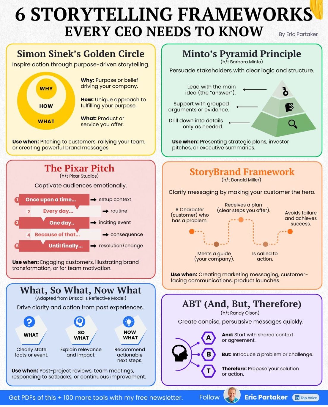
The Golden Circle refers to a concept promoted by Simon Sinek in one of his famous TED talks and in his book “Start With Why”. You can watch a video of the talk at the link below. Sinek argues that too often we communicate from the outside-in, starting with What we are doing, then explaining How we are doing it, and only then getting to the reason behind it all, the Why. Effective communication works from the inside-out, starting with Why we are doing what we are doing–the thing or purpose that drives us.
A common element of these storytelling models is to make an emotional connection early in the communication process:
The Golden Circle. If you lead communication with your purpose, your just cause, the reason why your organization (or you) exist, you communicate from a place of passion and meaning that gives communication credibility (ethos) and pathos.
Minto’s Pyramid. By starting a pitch with the answer, the main point, you get the attention of the audience.
ABT. By starting with shared context you are operating at the same level as the audience. The Pixar pitch does the same by describing a world and setting up a context with “Once upon a time…”.
StoryBrand. You lead with a customer problem, making the issue personal and relatable.
The most important storytelling frameworks in my opinion are ABT and the Golden Circle. Although the examples Sinek covers in the TED talk about the Golden Circle are from marketing and product management, it is a more general communication framework that is highly relevant in data science applications.
When should you choose ABT and when is the Golden Circle more effective? Storytelling with the ABT model is effective when a narrative tension can be resolved through presenting a problem and its solution. It is an effective model when it makes sense to lead with conflict. The Golden Circle is an effective model if you want to inspire the audience through purpose and belief; when it makes sense to lead with meaning.
Outside-in communication in the What-How-Why sequence might be less inspiring than outside-in communication in the Why-How-What sequence according to the Golden Circle. It still has a place. When talking to experts (evidence-first audience), outside-in communication that leads with data credibility is very effective. When inspiring action in a why-should-I-care audience, then leading with human stakes and inside-out communication is very effective. Here are examples of both types of communication, conveying results of a climate change analysis.
Communicating Temperature Data Analysis–Outside-in
What we found
NOAA temperature data from 1950-2024 show that average global temperatures have increased by 1.2°C. Our analysis of 15,000 weather stations reveals that the rate of warming has accelerated, with 18 of the 20 warmest years on record occurring since 2000.
How we did it
We analyzed daily temperature readings from NOAA’s Global Historical Climatology Network, applied spatial interpolation to account for station coverage gaps, and used linear regression with break-point analysis to identify acceleration patterns. Our model controls for natural climate cycles including El Niño and volcanic activity.
Why it matters
This warming rate exceeds previous IPCC (Intergovernmental Panel on Climate Change) projections and suggests we are approaching critical climate thresholds faster than anticipated. Coastal communities, agriculture, and water resources face increasing risks that require immediate adaptation planning.
Communicating Temperature Data Analysis–Inside-Out
Why this matters
Our children will inherit a fundamentally different planet than the one we grew up on. The question is not whether climate is changing—it is whether we understand the urgency clearly enough to act now, while we still have options.
How we know
By analyzing seven decades of NOAA temperature records from thousands of stations worldwide, we can see patterns that individual weather events obscure. We have accounted for natural variations—volcanic eruptions, ocean cycles—to isolate the human fingerprint on our climate system.
What the data show
The evidence is stark: 1.2°C of warming since 1950, with acceleration in recent decades. Eighteen of the twenty hottest years ever recorded have occurred since 2000. We are not approaching a crisis in some distant future—we are living through it right now.
34.4 Data Storytelling
How does the neuroscience of storytelling, the dramatic arc, and storytelling principles such as place and time, characters, conflict, transformation, and resolution, map to communication about data? Do I need to weave all this around the pie chart I am about to present?
There are two important variations of data storytelling for us:
Storytelling with Data. Here we use data to craft a compelling narrative. When journalists do this it is called data journalism. You also encounter the term visual essays.
Storytelling about Data. Here we use storytelling principles to create a compelling story about the results of data science.
Visual Essays
Here are some great examples of data journalism and visual essays, using data to tell a powerful story.
The next three examples are curated by the company Shorthand which develops tools for data storytelling. (Scroll down in the browser to unfold the stories).
Brexit by the Numbers. A Sky News story of the immediate impact of Brexit on the UK.
The annual impact report of Oxfam Ireland, a world-wide development organization fighting against inequality, poverty, and injustice.
The Arab News story about Jews of Lebanon, using simple graphics to tell the story of a minority community.
As you scroll through these publications, ask yourself
- What do these presentations have in common?
- Why is a particular presentation effective or ineffective?
- Which graphical elements are being used?
- Can you identify components of the dramatic arc and storytelling principles?
For twenty great examples of visual essays and visual storytelling, check out this collection.
A particularly powerful—in my opinion—data story is being told with a single graph style in this story about gun deaths in the U.S. It was introduced earlier in the chapter. If you revisit the visual essay now, can you also identify the emotional appeals of the story and how it helps you connect to the material?
Telling Stories about Data (Science)
Combine visuals and language
Recall that our brains are most wired to knowledge transfer through language, followed second by knowledge transfer through images. Combining visualization with language allows you to craft compelling stories that unlock the meaning of what you wish to convey.
Beautiful graphics are an element of a data story, but cannot by themselves provide the context in which the meaning is unlocked. They are part of the story. The production value of graphics and slides does not translate to a good story in itself.
You are using language and visualizations to make connections. What you say and what you show are not the story in itself. The audience will not remember the particular graphic. The audience will not remember the layout of the slides. But they will remember the characters in your story.
Focus on the audience
This is trivial but worth repeating. You are presenting material for the benefit of the audience, not for the benefit of the data science team. Go back and read that sentence again.
Everything you do should be focused on how to connect with the audience and make them memorize the meaning of your content. So you do not talk about the data science team and its accomplishments. It is not about you, it is about them! You talk about what the material you present means for them.
It is OK to acknowledge the team at the end of the presentation, possibly in appendix material that is shared with the presentation but not displayed in the room.
Pay attention to how many presentations start with “This is Me”, “This is Who we Are”, “This is What we Do”, “These are our collaborators”. You do not ever want to take credit for things you or the team did not do and you do not ever want to take credit away from others. The beginning of the presentation is not where you do that, however.
The counter argument that is sometimes made is that the audience has a limited attention span and putting credits and acknowledgements at the end buries them. By the time you get there the audience is exhausted and that misrepresents the team’s hard work and accomplishments. Also, if you run long you might not get to that part of the presentation.
Two responses to this counter argument:
The value of the work and the accomplishments of the team need to be evident from the content you are presenting.
If you are not getting through the material you need to work on the presentation. Not getting to material is the wrong kind of cliffhanger for the audience.
Create engagement
The modern office or classroom environment is not at all like sitting around a campfire at night. There are glass walls, people moving around, a clock in the corner of the room, HVAC systems going on and off, distractions from devices. On the plus side, you are not worried about being distracted by a saber-toothed tiger.
Starting a presentation by talking about process and methods, and introducing the team is a good way to lose the audience early on. You will have to fight against the current to re-engage them. Remember the ABT formula:
- And this is the way things were
- But there was a problem
- Therefore this is how it resolved
Get right into it.
To draw the audience in, use relatable experiences and frame them in the language of “you” and “yours”. Stimulate curiosity by raising an open question or mentioning a surprise result. Instead of opening with a slide titled “Fourth Quarter Cloud Expense Forecast” consider opening with these statements:
A look at our recent data suggested costs would increase. But did they?
Do cloud expenses really affect the bottom line?
Do the data support the conventional wisdom of subscription model vs pay as you go?
When I saw the data I was reminded that I never again want to wait in line
When sharing your own experiences, you are drawing on yourself as an example. Avoid oversharing and just talking about yourself.
The audience will be drawn to you if you are passionate and having fun working on this problem. It engages their curiosity, wondering what it is about this topic that makes you so passionate. The interest in the topic rubs up on the audience. Avoid any extremes. If you are too serious or dispassionate the audience might perceive that there might be deep-rooted issues with the material. If you are goofy or joke too much you will be seen as not serious and lacking credibility.
Story helpers
How do you go from having the statement
We are predicting a 7% increase in revenue in the next quarter
to having a story?
Anecdotes
Anecdotes are short, relevant, personal accounts of something relevant. The anecdote should be short enough not to distract from the story and long enough to be interesting. If you are telling a story about customers failing to sign up for the paid subscription service after a trial period, you could tell an anecdote about how you recently decided to use an online service because you could create the account through an existing service rather than creating a new username/password combination that you are loathe to track.
Case studies
A case study explains how a problem led to a solution. The case study does not have to present the identical problem as the one you are telling a story about. It just has to be a relatable study that suggests a possible solution path. Case studies are useful if the audience has experience with problems like those addressed in the case study.
Examples
Examples are similar to case studies, except they do not necessarily lay out the challenge or the solution. They can relate the audience to what other organizations are doing. Examples help convey that you are not solving an isolated or unusual problem and others are thinking about it as well.
Scenarios
A scenario is when you lay out a series of events and you ask the audience to predict each outcome. Scenarios are hypothetical and help get ideas out into the open. Make sure that the scenario is not too simple, otherwise it sounds like a children’s story. Like anecdotes, scenarios work best at the beginning of the story and should be told in the third person—you are not relating a personal experience:
Imagine a customer wants to move from the trial experience to a paid subscription. They like the ease with which they can flip the account but are hesitant because they have heard that it is a hassle to discontinue the service in the future.
Anecdotes, case studies, examples, and scenarios are not stories in themselves. They help you weave your story and give the larger message more meaning.