When you google “messy data”, you hit mostly on data quality issues such as duplicate records, inconsistent formats, missing values, invalid entries, outliers, and so on. We discussed those data quality issues in Chapter 16. There is a much more fundamental level of messiness beyond data cleanup that makes modeling data more challenging. Here are examples of messy data causing messy modeling:
The data source contains all the necessary information at the right data quality, but is organized in a way that makes analytic processing difficult.
The data are noisy and it is difficult to find any signal through the noise.
The data for a classification model is highly unbalanced, only a few observations fall into the category you are interested in. This is a common problem when modeling rare events.
You analyze data from a designed experiment but it lacks replication and you have to figure out a way to estimate the experimental error without bias.
The distribution of the data is multi-modal, suggesting that the underlying random process could be a mixture of distributions and requires a mixture of models.
You work with compositional data where features are constrained to sum to a constant (like percentages).
Model assumptions such as heteroscedasticity or uncorrelated errors are clearly violated.
Relationships are highly nonlinear and cannot be captured by a simple global model. Flexible models that capture nonlinear relationship such as decision trees do not perform well and complex models such as neural networks are not interpretable.
Data has only been partially observed, for example survival times at the end of the study are naturally censored; those that have survived until now will survive past the end of the study.
The missing value process is missing not at random and a complete-case analysis will bias the results.
The data exhibit irregular cyclical behavior that does not follow seasonal patterns.
The model features are highly linearly related (multicollinearity), making it difficult to isolate their individual effects.
Non-stationary random processes make it difficult to predict the future based on historical data.
You use surrogate variables for difficult to quantify attributes, leading to model oversimplification. Is citation count in academia a reliable surrogate for research impact?
This is not an exhaustive list and you will add to it through your own data science experiences. We cannot address remedies here in a first course on data science but address some of the topics.
30.1 Wrangling into Tabular Form
One interpretation of data messiness comes from the folks who brought us tidyverse. Data is untidy (messy) in their opinion, if it violates the tidy data set rules: each variable is in its own column and each observation is in its own row. Data often do not start out that way.
Wrangling data refers to the steps that organize data in a structured format that is suitable for analytic processing. The outcome of a wrangled data source is typically a table, a two-dimensional array of observations in rows and variables (features) in columns. There are no data quality issues, the data is simply not in the correct form for analytic processing.
Consider the classic airline passenger time series data from Box, Jenkins, and Reinsel (1976), showing monthly totals of international airline passengers between 1994 and 1960 (in thousands).
The data are arranged neatly, each year in a separate row, each month in a separate column. This is a great layout for time series analysis but maybe not the best layout for general analytic processing. The analysis variables are year, month, and the passenger count. Restructuring the AirPassengers data into a data frame with variables for year and count is easy because this data set is stored as an R time series.
str(AirPassengers)
Time-Series [1:144] from 1949 to 1961: 112 118 132 129 121 135 148 148 136 119 ...
dat <-data.frame(count=as.matrix(AirPassengers), time=time(AirPassengers),year=round(time(AirPassengers),0))head(dat)
In general, the structure of a non-tabular format is not known to the software and must be wrangled by the user. We do that here for the Gapminder dataset. The Gapminder Foundation is a Swedish non-profit that promotes the United Nations sustainability goals through use of statistics. The Gapminder data set tracks economic and social indicators like life expectancy and the GDP per capita of countries over time.
A wide format of the Gapminder data is available on GitHub here. We are following the material in this excellent online resource in wrangling the data in the wide format.
The data are stored in wide format, annual values for the variables GDP, life expectancy, and population appear in separate columns. This is not unlike how the AirPassengers data is displayed, but gap_wide is not a time series object. The desired (“tidy”) way of structuring the data, where each variable is a column and each observation is a row, is a tabular structure with variables
Continent
Country
Year
GDP
Life Expectancy
Population
For each combination of continent and country there will be 12 observations, one for each year.
Step 1.: gather (melt) columns
To restructure the Gapminder data set from wide format into the desired format takes several steps.
To move from wide to the desired long format, we use the tidyr::gather function. To do the opposite, moving from long to wide format, use the tidyr::spread function.
The first step is to gather the columns that contain the values for GDP, life expectancy, and population into separate rows. Those are all columns in gap_wide except continent and country, so we can exclude those from the gathering operation with -c(continent, country).
  continent      country   vartype_year    values
1    Africa      Algeria gdpPercap_1952 2449.0082
2    Africa       Angola gdpPercap_1952 3520.6103
3    Africa        Benin gdpPercap_1952 1062.7522
4    Africa     Botswana gdpPercap_1952  851.2411
5    Africa Burkina Faso gdpPercap_1952  543.2552
6    Africa      Burundi gdpPercap_1952  339.2965
tail(gap_step1)
     continent        country vartype_year   values
5107    Europe         Sweden     pop_2007  9031088
5108    Europe    Switzerland     pop_2007  7554661
5109    Europe         Turkey     pop_2007 71158647
5110    Europe United Kingdom     pop_2007 60776238
5111   Oceania      Australia     pop_2007 20434176
5112   Oceania    New Zealand     pop_2007  4115771
The resulting data frame has 5112 rows and 4 rows. How do the number of rows come about?
To move from wide to the desired long format, we use the melt method of the pandas DataFrame. To do the opposite, moving from long to wide format, use the pivot method.
The first step is to gather the columns that contain the values for GDP, life expectancy, and population into separate rows. Those are all columns in gap_wide except continent and country, so we can exclude those from the melting operation by designating them as identifiers id_vars=['continent', 'country'].
  continent       country    vartype_year       values
0    Africa       Algeria  gdpPercap_1952  2449.008185
1    Africa        Angola  gdpPercap_1952  3520.610273
2    Africa         Benin  gdpPercap_1952  1062.752200
3    Africa      Botswana  gdpPercap_1952   851.241141
4    Africa  Burkina Faso  gdpPercap_1952   543.255241
print(gap_step1.tail())
     continent         country vartype_year      values
5107    Europe     Switzerland     pop_2007   7554661.0
5108    Europe          Turkey     pop_2007  71158647.0
5109    Europe  United Kingdom     pop_2007  60776238.0
5110   Oceania       Australia     pop_2007  20434176.0
5111   Oceania     New Zealand     pop_2007   4115771.0
The resulting data frame has 5112 rows and 4 rows. How do the number of rows come about?
The original data has 142 rows in wide format
Three variables (gdpPercap, lifeExp,pop`) are measured for 12 years
There are 142 combinations of continent and country(the number of observations ingap_wide`).
Step 2. separate character variables
The gather function turns all variables into key-value pairs; the key is the name of the variable. The column that contains the names of the variables after the gathering is called vartype_year. In the next step dplyr::separate is called to split the character column vartype_year into two columns, one for the variable type and one for the year. The convert=TRUE option attempts to convert the data type of the new columns from character to numeric data—this fails for the vartype column but succeeds for the year column.
The gather function turns all variables into key-value pairs; the key is the name of the variable. The column that contains the names of the variables after the gathering is called vartype_year. In the next step tidyr::separate is called to split the character column vartype_year into two columns, one for the variable type and one for the year. The convert=TRUE option attempts to convert the data type of the new columns from character to numeric data—this fails for the vartype column but succeeds for the year column.
  continent      country   vartype year    values
1    Africa      Algeria gdpPercap 1952 2449.0082
2    Africa       Angola gdpPercap 1952 3520.6103
3    Africa        Benin gdpPercap 1952 1062.7522
4    Africa     Botswana gdpPercap 1952  851.2411
5    Africa Burkina Faso gdpPercap 1952  543.2552
6    Africa      Burundi gdpPercap 1952  339.2965
tail(gap_step2)
     continent        country vartype year   values
5107    Europe         Sweden     pop 2007  9031088
5108    Europe    Switzerland     pop 2007  7554661
5109    Europe         Turkey     pop 2007 71158647
5110    Europe United Kingdom     pop 2007 60776238
5111   Oceania      Australia     pop 2007 20434176
5112   Oceania    New Zealand     pop 2007  4115771
The melt method turns all variables into key-value pairs; the key is the name of the variable. The column that contains the names of the variables after the gathering is called vartype_year. In the next step str.split() is used to split the character column vartype_year into two columns, one for the variable type and one for the year.
  continent       country    vartype_year       values
0    Africa       Algeria  gdpPercap_1952  2449.008185
1    Africa        Angola  gdpPercap_1952  3520.610273
2    Africa         Benin  gdpPercap_1952  1062.752200
3    Africa      Botswana  gdpPercap_1952   851.241141
4    Africa  Burkina Faso  gdpPercap_1952   543.255241
print(gap_step1.tail())
     continent         country vartype_year      values
5107    Europe     Switzerland     pop_2007   7554661.0
5108    Europe          Turkey     pop_2007  71158647.0
5109    Europe  United Kingdom     pop_2007  60776238.0
5110   Oceania       Australia     pop_2007  20434176.0
5111   Oceania     New Zealand     pop_2007   4115771.0
Step 3. spread (pivot) rows into columns
We are almost there, but not quite. We now have columns for continent, country, and year, but the values column contains values of different types: 1,704 observations for GDP, 1,704 observations for life expectancy, and 1,704 observations for population.
To create separate columns from the rows we can reverse the gather operation with the spread function—it splits key-value pairs across multiple columns. The entries in the vartype column are used by the spreading operation as the names of the new columns.
  continent country year gdpPercap lifeExp      pop
1    Africa Algeria 1952  2449.008  43.077  9279525
2    Africa Algeria 1957  3013.976  45.685 10270856
3    Africa Algeria 1962  2550.817  48.303 11000948
4    Africa Algeria 1967  3246.992  51.407 12760499
5    Africa Algeria 1972  4182.664  54.518 14760787
6    Africa Algeria 1977  4910.417  58.014 17152804
tail(gapminder)
     continent     country year gdpPercap lifeExp     pop
1699   Oceania New Zealand 1982  17632.41  73.840 3210650
1700   Oceania New Zealand 1987  19007.19  74.320 3317166
1701   Oceania New Zealand 1992  18363.32  76.330 3437674
1702   Oceania New Zealand 1997  21050.41  77.550 3676187
1703   Oceania New Zealand 2002  23189.80  79.110 3908037
1704   Oceania New Zealand 2007  25185.01  80.204 4115771
In summary, we used gather to create one key-value pair of the variable_year columns and values in step 1, separated out the year in step 2, and spread the remaining variable types back out into columns in step 3.
To create separate columns from the rows we can reverse the melt operation with the pivot method—it splits key-value pairs across multiple columns. The entries in the vartype column are used by the spreading operation as the names of the new columns.
vartype continent  country  year    gdpPercap  lifeExp         pop
0          Africa  Algeria  1952  2449.008185   43.077   9279525.0
1          Africa  Algeria  1957  3013.976023   45.685  10270856.0
2          Africa  Algeria  1962  2550.816880   48.303  11000948.0
3          Africa  Algeria  1967  3246.991771   51.407  12760499.0
4          Africa  Algeria  1972  4182.663766   54.518  14760787.0
print(gapminder.tail())
vartype continent      country  year    gdpPercap  lifeExp        pop
1699      Oceania  New Zealand  1987  19007.19129   74.320  3317166.0
1700      Oceania  New Zealand  1992  18363.32494   76.330  3437674.0
1701      Oceania  New Zealand  1997  21050.41377   77.550  3676187.0
1702      Oceania  New Zealand  2002  23189.80135   79.110  3908037.0
1703      Oceania  New Zealand  2007  25185.00911   80.204  4115771.0
In summary, we used melt to create one key-value pair of the variable_year columns and values in step 1, separated out the year in step 2, and spread the remaining variable types back out into columns in step 3 (using pivot).
30.2 Low Signal to Noise Ratio
Low signal-to-noise ratio (SNR) means the true underlying patterns you want to detect are weak relative to the random variation in your data. The reason could be a weak (or no) signal, lots of variability in the data, or both. We saw in Figure 23.2 that what appears to be a signal can be all random noise.
Low SNR creates several fundamental challenges with statistical power and model stability:
More difficult to distinguish real patterns from random fluctuations
Increased risk of false positives (finding patterns that are not there)
Need for larger sample sizes to detect true effects
Model performance becomes highly sensitive to sampling variation
Small changes in training data can lead to dramatically different models
Overfitting becomes more likely as models chase the noise
Cross-validation results become unreliable and highly variable
Predictions have wide confidence intervals
Real-World Examples
Financial Markets
Stock price prediction often has extremely low SNR. Daily stock returns might have a signal (based on fundamentals, sentiment, etc.) that explains only 1-5% of the variance, with the rest being essentially random market noise. This is why most quantitative trading strategies have very modest information ratios.
Medical Diagnostics from Wearables
Detecting early signs of illness from smartphone accelerometer data has very low SNR. The subtle changes in gait or movement patterns that indicate health issues are tiny compared to normal variation in how people move, differences in phone placement, walking surfaces, etc.
Genomics
Identifying genetic variants associated with complex diseases often involves very small effect sizes. A genetic variant might increase disease risk by 1.1x, but this signal is buried in massive noise from environmental factors, other genes, and measurement error across thousands of genetic markers.
Social Media Sentiment Analysis
Predicting market movements or election outcomes from Twitter (X) sentiment has notoriously low SNR. Real predictive signals are overwhelmed by bots, sarcasm, regional biases, and the general noise of social media discourse.
Industrial Internet of Things (IoT)
Predicting equipment failure from sensor data often has low SNR because early failure signals are subtle vibrations or temperature changes that are small relative to normal operational variation and sensor noise.
How to Address Low SNR in Machine Learning
Data Strategy
Collect more data: the most straightforward approach, since signal improves with sample size while noise averages out
Engineer better features: domain knowledge can help extract signal more effectively than raw measurements
Aggregate temporal data: smooth out noise by averaging over time windows
Modeling Approaches
Regularization: L1/L2 penalties, elastic net to prevent overfitting to noise
Ensemble methods: random forests, gradient boosting to average out noise across multiple models
Dimension reduction: PCA, factor analysis to focus on major sources of variation
Robust methods: techniques less sensitive to outliers and noise
Advanced Techniques
Denoising autoencoders: learn to reconstruct clean signals from noisy inputs
Multi-task learning: leverage related tasks to improve signal detection
Transfer learning: use pre-trained models that have learned general patterns
Bayesian approaches: explicitly model uncertainty and incorporate prior knowledge
Validation and Evaluation
Nested cross-validation: more robust performance estimates
Repeated experiments: run multiple random seeds to assess stability
Out-of-time validation: especially important when SNR varies over time
Test statistical significance: ensure results are not just due to chance
Domain-Specific Approaches
Signal processing: filtering, spectral analysis for time series data
Causal inference: instrumental variables, natural experiments to isolate true effects
Meta-analysis: combine results across multiple studies to boost effective sample size
The key insight is that with low SNR, you often need to fundamentally change your approach rather than just tweaking hyperparameters. The focus shifts from optimizing predictive accuracy to ensuring that you are detecting real patterns rather than fitting noise.
30.3 Unbalanced Data
The Issue
Suppose we have a two-category classification problem. If the two classes appear with roughly the same frequencies we refer to a balanced situation. Imbalance exists when the two classes have very different sample frequencies. The following confusion matrix is an example of a highly imbalanced data set. (958 + 7)/1,000 = 0.965 of the observations fall into the majority class, only 0.035 fall into the minority class.
Example of a confusion matrix for 1,000 observations.
Observed Category
Predicted Category
Yes (Positive)
No (Negative)
Yes (Positive)
9
7
No (Negative)
26
958
The problem with highly unbalanced data sets is that they tend to favor the majority class in training. Even a completely uninformative model that would always predict the majority class (without looking at any data) would have a very high accuracy. Such a model would predict most observations correctly simply because almost all observations fall into that class. This is a problem because in most applications where data are imbalanced with respect to the target variable, the category of interest (the event category) is the minority category. When we investigate equipment failures, fraud cases, manufacturing defects, rare diseases, etc., we model rare events. Algorithms need to learn to find needles in a haystack. Furthermore, accuracy is often not the relevant model performance criterion. Sensitivity (recall), specificity, and precision are then more relevant.
To help the algorithm better learn the minority class of interest, you can adjust its focus on the minority class by using a weighted analysis or by adjusting the proportion of events to non-events. You can think of this as a data pre-processing step and it involves reducing the number of cases in the majority class (downsampling) or increasing the number of cases in the minority class (upsampling).
Downsampling eliminates at random observations in the majority class until the ratio of events and non-events meets a target value. It is not necessary to downsample to a 50:50 ratio between events and non-events. You have to achieve an event ratio where the algorithm can properly learn the minority class. You can monitor how balanced accuracy (or AUC) changes with the downsampling rate.
Problems with downsampling are the loss of information and the reduction in sample size. When working with qualitative input variables you need to ensure that downsampling does not drop levels of the input variable. For example, if you have three age groups in the data set and only two remain after downsampling, the model will not be able to make predictions for the eliminated age group. Downsampling reduces computational cost since it reduces the size of the training set and should be considered when you have large sample sizes to begin with.
Upsampling (also known as oversampling) the minority class avoids the problem of information loss. Here we add observations in the minority class to the training data until a target ratio of events and non-events (not necessarily 50:50) is achieved. While it preserves information in the data, simply randomly duplicating observations in the minority class can lead to overfitting. By duplicating data you are enticing the algorithm to learn the training data too closely.
To avoid the overfitting problem with random upsampling, methods have been developed that add not just duplicate data points. SMOTE (Synthetic Minority Oversampling Technique) is an interpolation technique that generates new data points in the minority class (Chawla et al. 2002). SMOTE works as follows:
Select an observation in the minority class at random.
Find its \(k\) nearest neighbors, this if often based on a \(k\)-NN analysis of the minority observations with \(k\)=5.
Choose one of the \(k\) nearest neighbors at random.
Interpolate between the randomly chosen observation (in step 1) and the chosen nearest neighbor, taking a random step toward the neighbor in feature space
Generate the new data point as a convex (weighted) combination between observation and the neighbor.
You can think of SMOTE as a data augmentation technique.
If data sets are highly unbalanced, upsampling will increase the computational burden. This effect is exacerbated if the target event ratio is close to 50:50 or if the data set is large to begin with. To avoid this problem and the respective pitfalls of upsampling and downsampling, the methods can be combined: downsample some observations in the majority class without sacrificing information and upsampling observations in the minority class using SMOTE. This is the procedure suggested in Chawla et al. (2002).
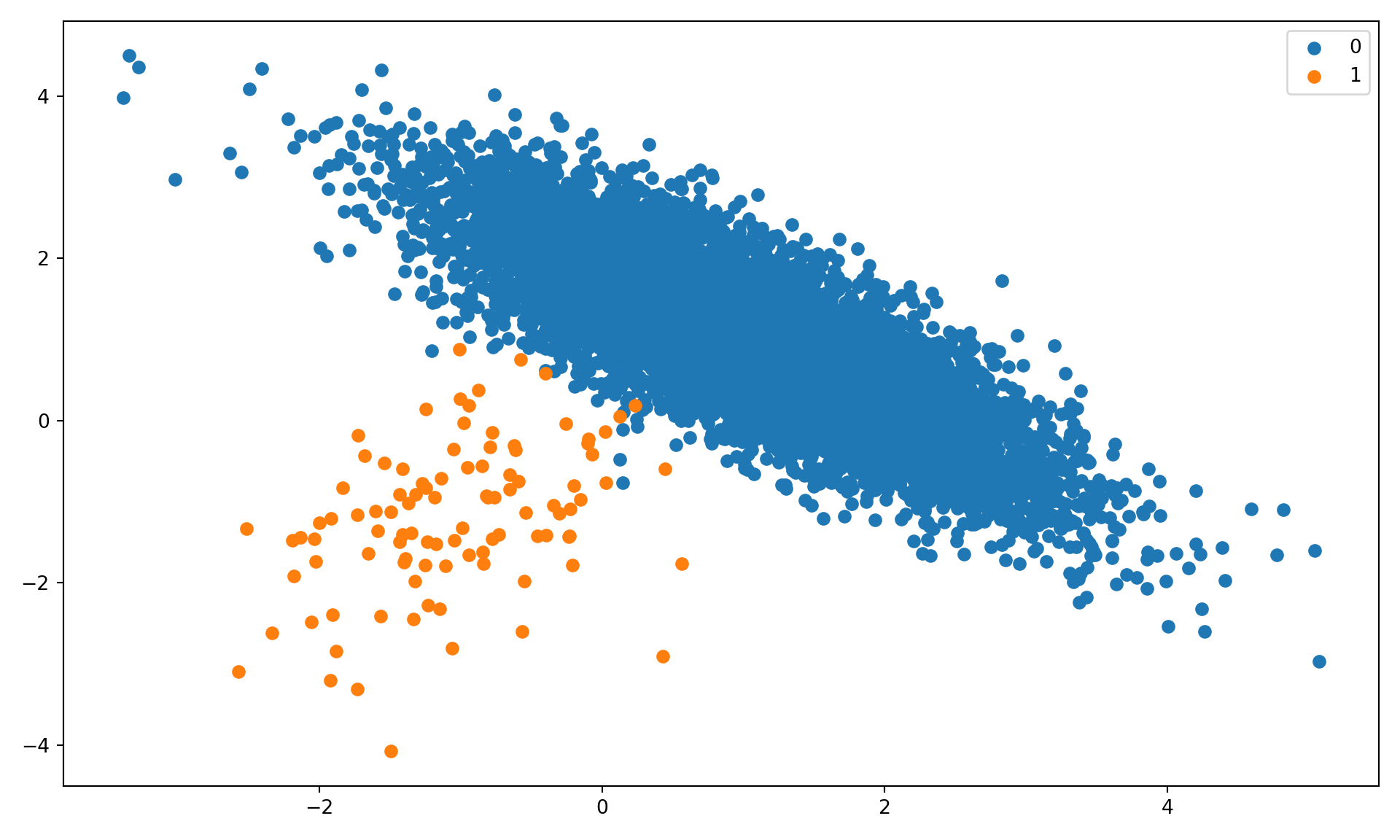
We begin by simulating a two-category classification data set with high imbalance between majority and minority class. 99% of the 10,000 observations fall into the majority class (Figure 30.1).
import numpy as npimport matplotlib.pyplot as pltfrom collections import Counterfrom sklearn.datasets import make_classificationX, y = make_classification( n_samples=10000, n_features=2, n_redundant=0, n_clusters_per_class=1, weights=[0.99], flip_y=0, random_state=34)# Summarize class distributioncounter = Counter(y)print(counter)
Figure 30.1: Simulated two-category data with 99% majority class unbalance.
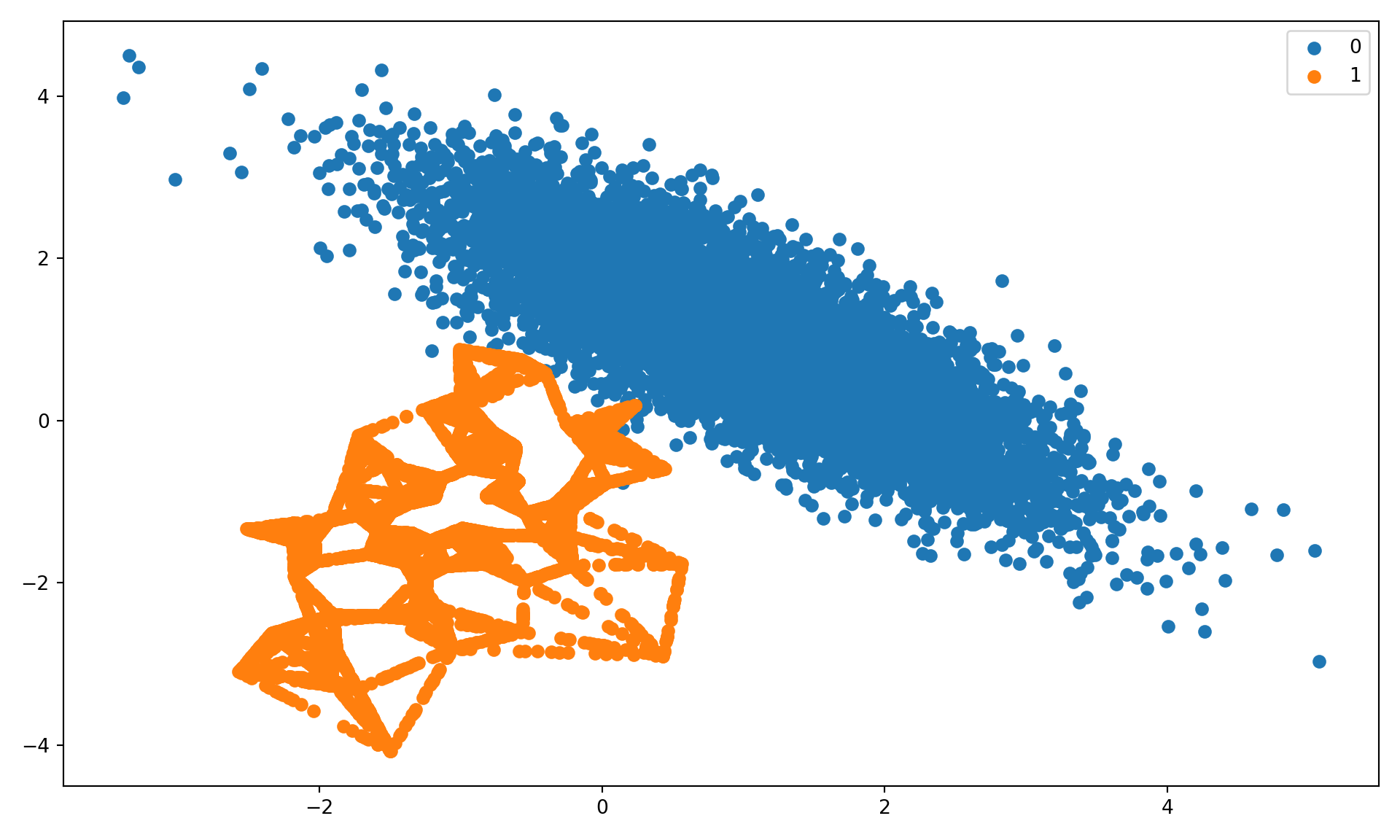
Next we oversample the minority class with SMOTE. Note that by default the SMOTE implementation in imblearn achieves a 50:50 ratio of events and non-events (Figure 30.2).
for label, _ in counter.items(): row_ix = np.where(yover == label)[0] plt.scatter(Xover[row_ix, 0], Xover[row_ix, 1], label=str(label));plt.legend();plt.tight_layout();plt.show();
Figure 30.2: Oversampled data with SMOTE.
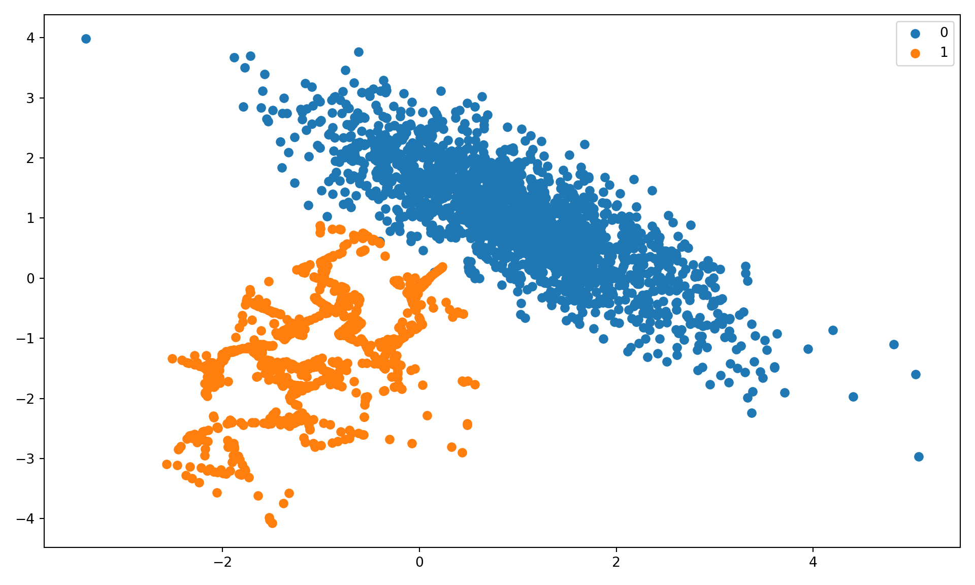
The next step uses a pipeline to combine oversampling of the minority class with undersampling of the majority class. The parameters of SMOTE and RandomUnderSampler are chosen so that the minority class has 10% of the events in the majority class (sampling_strategy=0.1) and the majority class has twice as many events (sampling_strategy=0.5).
for label, _ in counter.items(): row_ix = np.where(yoverunder == label)[0] plt.scatter(Xoverunder[row_ix, 0], Xoverunder[row_ix, 1], label=str(label));plt.legend();plt.tight_layout();plt.show();
Figure 30.3: Oversampled minority class and undersampled majority class.
How well does changing the balance of the categories affect the performance of a classification model? We choose here a decision tree and apply repeated (3) 10-fold cross-validation to determine the hyperparameters. The performance of the model is measured by the average balanced accuracy.
This signals a big improvement in balanced accuracy, but it is an overestimate of the improvement. Since we oversampled and undersampled the training data, the cross-validation folds are selected from the modified data, not the original data.
To get a true estimate of model performance, where the test data for cross-validation has the same structure as the original, unmodified data, we can set up a pipeline that first transforms the data, then fits the model.
Over- and undersampling improved the accuracy of the model compared to the original, unbalanced data set, but not as much as the previous run appeared to indicate (which used the over/under-sampled data to form the validation folds).
An alternative way to properly use cross-validation while over-/under-sampling is to create the validation folds first (based on the original) data and then apply over-/under-sampling to the data after removing the \(k\)thfold. This ensures that the sampling is applied only to the training data but not to the test data.
Box, G. E. P., G. M. Jenkins, and G. C. Reinsel. 1976. Time Series Analysis, Forecasting and Control. 3rd. Ed. Holden-Day.
Chawla, Nitesh V., Kevin W. Bowyer, Lawrence O. Hall, and W. Philip Kegelmeyer. 2002. “SMOTE: Synthetic Minority over-Sampling Technique.”J. Artif. Int. Res. 16 (1): 321–57.