18 Visualization
Quotes
There is no such thing as information overload. There is only bad design.
The greatest value of a picture is when it forces us to notice what we never expected to see.
If we communicate well, we call it storytelling.
18.1 Introduction
The purpose of data visualization is to communicate quantitative and qualitative data in an accurate and easily understandable way. It is used to convey information without distracting from it. It should be useful, appealing and never misleading. Like data summarization, visualization is a means of reducing a large amount of information to the essential elements.
Two Examples
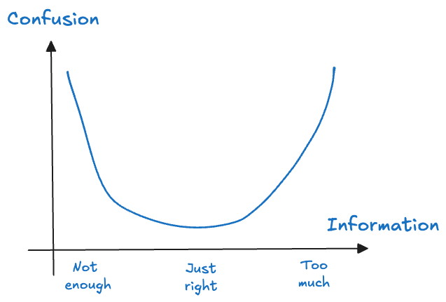
Let’s look at two examples of conveying data in tabular and in graphical form. Tabular data is how computers process information. It is not how humans best process data. However, both tables and graphics have pros and cons and it is up to you to choose. The task is to choose the right amount of information to display that maximizes comprehension (minimizes confusion) of the concept you want to convey (Figure 18.1). For example, if your audience needs to see the actual values, then a table might be a better choice than overloading a graphic with labels.
Twenty apple trees
The data for the following example were collected at the Winchester Agricultural Experiment Station of Virginia Tech and are analyzed in (Schabenberger and Pierce 2001, 466–74). Ten apple trees were randomly selected at the experiment station and 25 apples were randomly chosen on each tree. The data analyzed here comprise the eighty apples in the largest size class, those with an initial diameter equal or greater than 2.75 inches. Over a period of 12 weeks diameter measurements of the apples were taken at 2-week intervals. The variables in the data set are
Tree: the tree numberappleid: the number of the apple within the tree.measurement: the index of the measurements. Measurements were taken in two-week intervals, so thatmeasurement=1refers to the state of the apple after 2 weeks andmeasurement=6refers to the state of the apple at the end of the 12-week perioddiameterthe diameter of the apple at the time of measurement
Table 18.1 displays the diameters in inches of 20 apples from two trees over six measurements periods. The measurements are spaced 2 weeks apart and were collected at the Winchester Agricultural Experiment Station of Virginia Tech. The total data set comprises 80 apples from 10 trees.
| Tree | Apple | Period 1 | Period 2 | Period 3 | Period 4 | Period 5 | Period 6 |
|---|---|---|---|---|---|---|---|
| 1 | 1 | 2.90 | 2.90 | 2.90 | 2.93 | 2.94 | 2.94 |
| 2 | 2.86 | 2.90 | 2.93 | 2.96 | 2.99 | 3.01 | |
| 3 | 2.75 | 2.78 | 2.80 | 2.82 | 2.82 | 2.84 | |
| 4 | 2.81 | 2.84 | 2.88 | 2.92 | 2.92 | 2.95 | |
| 5 | 2.75 | 2.78 | 2.80 | 2.82 | 2.83 | 2.90 | |
| 6 | 2.92 | 2.96 | 2.96 | 3.02 | 3.02 | 3.04 | |
| 7 | 3.08 | ||||||
| 8 | 3.04 | 3.10 | 3.11 | 3.15 | 3.18 | 3.21 | |
| 9 | 2.78 | 2.82 | 2.83 | 2.86 | 2.87 | ||
| 10 | 2.76 | 2.78 | 2.82 | 2.85 | 2.86 | 2.87 | |
| 11 | 2.79 | 2.86 | 2.88 | 2.93 | 2.95 | 3.98 | |
| 12 | 2.76 | 2.81 | 2.82 | 2.86 | 2.90 | 2.90 | |
| 2 | 1 | 2.84 | 2.89 | 2.92 | 2.93 | 2.95 | |
| 2 | 2.75 | 2.80 | 2.82 | 2.84 | 2.86 | 2.86 | |
| 3 | 2.78 | 2.81 | 2.84 | 2.85 | 2.87 | 2.90 | |
| 4 | 2.84 | 2.86 | 2.86 | ||||
| 5 | 2.83 | 2.88 | 2.89 | 2.92 | 2.93 | 2.93 | |
| 6 | 2.80 | 2.86 | 2.89 | 2.92 | 2.93 | 2.95 | |
| 7 | 2.86 | 2.89 | 2.92 | 2.96 | 2.96 | 2.99 | |
| 8 | 2.75 | 2.80 | 2.83 | 2.85 | 2.86 | 2.88 |
If we were to display the entire data in a table, it would use four times as much space and it would be difficult to comprehend the data—to see what is going on. However, the tabular display is useful in some respects:
- It displays the exact diameter values.
- We see that there are missing values for some apples. For example, apple #7 on tree #1 has only one diameter measurement at the first occasion. Apple #4 on tree #2 has three measurements.
- Once measurements are missing, they remain missing, at least for the apples displayed in the table. That suggests that apples dropped out of the study, maybe they fell to the ground, were eaten or harvested.
- Apple identifiers are not unique across the trees. Apples with the same id appear on both trees. If we want to calculate summary statistics for apples, we must also take tree numbers into account. The technical term for this data structure is that apples are nested within trees.
There are other aspects of the data that are difficult to ascertain from the table:
- Apple diameters should not decrease over time. You need to scan every row to check for possible violations; they would suggest measurement errors.
- What do the trends over time look like? Are there significant changes in apple diameter over the 12-week period? If so, what is the shape of the trend?
- Do apples grow at similar rates on different trees?
- What does the data from the other trees look like?
- How many apples were measured on each tree?
We can see trends much better than we can read trends.
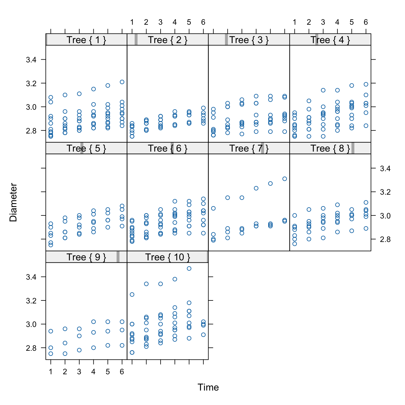
Figure 18.2 shows a trellis plot of the diameters of all eighty apples over the twelve-week study period. This type of graph is also called a lattice plot or a conditional plot. The display is arranged by one or more variables, and a separate plot is generated for the data associated with values of the conditioning variables. Here, the trellis plot is conditioned on the tree number, producing ten scatter plots of apple diameters for a given tree. The plots are not unrelated, however. They share the same \(x\)-axis and \(y\)-axis to facilitate comparisons across the plots.
The trellis plot readily conveys information that is difficult to read from the tabular display:
- The varying number of apples per tree.
- There is a definite trend over time in apple growth and it appears to be linear over time. Every two weeks each apple seems to grow by a steady amount; the amount differs between apples and trees.
- There is variability between the trees and variability among the apples from the same tree. The apple-to-apple variability is small on tree #2, and it is larger on trees #7 and #10, for example.
- All eighty apples are shown in a compact display.
- The smallest diameter seems to be around 2.8 inches. Recall that these apples are a subset of a larger sample of apples, limited to fruit with at least 2.75 inches of diameter at the initial measurement.
- The measurements are evenly spaced.
The graph is helpful to see patterns—trends, groupings, variability—but makes some information more difficult to consume. We see which measurements are larger and smaller (the pattern), but not their actual value. Showing the actual values to two decimal places is not the purpose of the graph. If we want to know the diameter of apple #4 on tree #7 at time 5, we can query the data to retrieve the exact value.
library(dplyr)
library(duckdb)
con <- dbConnect(duckdb(),dbdir = "../ads.ddb",read_only=TRUE)
apples <- dbGetQuery(con, "SELECT * FROM apples;")
dbDisconnect(con)
apples %>% filter((Tree==7) & (appleid==4) & (measurement==5)) Tree appleid measurement diameter
1 7 4 5 2.92import duckdb
import polars as pl
con = duckdb.connect(database="../ads.ddb", read_only=True)
apples = con.sql("SELECT * FROM apples").pl()
apples.filter((pl.col("Tree")==7) & (pl.col("appleid")==4) & (pl.col("measurement")==5))
shape: (1, 4)
| Tree | appleid | measurement | diameter |
|---|---|---|---|
| i64 | i64 | i64 | f64 |
| 7 | 4 | 5 | 2.92 |
We could add labels to the data symbols in the graph, or even replace the circles with labels that show the actual value, but this would make the graph really busy and messy.
We also have lost information about which data point belongs to which apple. Since diameters grow over time, our brain naturally interpolates the sequence of dots. For the largest measurements on say, tree #7 and tree #10, we are easily convinced that the dots belong to the same apple. We cannot be as confident when data points group together more. And we cannot be absolutely certain that the largest observations on tree #7 and tree #10 belong to the same apple. And without further identifying information, we do not know which apple that is.
There are other ways in which the graphic can be enhanced or improved:
- Add trends over time for individual apples and/or trees. That can help identify a model and show the variability between and within trees.
- Vary the plotting symbols or colors within a cell of a lattice to show which data points belong to the same apple.
(Is it better to vary colors or symbols or both?) - Add an apple id, maybe in the right margin of each cell, aligned with the last measurement.
(Would that work if an apple is not observed at the last measurement?)
The table Table 18.1 and the trellis graph Figure 18.2 display the raw data. We can also choose to work with summaries. Suppose we are interested in understanding the distribution of apple diameters by measurement time. The following statements compute several descriptive statistics from diameters at each measurement occasion.
apples %>% group_by(measurement) %>%
filter(!is.na(diameter)) %>%
summarize(count=n(),
mean=mean(diameter),
min=min(diameter),
q1 = quantile(diameter, probs = c(0.25)),
median = quantile(diameter, probs = c(0.5)),
q3 = quantile(diameter, probs = c(0.75)),
max=max(diameter))# A tibble: 6 × 8
measurement count mean min q1 median q3 max
<dbl> <int> <dbl> <dbl> <dbl> <dbl> <dbl> <dbl>
1 1 80 2.85 2.75 2.78 2.84 2.90 3.25
2 2 79 2.90 2.75 2.82 2.88 2.95 3.34
3 3 79 2.92 2.75 2.85 2.9 2.97 3.34
4 4 77 2.95 2.79 2.87 2.94 3.01 3.38
5 5 73 2.97 2.79 2.9 2.96 3.02 3.47
6 6 63 2.98 2.79 2.92 2.97 3.04 3.31apples.group_by("measurement").agg(
pl.col("diameter").count().alias('count'),
pl.col("diameter").mean().alias('mean'),
pl.col("diameter").min().alias('min'),
pl.col("diameter").quantile(0.25).alias('q1'),
pl.col("diameter").quantile(0.5).alias('median'),
pl.col("diameter").quantile(0.75).alias('q3'),
pl.col("diameter").max().alias('max')
).sort("measurement")
shape: (6, 8)
| measurement | count | mean | min | q1 | median | q3 | max |
|---|---|---|---|---|---|---|---|
| i64 | u32 | f64 | f64 | f64 | f64 | f64 | f64 |
| 1 | 80 | 2.852875 | 2.75 | 2.78 | 2.84 | 2.9 | 3.25 |
| 2 | 79 | 2.89519 | 2.75 | 2.82 | 2.88 | 2.95 | 3.34 |
| 3 | 79 | 2.921266 | 2.75 | 2.85 | 2.9 | 2.98 | 3.34 |
| 4 | 77 | 2.954545 | 2.79 | 2.87 | 2.94 | 3.01 | 3.38 |
| 5 | 73 | 2.973288 | 2.79 | 2.9 | 2.96 | 3.02 | 3.47 |
| 6 | 63 | 2.981587 | 2.79 | 2.92 | 2.97 | 3.04 | 3.31 |
The output shows that the number of observations contributing at each measurement time decreases; this is expected as apples are lost during the study. The location statistics (mean, min, median, Q1, Q3, and max) increase over time, showing that the average apple grows.
A visual display that produces the same information and conveys the distributions as well as the trend over time more clearly arranges box plots for the measurement times (Figure 18.3).
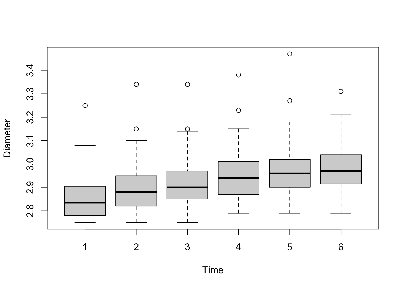
The general organization of a box plot was presented in Figure 17.3. The grey box in the center of the box plot extends from the first to the third quartile and covers the central 50% of the distribution; its width is the inter-quartile range (IQR = \(Q_3 - Q_1\)). A line is drawn at the location of the median. The upper and lower extensions of the box are called the whiskers of the box plot. These extend to the largest and smallest observations, respectively, that are within 1.5 times the IQR from the edge of the box. If there are no dots plotted beyond the whiskers, they fall on the max and min, respectively. “Outliers” are shown as dots above and below the whiskers. In the apple data, they appear only at the upper end of the measurements. These outliers are simply unusual given the probability distribution. If you collect enough samples from any distribution, you will expect to draw a certain number of values from the tails of the distribution.
Factor level comparisons
When comparing levels of qualitative factors for statistical significance, it is common to display the results in tables.
The carbon dioxide (CO2) uptake of six plants from Quebec and six plants from Mississippi of the grass species Echinochloa crus-galli was measured at several levels of ambient CO2 concentration. Three of the six plants from each location were chilled overnight prior to conducting the experiment. There are seven levels of ambient carbon dioxide concentrations: 95, 175, 250, 350, 500, 675, and 1,000 mL/L. The outcome of interest (the target) is the plant uptake of CO2 (measured in \(\mu\)mol/m2 sec).
library(sasLM)
head(CO2,10) Plant Type Treatment conc uptake
1 Qn1 Quebec nonchilled 95 16.0
2 Qn1 Quebec nonchilled 175 30.4
3 Qn1 Quebec nonchilled 250 34.8
4 Qn1 Quebec nonchilled 350 37.2
5 Qn1 Quebec nonchilled 500 35.3
6 Qn1 Quebec nonchilled 675 39.2
7 Qn1 Quebec nonchilled 1000 39.7
8 Qn2 Quebec nonchilled 95 13.6
9 Qn2 Quebec nonchilled 175 27.3
10 Qn2 Quebec nonchilled 250 37.1Suppose we want to compare the CO2 uptake among the seven concentrations in pairs, averaged across the plant origin and whether the plants were chilled. There are 7*6/2 = 21 such pairwise comparisons: 95 vs 175 mL/M, 95 vs 250 ml/ML, …, 675 vs 1,000 mL/L.
PDIFF(uptake ~ Type*Treatment + as.factor(conc), CO2, "as.factor(conc)") Estimate Lower CL Upper CL Std. Error t value Df Pr(>|t|)
95 - 175 -10.0250 -13.1020 -6.9480 1.5443 -6.4918 74 8.576e-09 ***
95 - 250 -16.6167 -19.6937 -13.5397 1.5443 -10.7603 74 < 2.2e-16 ***
95 - 350 -18.4083 -21.4853 -15.3313 1.5443 -11.9205 74 < 2.2e-16 ***
95 - 500 -18.6167 -21.6937 -15.5397 1.5443 -12.0554 74 < 2.2e-16 ***
95 - 675 -19.6917 -22.7687 -16.6147 1.5443 -12.7515 74 < 2.2e-16 ***
95 - 1000 -21.3250 -24.4020 -18.2480 1.5443 -13.8092 74 < 2.2e-16 ***
175 - 250 -6.5917 -9.6687 -3.5147 1.5443 -4.2685 74 5.758e-05 ***
175 - 350 -8.3833 -11.4603 -5.3063 1.5443 -5.4287 74 6.895e-07 ***
175 - 500 -8.5917 -11.6687 -5.5147 1.5443 -5.5636 74 4.008e-07 ***
175 - 675 -9.6667 -12.7437 -6.5897 1.5443 -6.2597 74 2.278e-08 ***
175 - 1000 -11.3000 -14.3770 -8.2230 1.5443 -7.3174 74 2.505e-10 ***
250 - 350 -1.7917 -4.8687 1.2853 1.5443 -1.1602 74 0.249693
250 - 500 -2.0000 -5.0770 1.0770 1.5443 -1.2951 74 0.199306
250 - 675 -3.0750 -6.1520 0.0020 1.5443 -1.9912 74 0.050146 .
250 - 1000 -4.7083 -7.7853 -1.6313 1.5443 -3.0489 74 0.003185 **
350 - 500 -0.2083 -3.2853 2.8687 1.5443 -0.1349 74 0.893051
350 - 675 -1.2833 -4.3603 1.7937 1.5443 -0.8310 74 0.408628
350 - 1000 -2.9167 -5.9937 0.1603 1.5443 -1.8887 74 0.062849 .
500 - 675 -1.0750 -4.1520 2.0020 1.5443 -0.6961 74 0.488531
500 - 1000 -2.7083 -5.7853 0.3687 1.5443 -1.7538 74 0.083604 .
675 - 1000 -1.6333 -4.7103 1.4437 1.5443 -1.0577 74 0.293642
---
Signif. codes: 0 '***' 0.001 '**' 0.01 '*' 0.05 '.' 0.1 ' ' 1A common question when analyzing experiments with factors is “what level is significantly different from other levels?”. Table 18.2 displays the \(p\)-values for the hypothesis that level X and Y do not differ in CO2 plant uptake in the right-most column. This is often annotated with the “star” notation, a short-hand to indicate whether a comparison is significant at the 5% (\(p\)-value < 0.05, *), 1% (\(p\)-value < 0.01, **), or 0.1% (\(p\)-value < 0.001, ***) level. Luckily, in Table 18.2 the significant comparison appear near the top of the table, one concludes that the 95 mL/L concentration and the 175 mL/L concentration differ significantly from the other concentrations in plant CO2 uptake.
What else can we learn from the table of pairwise comparisons?
- The lower CO2 concentrations result in lower CO2 plant uptake, as seen by the negative values in the
Estimatecolumn. - Whenever the \(p\)-value is greater than 0.05, the confidence interval given by the
Lower CLandUpper CLcolumns includes 0 — this suggests we are looking at 95% confidence intervals of the difference. This can be verified with the250--675comparison; it is very close to a 0.05 significance level. (A check of thePDIFFdocumentation also confirms a default confidence level of 0.95.) - The values in the
Std. Errorcolumn are identical, a result of the balanced nature of the data: each experimental condition is replicated the same number of times and all combinations of factors are present. This column is the standard error—that is, the standard deviation of the estimate in the first column.
A table such as Table 18.2 is common in scientific publications. If the aim is to discuss which treatments are statistically significant from other treatments, then there are some shortcomings of the tabular display:
- Repetitive information in columns, such as standard errors that do not change. If there is only one standard error, this could go into the table caption.
- The degrees of freedom (
DFcolumn) of the comparisons also do not change due to the nature of the data and the model. There is no need to repeat that information. - We do not need the 95% confidence limits, the \(t\)-values, and the \(p\)-values. Either the \(p\)-values or the confidence bounds are sufficient to indicate statistical significance.
- We do not know the actual estimates for the CO2 uptakes for the concentration levels. Only differences are displayed. In a publication you would accompany the table of differences with a table of the level estimates (Table 18.3), or somehow annotate a table of the level estimates with information about significant differences.
LSM(uptake ~ Type*Treatment + as.factor(conc), CO2, "as.factor(conc)") Group LSmean LowerCL UpperCL SE Df
1000 A 33.58333 31.40756 35.75911 1.091958 74
675 AB 31.95000 29.77423 34.12577 1.091958 74
500 AB 30.87500 28.69923 33.05077 1.091958 74
350 AB 30.66667 28.49089 32.84244 1.091958 74
250 B 28.87500 26.69923 31.05077 1.091958 74
175 C 22.28333 20.10756 24.45911 1.091958 74
95 D 12.25833 10.08256 14.43411 1.091958 74These shortcomings are an opportunity for a different display of the pertinent information. One such display is known as the diffogram, shown in Figure 18.4.
Diffogram(uptake ~ Type*Treatment + as.factor(conc),
Data=CO2,
Term="as.factor(conc)",
las=1,
cex.axis=0.75,
xlab="Carbon dioxide uptake",
ylab="Carbon dioxide uptake")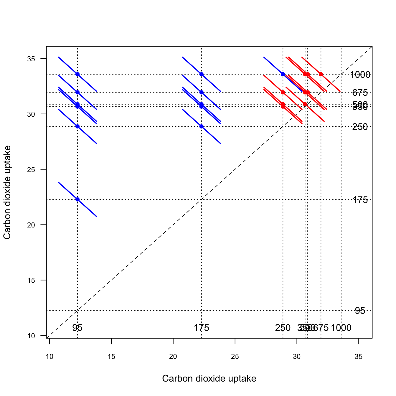
The axes of the diffogram show the levels of the target variable. The factor levels being compared are identified through annotations and vertical/horizontal dotted lines. For example, we see that 95 mL/L concentration leads to an average CO2 uptake of about 12 \(\mu\)mol/m2 sec, the 175 mL/L concentration leads to an average CO2 uptake of about 22 \(\mu\)mol/m2 sec.
A dot is placed at the intersection of two concentration levels and a colored line is drawn at the intersection. The length of the line is a function of the width of the confidence interval for the difference of the two factor levels. If the line reaches the 45 degree reference line, the comparison of the two levels is not statistically significant at the confidence level that applies to the visualization (default is 0.95 confidence level)—these comparisons are drawn with red lines. If the line does not intersect the 45 degree reference line, the comparison is significant.
The diffogram allows you to quickly see which comparisons are significant and reveals patterns between the levels.
Personal Experience
While I was working on the MIXED procedure and was developing the GLIMMIX procedure in SAS, we were also starting to add statistical graphics to SAS procedures. The diffogram in the SAS/STAT procedures that support the LSMEANS statement (GLM, MIXED, GLIMMIX) was part of that effort. A least-squares mean is a SAS construct to estimate the marginal mean of a target variable across a balanced population, even in an unbalanced design. It is based on a special type of estimable function. As you can see from the code above, the concepts have since found their way into R.
Goals of Visualization
Many decisions go into creating a good data visualization. What should we pay attention to? How do we choose a good plot type? How much embellishment of the graph is too little or too much?
Gelman and Unwin (2013) list these basic goals of data visualization:
- Discovery
- Give an overview—a qualitative sense of what is in a data set.
- Convey scale and complexity—a network graph does not reveal the underlying structure but gives a sense of the size and connectivity in the network.
- Exploration—discover unexpected aspects of the data.
- Communication
- Tell a story—to self and others by displaying information in an understandable way. “If we communicate well, we call it storytelling”.
- Attract attention and stimulate interest—graphs are grabby.
Tukey (1993) summarized the purpose of graphical displays in four statements:
Graphics are for the qualitative/descriptive—conceivably the semiquantitative—never for the carefully quantitative (tables do that better).
Graphics are for comparison—comparison of one kind or another—not for access to individual amounts.
Graphics are for impact—interocular impact if possible, swinging-finger impact if that is the best one can do, or impact for the unexpected as a minimum—but almost never for something that has to be worked at hard to be perceived.
Finally, graphics should report the results of careful data analysis—rather than be an attempt to replace it.
The graphic must allow us to compare things, it is not about revealing actual values. The mean or median can be represented as a reference line, as in the boxplot, but you do not need to show the actual value of the mean or median. It exists on the graphic through its relation to other graphical elements. By the same token, Tukey argues that you should not have to display the scale of the horizontal or vertical axis unless that is needed for the interpretation; for example when plotting on a log scale.
You can always add labels that show the values being graphed, but overdoing that turns a graphic into an elaborate tabular display. If that is necessary, then maybe a table is a better way to present the information. The interocular impact Tukey is talking about in 3. is the information that hits the viewer “right between the eyes”.
Example: Baby Names
The third and fourth points are illustrated nicely with the following example from the Gelman and Unwin paper (Figure 18.5).
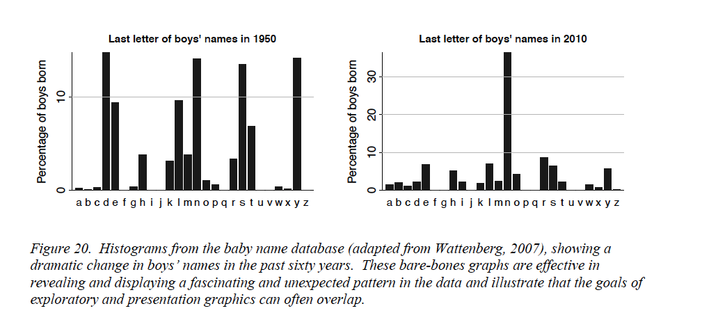
At the start of the 20th century, ten last letters dominated boys’ names, by 1950 that had reduced to six letters. By 2010, the letter “n” stands out; about 1/3 of boys’ names in the U.S. end in “n”! That is interocular impact, it stands out. Is this a spurious effect? What could cause this? What does it mean? Gelman and Unwin, consulting with the authors of the graphic, provide this explanation. Over time, parents felt less constrained in choosing baby names, whereas a hundred years ago they choose from a small set of common names, often picking names of male relatives. Surprisingly, the greater freedom in choosing names nowadays results in selecting soundalikes (Aiden, Caden, Hayden, etc.) resulting in clustering in the last letter. Gelman and Unwin conclude
Nowadays the distribution of names is more diffuse but the distribution of sounds is more concentrated.
Whether this explanation is correct can be debated. It is irrefutable that the visualization prompted an interesting question—it has interocular impact.
Exploratory and Presentation Graphics
Gelman and Unwin (2013) discuss the difference between information visualization, the use of graphics to convey information outside of statistics, and statistical graphics, the use of visualization to convey information in data. Infographics, the result of information visualization, grab your attention and get you thinking. Statistical graphics facilitate a deeper understanding of the data. The two should be related—the information visualized in an Infographic is very often data, and statistical graphics are often not as catchy and beautiful as professional visualizations. There is a good reason for that, and it depends on whether you create graphics in exploratory mode or in presentation mode. What makes a good graphic depends on the mode.
Exploratory Mode
During exploratory work you are trying to get insight into the data. Graphing is about producing a large number of graphics for an audience of one—yourself. Speed, flexibility, and alternative views of the data are of the essence. You do not need to grab your own attention; you already have it. You do not need to provide a lot of context; you already know it. Characteristics of good data visualization in exploratory mode are
- Simple to create
- Multiple views of the data
- Makes you think and curious about digging deeper, stimulates self-interest
- Less is more; graphics show only what they need to
- Enough detail to give insight
Figure 18.2 and Figure 18.3 are examples of exploratory graphics.
Tip
Think of many graphs viewed by one person—yourself.
Presentation Mode
In presentation mode you work on a small number of graphics that are viewed by a much larger audience. The audience is not yourself. You do not have the attention of the audience yet and need to grab it. The audience also does not have full context yet and should be able to construct it from the graphic (and maybe a few other pieces of information). The presentation graphic will have elements such as legends, labels, annotations, and captions that help convey the context.
Characteristics of a good data visualization in presentation mode are (Figure 18.6)
- Grabs attention and draws the reader in; wow factor
- Shows only what it needs to
- A single view; is self-contained
- Tell a story
- Provides context through the visualization itself (legend, caption)
Tip
Think of many people viewing one graph—produced by yourself.
Notice that in both modes graphics should display only what they need to. Avoid excessive annotations, colors, labels, grid lines—the stuff Tufte (1983) and Tufte (2001) refers to as chartjunk. However, what is needed depends on the purpose of the graphic. While less is always more, presentation graphics are more self contained and need to provide information and context that you already have in exploration mode.
Before we dive deeper in the process and best practices of data visualization, let’s spend a moment to explore why graphical displays are so effective in communicating data science. We know “a picture is worth a 1,000 words.” But why?
18.2 Background
Modes of Intelligence
Gardner (1983) coined the idea of multiple intelligences. Rather than a single, general intelligence, the theory suggests that human intelligence is made up of different modalities (Figure 18.7). The modalities most associated with the traditional notion of general intelligence are the linguistic and the logical-mathematical intelligences.
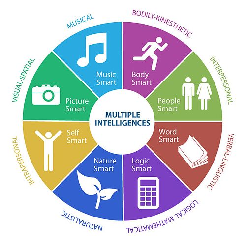
The intelligences (modalities) express themselves as skills or competencies. Someone with high linguistic intelligence learns languages easily and enjoys reading, writing, and storytelling. Someone with well-developed interpersonal intelligence will be able to sense mood and intentions of others—they have high empathy.
Critics of the theory of multiple intelligences object to using the term intelligence to describe what they consider to be just abilities, talents, or aptitudes. There is no experimental data to back up the categorization. Further, Gardner’s theory is based on low correlations between the modes of intelligence, as if they are almost orthogonal. The correlations between different aspects of intelligence are typically strong, however, supporting the idea of a general intelligence.
Despite the criticism, the theory of modes of intelligences is helpful to us in several ways.
It helps to understand the abilities of others and how to adjust communication for the benefit of the recipient. If you are communicating to people who work daily with maps (spatial intelligence), making your point by presenting text or tables adds extra cognitive burden.
It helps to recognize how different abilities are being used in solving data science problems. Except for the naturalistic and musical intelligences, you will likely be challenged as a data scientist to exercise all modes of intelligence. The diversity of thoughts and ways of looking at a problem is a strength of teams (Table 18.4).
| Mode | Skills | Data Science Relevance |
|---|---|---|
| Verbal-Linguistic | Sensitivity to words and their meaning. Includes abstract reasoning and symbolic thinking. Learns languages easily; enjoys reading, writing, storytelling | Need to communicate quantitative information through language |
| Logical-Mathematical | Inductive and deductive reasoning. Recognizing patterns and relationships. Good at problem finding and convergent problem solving. | An essential part of research, discovering relationships, testing hypotheses. Application of abstract rules to specific problems. |
| Visual-Spatial | Mental visualization (seeing with the mind’s eye) and perception of the world. Practical problem solving and artistic creation. | Producing data visualizations and working in abstract, high-dimensional spaces. Design of applications and interfaces. |
| Interpersonal | Establish relationships with others. Sensitivity to other’s moods and intentions. Empathetic. Can be leaders or followers. | Cooperating with and leading others. Essential to working on teams. |
| Intrapersonal | Knowledge of self and ability to reflect and introspect. Predict and manage your own reaction. | Developing abstract theory. Leading and decision making in high-stress situations. |
| Body-Kinesthetic | Control of bodily movements and motor control. Includes sense of timing and sense of goal of physical action. Prefers hands-on learning. | Communicating data science knowledge to hands-on learners. Giving presentations. |
| Musical-Rhythmical | Sensitivity to sounds, rhythms, timber, meter, tones, and pitch. | |
| Naturalistic | Ability to recognize flora and fauna. Nurturing and relating information to one’s natural surroundings. Pattern recognition, taxonomy, and empathy for living beings are essential cognitive skills. | Clearly important in our past as hunters, gatherers, and farmers. Not of great relevance in working with data. |
Learning Styles
Somewhat separate from the modes of intelligence is the concept of learning styles, the different ways in which individuals prefer to learn and absorb information. In fact, a criticism of the Gardner’s multiple intelligence concept is to conflate personality, talent, and learning style. However, to choose the best medium for communicating information, you need to understand what medium works best for the audience.
Tabular and graphical displays complement each other, or in the words of Gelman and Unwin (2013):
[…] a picture may be worth a thousand words, but a picture plus 1000 words is more valuable than two pictures or 2000 words.
According to the VARK theory, there are four predominant learning styles, Visual, Auditory (aural), Read/Write, and Kinesthetic (tactile). Kinesthetic learners learn best through experience and interactions—they are hands-on l earners. Read/Write learners prefer text as input and output; they interact with material through reading and writing. Aural learners prefer to retain information via listening—lectures, podcasts, discussions, talking out loud. Visual learners, finally, retain information best when it is presented in the forms of graphs, figures, images, charts, photos, videos.
It is claimed that about 60% of us are visual learners, 30% are aural learners, and 5% are kinesthetic learners. These percentages are debated as is the concept of distinct learning styles. The scientific consensus is that there is no evidence to support matching people to a single learning style. We show traits of multiple learning styles. Rather than forcing your audience into categories, you should cater communication to different learning preferences and needs.
Story, Graphic, Text
We like to believe statistics such as “60% of individuals are visual learners” because they feel right. Looking at a graphic is more pleasant than looking at a pile of numbers. The reason is not a mode of intelligence or a learning style. It is how humans have evolved and how our brains are wired.
About 100,000 to 135,000 years ago, humans invented language. There is evidence that 100,000 years ago we used language for social uses. The oldest drawing is believed to be about 70,000 years old, resembling symbols (hashtag) rather than the depiction of objects. The oldest cave drawings of figurative art are about 40,000 years old. It took another 35,000 years before writing was invented. The Kish tablet, found in Iraq at the site of the ancient Sumerian city of Kish, has been dated around 3,500 B.C. (Figure 33.8). Interestingly, early forms of writing were highly pictorial.

Figure 18.9 depicts this timeline. The communication modes higher up in Figure 18.9 are more effective because our brains are wired for them.
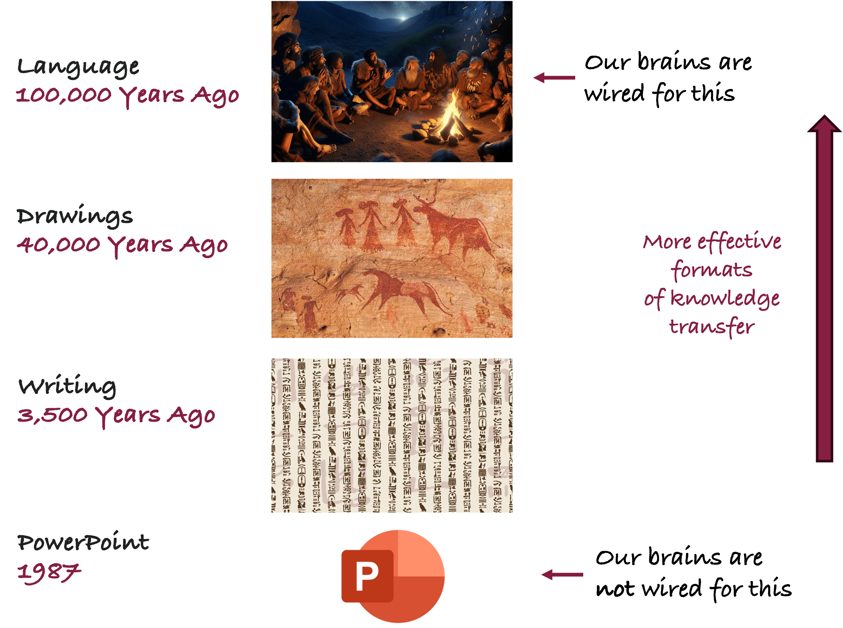
Effective communication draws on storytelling, combining language and visualizations. The more you lean on the modes we have evolved to and we have practiced for a long time, the more easily the audience retains information; the more engaging, fun, and memorable the communication. More on storytelling with data in Chapter 34.
Cognitive Burden
Cognitive burden is the amount of mental work required to complete a task. By reducing the cognitive burden we help the audience to focus on what matters and we make what matters easily consumable. Suppose a graphic is shown on a slide for 30 seconds. If it takes you 20 seconds to decipher symbols, interpret axis labels and legends, compare line types, etc., then the cognitive burden is too high. By the time you figured out what is happening on the graphic, the presentation has moved on. You are getting lost. The fix is not to leave the slide up longer, but to design the visualization in such a way that the information can be effortlessly consumed.
We process information in our sub-conscious and our conscious minds. The sub-conscious is uncontrolled, always on, and effortless—it is your brain on autopilot. The conscious mind is where the hard work happens—it requires effort to engage.
The amount of information processed in the conscious mind is much lower compared to the sub-conscious mind for any of the senses (Figure 18.10). The sub-conscious acts as a filter for information, passing to the conscious mind that which needs more in-depth processing and engagement. We can take in much more information (consciously or sub-consciously) through sight than through any other sense.
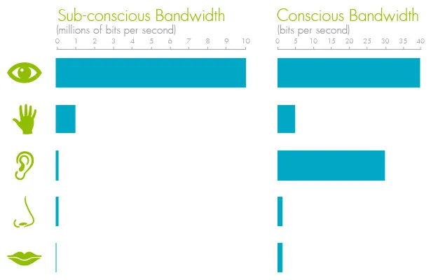
The combination of processing power and bandwidth is why sight is so well suited for understanding data. The more you can engage the autopilot of the sub-conscious mind, the lower the cognitive burden of the visualization. This is where pre-attentive attributes come in.
Pre-attentive Attributes
Pre-attentive attributes are features such as length, width, size, shape, etc., that our brain processes almost instantaneously and with little effort.
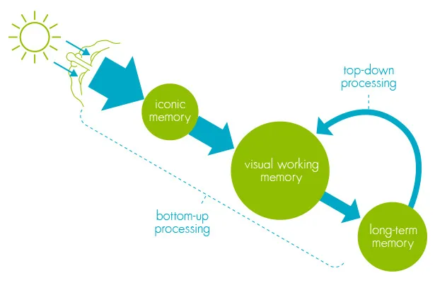
When information (light) enters the retina, it is processed in iconic memory, a short-term buffer and processor that maintains an image of the world and enriches the information. This is where pre-attentive attributes are processed, rapid and massively parallel in the sub-conscious mind. The visual information is then passed on to visual working memory, short-term storage that is combined with information from long-term memory for conscious processing.
Effective data visualizations encode as much possible information through pre-attentive attributes.
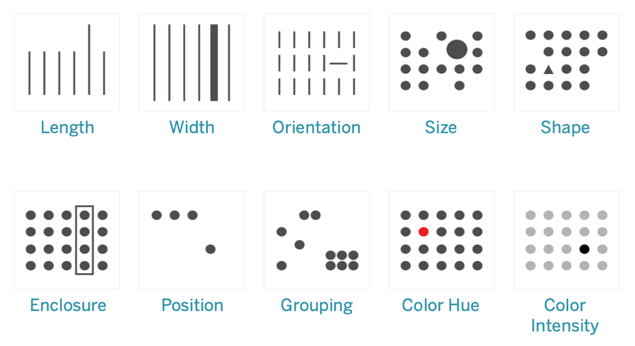
Here are some guidelines about using pre-attentive attributes:
- Quantitative Values
- To encode quantitative values, length and position (in 2-dimensional space) are best as they are naturally interpreted as quantitative.
- Lines of different lengths are more easily interpreted as smaller and larger values than lines of different widths.
- Shapes are not useful to encode quantitative values. Is a circle larger than a square? The answer has a higher cognitive burden and slows down comprehension of the visualization.
- Group Identification
- Shape, color, proximity, and connections are effective pre-attentive attributes to identify groups of data points that belong together.
- Comparisons
- The choice of attributes and features determines whether comparisons are more accurate or more generic.
- The most accurate comparisons are possible using 2-dimensional position and length attributes.
- Color intensity, color hue, area, and volume allow more generic comparisons but are not useful when accuracy is required.
You cannot infer actual values from pre-attentive attributes such as length or size, we only get a greater—lesser impression. Most of the times that is sufficient. Information about actual values has to be added through text, labels, grid lines. These are not pre-attentive attributes but learned symbols that require conscious processing. The effort to comprehend a visualization increases with the addition of non-pre-attentive attributes. You should weigh whether the additional processing effort is justified relative to the information gained. A labeled axis requires fewer annotations and mental processing than labeling every data point with its actual value.
Example: Pie Chart vs Bar Chart
An example of the importance of pre-attentive attributes is the display of quantitative information in pie charts versus bar charts.
The pie chart in Figure 18.12 displays five values and uses area to compare and color to differentiate. Can you tell from the chart whether foo is larger than bar? How does ipsum compare to bar and lorem?
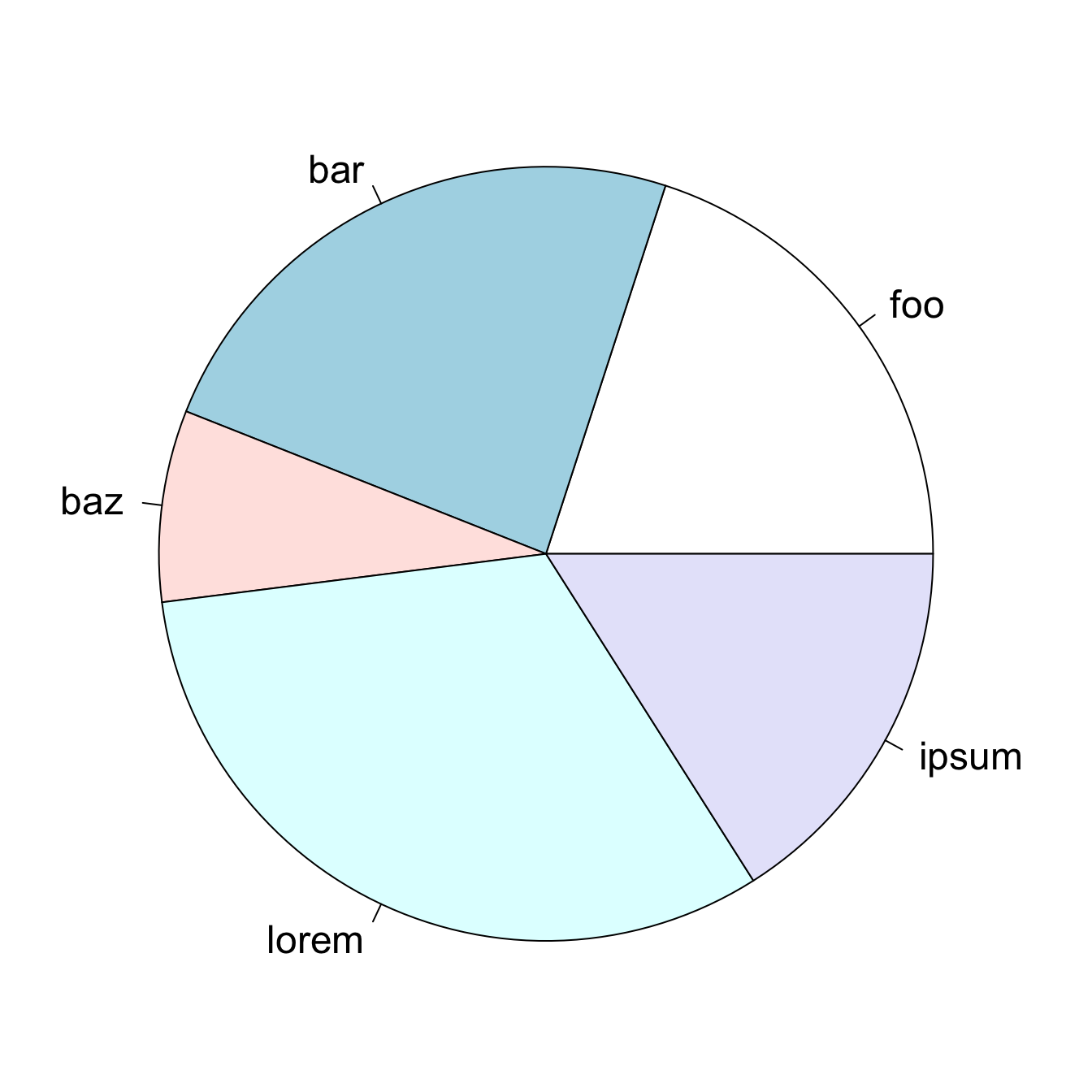
Since it is difficult to make accurate comparisons based on area, why not add labels to the chart? While we are at it, we can also dress up the display by using more color and 3-dimensional plotting.

This allows us to compare the values and conclude which slices of the pie are larger and which slices are smaller. But if we show the percentages, then why use a graphic in the first place? By using labels to show values, the chart requires as much cognitive engagement as a table of values:
| Category | foo | bar | baz | lorem | ipsum |
|---|---|---|---|---|---|
| Percentage | 20 | 24 | 8 | 32 | 16 |
The more vibrant colors do not add to the comprehension of the data and the 3-dimensional display makes things worse: comparing values based on volume is more difficult than comparing values based on area which in turn is more difficult than comparing values based on length.
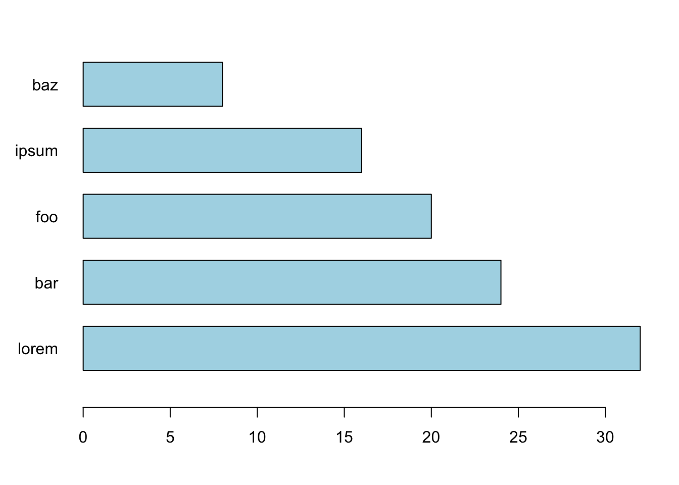
Quantitative values can be encoded as pre-attentive attributes and comparisons are most accurate for lines and 2-dimensional positions. Figure 18.13 visualizes the data using pre-attentive attributes. The values are easily distinguished based on the length (height) of the bars. The categories have been ordered by magnitude. No color is necessary to distinguish the categories, the labels are sufficient.
Chartjunk
The term chartjunk was coined by Edward Tufte in his influential (cult) 1983 book “The Display of Quantitative Information” (Tufte 1983, 2001). Chartjunk are the elements of a data visualization that are not necessary to comprehend the information. Chartjunk distracts from the information the graph wants to convey. Tufte, who taught at Princeton together with John W. Tukey, subscribed to minimalist design: if it does not add anything to the interpretation of the data, do not add it to the chart.
The excessive use of colors, heavy grid lines, ornamental shadings, unnecessary color gradients, excessive text, background images, excessive annotations and decorations are examples of chartjunk. Not all graphical elements are chartjunk—you should ask yourself before adding an element to a graphic: is it helpful? Text annotations can be extremely helpful, but overdoing it can lead to busy charts that are not intelligible. By adding too many text labels, the label avoidance algorithm of graphing software might place labels in areas of the graph where they are misleading. If grid lines are not necessary for the interpretation of the graphic, leave them off. If grid lines are helpful, add them in a color or with transparency that does not distract from the data in the graph. Unfortunately, it is all too easy to add colors, styles, annotations, grid lines, inserts, legends, etc. to graphics. Software makes it easy to overdo it.
The graphic in Figure 18.14 is a great example of a chart with lots of junk. There are exactly five unique numbers: the percentage of college students under 25 years of age between 1972 and 1976. Any other value in the display can be derived from those. Showing the the percentages and their complement adding to 100% is not necessary. The percentage of students age 25 and over is implied by the percentage of students under age 25. Each set of percentages is displayed with two colors—and different sets of colors for good measure. The 3-dimensional bars do not add anything, neither do the rounded bars. Choosing to graph the percentages over a limited range of values (28–34% for the students age 25 and over) visually exaggerates the differences between the years—that is bad form. Finally, connecting the percentages across years suggests some form of trend over time.
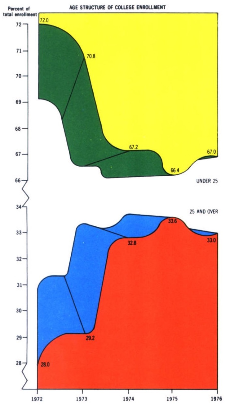
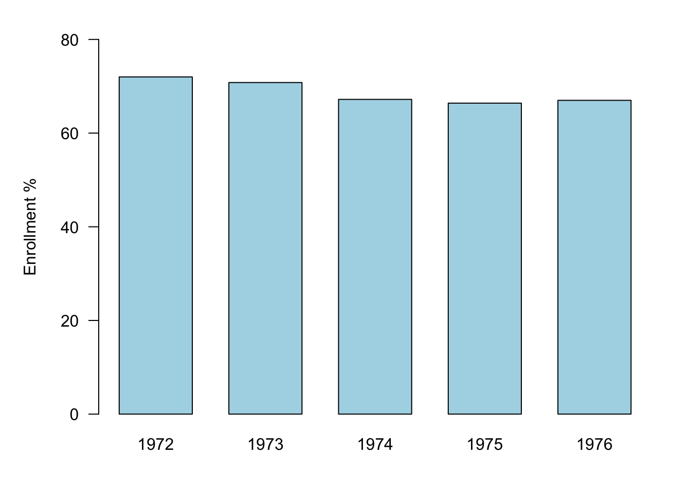
Figure 18.15 is a cleaned-up version of the same data, showing enrollment percentages for the students under 25 years of age. By including zero on the vertical axis, the true differences between the years are revealed. The changes are much less dramatic than Figure 18.14 suggests.
Tufte’s war path on chartjunk needs to be moderated for our purposes. The minimalist view that anything that is unnecessary to comprehend the information is junk goes too far. We must keep the purpose of the data visualization in mind. In exploratory mode, you generate lots of graphics and different views of the data to learn about the data, find patterns, and stimulate thought—the audience is you. Naturally, we eschew adding too many elements to graphics, everything is about speed and flexibility—polish takes time. In presentation mode, the data visualization needs to grab attention and open the door for the audience to engage with the data. Annotations, colors, labels, headlines, titles, which would be chartjunk in exploratory mode, have a different role and place in presentation mode. They might not be necessary to comprehend the information but can reduce the cognitive burden the audience members have to expend.
Tufte also introduced the concept of the data-ink ratio: a visualization should maximize the amount of ink it uses on displaying data and minimize the amount of ink used on embellishments and annotations. Figure 18.14 certainly fails the data-ink ratio test.
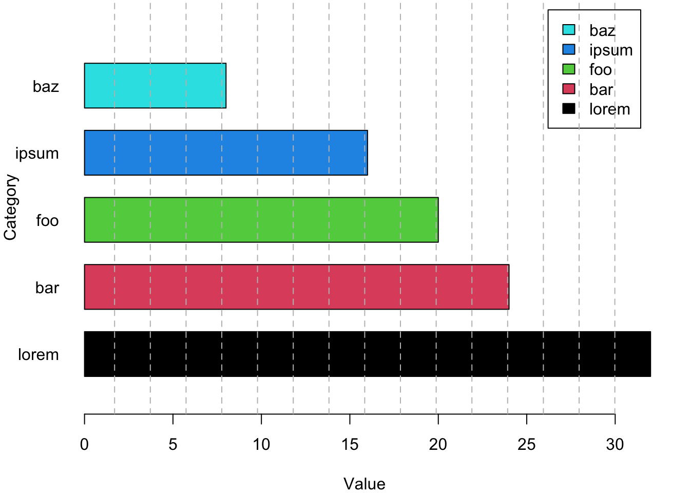
Figure 18.16 is a junkified version of the bar chart in Figure 18.13—it is full of chartjunk and devotes too much ink to things other than data:
- The legend is not necessary; categories are identified through the labels.
- The axis label “Category” is not necessary, it is clear what is being displayed.
- The vertical orientation of the axis label and the horizontal orientation of the categories is visually distracting.
- Varying the colors of the bars is distracting and does not add new information. The relevant information for comparison is the length of the bars.
- The grid lines are intrusive and add too much ink to the plot.
18.3 Process and Best Practices
The data visualization process starts with defining the intention of the visualization:
What is the context for the graphic? Are you in exploratory mode to learn about the data or are you in presentation mode to tell the story of the data?
What is the statistical purpose of the visualization? Are you in a classification, regression, or clustering application? Are you describing the distributions and relationships in the data or the result of training a model?
What is the data to be visualized? Is it raw data or summarized data or data derived from a model?
The next step in the process is to examine candidate visualizations and to select a concept. Libraries of graphics examples come in handy at this step. Here are some sites that show worked graphics examples:
R Graph Gallery: an extensive collection of graphics in R using base R graphing functions and ggplot2.
Python Graph Gallery: an extensive collection of graphics in Python organized like the R gallery. Also offers tutorials for Matplotlib, Seaborn, Plotly, and Pandas.
MakeoverMonday: this is a social data visualization project in the UK that posts a new data set every Monday and invites users to visualize the data. Several visualizations are chosen and displayed in the gallery and the blog each week. The site is also a great resource for data sets.
Data Viz Project: a collection of data visualizations to get inspired and find the right visualization for your data. The project is run by Ferdio, an infographic and data viz company in Copenhagen.
Dataviz Inspiration: Hundreds of impactful data visualization projects from the person behind the R Graph Gallery. With code where available.
Information is Beautiful: great visualizations of good news, positive trends, and uplifting statistics.
Datylon’s Inspiration: Datylon is a data visualization platform, this page shows visualizations by category created with Datylon.
The next step is to implement the chosen design and to perform the Trifecta checkup discussed in more detail below. Finally, it is a good idea to test the visualization with others and to get constructive feedback on what works and what does not. Does the visualization achieve the goals set out in the first step of the process? What attracts the audience, what distracts the audience?
The Trifecta checkup
The data visualization expert Kaiser Fung created a framework to critique data visualizations. It is recommended that you run your visualizations through this checkup. It rests on three simple investigations:
Q: What question are we trying to answer?
D: What do the data say?
V: What does the visualization say?
Hopefully, the answers to the tree lines of inquiry are the same. The framework is arranged in a Question—Data—Visualization triangle, in what Fung calls the junk charts trifecta:
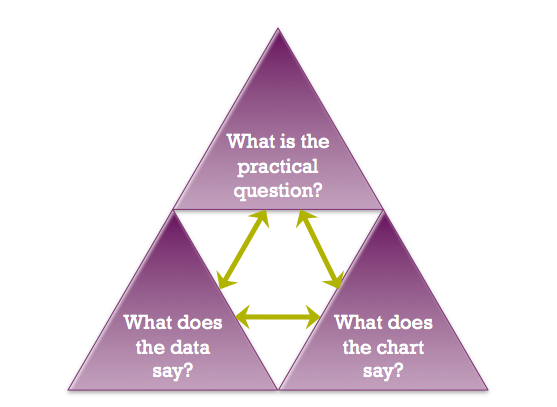
A good visualization scores on all three dimensions, Q—D—V. It poses an interesting question, uses quality data that are relevant to the question, and visualization techniques that follow best practices and bring out the relevant information (without adding chartjunk). Tufte’s concerns about chartjunk and maximizing the data-ink ratio fall mostly in the V corner of the trifecta. But even the best visualization techniques are useless when applied to bad or irrelevant data or attempting to answer an irrelevant or ill-formed question.
An example of a graphic that fails on all three dimensions is discussed by Fung here and shown below. This graphic appeared in the Wall Street Journal.
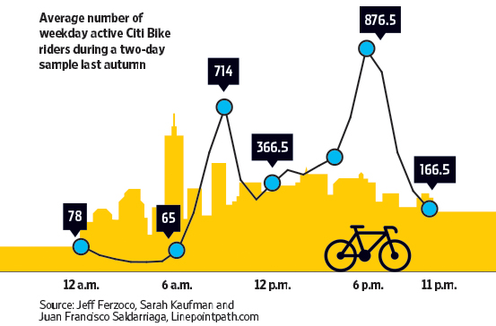
Q—What question are we trying to answer?
How many riders use Citi Bike during a weekday? That is not a very interesting question, unless you are a city planner. Even then, you are more interested in when and where the bikes are used, rather than some overall number. The chart breaks the daily usage down over time. We see that most riders are in the morning and early evening—going to work and leaving work. That too is not very interesting and not at all surprising.D—What do the data say?
The data were collected on two days in the fall. What does this represent? Certainly not the average usage over the year. How were those two days selected? Where was the data collected? Randomly throughout the city, only downtown, in certain districts? What was sampled? The days of the months? The riders? The city districts?V—What does the visualization say?
Does the graphic answer the question using best practices for data visualization? There is much going wrong here.The city background is chartjunk, an unnecessary embellishment that does not add any information.
Similarly, the bicycle icon is unnecessary. It might be moderately helpful in clarifying that “Bike” refers to bicycle and not motorbike, but that could be made clear without adding a graphics element.
The blue dots and the connecting lines are a real problem. How are the connections between the dots drawn? Are the segments (some curved, some jagged) based on observations taken at those times? If so, the data should be displayed. If not, what justifies connecting the dots in an irregular way?
The scale of the data is misleading. If there was a vertical axis with labels, one could clearly see that the dots are not plotted along an even scale. The vertical distance between the points labeled 65 and 166.5 is about 100 units and is greater than the distance between the points labeled 166.5 and 366.5, about 200 units apart. Once we discover this, we can no longer trust the vertical placement of the dots. Instead, we must make mental arithmetic to interpret the data by value. Displaying the data in a table would have had the same effect.
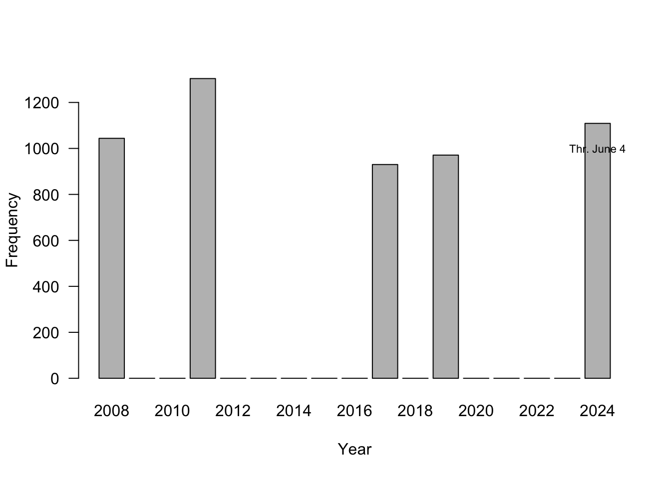
Figure 18.19 is a screenshot from a local TV newscast in Virginia; it shows a histogram for the five most active years in terms of number of tornadoes. Does this graphic pass the trifecta checkup?
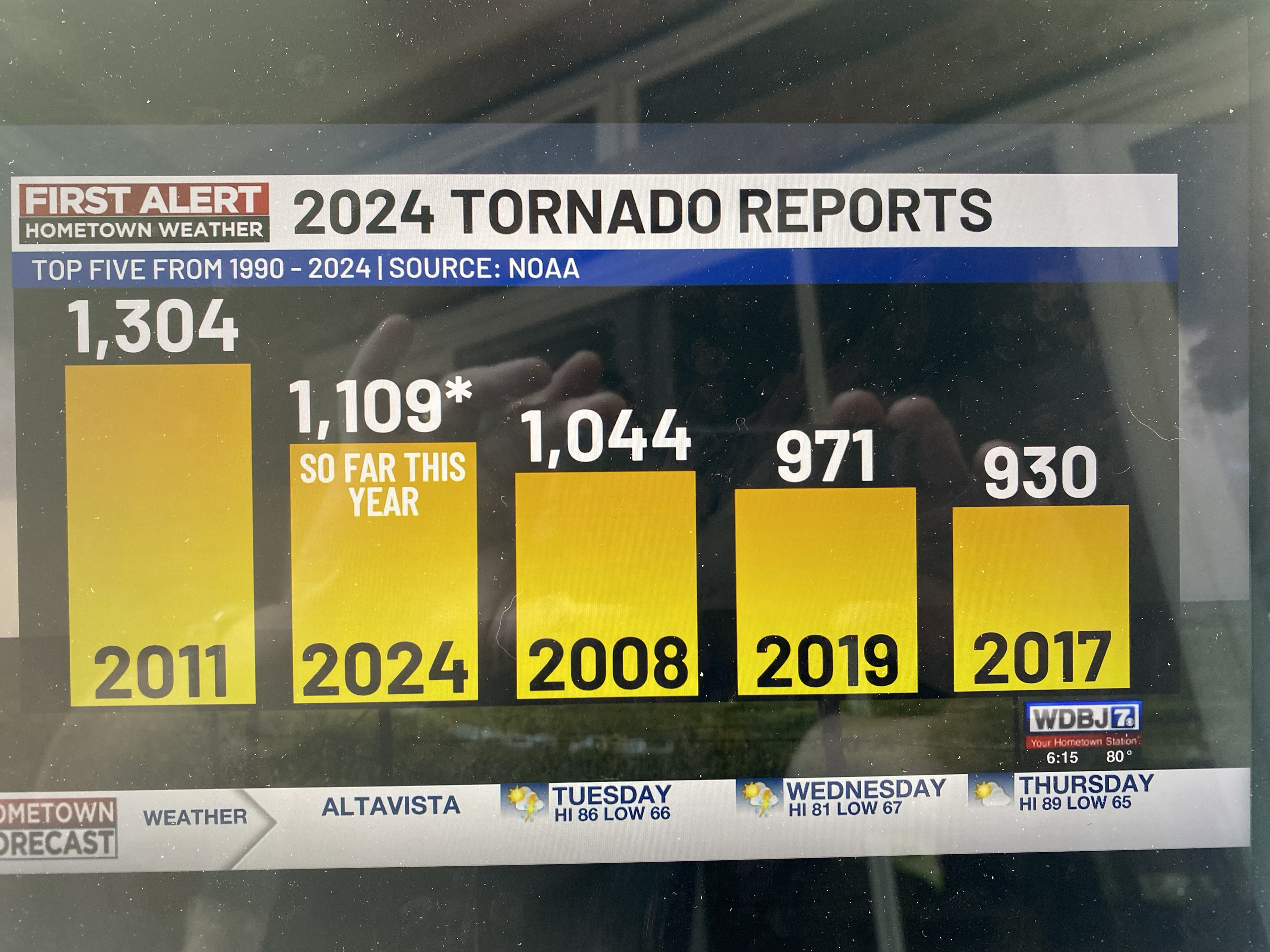
Q—What question are we trying to answer?
Is 2024 an unusual year in terms of tornado activity?D—What do the data say?
2024 is among the top-5 years of tornado activity. But we do not know whether this is for the entire U.S., the entire world, or for the state of Virginia? It is probably not the latter, 1,000 reported tornadoes per year in Virginia is a bit much. How far along are we in 2024 when this was reported? 2024 might not be an unusual year compared to the top-5 if the report was issued at the end of tornado season; 2024 might be an outlier if the report was issued early on in the tornado season.V—What does the visualization say?
There is a lot going on in the visualization. The bars are ordered from high to low, which disrupts the ordering by time. The eye is naturally drawn to the year labels at the bottom of the bars and has to work overtime to make sense of the chronology. When data are presented in a temporal context our brain wants the data arranged by time (Figure 18.20). The asterisk near the number 1,109 for 2024 leads nowhere. We associate it with the text in the bar for that year anyway, so the asterisk is not necessary. The visualization does not tell us what geographic region the numbers belong to. Is this global data or U.S. data?
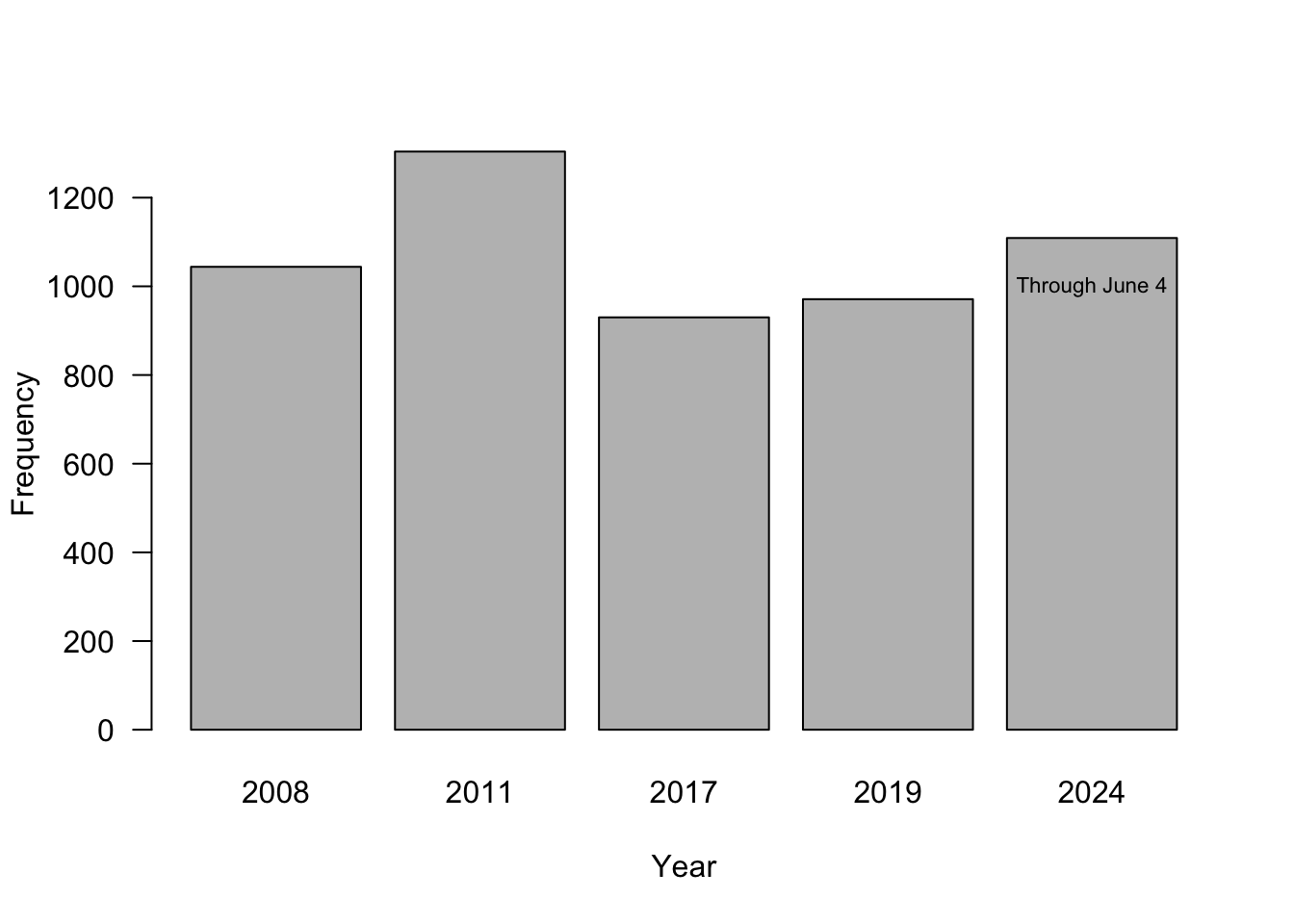
The problem with using a bar chart for select years only is not to give an accurate impression of how far the data points are separated in time. The first two bars are 3 years apart, the next two bars are 6 years apart. Figure 18.21 fixes that issue by spacing the bars approrpriately.
Infographics
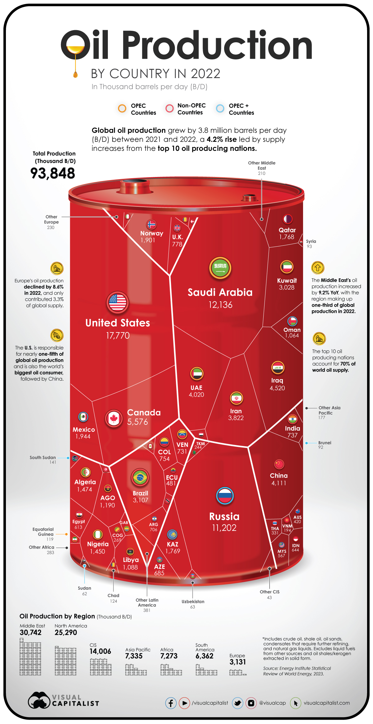
Infographics are often guilty of adding extraneous information or displaying data in sub-optimal (nonsensical) ways. Below is another example from Junk Charts. The graphic visualizes the 2022 oil production measured in 1,000 barrels per day by country. The data are projected onto a barrel. Countries are grouped by geographic region and by an industry-specific classification into OPEC, non-OPEC, and OPEC+ countries. The geographic regions are delineated on the barrel surface with thick white lines. Thin white lines mark polygons associated with each country. Aggregations by geographic region are shown below the barrel. The industry-specific categorization is displayed as colored rings around the country flag.
Shapes are not a good pre-attentive attribute to display values, and polygons are particularly difficult to comprehend. Presumably, the size of the country polygons is proportional to their oil production—but who knows, there is no way of validating this. The use of polygons increases the cognitive burden to comprehend the visualization.
The visualization contains duplicated information:
Each polygon is labeled with the countries’ oil production; this information duplication is required to make sense of the data because the polygon area is difficult to interpret.
Greater/lesser oil production by country is also displayed through the size of the map inserts and the font (boldness and font size) of the country names.
The country information is duplicated unnecessarily. Countries are shown by name and with their flags. Some country names are abbreviated, and this adds extra mental processing to identify the country. If you are not familiar with working with country codes, identifying the oil production for Angola is tricky (AGO).
The geographic summaries display totals as labels and graphically by stacking barrel symbols; each barrel corresponds to 1,000 barrels of oil produced per day.
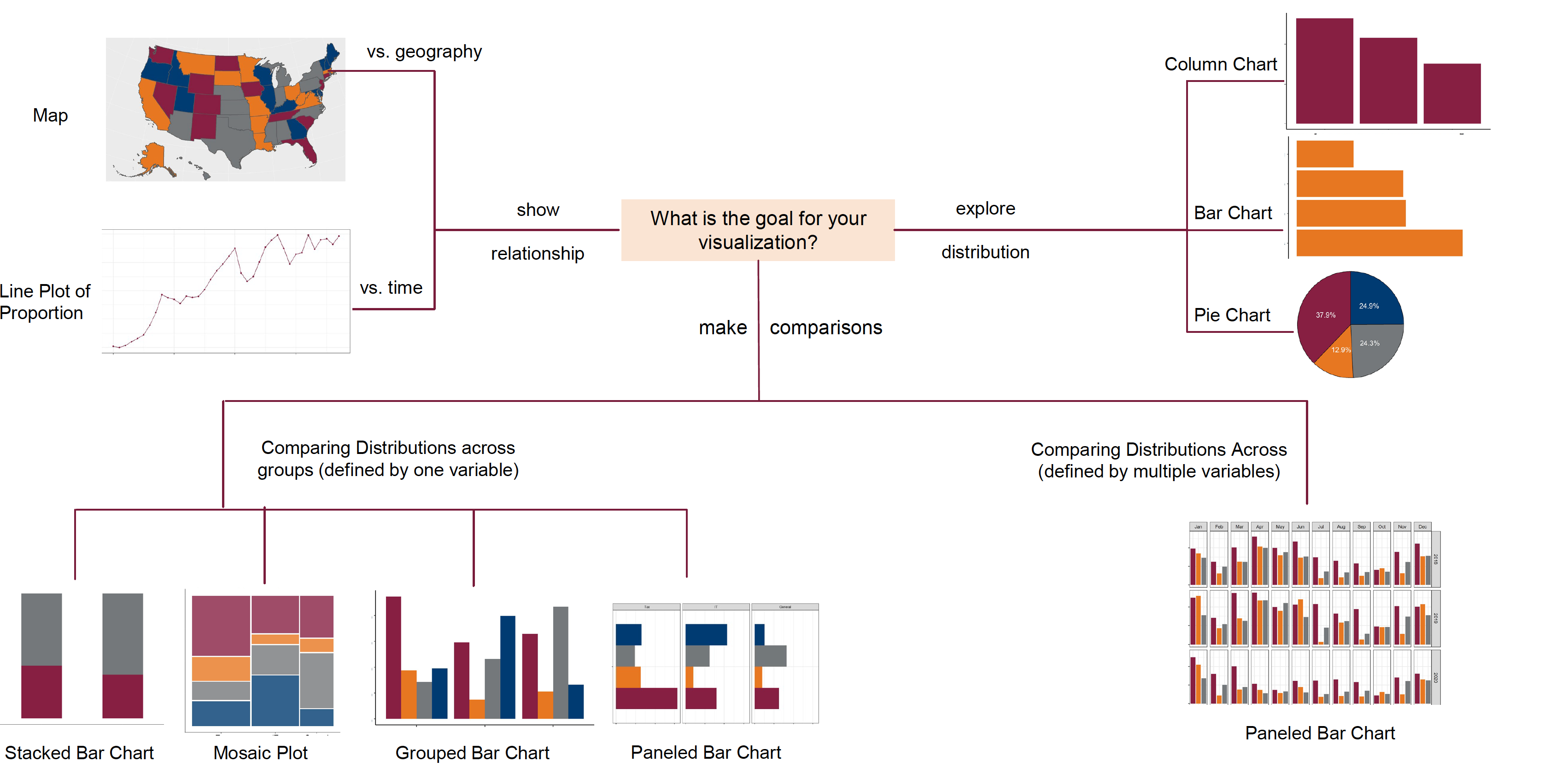
Choosing the Data Visualization
Andrew Abela published the Chart Chooser, a great visualization to help select the appropriate data visualization based on the data type and the goal of the visualization (Figure 18.23, Abela (2020)). An online version with templates for PowerPoint and Excel is available here.
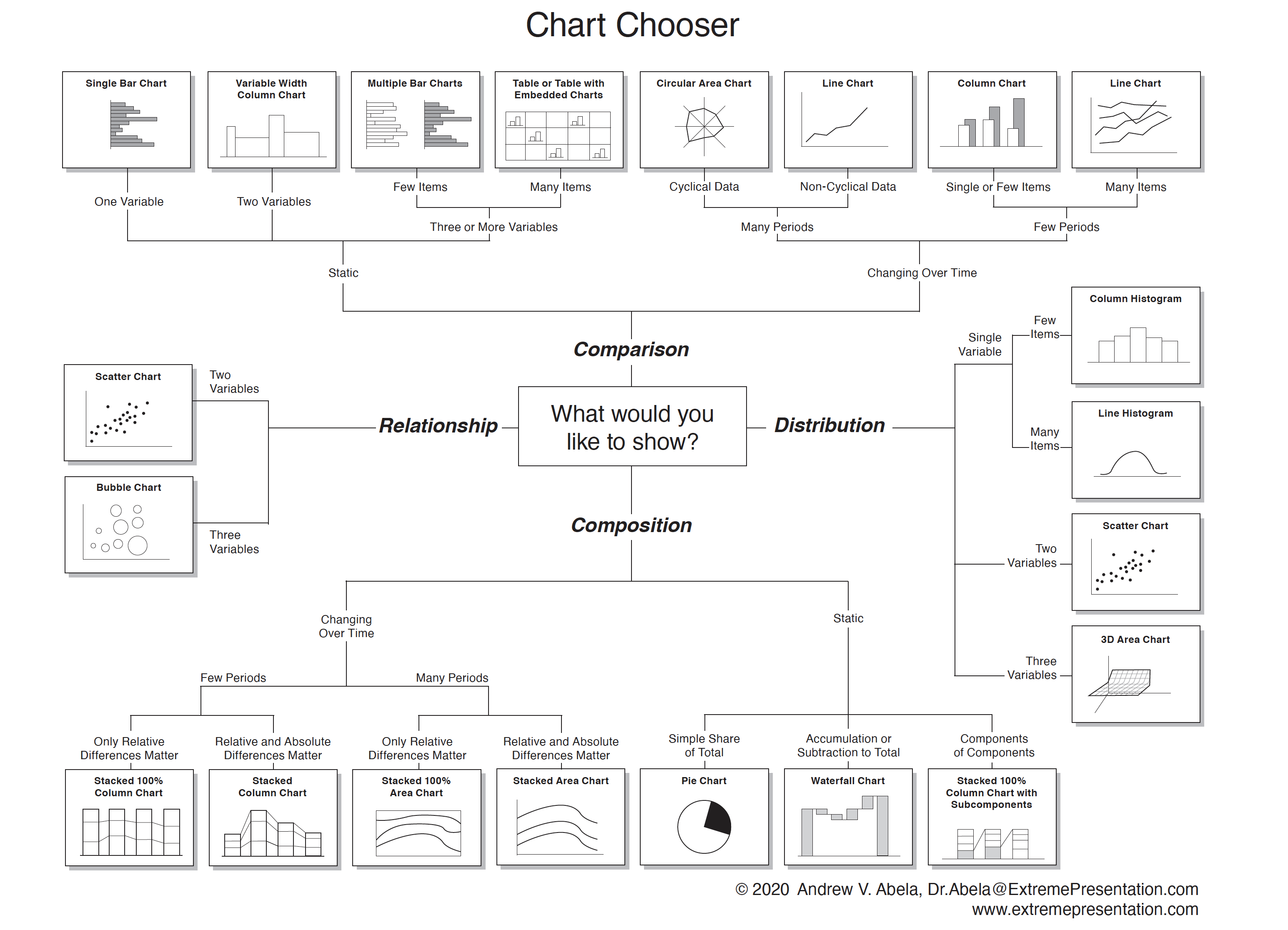
To select a chart type, start in the center of the chooser with the purpose of the visualization. Do you want to compare items or variables? Do you want to see the distribution of one or more variables? Do you want to show the relationship between variables or how totals disaggregate?
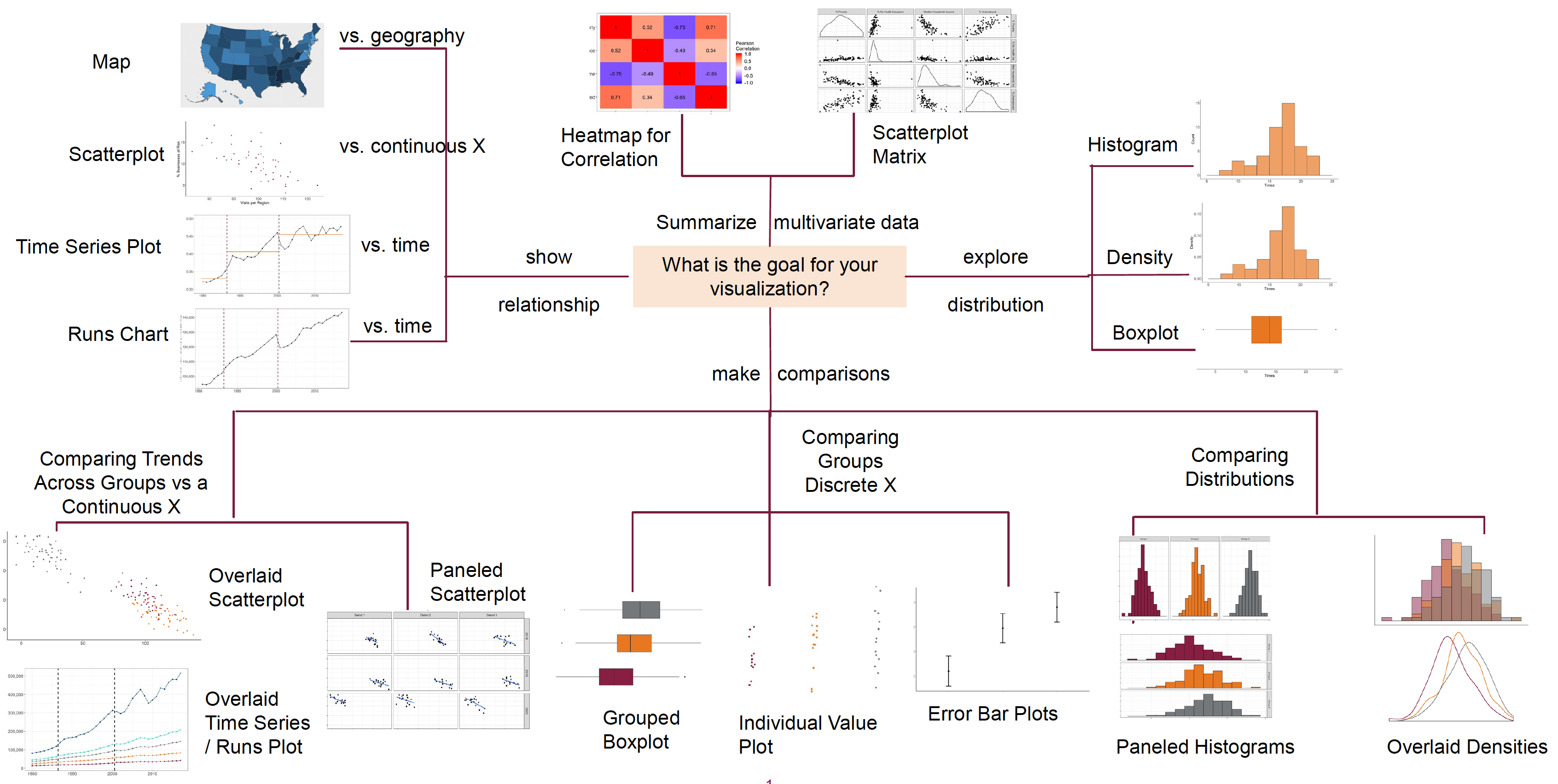
The next two figures show adaptations of the Chart Chooser for continuous and discrete target variables by Prof. Van Mullekom (Virginia Tech).
Example: Monthly Temperature Data
Suppose you wish to display the monthly temperatures in four cities, Chicago, Houston, San Diego, and Death Valley. The goal is to compare the temperature throughout the year between the cities. According to the chart chooser for continuous target variables, a paneled scatterplot or overlaid time series plot could be useful. Since the data are cyclical, we could also consider a cyclical chart type.
A sub-optimal chart type, possibly inspired by plotting temperature, would be a “heat” map. Heat maps are used to display the values of a target variable across the values of two other variables, using color-type attributes (color gradient, transparency, …) to distinguish values. Here, temperature is the target variable, displayed across city and month.
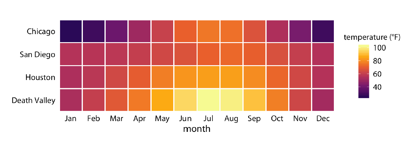
You can think of a heat map as the visualization of a matrix; the row-column grid defines the cells, and the color depends on the values in the cells. When properly executed, the heat map reveals patterns between the variables, such as hot spots. Correlation matrices are good examples for the use of heat maps. Also, when you are plotting large data sets, binning the data and using a heat map can reveal patterns while limiting the amount of memory needed to generate the graph. An example is a residual plot for a model with millions of data points.
The problems with using the heat map in this example are:
There is no specific ordering between Chicago, San Diego, Houston, and Death Valley. The cities on the vertical axis are not arranged from North to South either. Death Valley Junction is further north than San Diego and Houston; Houston is the southern-most city of the four. Heat maps are best used when the vertical and horizontal axis can be interpreted in a greater/lesser sense or when both axis refer to the same categories.
The cyclical nature of the year is somewhat lost in the display. January connects to December in the same way that it connects to February.
Colors are not a good pre-attention attribute for value comparisons. It is clear that the summer months are hotter in Death Valley than in the other cities, but how much hotter?
A lot of ink is spent on coloring the squares.
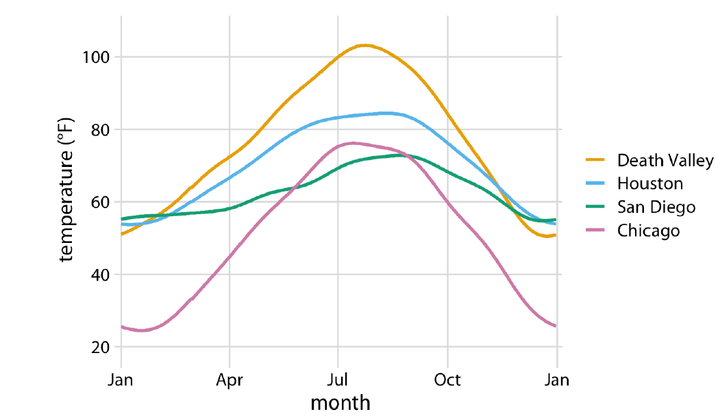
A simpler—and more informative—display of the same data is shown below. A line chart of temperature by month, separate for each location. The differences between the cities are easier to see. The cyclical nature of the data is hinted at through the \(x\)-axis label—it begins and ends with January. The grid lines help to identify the actual temperature values.
Data visualization is only one method of information visualization. The interactive periodic table of visualization methods, presents visualization of data, methods, information, strategy, metaphors, and concepts, in the form of a periodic table. Hover over an element to see an example of the visualization method.
Grammar of Graphics (ggplot)
The grammar of graphics was described by statistician Leland Wilkinson and conceptualizes data visualization as a series of layers, in an analogy with linguistic grammar (Wilkinson 2005). Just like a sentence has subject and predicates, a scientific graph has parts.
The grammar of graphics is helpful because we associate data visualization not by the name of this plot or that chart type, but by a series of elements, depicted as layers. Rather than thinking of a histogram, the visualization is built from the ground up; that it is a histogram is defined in the geometries layer.
Each graphic consists of at least the following layers:
- The data itself (Data layer)
- The mappings from data attributes to perceptible qualities (Aesthetics layer)
- The geometrical objects that represent the data (Geometries layer)
In addition, we might apply statistical transformations of the data, must place all objects in a 2-dimensional space and decide on presentation elements such as fonts and colors. And if the data consist of multiple groups, we need a faceting specification to organize the graphic or the page in multiple groups.
Figure 18.28 shows the layered representation of the grammar of graphics.
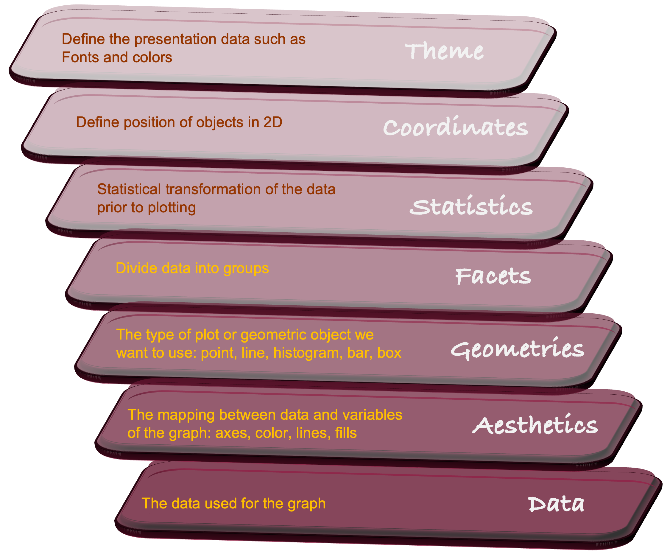
Thinking about data visualization in these terms is helpful because we get away from thinking about pie charts and box plots and line charts, and move toward thinking about how to organize the basic elements of a visualization.
R programmers are familiar with the grammar of graphics from the ggplot2() package. The grammar of graphics paradigm is implemented in Python in the plotnine library.
The following statements generate a data visualization from data frame df (layer 1). This data frame contains data from 196 observations of the optic nerve head from patients with and without glaucoma. The aes() function defines the aesthetics layer, associating variable eag with the \(x\)-axis and specifying variable Glaucoma as a grouping variable (eag is the global effective area of the optic nerve head measured on a confocal laser image). The geometries and statistics layers are added to the previous layers with the geom_density() function, requesting a kernel density plot. The scale_x_log10() function modifies the data-to-aesthetics mapping by applying a log10 scale to the \(x\)-axis. The result is a grouped density plot on the log10 scale.
library(duckdb)
library(tidyverse)
con <- dbConnect(duckdb(),dbdir = "../ads.ddb",read_only=TRUE)
df <- dbGetQuery(con, "SELECT eag, Glaucoma from glaucoma;")
dbDisconnect(con)
df$Glaucoma <- as.factor(df$Glaucoma)
df %>% ggplot(aes(x=eag, group=Glaucoma, fill=Glaucoma)) +
geom_density() +
scale_x_log10()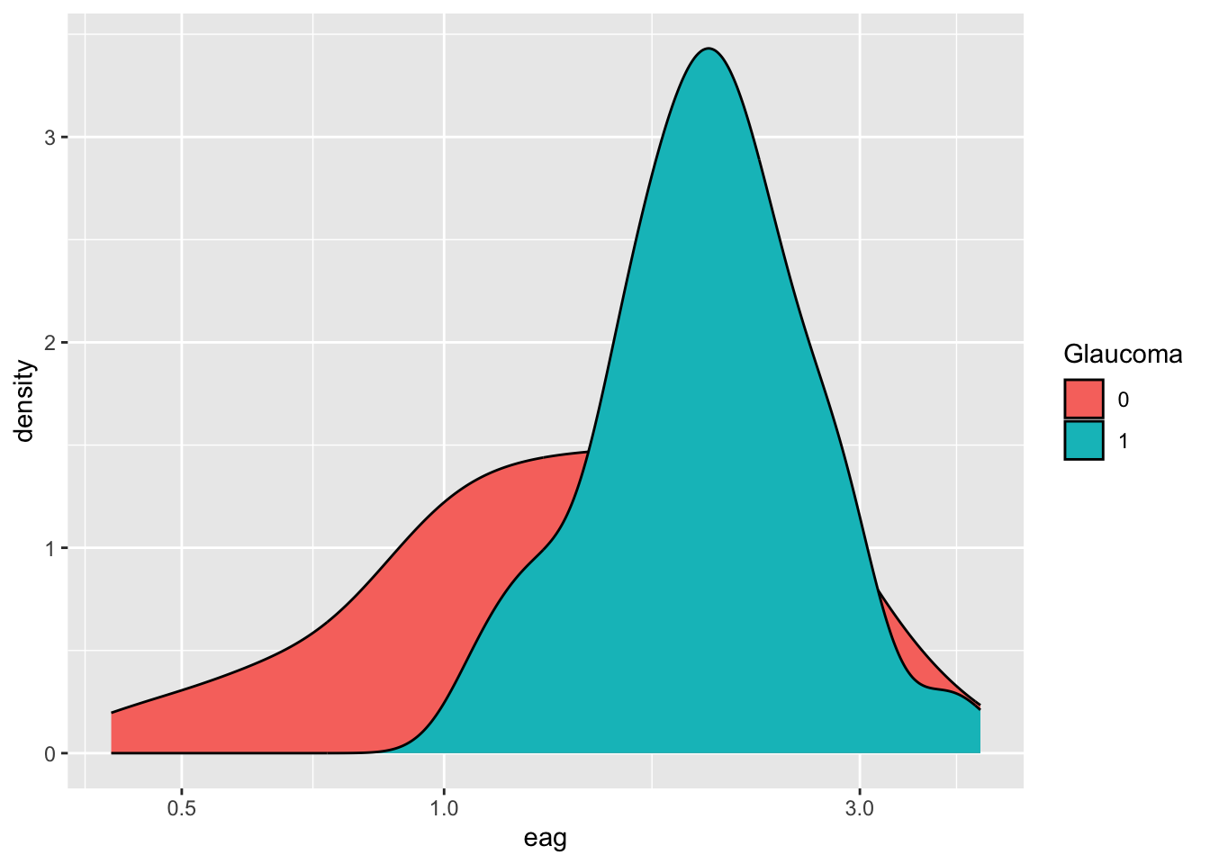
from plotnine import ggplot, aes, geom_density, scale_x_log10
df = con.sql("SELECT eag, Glaucoma from glaucoma;").df()
plot = (ggplot(df, aes(x="eag", group="factor(Glaucoma)", fill="factor(Glaucoma)"))
+ geom_density(alpha=0.7)
+ scale_x_log10())
plot.show();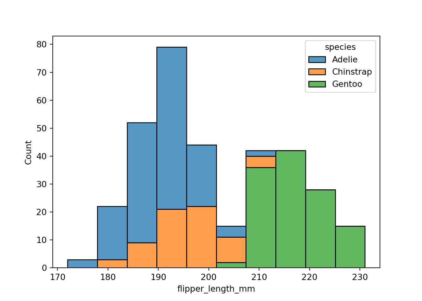
ggplot works out of the box with Polars DataFrames:
glauc_pl = con.sql("SELECT eag, Glaucoma from glaucoma").pl()
plot = (ggplot(glauc_pl)
+ aes(x="eag", group="factor(Glaucoma)", fill="factor(Glaucoma)")
+ geom_density(alpha=0.7)
+ scale_x_log10())
plot.show();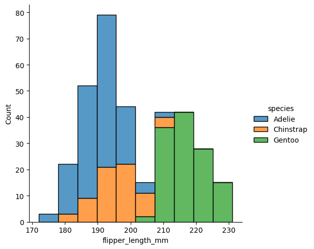
18.4 Data Visualization with R
Visualizing data in R generally follows one of the following paradigms:
Relying on the basic graphics in
Rsuch asplot,pairs,hist, etc.Using a package that provides special graphics capabilities, for example
rpart.plotto display decision trees built withrpart, or functions in thefactoextrapackage to visualize results from multivariate analyses and clustering, or thelatticepackage for conditional (trellis) plots.Using the
ggplot2package from thetidyverseto build grammar of graphics-style visualizations.
Basic Graphics in R
A wide variety of plotting functions come with the base graphics package. To see all functions in that library, check out the following command:
library(help="graphics")For data science applications, the most important plotting functions are
plot: generic function for plotting ofRobjectssmoothScatter: smoothed color density representation of a scatter plotpairs: matrix of scatter plotshist: histogram of the given data valuesacf: computes (and by default plots) estimates of the auto-correlation functionboxplot: box-and-whisker plot(s) of the given (grouped) valuesbarplot: bar plot with vertical or horizontal barsdotchart: Cleveland’s dot plotrug: Adds a rug representaion to another plotpie: draw a pie chartstars: star (segment) plots and spider (radar) plotscontour: contour plot, or add contour lines to an existing plotimage: grid of colored or gray-scale rectangles with colors corresponding to the values in z
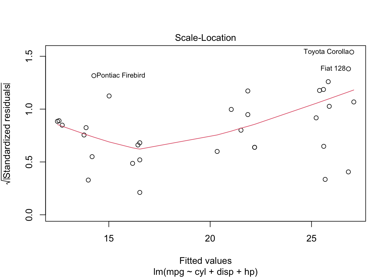
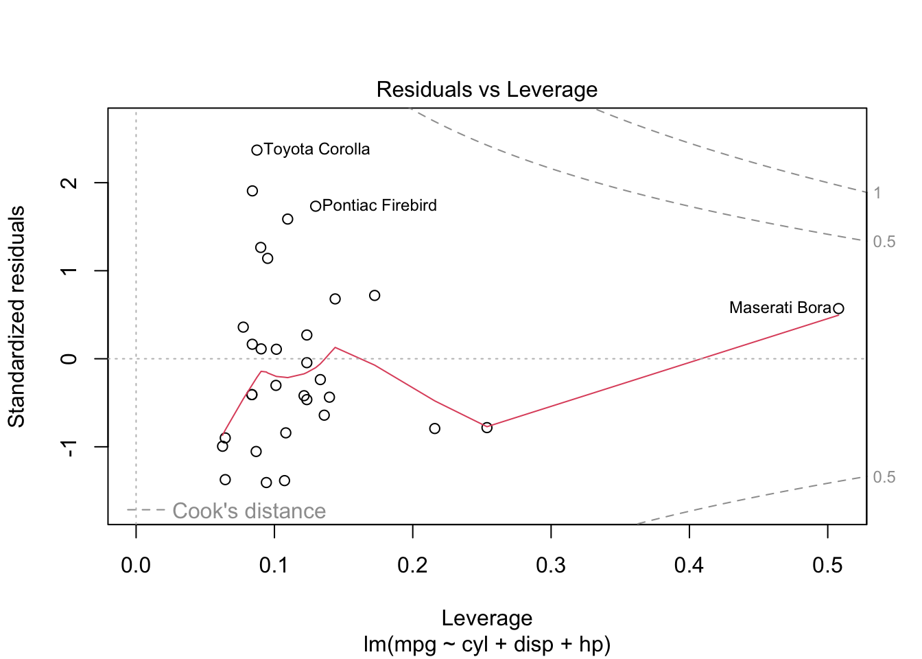
plot is both the generic scatterplot function and a generic plotting function for other R objects. For example, when passed an output object from lm, plot produces a series of diagnostic plots:
reg <- lm(mpg ~ cyl + disp + hp, data=mtcars)
plot(reg)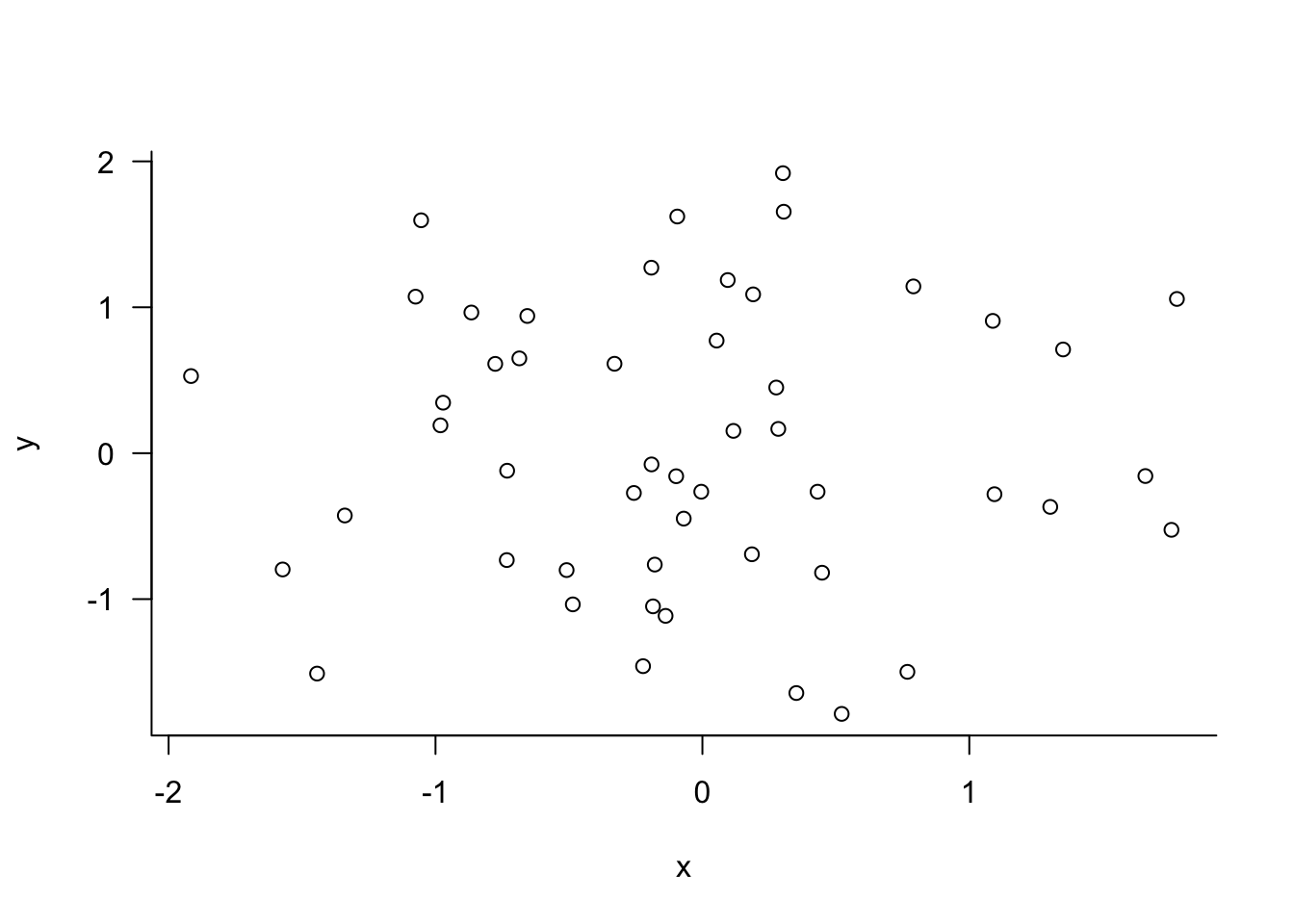
Other graphic functions support the previous
lines: A generic function taking coordinates and joining the corresponding points with line segmentsablines: This function adds one or more straight lines through the current plotpoints: draws a sequence of points at the specified coordinatespanel.smooth: simple panel plotpolygon: polygon draws the polygons whose vertices are given in x and ysymbols: this function draws symbols on a plotarrows: add arrows to a plotaxis: add an axis to a plotlegend: add a legend to a plotmtext: writes text into the margin of a plottext: adds text (one or a vector of labels) to a plottitle: add titles (main, sub) and labels (xlab, ylab) to a plot
The behavior of the graphics functions can be modified with parameters. There are two ways to pass parameters to a plot: specify it as part of the function call, or use the generic par function.
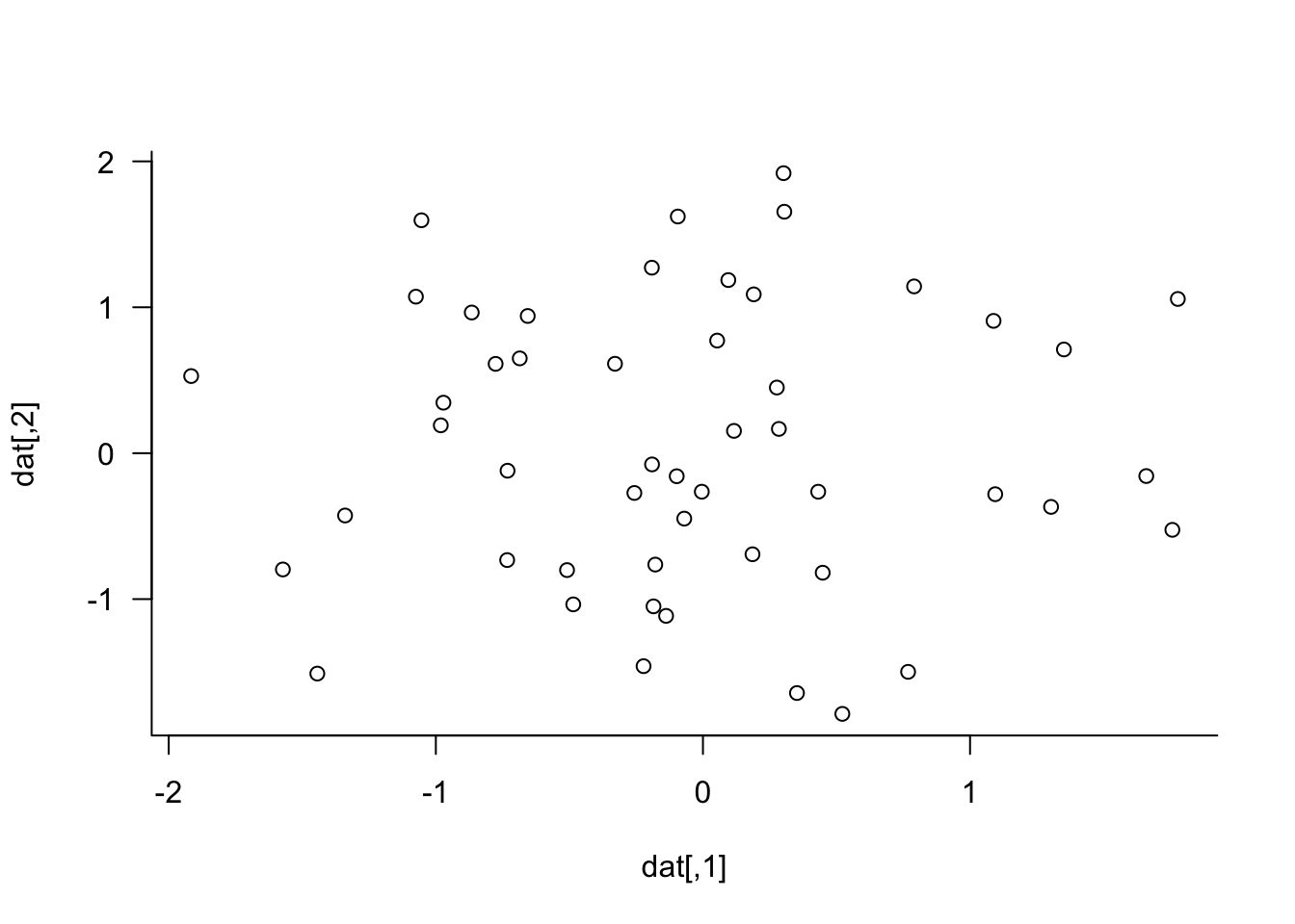
set.seed(543)
dat <- matrix(rnorm(100),nrow=50,ncol=2)
plot(dat, las=1, bty="l", xlab="x", ylab="y")
par(las=1, bty="l")
plot(dat)
xlab= and ylab= are not graphical parameters, they are passed in the plot function. las= and bty= are graphical parameter that determine the style of axis labels and the boundary box of the plot. These parameters can also be passed in the par function. Check the documentation for parameters that are set or queried with par.
18.5 Data Visualization with Python
A large number of Python tools are available for data visualization. You can find the open-source software tools at PyViz.org. From this page of all OSS Python visualization tools on PyViz, you see that many of them are built on the same backends, primarily matplotlib, bokeh, and plotly.
Matplotlib
The matplotlib library was one of the first Python visualization libraries and is built on NumPy arrays and the SciPy stack. It pre-dates Pandas and was originally conceived as a Python alternative for MATLAB users; that explains the name and why it has a MATLAB-style API. However, it also has an object-oriented API that is used for complex visualizations.
While you can do anything in matplotlib, it can require a lot of boilerplate code for complex graphic; other libraries are providing higher-level APIs to speed up the creation of good data visualizations. Packages such as seaborn are built on matplotlib, so the general vernacular and layout of a seaborn chart is the same as for matplotlib. You can find the extensive matplotlib documentation here.
Seaborn
The seaborn library has a higher-level API built on top of matplotlib and is deeply integrated with Pandas, remedying two of the frequent complaints about matplotlib. Seaborn alone will get you far, but code often calls matplotlib functions. A typical preamble in Python modules using seaborn is thus something like this:
import numpy as np
import pandas as pd
import matplotlib as mpl
import matplotlib.pyplot as plt
import seaborn as sns
import seaborn.objects as soSeaborn categorizes plotting functions into figure-level and axes-level functions. In matplotlib vernacular, axes-level functions plot data onto a matplotlib.pyplot.Axes object. Figure-level functions such as relplot(), displot(), and catplot(), interact with matplotlib through the seaborn FacetGrid object.
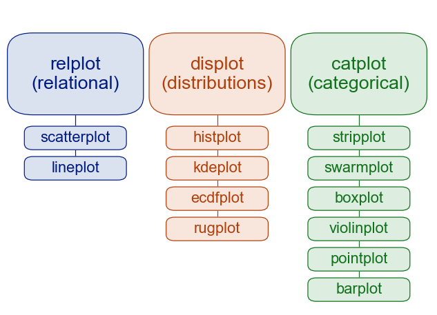
The figure-level functions, e.g, displot(), provide an interface to its axis-level functions, e.g., histplot(), and each figure-level module has a default axis-level function (histplot() in the displot() module).
import seaborn as sns
import seaborn.objects as so
penguins = sns.load_dataset("penguins")
plot = sns.histplot(data=penguins,
x="flipper_length_mm",
hue="species", multiple="stack")
plot
The figure-level histogram is created by calling the displot() function. You can explicitly ask for histograms with kind=”hist”, or let the function default to producing histograms.
sns.displot(data=penguins,
x="flipper_length_mm",
hue="species", multiple="stack", kind="hist");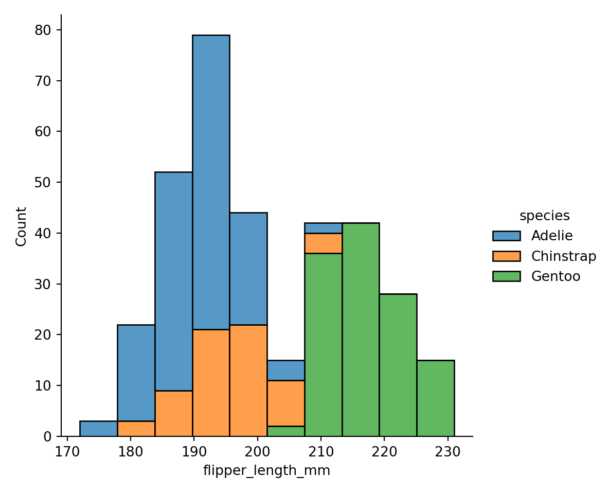
A side-effect of using a figure-level function is that the figure owns the canvas. The legend is placed outside of the chart of the figure-level function and inside the chart of the axes-level function.
One advantage of figure-level functions is that they can create subplots easily. Removing multiple="stack" produces:
sns.displot(data=penguins, x="flipper_length_mm", hue="species", col="species");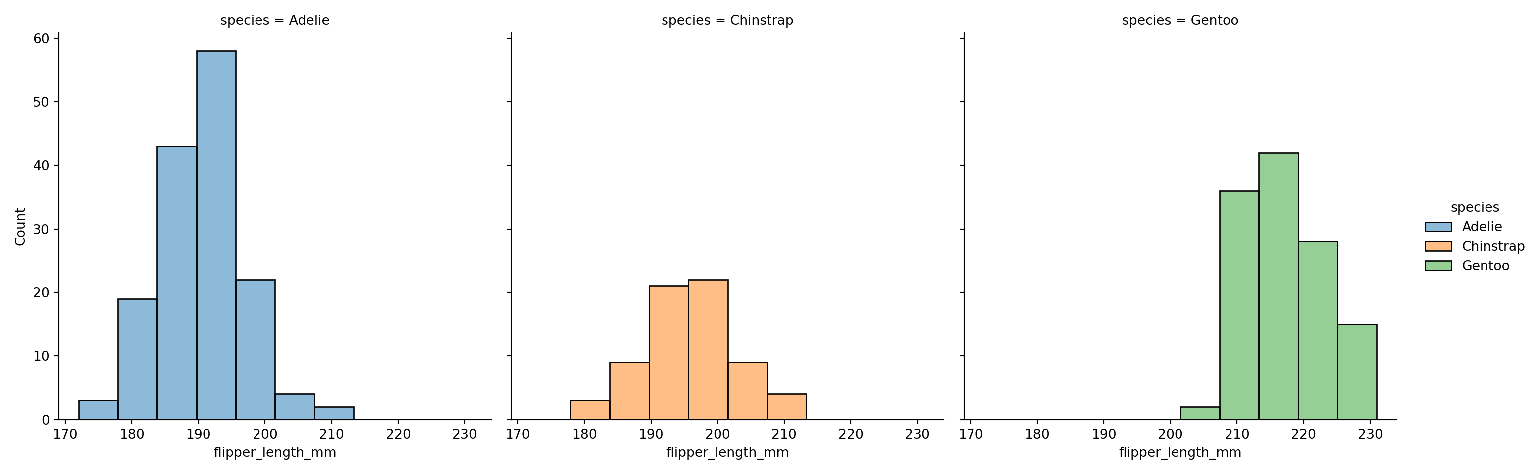
Removing multiple="stack" from the axes-level chart produces three overlaid histograms that are difficult to interpret:
sns.histplot(data=penguins, x="flipper_length_mm", hue="species")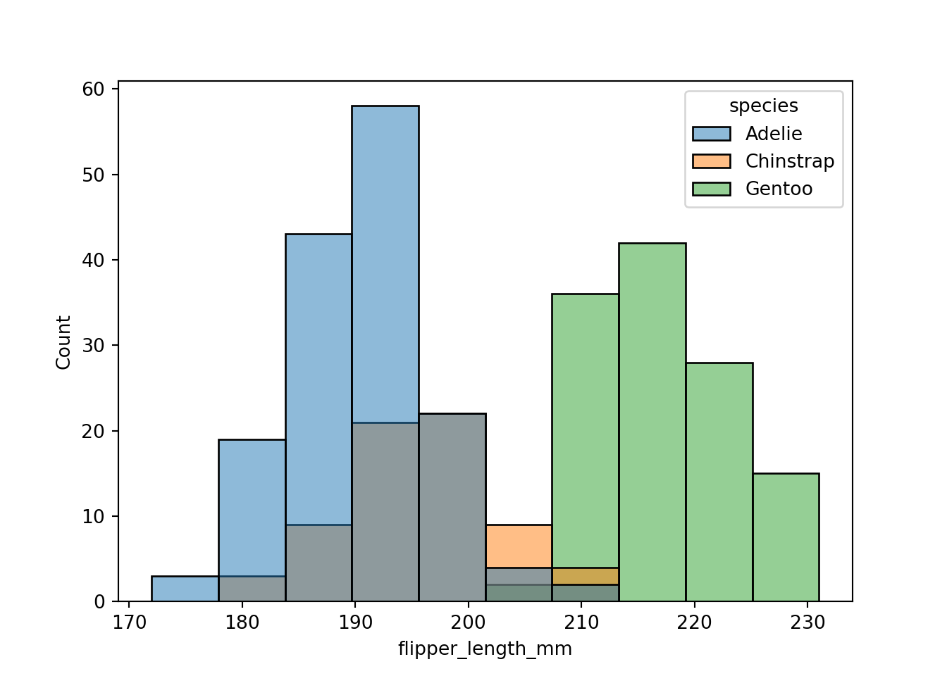
Plotly
Plotly is a Python library for interactive graphics, based on the d3.js JavaScript library. The makers of plotly also have a commercial analytic platform, Dash, but plotly is open source and free to use.
To install plotly, assuming you are using pip to manage Python packages, simply run
pip install plotlyOn my system I also had to
pip install --upgrade nbformatand restart VSCode after the upgrade. You will know that this step is necessary when fig.show() throws an error about requiring a more recent version of nbformat than is installed.
The plotly library has two APIs, plotly graph objects and plotly express. The express API allows you to generate interactive graphics quickly with minimal code.
The southern_oscillation table contains monthly measurements of the southern oscillation index (SOI) from 1951 until today. The SOI is a standardized index based on sea-level pressures between Tahiti and Darwin, Australia. Although the two locations are nearly 5,000 miles apart, that pressure difference corresponds well to changes in ocean temperatures and coincides with El Niño and La Niña weather patterns. Prolonged periods of negative SOI values coincide with abnormally warm ocean waters typical of El Niño. Prolonged positive SOI values correspond to La Niña periods.
The following statements load the SOI data from the DuckDB database into a pandas DataFrame and use the express API of plotly to produce a box plot of SOI values for each year.
import pandas as pd
import plotly.express as px
import plotly.io as pio
from IPython.display import HTML
so_osc = con.sql("SELECT * FROM southern_oscillation;").df()
fig = px.box(data_frame=so_osc, x="year", y="soi")
html_str = fig.to_html(include_plotlyjs=True)
HTML(html_str)The graphic produced by plotly is interactive. Hovering over a box reveals the statistics from which the box was constructed. The buttons near the top of the graphic enable you to zoom in and out of the graphic, pan the view, and export it as a .png file.
The graph object API of plotly is more detailed, requiring a bit more code, but giving more control. With this API you initiate a visualization with go.Figure(), and update it with update_layout(). The following statements recreate the series of box plots above using plotly graph objects.
import plotly.graph_objects as go
fig = go.Figure(data=[go.Box(x=so_osc["year"].astype(str),y=so_osc["soi"])])
fig.update_layout(title="Box Plots of SOI by Year",
xaxis_title="Year",
yaxis_title="SOI")Next is a neat visualization that you do not see every day. A parallel coordinate plot represents each row of a data frame as a line that connects the values of the observation across multiple variables. The following statements produce this plot across the sepal and petal measurements of the Iris data. The three species are identified in the plot through colors, which requires a numeric value. Species 1 corresponds to I. setosa, species 2 corresponds to I. versicolor, and species 3 to I. virginica.
from functools import reduce
iris = con.sql("SELECT * FROM iris").df()
# recode species as numeric so it can be used as a value for color
unique_list = reduce(lambda l, x: l + [x] if x not in l else l, iris["species"], [])
res = [unique_list.index(i) for i in iris["species"]]
colors = [x + 1 for x in res]
fig = px.parallel_coordinates(
iris,
color=colors,
labels={"color" : "Species",
"sepal_width" : "Sepal Width",
"sepal_length": "Sepal Length",
"petal_width" : "Petal Width",
"petal_length": "Petal Length", },
color_continuous_scale=px.colors.diverging.Tealrose,
color_continuous_midpoint=2)
fig.update_layout(coloraxis_showscale=False)The parallel coordinates plot shows that the petal measurements for I. setosa are smaller than for the other species and that I. setosa has fairly wide sepals compared to the other species. If you wish to classify iris species based on flower measurements, petal length and petal width seem like excellent candidates. Sepal measurements, on the other hand, are not as differentiating between the species.
Vega-Altair
Vega-Altair is a declarative visualization package for Python and is built on the Vega-Lite grammar. The key concept is to declare links between data columns and visual encoding channels such as the axes and colors. The library attempts to handle a lot of things automatically, for example, deciding chart types based on column types in data frames. The following image is from the Vega-Altair documentation:
import altair as alt
from vega_datasets import data
cars = data.cars()
alt.Chart(cars).mark_point().encode(
x='Horsepower',
y='Miles_per_Gallon',
color='Origin',
).interactive()alt.Chart(cars) starts the visualization. mark_point() instructs to display points encoded as follows: Horsepower on the \(x\)-axis, Miles_per_Gallon on the \(y\)-axis and the color of the points associated with the Origin variable.
Pandas vs Polars
Matplotlib, Seaborn, Plotly, ggplot, and Altair (since v5+) can work with polars DataFrames out-of-the-box. If you are running into problems passing a polars DataFrame to a visualization routine that works fine with a Pandas DataFrame you can always convert using the .to_pandas() function. For example, the parallel coordinates plot in plotly express works with a pandas DataFrame but generates an AttributeError with a polars DataFrame. Using the .to_pandas() method took care of the problem.
iris = con.sql("SELECT * FROM iris").pl()
fig = px.parallel_coordinates(
iris.to_pandas(),
color_continuous_scale=px.colors.diverging.Tealrose,
color_continuous_midpoint=2)
fig.update_layout(coloraxis_showscale=False)18.6 Multipanel Plots
Multipanel plots, as the name suggests, arrange multiple plots in an overall visualization, the space allocated to an individual plot is called a panel.
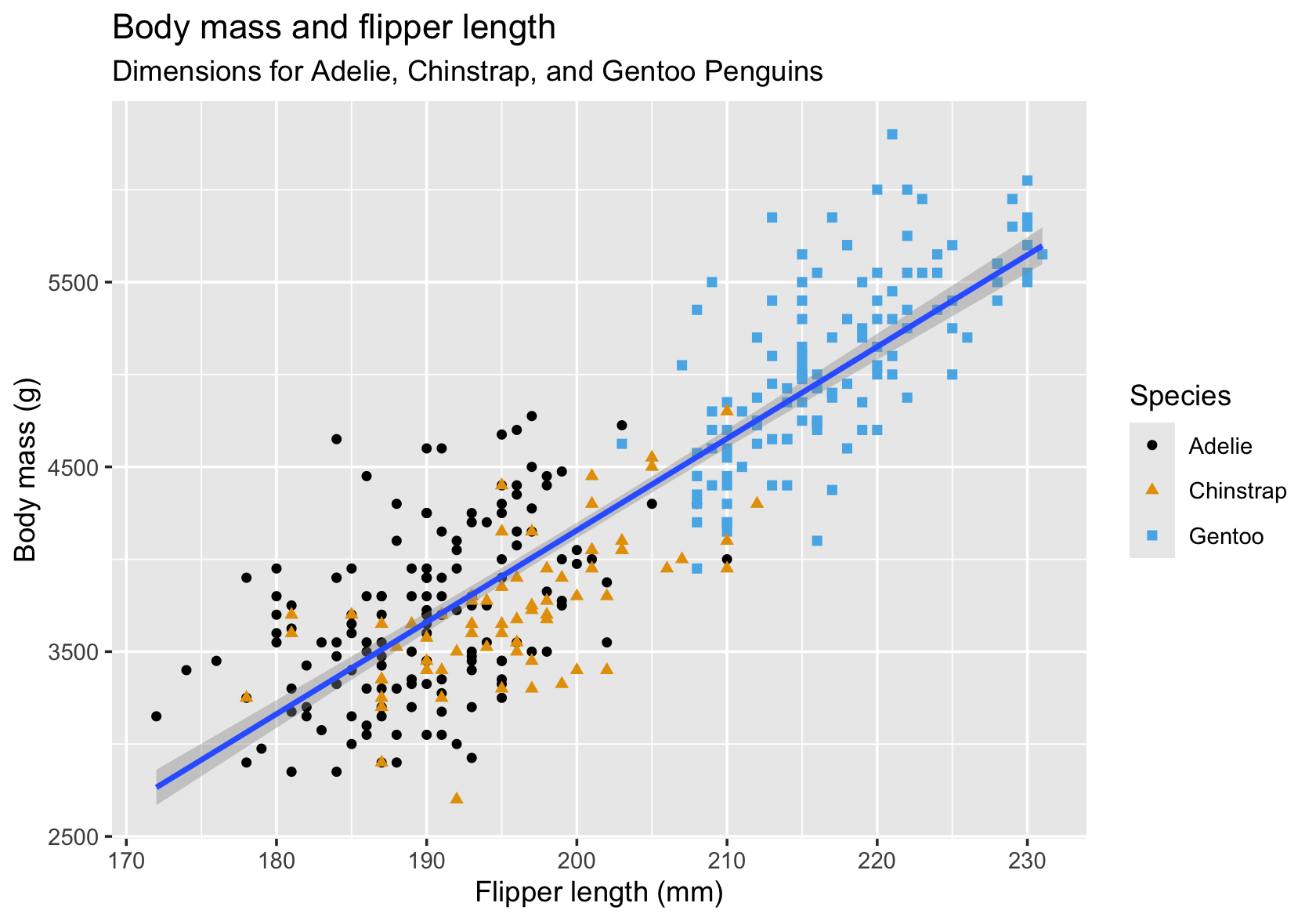
Figure 18.30 is an example of a two-panel plot with separate panels for male and female penguins that shows separate regressions with confidence intervals for each species and sex combination. The facet_wrap function accomplishes the grouping of the data by sex and the paneling.
library(palmerpenguins)
library(tidyverse)
penguins %>%
filter(!is.na(sex)) %>%
select(sex,body_mass_g, species, flipper_length_mm) %>%
ggplot(aes(x=flipper_length_mm, y=body_mass_g, color=species)) +
geom_point() +
geom_smooth(method="lm", se=TRUE) +
facet_wrap(~ sex) +
theme(axis.text.x = element_text(angle=45,hjust=1))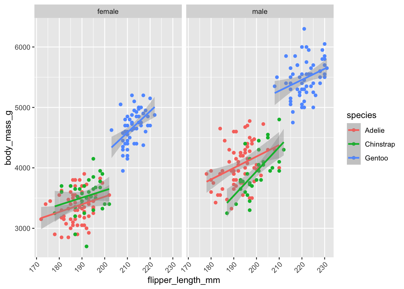
Figure 18.31 is an example of a two-panel plot with separate panels for male and female penguins that shows separate regressions with confidence intervals for each species and sex combination. The facet_wrap function accomplishes the grouping of the data by sex and the paneling.
from plotnine import (ggplot, aes, geom_point, geom_smooth, facet_wrap, theme, element_text)
plot = (penguins
.dropna(subset=['sex'])
[['sex', 'body_mass_g', 'species', 'flipper_length_mm']]
.pipe(ggplot, aes(x='flipper_length_mm', y='body_mass_g', color='species'))
+ geom_point()
+ geom_smooth(method='lm', se=True)
+ facet_wrap('~ sex')
+ theme(axis_text_x=element_text(angle=45, ha='right'))
)
plot.show()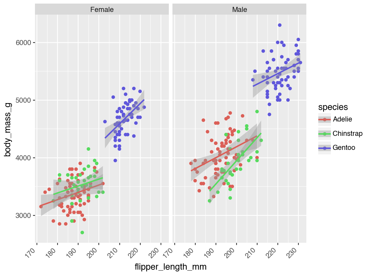
In general, we distinguish two types of multipanel plots. In trellis (also called lattice) plots, the panels are defined by grouping variables. The panels created with facet_wrap in the previous plots are ggplot examples of how to do that. These plots are also called conditional graphics as each panel is conditioned on certain values of the data. Furthermore, the basic plot elements in the panels are the same; scatterplots with smoothing lines, for example.
Compound graphics on the other hand, display different plot types in the panels and the data are typically not conditioned in the sense that different panels show different subsets of the data. Rather, the multiple panels display different aspects of the same data.
An important difference between conditional plots and compound graphics is that the software manages the panels for you with conditional plots; you have to manage and populate the panels for compound graphics.
Conditional Plots
You can produce conditional plots in two ways: using conditioning capabilities built into a graphics package or using a graphics package built specifically for conditioning. ggplot follows the first model. You can construct any basic visualization following graphics of grammar rules. In the Facets layer you decide how to divide the data into groups (the conditioning) and assign groups to panels.
The lattice package in R follows the second approach. It has specific functions for conditioning and paneling specific plot types. For example, lattice::xyplot produces paneled scatterplots, lattice::barchart produces conditional bar charts, lattice::bwplot produces conditional box plots, and so on.
Facets in ggplot
With ggplot, the facet_wrap and facet_grid functions determine the layout of the panels. facet_wrap creates a sequence of panels while facet_grid uses a row-column layout.
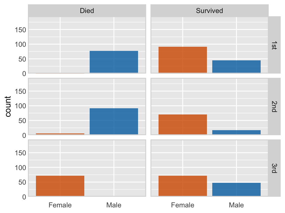
The following code, modified from Wilke (2019), see here, uses the facet_grid paneling capabilities of ggplot to display the survival or death for passengers on the titanic, based on the passengers in the training data, conditioned by gender and passenger class.
library(titanic)
titanic_train %>%
mutate(surv = ifelse(Survived == 0, "Died", "Survived")) %>%
mutate(class = ifelse(Pclass==1,"1st",ifelse(Pclass==2,"2nd","3rd"))) %>%
mutate(sex = ifelse(Sex=='male',"Male","Female")) %>%
ggplot(aes(sex, fill = sex)) +
geom_bar() +
facet_grid(class ~ surv) +
scale_x_discrete(name = NULL) +
scale_y_continuous(limits = c(0, 195), expand = c(0, 0)) +
scale_fill_manual(values = c("#D55E00D0", "#0072B2D0"), guide = "none") +
theme(
axis.line = element_blank(),
axis.ticks.length = grid::unit(0, "pt"),
axis.ticks = element_blank(),
axis.text.x = element_text(margin = margin(7, 0, 0, 0)),
strip.text = element_text(margin = margin(3.5, 3.5, 3.5, 3.5)),
strip.background = element_rect(
fill = "grey85",
color = "grey85",
linetype = 1,
size = 0.25
),
panel.border = element_rect(
color = "grey85",
fill = NA,
linetype = 1,
size = 1.)
)
from plotnine import (ggplot, aes, geom_bar, facet_grid, scale_x_discrete,
scale_y_continuous, scale_fill_manual, theme,
element_blank, element_text, element_rect)
titanic_train = sns.load_dataset('titanic')
plot = (titanic_train
.assign(
surv = lambda x: np.where(x['survived'] == 0, "Died", "Survived"),
class_cat = lambda x: np.where(x['pclass'] == 1, "1st",
np.where(x['pclass'] == 2, "2nd", "3rd")),
sex_cat = lambda x: np.where(x['sex'] == 'male', "Male", "Female")
)
.pipe(ggplot, aes(x='sex_cat', fill='sex_cat'))
+ geom_bar()
+ facet_grid('class_cat ~ surv')
+ scale_x_discrete(name=None)
+ scale_y_continuous(limits=(0, 195), expand=(0, 0))
+ scale_fill_manual(values=["#D55E00D0", "#0072B2D0"], guide=None)
+ theme(
axis_line=element_blank(),
axis_ticks_length=0,
axis_ticks=element_blank(),
axis_text_x=element_text(vjust=1),
strip_text=element_text(),
strip_background=element_rect(
fill="#D9D9D9",
color="#D9D9D9",
linetype="solid",
size=0.25
),
panel_border=element_rect(
color="#D9D9D9",
fill=None,
linetype="solid",
size=1.0
)
))
plot.show()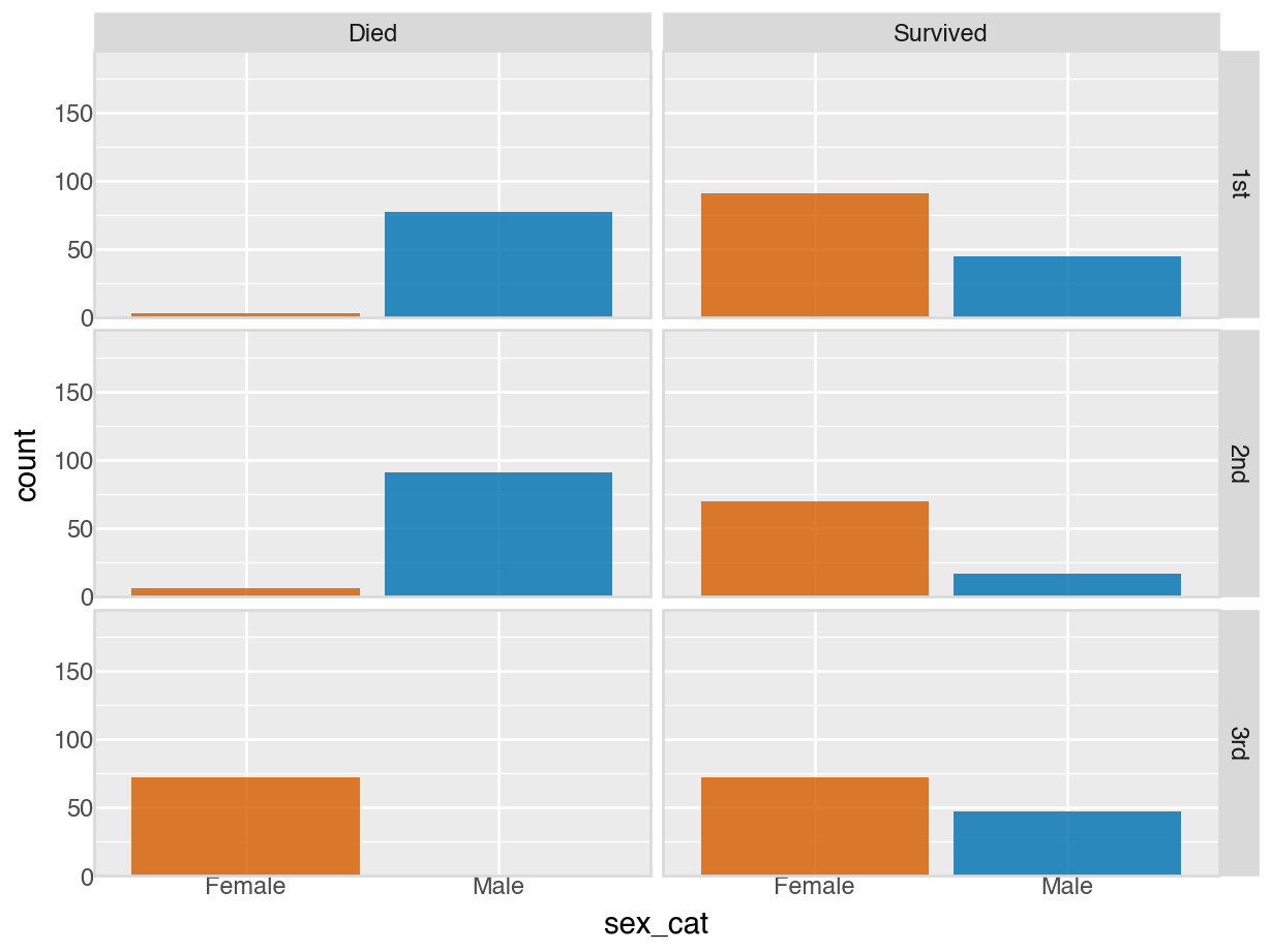
We return to the apple data set from the introduction to produce a conditional plot similar to Figure 18.2, but where each of the eighty apples is in its own panel and using ggplot. This side-by-side comparison allows us to better see the apple-specific growth trends which would get lost if we were to overlay data from all apples in a single plot. But apple IDs are not unique within tree numbers in this data set. To uniquely identify an apple, we have to somehow indicate that nesting. This can be done by combining tree and apple id into a single identifier.
apples %>%
mutate(TreeAppleID = paste(as.character(Tree),"|",as.character(appleid))) %>%
ggplot(aes(y = diameter, x = measurement)) +
geom_point(color = "blue", size = 0.5) +
geom_smooth(formula = y ~ x,
method = 'lm',
se = FALSE,
size = 0.25,
color = '#D55E00',
fullrange = TRUE) +
scale_x_continuous(name="Measurement occasion") +
scale_y_continuous(name="Diameter") +
facet_wrap(~TreeAppleID, ncol = 10) +
theme(axis.title = element_text(size = 14),
axis.ticks = element_blank(),
axis.ticks.length = unit(0, "pt"),
strip.text = element_text(margin = margin(3.5, 3.5, 3.5, 3.5)),
panel.border = element_rect(color = "grey80",
fill = NA,
linetype = 1,
linewidth = 1.
),
plot.margin = margin(3, 5, 3, 1.5)
)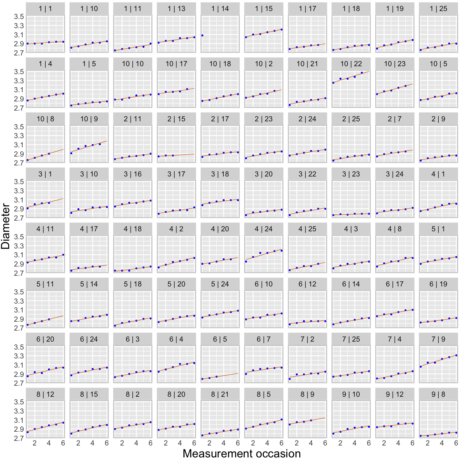
from plotnine import (ggplot, aes, geom_point, geom_smooth, scale_x_continuous,
scale_y_continuous, facet_wrap, theme, element_text,
element_blank, element_rect)
plot = (apples.to_pandas()
.assign(TreeAppleID = lambda x: x['Tree'].astype(str) + "|" + x['appleid'].astype(str))
.pipe(ggplot, aes(y='diameter', x='measurement'))
+ geom_point(color="blue", size=0.5)
+ geom_smooth(formula='y ~ x',
method='lm',
se=False,
size=0.25,
color='#D55E00',
fullrange=True)
+ scale_x_continuous(name="Measurement occasion")
+ scale_y_continuous(name="Diameter")
+ facet_wrap('~TreeAppleID', ncol=10)
+ theme(
axis_title=element_text(size=14),
axis_ticks=element_blank(),
axis_ticks_length=0,
strip_text=element_text(),
panel_border=element_rect(
color="#CCCCCC",
fill=None,
linetype="solid",
size=1.0
),
figure_size=(10, 10) # width, height in inches
))
plot.show()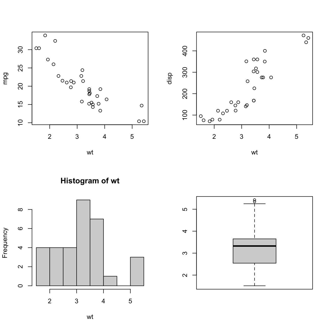
For comparison purposes it is important that the scales of the axes, in particular the y-axis, is the same across all panels. Otherwise it would not be possible to compare growth trajectories between apples.
Trellis plots with lattice in R
The lattice package in R has special plotting functions for conditional plot types. For example, xyplot produces paneled scatterplots. The following code displays the apple diameters over time, grouped (conditioned) by tree, it generates Figure 18.2.
The strip= option determines the labeling of the header strip of the panels. The as.table=TRUE option arranges the tree numbers from smallest to largest (try it out without that option) and the layout= option requests a single page of up to 12 panels in 4 rows and 3 columns.
library(lattice)
xyplot(diameter ~ measurement | Tree,
data=apples,
strip = function(...) {
strip.default(...,
strip.names =c(T,T),
strip.levels=c(T,T),
sep=" ")
},
xlab="Measurement index",
ylab="Diameter (inches)",
type=c("p"),
as.table=TRUE,
layout=c(4,3,1))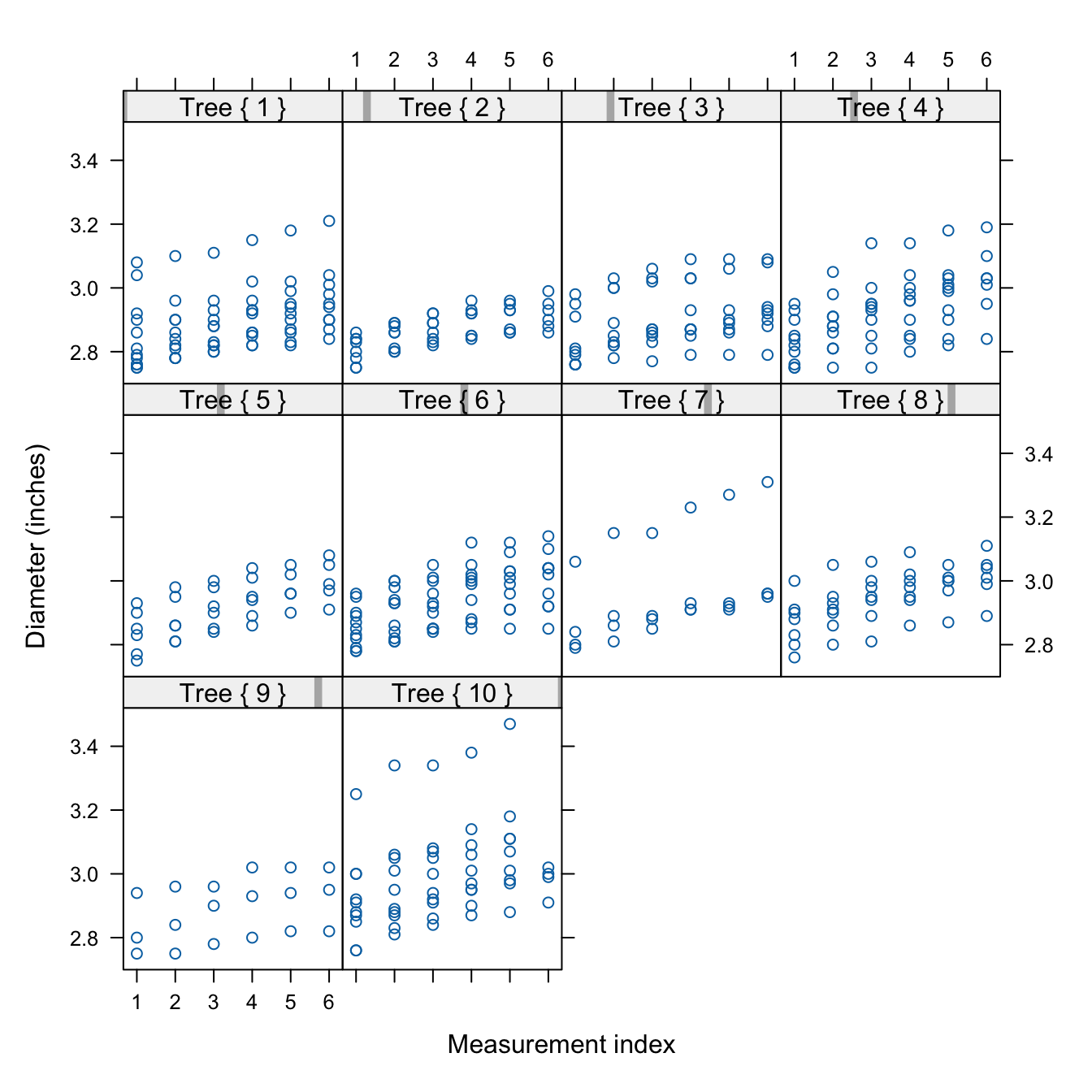
Compound Graphics in R
There are two basic ways to arrange the plotting area in R for compound graphics: with par(mfrow=) and with layout.
The two important options to create multipanel plots with par are par(mfrow=) (or par(mfcol=)) and par(fig=). mfrow and mfcol specify the number of panels as a 2-dimensional vector of the form c(num_rows,num_cols). mfrow fills the panels by rows, mfcol fills them by columns.
The following code arranges two scatterplots, a histogram, and a box plot in a 2 x 2 array.
attach(mtcars)
par(mfrow=c(2,2))
plot(wt, mpg)
plot(wt, disp)
hist(wt)
boxplot(wt)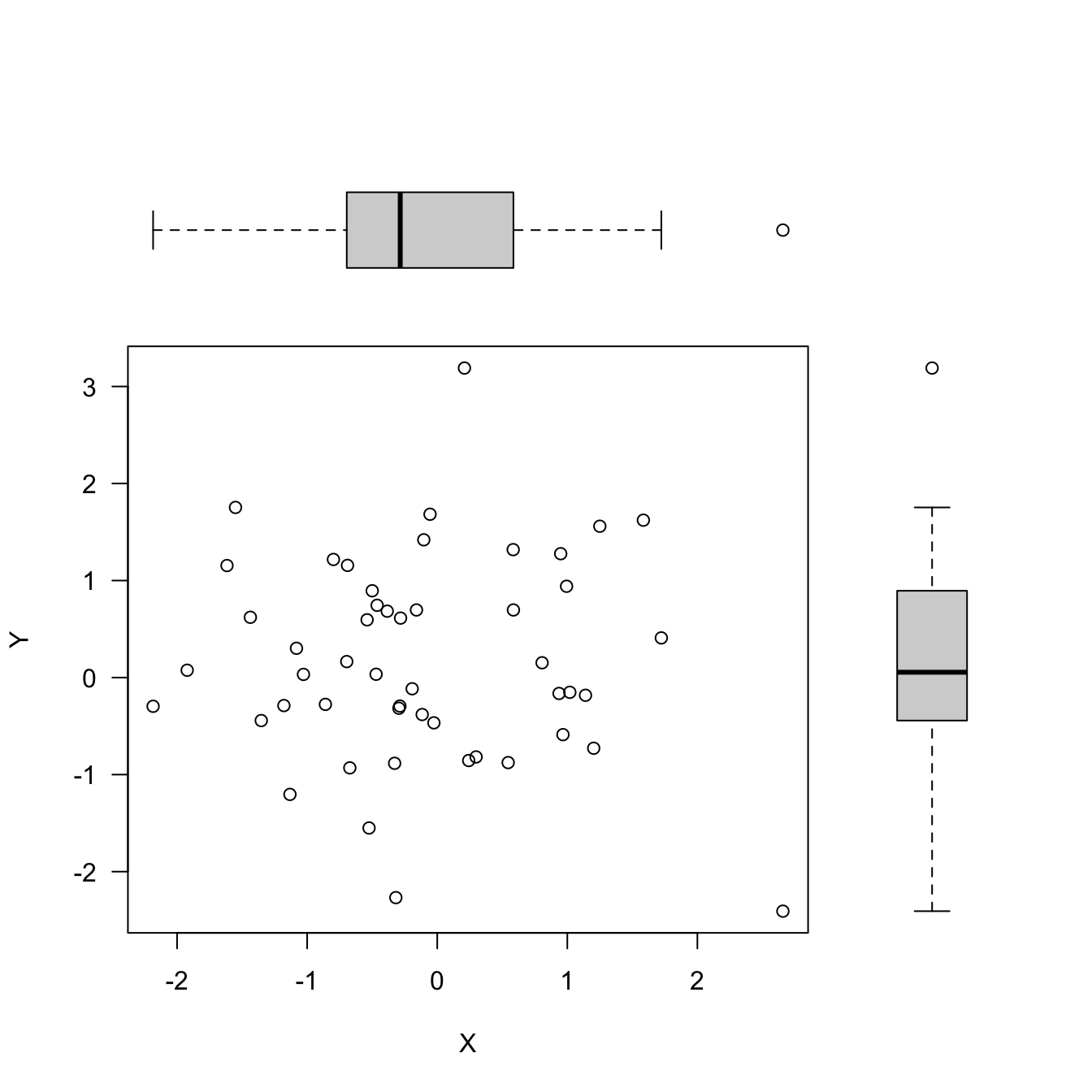
If you want to exercise more control over the size of the panels you can use the par(fig=) option to specify coordinates for the figure region. If you use par(fig=) you do not need to specify mfrow or mfcol. But you need to tell R to create a new plot with new=TRUE so it does not add a visualization to an existing plot.
The following code creates a scatterplot in the center of the graphics area with box plots for the two variables in the margins. The par(fig=c( )) options specify the coordinates for the individual plots on the graphics area as a vector of the form c(x1, x2, y1, y2).
set.seed(645)
dat <- matrix(rnorm(100),nrow=50,ncol=2)
par(fig=c(0,0.8,0,0.8), new=TRUE)
plot(dat, xlab="X", ylab="Y", las =1)
par(fig=c(0,0.8,0.55,1), new=TRUE)
boxplot(dat[,1], horizontal=TRUE, axes=FALSE)
par(fig=c(0.65,1,0,0.8),new=TRUE)
boxplot(dat[,2], axes=FALSE)
The second approach of controlling the layout of a compound graph in R is to use the layout function. Its first argiment is a matrix that specifies the location of the figures. For example, the matrix \[
\left [\begin{array}{cc} 1 & 1 \\ 2 & 3 \end{array} \right]
\] specifies that there are three plots, with the first occupying the first row of the multipanel plot, and plots 2 and 3 sharing the panels in the second row. The matrix \[
\left [\begin{array}{cc} 2 & 0 \\ 1 & 3 \end{array} \right]
\] specifies that the compound graphic is made up of three graphics. The first plot that is produced will go into the lower left corner of the graph, the second plot goes in the upper left corner, and the third plot goes into the lower right corner. That is the pattern in the following code.
set.seed(6)
x <- rexp(50)
layout(matrix(c(2, 0, 1, 3), nrow=2, ncol=2, byrow=TRUE),
widths =c(3, 1),
heights =c(1, 3),
respect =TRUE)
# Margin specification in terms of lines
# The default is c(5.1, 4.1, 4.1, 2.1)
par(mar=c(5.1, 4.1, 0, 0)) # (bottom, left, top, right)
plot(x, cex=2, pch=20)
par(mar = c(0, 4.1, 0, 0))
hist(x, main="", bty="n", axes=FALSE, ylab="")
par(mar = c(5.1, 0, 0, 0))
boxplot(x, axes=FALSE, bty="n")
The widths and heights options of layout give the relative widths of the columns and rows of the graphics area, respectively. widths=c(3, 1) specifies that the first column is three times as wide as the second column. The par(mar=) calls change the margins of the graph area to allow for the placement of the graphics elements. mar= specifies margins in terms of number of lines.
18.7 Snafu or Disinformation?
Data visualizations are powerful tools, they allow the author to focus our attention on information. In choosing a visualization type, filling it with data, and annotating it, you exercise control over what is displayed and how it is interpreted. In 1954, Darrell Huff published one of the most widely sold statistics text, “How to Lie with Statistics” (Huff 1954). Huff covered such topics as how to introduce bias through sampling, how to cherry-pick statistics (“the well-chosen average”), how to misinterpret correlation for causation, and how to distort with statistical graphics. He said
Many a statistic is false on its face. It gets by only because the magic of numbers brings about a suspension of common sense.
Examples of poorly designed graphics and misleading graphics abound. The reasons might be malfeasance, chicanery, disingenuity, or incompetence.
Example: Covid-19 Statistics
The following graphic aired on a local TV channel in North Carolina on April 5, 2020. It was the beginning of the Covid-19 pandemic and audiences were keen to hear about the local case counts. Is there anything wrong with the visualization?
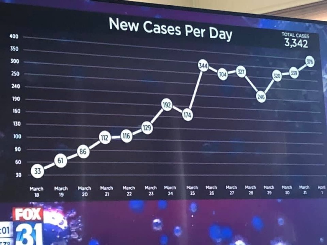
The number of daily cases has been more or less steadily increasing since March 18 (33 cases) and two weeks later stands at 376 cases per day.
The placement of the bubbles seems odd. The first bubble, 33 cases, seem further away from the horizontal grid line than, say, the bubble for 112 cases on March 21 is distant from the grid line at 100 cases. Maybe it is the angle at which the graph is viewed, but 112 (March 21) and 116 (March 22) should be about 1/2 way between 100 and 130, they are drawn closer to the line at 100.
Spending a bit more time with the \(y\)-axis you notice that the grid lines are evenly spaced, but that the reference labels are not equi-distant. The differences between the grid labels are 30, 30, 10, 30, 30, 30, 50, 10, 50, 50, and 50 units. Why would someone do this?
In a blog entitled “How to Spot Visualization Lies”, Nathan Yau gives numerous examples how chart construction can mislead. For example, a common device to exaggerate differences between groups is to draw bar charts with a baseline different than zero. The height of the bar is the information conveyed by the bar chart so bars should always start at zero (Figure 18.34, data from NOAA).
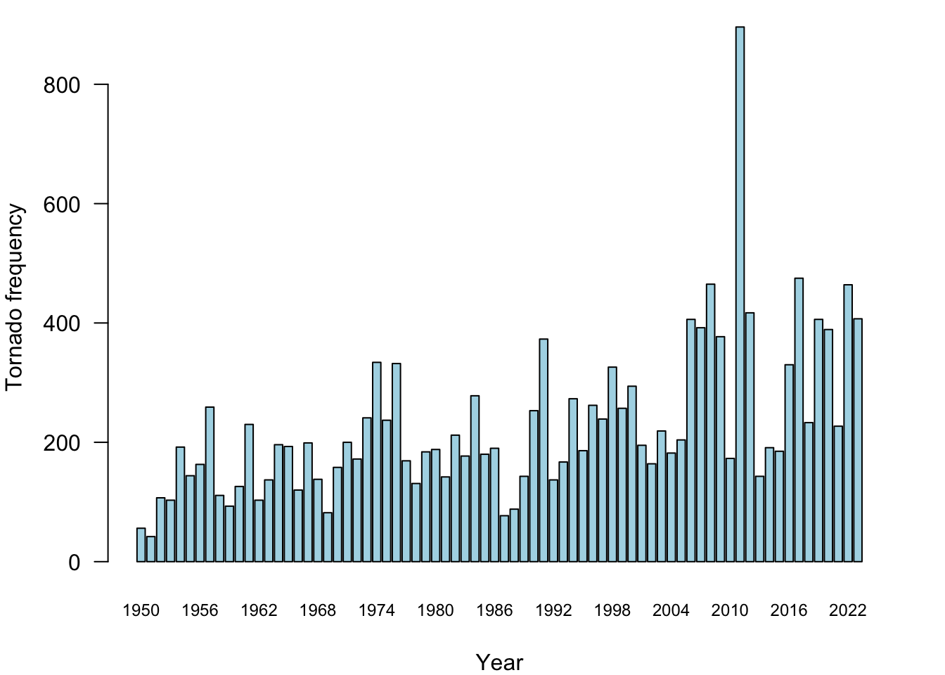
When the baseline of the bar chart is changed, the length of the bars represent the difference from the baseline and the data need to be presented as such. The coloring of the bars in Figure 18.35 draws extra attention to the fact that we are looking at deviations from a baseline.
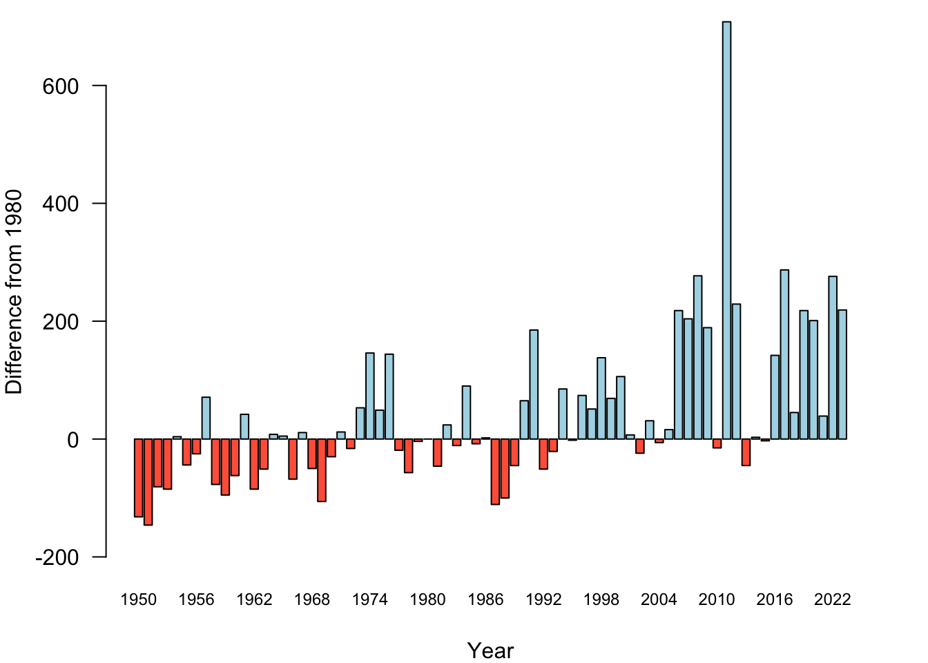
Statistics that are false on their face are comparisons that are based on absolute numbers but should be done on a relative scale. The absolute tornado numbers are comparable in Figure 18.34 because they relate to time intervals of the same length, February–April in each year. Someone could raise an objection here, because leap years have an extra day in February compared to non-leap years, so 1/4 of the bars have a basis of 90 days and 3/4 of the bars have a basis of 89 days. OK, sue me. The comparisons between the bars is still pretty darn fair.
However, if you compare, say, crime statistics, cancer incidences, service subscribers, etc., between regions or states, then large absolute numbers in large regions are probably not a surprise. There being fewer crimes in Blacksburg, VA than in Chicago does not make Blacksburg a safer place to live. It is a safer place because there are fewer crimes per resident or per 10,000 residents in Blacksburg, VA compared to Chicago.
18.8 Gallery of Terrible Graphics
And now, without much commentary or warning, here are some truly terrible examples of data visualization.
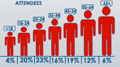
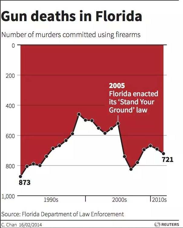

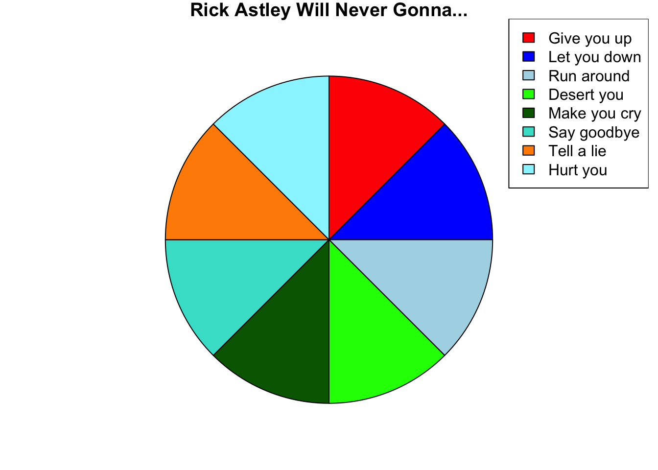
And now you have been rickrolled.