24 Correlation and Causation
Quote
Just because two variables have a statistical relationship with each other does not mean
that one is responsible for the other. For instance, ice cream sales and forest fires
are correlated because both occur more often in the summer heat. But there is no
causation; you don’t light a patch of the Montana brush on fire when you buy a
pint of Häagan-Dazs.
24.1 Introduction
One of the key tasks in analyzing data is uncovering relationships between things. Describing the statistical behavior of a single variable is interesting. Studying how two or more variables behave together is really interesting. That is how we uncover mechanisms, relationships, associations, and patterns. And if things go really well, we might discover cause-and-effect relationships.
You might have heard the saying
correlation does not imply causation
What do we mean by that?
Causation implies that one thing is the result of another thing; they stand in a cause-and-effect relationship to each other. The gravitational pull of the moon on earth’s oceans causes the tides. An accident causes a traffic jam. Smoking causes an increase in the risk of developing lung cancer.
Correlation, on the other hand, is about establishing association between attributes. The weight of a person is correlated with their height. Taller people tend to be heavier but height alone is not the only factor affecting someone’s weight. Smoking is correlated with alcoholism but does not cause it.
Figure 24.1 displays the relationship between highway accidents in the U.S. and lemon imports from Mexico for a period of five years, from 1996–2001. The U.S. Dept. of Agriculture tracks agricultural imports and exports, the U.S. National Highway Traffic Safety Administration (NHTSA) tracks highway fatalities. Neither federal agency probably thought much about the data collected by the other agency. But when put together, voilà. A clear trend emerges!
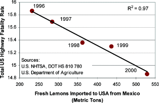
If the relationship in Figure 24.1 is causal, public policy to reduce highway fatalities is very clear: reduce fresh lemon imports from Mexico! Clearly, this is not a causal relationship. There must be another explanation why the variables in Figure 24.1 appear related.
Compare this situation to John Snow’s investigation of the relationship between water quality and cholera incidences in 19th century London (Section 2.8.1). Snow found higher cholera incidences in houses closer to the Broad Street public water pump. There was a strong association between cholera cases and proximity to the pump. But did the pump—or more precisely the water from the pump or something in the water—cause cholera? Today we know that cholera is caused by the bacterium Vibrio cholerae, but that discovery was not made until 1883.
24.2 Continuous Data
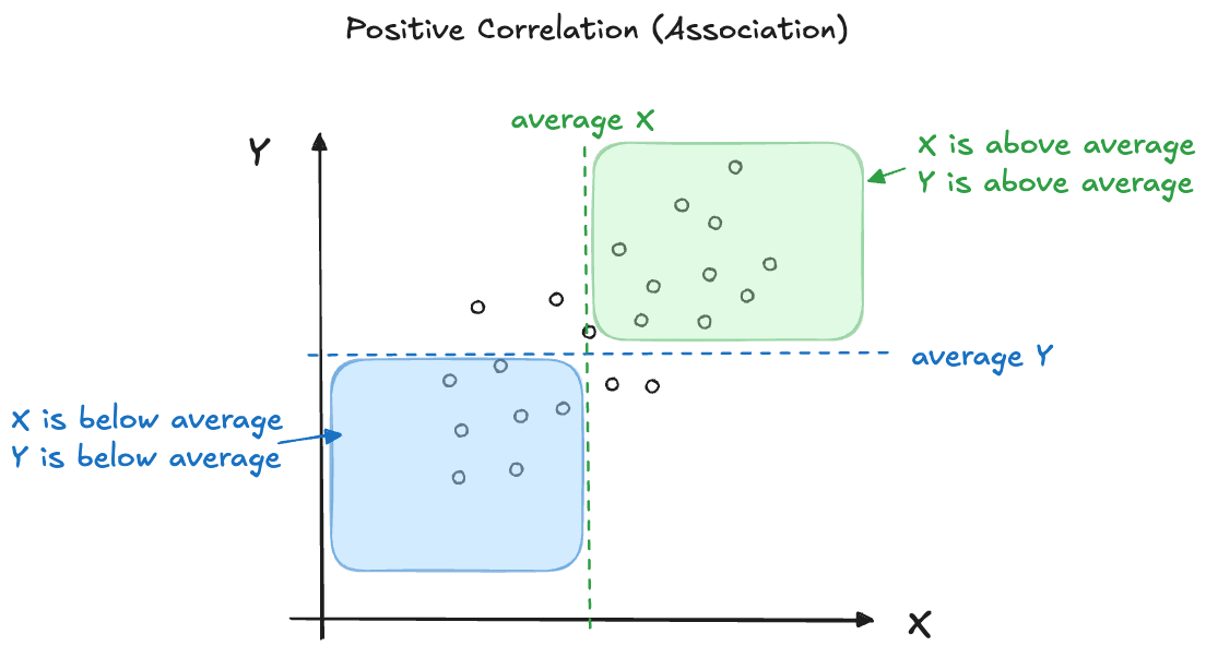
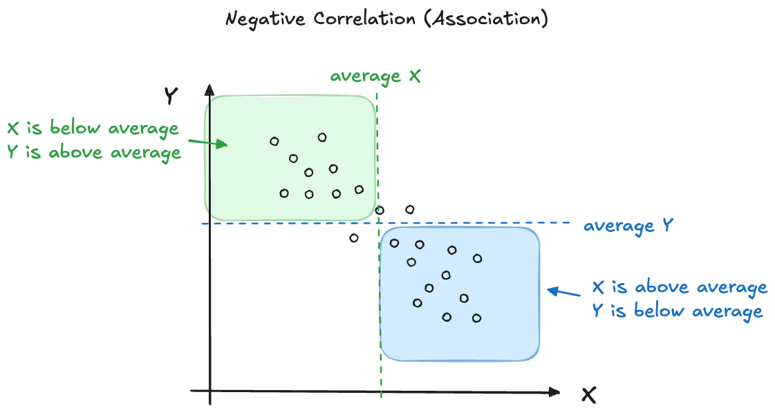
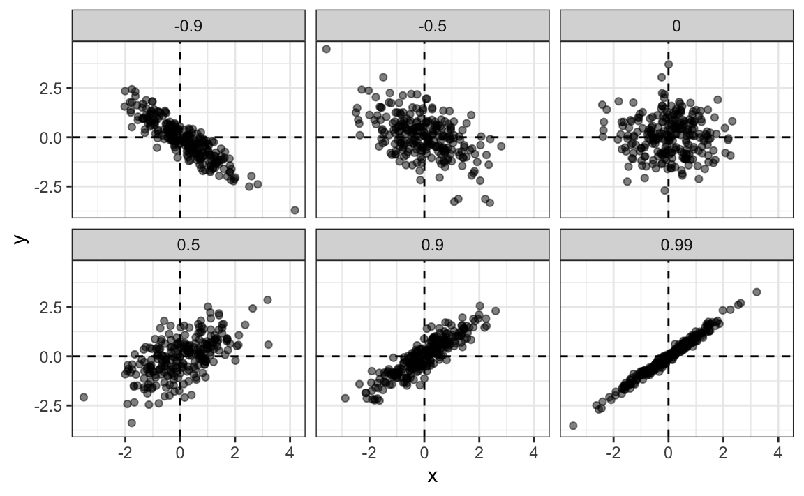
We experience correlation when one attribute changes with another. When the attributes are continuous, we can display their association with a scatterplot. A positive correlation then implies that the point cloud has a positive slope, as one attribute increases the other one tends to increase as well (Figure 24.2). When the correlation is negative, an increase in one attribute is associated with a decrease in the other attribute (Figure 24.3).
While the direction of the point cloud indicates whether the correlation (association) is positive or negative, the tightness of the point cloud indicates the strength of the association (Figure 24.4).
Correlation Coefficient
The correlation between variables \(X\) and \(Y\) is a feature of the joint probability distribution \(f(x,y)\). It is a function of the expected values of \(X\), \(Y\), and \(XY\).
Definition: Correlation
The correlation between random variables \(X\) and \(Y\), denoted \(\rho_{xy}\) or \(\text{Corr}[X,Y]\), is the ratio of their covariance, \(\text{Cov}[X,Y]\), and the product of their standard deviations:
\[ \text{Cov}[X,Y] = \text{E}\lbrack\left( X - \text{E}\lbrack X\rbrack \right)\left( Y - \text{E}\lbrack Y\rbrack \right) = \text{E}\lbrack XY\rbrack - \text{E}\lbrack X\rbrack\text{E}\lbrack Y\rbrack \]
\[ \rho_{xy} = \text{Corr}[X,Y] = \frac{\text{Cov}[X,Y]}{\sqrt{\text{Var}\lbrack X\rbrack \ \text{Var}\lbrack Y\rbrack}} \]
When the correlation between \(X\) and \(Y\) is non-zero, we say that \(X\) and \(Y\) are correlated or are associated with each other. The covariance measures how \(X\) and \(Y\) vary jointly: as \(X\) deviates from its mean, how does \(Y\) change relative to its mean? The correlation is positive when above-average values of \(X\) are associated with above-average values of \(Y\). Dividing by the product of the standard deviations scales the correlation so that \(-1 \leq \rho_{xy} \leq 1\).
The correlation—like the covariance—is a function of expected values, it describes long-run behavior of the joint distribution of \(X\) and \(Y\). The correlation is not directly knowable and is estimated from pairs of observations \((x_1, y_1),\cdots,\ (x_n, y_n)\). The most common estimator when \(X\) and \(Y\) are continuous random variables is the Pearson product-moment correlation coefficient.
Definition: Pearson Product-moment Correlation Coefficient
The Pearson product-moment estimate of the correlation \(\text{Corr}[X,Y],\) based on a sample \((x_1, y_1),\cdots,(x_n,y_n),\) is given by
\[ \widehat{\rho}_{xy} = \frac{SS_{xy}}{\sqrt{SS_{x}SS_{y}}} \]
\[ \begin{align*} SS_{xy} &= \sum_{i = 1}^{n}{\left( x_{i} - \overline{x} \right)\left( y_{i} - \overline{y} \right) = \sum_{i = 1}^{n}{x_{i}y_{i}} - n\overline{x}\overline{y}}\\ SS_{x} &= \sum_{i = 1}^{n}{\left( x_{i} - \overline{x} \right)^{2} = \sum_{i = 1}^{n}x_{i}^{2} - n{\overline{x}}^{2}}\\ SS_{y} &= \sum_{i = 1}^{n}{\left( y_{i} - \overline{y} \right)^{2} = \sum_{i = 1}^{n}y_{i}^{2} - n{\overline{y}}^{2}}\\ \end{align*} \]
\(SS_{x}\) and \(SS_{y}\) are called the observed sum of squares of \(X\) and \(Y\), respectively. \(SS_{xy}\) is the observed sum of cross-products between the variables.
Relationship to raw sum of squares
In Section 17.5 we introduced the notation \(S_y\), \(S_{yy}\), and \(S_{xy}\) for the raw sums, raw sums of squares, and raw sums of cross-products: \[\begin{align*} S_y &= \sum_{i=1}^n y_i \\ S_{yy} &= \sum_{i=1}^n y_i^2 \\ S_{xy} &= \sum_{i=1}^n x_i y_i \end{align*}\]
Using these quantities, the sum of squares terms above can be expressed as \[\begin{align*} SS_{y} &= S_{yy} - S_{y}^2/n \\ SS_{x} &= S_{xx} - S_{x}^2/n \\ SS_{xy} &= S_{xy} - S_{x}S_{y}/n \\ \end{align*}\]
Like the correlation \(\text{Corr}[x,y]\), the correlation coefficient \(\widehat{\rho}_{xy}\) ranges from \(-1\) to \(1\). Both of these extremes are called perfect correlations and occur when all points fall on a perfect line, without any variability about the line. The relationship is deterministic.
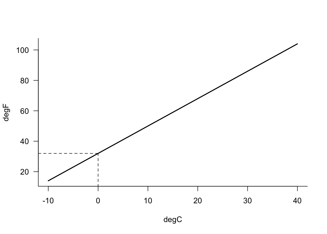
Linear mathematical relationships exhibit such patterns, for example, the relationship between degree Celsius and degree Fahrenheit (Figure 24.5): \[ ^\circ F = {^\circ C} \times \frac{9}{5} + 32 \]
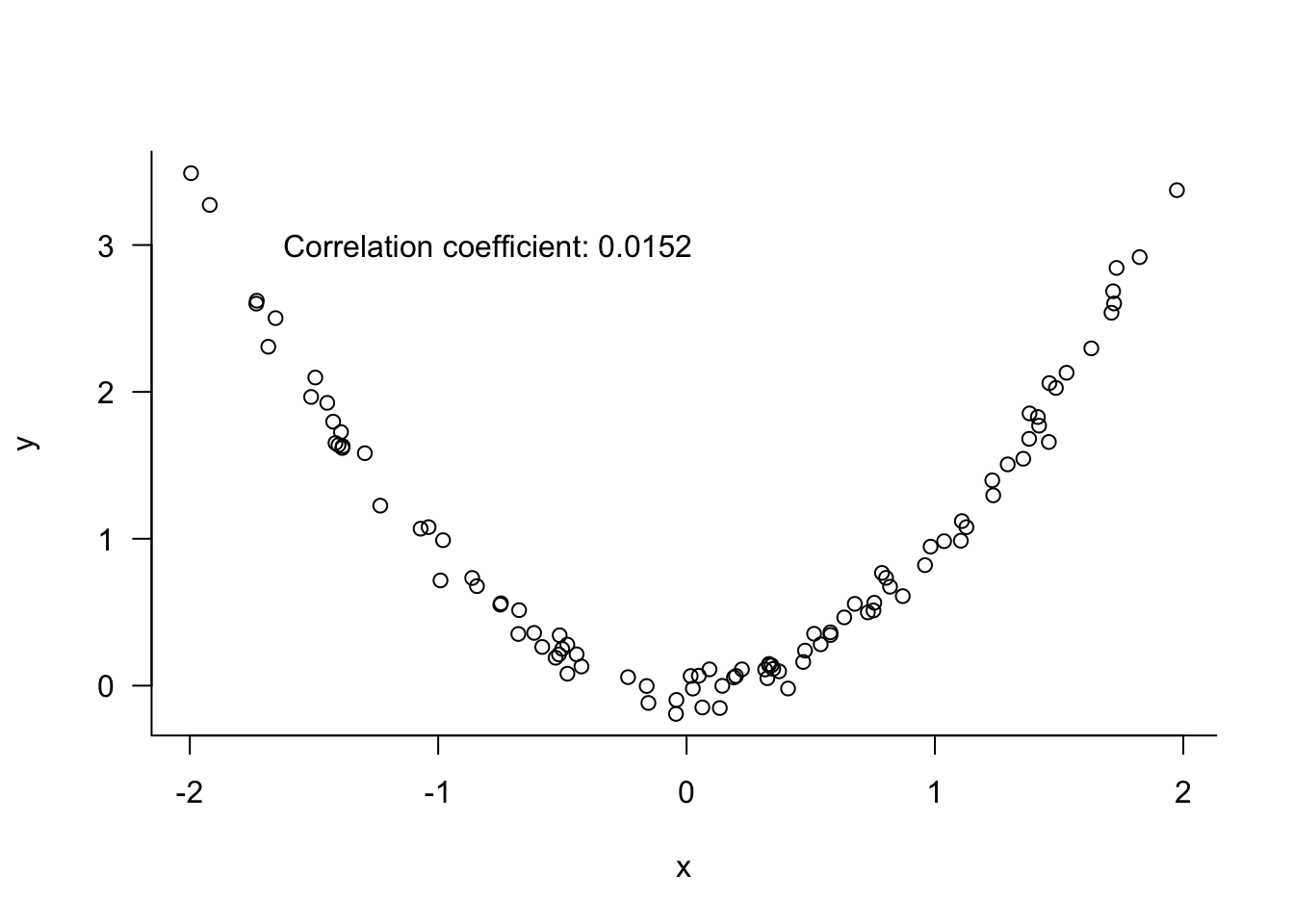
This leads us to another important point about correlation metrics: the relationship between attributes can be quite strong, but their degree of linear relationship can be low. Figure 24.6 shows two variables with a strong nonlinear relationship. \(Y\) decreases with increasing \(C\) for values \(X < 0\) and \(Y\) increases with \(X\) for values \(X > 0\). When the standard linear correlation coefficient is calculated, it turns out to indicate a very weak relationship between the variables—a very weak linear relationship.
The takeaway is not to only focus on reported measures of association but to also examine the relationships visually.
Spurious Correlation
Correlation itself is not a reliable concept either. Correlation can be the result of a direct relationship between the variables, or it can be induced by mediating or latent (confounding) variables. Correlations that are not the result of direct relationships are called spurious.
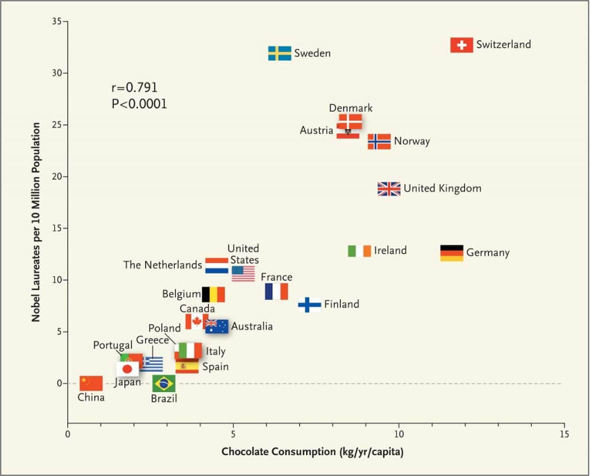
Figure 24.7 displays the number of Nobel laureates per 10 million population against the chocolate consumption (in kg per capita and year) for various countries (Messerli 2012). An upward trend is clearly noticeable. A greater per-capita chocolate consumption is associated with a lager number of Nobel laureates. Whoa! If the two variables stand in a cause-effect relationship then we have a simple recipe to increase Nobel prizes: we all should eat more chocolate. While one can argue the benefits of chocolate for cognitive function, what we have here is a simple correlation. The two attributes, number of Nobel laureates per 10 million population and chocolate consumption per capita, are related. If one increases so does the other. But why?
This is an example of a spurious correlation. The variables are not really dependent on each other, a relationship is induced in some other way. In this particular example, the correlation was “found” by cherry-picking the data: only four years of chocolate consumption were considered on a limited number of chocolate products and no data prior to 2002 was used. The number of Nobel laureates is a cumulative measure that spans a much longer time frame.
It appears that the data were organized in such a way as to suggest a relationship between the variables.
You can find spurious correlations everywhere, without manipulating the data. Here are some examples and the reasons why the data appear correlated.
Coincidence
Forecasting economic conditions is difficult and highly valuable. Since the end of World War II there have been only eleven economic recessions. On the other hand we are producing thousands of economic indicators. The government alone generates 45,000 economic statistics each year (Silver 2012, 185).
So it should not be surprising that when sifting through all those variables we find some that appear to go up or down together, just by coincidence.
A famous example is the Super Bowl winning conference as an indicator of economic performance. Between 1967 and 1997, in years when the team from the original NFL won, the stock market went up by 14%. When a team from the original AFL won the stock market decreased by almost 10%. Through 1997, the Super Bowl winner “predicted” correctly the direction of the stock market in 28 out of 31 years (Silver 2012). Since 1998 the trend has reversed and the stock market is doing better when an AFL team won the Super Bowl. Coincidence during a period of time leads to mistake noise for signal.
Another example of coincidence being mistaken for correlation is Paul, the Octopus who correctly predicted the winner in 2008–2010 international soccer matches 12 out of 14 times, an 85% accuracy. Since this success rate is unlikely to happen by chance, it was determined that Paul the octopus has divine powers. When Paul got it wrong in a 2010 FIFA World Cup game between Germany and Spain, the German fans called for Paul to be eaten and the Spanish Prime Minister offered Paul asylum.
Latent variables
A correlation between variables A and C can be induced by another variable, say B. If A is correlated with (or caused by) B and C is correlated with (or caused by) B, then plotting A versus C indicates a correlation between the two variables. However, the relationship is induced by the latent variable B.
Latent variables are often the real reason why things appear related when we deal with variables that depend on population size or common factors such as the weather or time.
Example: Donuts and High School Graduation
The number of high school graduates and donut consumption are positively correlated—with increasing donut consumption the number of high school graduates increases (Figure 24.8). This is a spurious correlation induced by the latent variable population size. Both variables increase over time with an increasing population. Even if the proportion of high school graduates and the donut consumption per person are unrelated, the total numbers will be higher in a larger population.
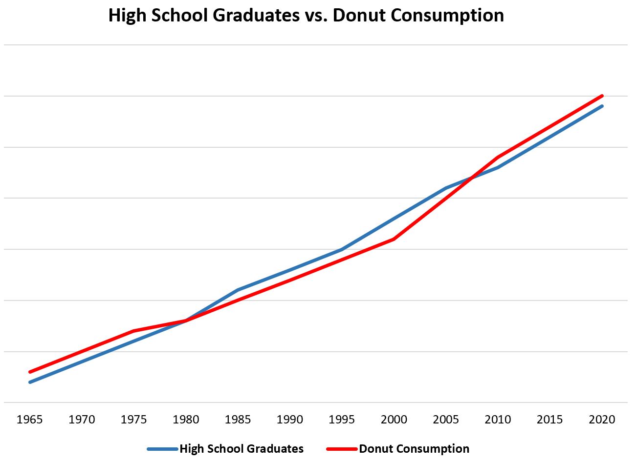
Notice that we are not plotting graduation rates, these would most likely not have any relationships with donut consumption. The latent variable at work here is the size of the population over time. As the population increases, more donuts are consumed and more people graduate from high school.
A similar spurious correlation is that between ice cream sales and forest fires. Both increase during the summer heat and decrease in the winter.
You can imagine the horrible public policy decisions one would make by mistaken those spurious correlations for cause and effect relationships.
Induced correlation
Correlations can also be induced by confounding variables that distort relationships or by mathematical manipulations that induce dependencies.
Example: Confounded Customer Churn
A common request to the data science team is to use data analytics to improve customer retention. That starts with understanding why customers leave the company (churn).
An analysis of historical customer data reveals a positive correlation between churn rate and discounts offered. This association is induced by a confounding factor: customer satisfaction. Customers who are dissatisfied are more likely to complain to customer service, which results in discount offers to entice the complaining customer to stay with the vendor. The discount offer cannot overcome the customer’s dissatisfaction and they churn the company. Without understanding the confounding factor—customer satisfaction—an analysis of the raw data could suggest that higher discount rates lead to higher customer attrition.
Another interesting mechanism to induce correlation is by introducing a mathematical dependence between two attributes. A famous example is the relationship between birth rate and the density of storks.
Example: Storks and Babies

In central Europe a persistent myth is that storks bring babies. The origin of the association probably goes back to medieval days when conception was more common in mid-summer during the celebration of the summer solstice which is also a pagan holiday of marriage and fertility. The white stork is a migratory bird that flies to Africa in the fall and returns to Europe nine months later. The return of the storks coincided with the arrival of newborns; the connection was made that storks brought the babies.
Although the myth has been debunked, there have been several studies of the connection between fertility and the stork abundance. Neyman (1952) describes a study of 54 counties that comprises the following attributes:
\(W\): Number of women of child-bearing age in the county (in 10,000)
\(S\): Number of storks in the county
\(B\): Number of babies born in the county
Since it is likely that these numbers increase with the size of the county, the variables analyzed were \(Y = B/W\) and \(X = S/W\), the birth rate per 10,000 women and the density of storks per 10,000 women. Figure 5.8 reproduces the scatterplot of \(Y\) vs \(X\).
There seems to be a clear trend, the birth rate increases with the stork density. Is that evidence the myth is correct after all?
The reason for the apparent trend is the use of \(W\) in the denominator of both \(X\) and \(Y\). Even if \(S\) and \(B\) are unrelated, the ratio with a common variable induces a correlation between \(X\) and \(Y\).
There are many examples of spurious correlations—from hilarious to frightening—and these are often trotted out to try and explain the difference between correlation and causation. The debate between correlation and causation is not because correlations can be spurious. The rooster crows when the sun rises, this is not a spurious relationship. But the rooster does not cause the sun to rise. Correlation of any kind, true dependence or spurious, does not imply causation—but then what does?
Smoking causes lung cancer but smoking does not cause alcoholism. However, there is an association (correlation) between smoking and alcoholics. How did we establish causation in one instance and correlation in the other? The battle for the statement “smoking causes lung cancer” raged for many years and it was not straightforward to settle the question based on the established methodology for establishing causation.
24.3 Categorical Data
When we are dealing with discrete attributes, the association cannot be revealed through a point cloud. The Pearson correlation coefficient applies only if the two variables are continuous, With categorical data, we cross-tabulate the frequency of occurrence of the attributes and calculate measures of association or agreement.
Association expresses the relationship between two general qualitative variables. Agreement applies when the two variables are the same, for example, when two teachers grade the same set of exams and we are investigating how well their grades agree.
An example of cross-tabulating counts to demonstrate association is Table 2.4 in John Snow’s cholera study. It shows that cholera deaths are 10 times more likely to occur in homes supplied by the Southward & Vauxhall water company than in homes supplied by the Lambeth water company.
Table 24.1 displays the data for two raters who evaluated the quality of 236 experimental units from 1–5. The result is a 5 x 5 table with ordinal rows and columns. For example, 16 experimental units were assigned to damage category 3 by rater 1 and to damage category 2 by rater 2. There is relatively strong association between the ratings, the majority of the counts fall on the diagonal of the table and in the cells immediately off the diagonal (where the raters disagree by one damage category). In a situation like this, we do not expect the ratings to be independent, the question is how strongly the two raters agree with each other.
| Rater 2 | 1 | 2 | 3 | 4 | 5 | Margin |
|---|---|---|---|---|---|---|
| 1 | 10 | 6 | 4 | 2 | 2 | 24 |
| 2 | 12 | 20 | 16 | 7 | 2 | 57 |
| 3 | 1 | 12 | 30 | 20 | 6 | 69 |
| 4 | 4 | 5 | 10 | 25 | 12 | 56 |
| 5 | 1 | 3 | 3 | 8 | 15 | 30 |
| Margin | 28 | 46 | 63 | 62 | 37 | 236 |
Two common measures of association in contingency tables are odds ratios and Cramer’s V statistic. Cohen’s Kappa statistic is used to measure agreement. We describe these statistics here briefly. Refer to the review material in Section 60.6 for more details.
Odds ratio
Consider the simple case of a 2x2 table cross-classifying categorical variables \(X\) and \(Y\) (Table 24.2).
| \(Y_1\) | \(Y_2\) | Margin | |
|---|---|---|---|
| \(X_1\) | \(N_{11}\) | \(N_{12}\) | \(N_{1.}\) |
| \(X_2\) | \(N_{21}\) | \(N_{22}\) | \(N_{2.}\) |
| Margin | \(N_{.1}\) | \(N_{.2}\) | \(N_{..}\) |
The cell frequencies are \(N_{ij}\), the marginal frequencies are \(N_{i.}\) and \(N_{.j}\), the total table frequency is \(N_{..}\).
The probability for a randomly drawn observation from the joint distribution of \(X\) and \(Y\) to land in a particular cell is estimated as \(\widehat{\pi}_{ij} = N_{ij}/N_{..}\).
The odds of an event is defined as the ratio of the event probability and its complement. For example, the odds of \(Y_1\) in the presence of \(X\) are \[ O_{y_1} = \frac{\pi_{11}}{\pi_{21}} \] The odds of \(Y_2\) in the presence of \(X\) are \[ O_{y_2} = \frac{\pi_{12}}{\pi_{22}} \]
Similarly, we can define odds of \(X\) in the presence of \(Y\): \[ O_{x_1} = \frac{\pi_{11}}{\pi_{12}} \qquad O_{x_2} = \frac{\pi_{21}}{\pi_{22}} \]
The odds specify how likely one event is relative to another. The odds ratio, also known as the cross-product ratio, relates those odds to each other: \[ OR = \frac{O_{x_1}}{O_{x_2}} = \frac{\pi_{11}/\pi_{12}}{\pi_{21}/\pi_{22}} = \frac{\pi_{11}\pi_{22}}{\pi_{21}\pi_{12}} \] The log odds ratio is the log off this expression: \[ \log(OR) = \log(\pi_{11})+\log({\pi_{22}}) - \log(\pi_{21}) - \log({\pi_{12}}) \]
The odds ratio has nice properties.
Interpretation. If \(OR > 1\), then \(X\) and \(Y\) are associated (correlated) in the sense that, compared to the absence of \(X\), the presence of \(X\) raises the odds of \(Y\), and symmetrically the presence of \(Y\) raises the odds of \(X\). If \(OR < 1\), then \(X\) and \(Y\) have a negative association, the presence of one reduces the odds of the other.
Test for independence. \(X\) and \(Y\) are independent if their odds ratio is one (log odds ratio is zero). The odds of one event then do not change due to the presence or absence of the other variable.
Symmetry. Computing the odds ratio by relating the odds of \(Y\) yields \[ OR = \frac{O_{y_1}}{O_{y_2}} = \frac{\pi_{11}/\pi_{21}}{\pi_{12}/\pi_{22}} = \frac{\pi_{11}\pi_{22}}{\pi_{21}\pi_{12}} \]
Statistical tests and confidence intervals for the odds ratio are based on the asymptotic distribution of the log odds ratio. The estimated log odds ratio has an approximate Gaussian distribution with mean \(\log(OR)\) and variance \[ \frac{1}{N_{11}} + \frac{1}{N_{12}} + \frac{1}{N_{21}} + \frac{1}{N_{22}} \]
Cramer’s \(V\)
The \(V\) statistic of Cramer is a general measure of association for \(r \times c\) contingency tables. It is based on the Pearson statistic \[ X^2 = \sum_{i=1}^r\sum_{j=1}^c \frac{(N_{ij}-E_{ij})^2}{E_{ij}} \] where \(E_{ij} = N_{i.}N{.j}/N{..}\) is the expected frequency under independence of \(X\) and \(Y\). Cramer’s \(V\) is given by \[ V = \sqrt{\frac{X^2}{N_{..}\times \min\{(r-1),(c-1)\}}} \] \(V\) falls between 0 and 1, with 0 indicating that the row and column variable of the contingency table are not related.
Measures of Agreement
When the rows and columns of a contingency table refer to the same variable, observed under different conditions or measured in different ways, then we expect them not to be independent. When we compare the target values in the test data set of a binary classification with the predicted categories from a statistical model, we do not expect observed and predicted categories to be unrelated; we expect some agreement.
Agreement and association are two forms of structured interaction between two variables. Agreement is based on the concordance between the rows and columns of a table; the values that fall on the diagonal versus the values in off-diagonal cells. The computations based on a 2 x 2 confusion matrix are a special case (Section 23.3.3.3).
The appropriate measure of agreement depends on the nature of the data and the size of the table.
Cohen’s Kappa (\(\kappa\))
Cohen’s \(\kappa\) statistic measures the agreement between two raters in a square table (\(r \times r\)). It is based on the simple idea to adjust the observed degree of agreement for the amount of agreement the two raters would have exhibited purely by chance. \(\kappa\) is suitable for nominal (unordered) categories; a weighted form of the Kappa statistic is available for ordered categories.
Let \(\pi_{ij}\) denote the probability for a rating in category \(i\) by the first rater and a rating in category \(j\) by the second rater. The observed level of agreement between the ratings is obtained from the diagonal cells: \[ \pi_o = \sum_{i=1}^r \pi_{ii} \] If the ratings are independent, we do not expect zero agreement. Some counts would fall on the diagonal by chance. This chance agreement can be calculated from the marginal probabilities: \[ \pi_e = \sum_{i=1}^r \pi_{i.}\pi_{.j} \]
The Kappa statistic is defined as \[ \kappa = \frac{\pi_o - \pi_e}{1-\pi_e} = 1 - \frac{1-\pi_o}{1-\pi_e} \]
Complete agreement results in \(\kappa = 1\). If the rater agreement is no greater than what would be expected by chance, then \(\kappa=0\).
24.4 Establishing Causality
Establishing a causal link between factors is the holy grail of scientific study. When we prove that one event is the result of another event, we have established new, irrefutable knowledge, beyond a reasonable doubt.
Establishing cause and effect is also quite difficult. Spiegelhalter (2021, 97) calls causation a “deeply contested subject”. You get a splinter in your finger and it hurts. Did the splinter cause the pain? Is it possible that the finger would have abruptly started to hurt if it wasn’t for the splinter? If it was me, it would be pretty obvious to me that the splinter caused the pain.
But wait. Not everyone has the same level of pain tolerance. The splinter that causes me much agony might be a mere scratch, hardly noticeable, for someone else. How do we take this variability in the population into account in making statements about causality?
When we say that smoking causes lung cancer, we do not claim that every smoker will get the disease. Some smokers do not get lung cancer and there are lung cancer patients who never smoked. The second leading cause of lung cancer deaths in the U.S. is exposure to Radon gas. That is why in many regions Radon inspections are required prior to purchasing homes. A more precise statement would be that smoking causes an increase in the likelihood of getting lung cancer. It is not a statement about what happens to Joe or Diana. The statistical notion of causation between \(X\) and \(Y\) means that if \(X\) occurs, \(Y\) tends to occur more or less often. The statistical notion of causation is not deterministic (Spiegelhalter 2021, 99).
In a study about the association between repeated head impacts (RHI) and chronic traumatic encephalopathy (CTE), Nowinski et al. (2022) state that causation is an interpretation, not an entity. In studies involving complex environmental exposures causation is a continuum from highly unlikely to highly likely, and no single study can prove causation.
In the presence of uncertainty some scientific standard needs to be met in order for us to claim that something has been proven and even then, we are not making statements that the something will happen every time, only that the proportion of times that it will happen has been affected.
Confounding
Let’s return to the 1854 cholera outbreak and the question before John Snow: did something in the water of the Broad Street public water pump cause cholera? If so, this would explain the higher incidence rate of cholera in residences near the pump and it would also explain the other anomalies he found in the data (see Section 2.8.1).
The map Snow drew in 1854 (Figure 2.7) might be convincing to us, his contemporaries did not feel that way. For one, he could not prove that the Broad Street well water caused the cholera cases. And his hypothesis was inconsistent with the prevailing theory of the time, that cholera was caused by airborne particles (miasma) from dirty or decaying biological material.
The analysis of the cholera map established a correlation rather than causation because of the possibility of confounding factors: variables that can mask or distort the effect of other variables. In the 1960s it was shown that coffee drinkers had higher rates of lung cancer than non-coffee drinkers. Some thought this was implication of coffee as a cause of lung cancer. That is incorrect. The association is due to a confounding factor: coffee drinkers at the time were more likely to be also smokers. Coffee drinking was associated with lung cancer but does not cause the disease.
A confounding factor is related to both the cause and the effect and can mislead us into attributing too much or too little importance to the potential cause. Variables such as age, time, temperature, population size are often confounding factors because they act on the factor of interest and on the outcome of interest. For example, age is a confounding factor in studies of exposure to harmful agents. If damage from the agent is more prevalent in older people, age can be a confounding factor because older people have been exposed longer.
When spurious correlations are induced by latent variables, the latent variable is a confounder. The apparent correlation between ice cream sales and shark attacks is explained by the confounder temperature. Ice cream sales and shark attacks increase with temperature as more people buy ice cream and more people go to the beach.
In order to establish a causal link between two variables, the confounding factors must be accounted for—at least beyond a reasonable doubt. Otherwise there will always be some reason to believe another mechanism was at work. There are a few principal mechanisms to deal with confounding variables:
- Adjustment
- Stratification
- Randomization
We will discuss these in turn, but note that they are not mutually exclusive. A study might involve experimentation with randomly assigned treatments as well as model adjustments for confounding variables.
Adjustment
Adjusting for confounding variables means to include the variables in models that describe the relationship between the factor of interest and the outcome of interest. Consider the Radon exposure example above. A model to describe the relationship between exposure \(x\) (in picocuries per liter air) and cancer risk could be written in two parts: \[ \begin{align} \eta &= \beta_0 + \beta_1 x + \beta_2 \text{ age} \\ \Pr(\text{Develops cancer}) &= \frac{1}{1+\exp\{-\eta\}} \\ \end{align} \tag{24.1}\]
The first term of the model, \(\eta\), is called the linear predictor and is a function of the variables that materially determine the cancer risk. In addition to the exposure \(x\), the linear predictor also contains a term for a person’s age. The second expression in Equation 24.1 transforms the linear predictor into a probability—it is called the logistic transformation.
This model allows us to estimate how much of the cancer risk is due to the level of radon exposure and how much is due to the age of the person. With the variable of interest (\(x\)) and the confounding variable (age) disentangled we can make statements about the risk of cancer as a function of radon exposure and age.
An important aspect of adjusting for confounding variables is the functional relationship between the variables. In Equation 24.1 the two variables enter the linear predictor in an additive fashion. Maybe this is not the appropriate adjustment. If the effect of age on cancer risk changes with the level of radon exposure then we say that the two variables interact. A model that includes a multiplicative interaction tterm then might be more appropriate: \[ \eta = \beta_0 + \beta_1 x + \beta_2 \text{ age} + \beta_3 x\,\text{age}\\ \]
In other words, determining how to model the relationship of confounding variables on other variables and on the outcome of interest, is of great importance.
Stratification
Stratification is an approach to deal with confounding factors that are qualitative. It means to examine relationships separately for each level of the confounder. To see if there is a general relationship between ice cream sales and shark attacks we can examine the association for different temperature ranges. As a surrogate for that we can look at the association by month or by season.
When performing analyses overall and comparing them to analyses within groups (within strata) we can run into situations where the two seem to provide contradictory results. This is known as Simpson’s paradox.
Simpson’s Paradox
The paradox is named after Edward Simpson who described it in a technical paper in 1951, but the phenomenon has been known much longer. It is also not a paradox as it does not lead to nonsensical outcomes or a contradiction. What we know as Simpson’s Paradox is simply the result of looking at an aspect from two viewpoints: The trend that we see in combined data can reverse when we look at the data in groups.
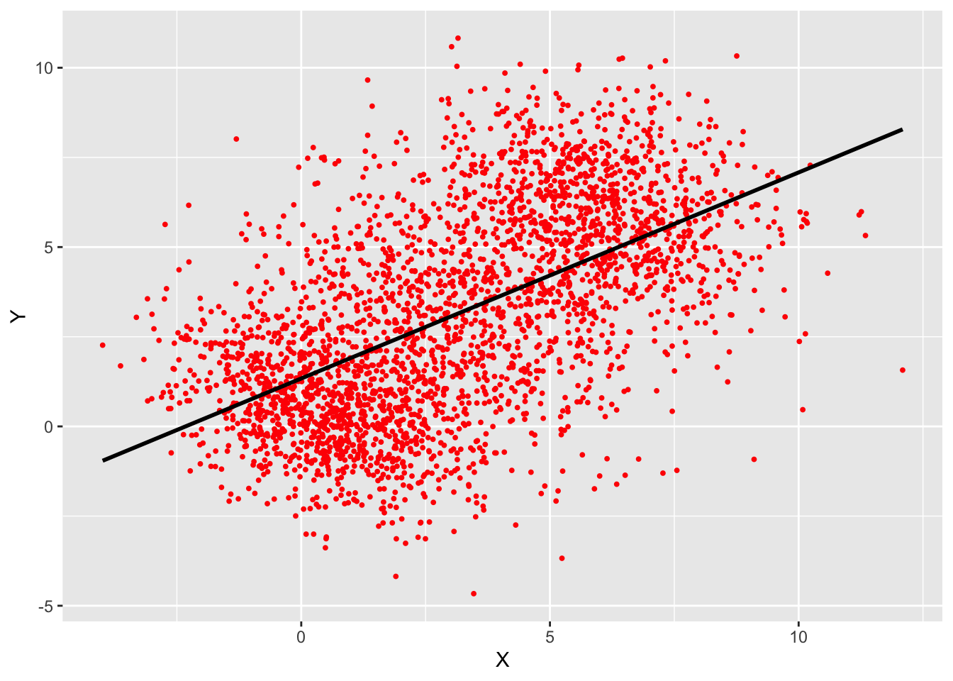
Figure 24.10 displays a scatter plot of two variables and a linear regression trend. The slope is positive, the average value of \(Y\) increases with the value of \(X\).
The data in Figure 24.10 consists of three groups and when the regression analysis is performed separately for each group, a different picture emerges. Within each group the regression relationship indicates a negative slope, the opposite of the trend in the ungrouped data (Figure 24.11).
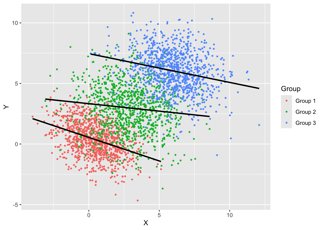
The apparent contradiction comes about because the three groups have different centers and orientation. When “stacked” they create a single point cloud with a positive slope. As mentioned previously, this is not really a paradox, both ways of looking at the data are sensible and the results are meaningful either way. The “paradox” lies in the fact that the two views lead to seemingly different conclusions about the relationship between the variables.
Examples of Simpson’s Paradox with qualitative data can be found in college admissions data. Wikipedia shows the apparent gender bias effect for 1973 data from UC Berkeley. Spiegelhalter (2021) shows data for Cambridge from 1996. The table in Spiegelhalter (2021, 111) is reproduced below as two separate tables.
| Women | Men | |||||
|---|---|---|---|---|---|---|
| Applied | Accepted | % | Applied | Accepted | % | |
| Total | 1,184 | 274 | 23% | 2,740 | 584 | 24% |
Table 24.3 shows the overall acceptance rates for men and women, with the former slightly higher by one percent.
| Women | Men | |||||
|---|---|---|---|---|---|---|
| Applied | Accepted | % | Applied | Accepted | % | |
| Computer Science | 26 | 7 | 27% | 228 | 58 | 25% |
| Economics | 240 | 63 | 26% | 512 | 112 | 22% |
| Engineering | 164 | 52 | 32% | 972 | 252 | 26% |
| Medicine | 416 | 99 | 24% | 578 | 140 | 24% |
| Veterinary Medicine | 338 | 53 | 16% | 180 | 22 | 12% |
Table 24.4 shows the applications and acceptance rates by discipline. In each discipline the acceptance rate for women is at least as high as that for men, in fact it is higher than that for men, except for Medicine.
How do we explain this apparent contradiction? In each discipline the acceptance rate for women is as high or higher than that for men, but overall the acceptance rat for women is lower. The explanation is that women were more likely to apply for subjects that have high application numbers and are more difficult to get in. 64% of the applications from women went to Medicine and Veterinary Medicine (416 + 338 out of 1,184). Only 30% of the male applications went to those subjects. Men applied disproportionately more to Engineering, which has a higher acceptance rate than the other STEM disciplines. It seems that there is no gender bias in these admission numbers, the lower overall admission rate for women is the result in women applying in larger numbers to STEM disciplines that are difficult to get into.
Randomization
Randomization is a simple and effective mechanism to create probabilistic equivalence in data and takes two forms: random selection and random assignment. Random does not imply haphazard or arbitrary, the way in which selection or assignment is randomized obeys probability distributions. Because we specify the distribution according to which selection or assignment occurs, we understand the probabilistic behavior of the data we collect.
For example, we select a random sample of people from a population such that each person has the same chance of entering the sample. This guarantees that the attributes of the population are represented properly in the sample. The proportion of persons of different age, gender, race, etc. in the sample will be representative of the population from which the sample is drawn, although the exact proportions will not be identical in a particular sample. If we were to draw a sample of \(n\) people by a non-random mechanism, for example, by taking the first \(n\) folks who drive through an intersection, or \(n\) airline passengers on a given day, or \(n\) residents of a particular neighborhood, or the first \(n\) entries in the list of the U.S. Census Bureau, our sample would not be representative of the population we are interested in studying. The sample would suffer from selection bias, conclusions drawn from analyzing the data in the sample would not apply to the population as a whole. Note that random sampling from a non-representative list also suffers from selection bias. Randomly sampling social media posts does not give insight into the opinions of the general population because social media users are not representative of the general population. Asking questions of a random sample of drivers passing through an intersection does not properly represent those who do not drive or live elsewhere.
The random mechanism in random selection has a balancing property. It ensures that sub-groups are not over represented or under represented in the sample, provided that the sample is sufficiently large. This balancing property is also key for the second form of randomization: random assignment when conditions are manipulated on purpose. This leads us to experimentation.
Experimentation–The Randomized Controlled Trial (RCT)
Example: RCBD in Agriculture
Suppose you wish to study how poppies grow on an agricultural field. The poppies are subject to varying growing conditions due to differences in the soil characteristics, topography, weather, plant-to-plant variations, and so on. We are particularly interested to see how six different fertilizer applications affect the poppy growth. The conditions that affect poppy growth can be grouped into three categories:
- Conditions we manipulate
- Conditions we do not manipulate but know about
- Conditions we do not know about (lurking factors)
The fertilizer treatments fall into the first category. We can apply parts of the field and apply fertilizer A to it, other parts receive fertilizer B, and so on. Suppose that the field is large and sloped and we suspect a gradient in soil nutrients and water. This falls into the second category. We do not create or manipulate the soil and water conditions, but we are aware of them. They are a confounding factor. All other potential influences of poppy growth fall into the third category.
Figure 24.12 displays a popular layout for running such a fertilizer experiment in agricultural science. It is called a randomized complete block design (RCBD). The experimental area is divided up into separate blocks, in this case four of them.
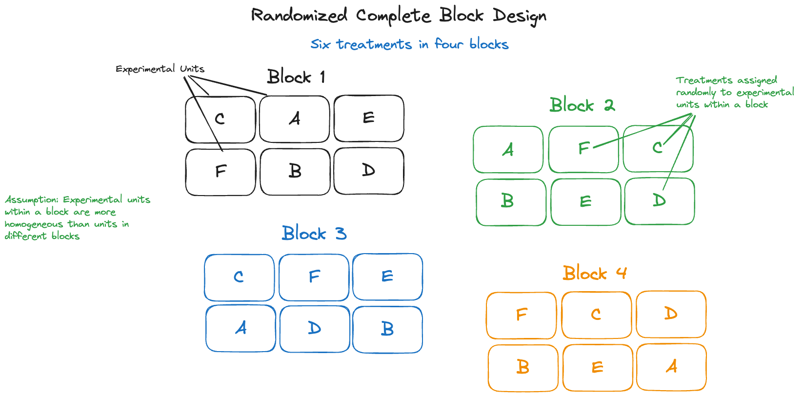
The blocks are chosen so that the fields within a block—we call them experimental units—are homogeneous with respect to the conditions we know about. This is the technique to control confounding factors in category 2 by stratification and adjustment. Within each block the fertilizer treatments are assigned randomly to the six experimental units. This random assignment balances out the effects of the confounding factors we do not know about (category 3). If we were to assign treatments to experimental unit in a deterministic way—for example, treatment A always to the upper left unit, treatment B right next to it, etc.—it is possible that confounding factors associated with the position in the block mask or distort the effect of the treatment. We would then not really compare treatment A to treatment B, but a blend of treatment effect and location effect.
Finally, because the world is uncertain, we do not apply the treatments only once. We use multiple blocks, each with a separate assignment of treatments to experimental units to replicate the per-block layout. This replication allows us to measure the inherent variability in poppy growth, unaffected by treatment or confounding factors.
If the experimental units in our agricultural science experiment contain more poppies than we can harvest and analyze in the lab, we would select some of them for lab analysis. This would be done by random selection to make sure that the plants analyzed in the lab are representative of the plants growing on the experimental unit.
In this RCBD with four blocks and six treatments we encounter all techniques to manage confounding factors: stratification, adjustment (because block effects will be included in the model during analysis), and randomization. As a result, we are allowed to make cause-and-effect statements about the treatment factor we manipulated, the fertilizer. If plants grown under the fertilizer A treatment are taller than those grown under fertilizer B, then there are only two possible explanations:
- Fertilizer A causes poppies to grow taller compared to fertilizer B
- Coincidence: the height difference we are seeing is due to chance
Other explanations can be ruled out because we controlled the experiment for other factors.
In order to separate the two remaining explanations, we analyze the size of the treatment differences relative to the inherent variability in poppy growth. That is the reason why the experiment uses multiple blocks rather than a single block. The replication of treatment assignments allows us to estimate that inherent variation. If poppy growth varies widely, then a small difference in height between plants from treatment A and treatment B will not surprise us. If inherent growth variation is small, observed differences between treatments point at the fertilizer as the cause.
Other Experiments
Experimentation with random assignment of conditions has a long history. It started in agricultural experiments and has since permeated many domains. Randomized clinical trials are common to test medical drugs, devices, and treatments. Industrial experimentation is used to find the best manufacturing conditions for products.
Randomized trials are also used in the social sciences. Spiegelhalter (2021, 107) cites the Study of the Therapeutic Effects of Intercessory Prayer (STEP) by Benson H. et al. (2006) to answer the question whether being prayed for improves the recovery of patients after coronary artery bypass graft (CABG) surgery. The Methods section of the paper describes the randomized experiment:
Patients at 6 US hospitals were randomly assigned to 1 of 3 groups: 604 received intercessory prayer after being informed that they may or may not receive prayer; 597 did not receive intercessory prayer also after being informed that they may or may not receive prayer; and 601 received intercessory prayer after being informed they would receive prayer. Intercessory prayer was provided for 14 days, starting the night before CABG. The primary outcome was presence of any complication within 30 days of CABG. Secondary outcomes were any major event and mortality.
The study concludes
Intercessory prayer itself had no effect on complication-free recovery from CABG, but certainty of receiving intercessory prayer was associated with a higher incidence of complications.
Knowing that they were being prayed for might have made patients more uncertain, wondering whether they are so sick that they had to call in the prayer team.
A/B Testing
Experimentation with random assignment is also used frequently in the technology industry, the technique is known as A/B testing. Only two treatments are being evaluated (A and B), one is typically a current product or design. Users of the product/design are randomly directed to the A or B option and the attribute of interest is measured (click-through rate, time on page, use of features on page, checkout, purchase amount, etc.). We are all participating in these ongoing A/B experiments when we operate online. Google is said to run about 10,000 A/B experiments every year.
When Experimentation is Not Possible
Experimentation with random assignment of treatments is the gold standard to establish cause and effect. But it is not always possible to go down that path.
Some systems defy manipulation with treatments. We can only observe the weather we cannot change it. The process of manipulation can alter how a system behaves in ways that are not related to the treatment application, so we cannot really study just the treatment effects. Epidemiological studies, like John Snow’s investigation of the 1854 Cholera epidemic are by definition observational studies: we observe what is happening, not conditions we create deliberately.
While one can assign conditions, ethical considerations might prevent us from doing so. How can we justify assigning harmful things and ask a person to smoke two packs of cigarettes a day for the next 10 years? In the case of testing a medical breakthrough against a horrible disease, how can we justify assigning patients to a placebo group and withholding a potentially life-saving treatment? To show that repeated head impact (RHI) causes chronic traumatic encephalopathy (CTE), it would not be ethical to randomize subjects and hit those assigned to the RHI arm of the study repeatedly over the head.
When experimentation is not possible, we rely on observational data, analyzing the data we can collect, and it is often the best we can do. How can we then explain the association we find in the data and get closer to establishing causality?
To link RHI to CTE, we can study data on subjects who have been exposed to repeated head trauma, such as boxers and football players, and compare their likelihood of developing CTE to individuals who did not experience such head trauma. Comparisons must be made with care. We would not want to compare star athletes who experience head trauma with non-athletes who did not experience head trauma; there would be too many confounding factors. Maybe we could follow a group of athletes over time and record accumulated head impacts along with brain scans. While we cannot design an experiment, we can design how to collect observational data.
Quasi-experiments
If you cannot manipulate and control factors in an experiment, maybe you are lucky to find data where the confounding factors have already been controlled for you. Sometimes real life runs these quasi-experiments for us and eliminates the confounding factors. Although the data is observational rather than experimental, it can go a long way toward establishing causality. In Section 2.8.1.4 we discussed a second, deeper analysis John Snow conducted in which he compared cases between customers of the Lambeth and the Southward & Vauxhall water companies. For all intents and purposes the groups serviced by the two companies were identical except for the source of the water. Lambeth’s water was drawn upriver from sewage discharge into the River Thames and was cleaner than the water from Southwark & Vauxhall, which drew water below the sewage discharge. The much higher cholera incidence in the group supplied by Southwark & Vauxhall was sufficient evidence to implicate the water.
Hill’s Criteria
Establishing causality from observational data, as in the case of Snow’s water quality study, is a common problem in epidemiology, the study of the distribution of diseases and health risks. Establishing designed experiments with randomized control of factors is often not possible in those studies.
The English epidemiologist and statistician Sir Author Bradford Hill established nine principles that allow one to move from association to causation. These are known as Hill’s criteria, developed to establish causation involving environmental exposure. Hill was part of the research team that confirmed the link between smoking and lung cancer. The criteria are:
Strength: strong association is stronger evidence of causality. A small association does not rule out a causal effect, however.
Consistency: similar studies by others in different places with different samples give consistent findings.
Specificity: the more specific the association between a factor and an effect, the more likely we are dealing with cause and effect. The association is specific when the cause leads to only one outcome and the outcome can only come from the one cause.
Temporarlity: the effect comes after the cause.
Gradient: an increase in level, intensity, duration or total level of exposure to the potential cause leads to progressive increase in (the likelihood of) the outcome.
Plausibility: the association is plausible based on known scientific facts.
Coherence: agreement between epidemiological and laboratory findings. The interpretation of the data does not seriously conflict with what is already known about the disease or exposure.
Experimentation: if experimentation is possible, it provides results in support of the causal hypothesis (provides strong evidence).
Analogy: similarity between things that are otherwise different. Scientists can use prior knowledge and patterns to infer similar causal associations.
Hill’s criteria should be viewed as a guideline for establishing causality based on association. Proving causality is not done by clicking check boxes. Meeting the criteria increases the likelihood that a factor causes an effect.
The Ladder of Causation
In domains and applications where experimentation is not possible and confounding factors are present, we try to establish causation by a process called causal inference. By studying which variables act on each other, causality can be inferred. The Ladder of causation is an important tool in causal inference.
The difference between the experimental and the observational study is doing versus seeing. Designed experiments are the statistician’s way of “doing”, but it is not always possible to manipulate and intervene with systems in this way. Ethical concerns might rule out giving harmful treatments. Some effects can only be assessed over long periods of time and maintaining control of other effects over time can be difficult. Some systems are altered by interventions in ways that make inferences about the original state meaningless. Some systems defy randomization. If you cannot randomize the stock market, how can we establish that higher returns were caused by a change in trading algorithm? How can we establish that human activity causes climate change? Traditional designed experimentation cannot be used. A prohibition to think about causation unless we are in a randomized controlled trial is not helpful.
In our daily lives we make causal inferences, not statistical ones. Human intuition is grounded in causal logic. When I gradually push a book over the edge of a table it will eventually fall off the table, caused by gravity. I do not need to repeat this 20 times to convince me that what was observed—the book fell—was just incredibly unlikely. Human intuition is sufficient to conclude that the physical therapy reduced the pain from tennis elbow. Something was done (to us, physical therapy) and we see the effect (on us, pain reduction). We do not require a statistical experiment to figure out that we have been helped. On the other hand, if we decide among treatment alternatives for tennis elbow, the existence of such experiments can be helpful in deciding on a treatment plan.
In their influential (cult) text “The Book of Why”, Judea Pearl and Dana MacKenzie introduce the Ladder of Causation, three distinct levels of cognitive ability: seeing, doing, and imagining (Pearl and MacKenzie 2018).
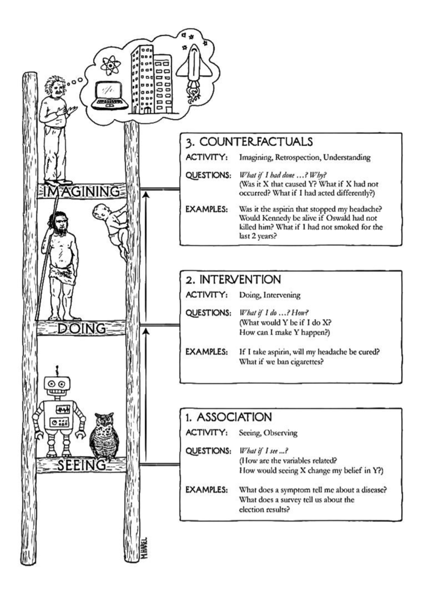
First rung—seeing
Seeing (observing) means detection of regularities and irregularities in the environment and acting on it. Most animals have this cognitive ability. An owl observes the movement of its prey and reacts to it. It recognizes regular and irregular patterns—healthy versus unhealthy prey—and changes its reaction to the environment. The first rung of the ladder of causation is where questions are answered by observing. The typical question is “What if I observe …?” A this rung of the ladder we find relationships and associations but cannot establish causality. We cannot determine why something happened.
Modifying an example given by Pearl and MacKenzie, suppose the manager of a grocery store wonders how likely someone who buys diapers also buys a 6-pack of beer. From the database of store sales, we can estimate the probability Pr(customer buys a 6-pack of beer) and the conditional probability Pr(customer buys a 6-pack of beer | customer also bought diapers).
The conditional probability is a measure of the association of the two events: buying diapers and buying beer. We cannot learn from this information whether increasing the price of diapers would affect beer sales. Even if the database of store sales contains sales where diapers were more expensive, we cannot conclude an effect on beer sales because the prices could have been higher in the past for other reasons, maybe a diaper supply shortage. The differences we see in the data are not due to the interventions we should have taken to answer the question of interest.
Second rung—doing
The second rung of the ladder of causation is reached when we deliberately change the world. As Pearl and MacKenzie put it
Seeing smoke tells us a totally different story about the likelihood of fire than making smoke.
Questions we answer at this level are “What if we do…?” and “What happens if …?”. The store manager now raises the price of diapers under the current market condition and observes how the sale of beer reacts to the intervention. In particular, they are interested if the conditional probability Pr(beer | diaper) changes. If the store is part of a larger chain, they can run an A/B experiment, raising the price of diapers at some randomly selected stores, and comparing the sales numbers across stores with and without price increase.
Third rung—imagining
The third rung of the ladder of causation answers a different set of questions, one that requires not just interventions, but theory of interventions that allows us to imagine worlds that have not happened. These “What if…?” questions are called counterfactuals. So we raised the price of diapers and beer sales dropped. Why? What caused that? Was it the change in price of diapers? Was it the cooler weather? Was it the change in the NFL schedule? To answer these questions, we need to imagine and reason about a world where we did not change the price of diapers.
Experiments cannot answer questions such as “What if I had done…?”; the first two rungs deal with observable phenomenon, either through observing what is or observing an intervention. The final rung of the ladder of causation requires models for the underlying processes, understanding that manifests itself in theories and what we call laws of nature.
The role of data
Interestingly, Pearl and MacKenzie place artificial intelligence and machine learning, as depicted by the robot, on the first rung of the ladder of causation. By simply observing what is we cannot answer causal “What if” questions at the upper rungs of the ladder: “What if I do …?”, “What if I had done …?”.
Does that mean we can never use observational data to make causal statements? Yes, unless the data are supplemented with models and theories that fall outside of the data. The store manager could answer the question “What happens if I change the price of diapers?” without experimentation, based on a model of consumer behavior and market conditions. Combining this model with the observed data on beer—diaper sales can produce a better prediction of the effect on beer sales than the observational data alone, subject to the correctness of the assumed market model.
Why are we discussing all this in the context of data science?
Most of the data you work with is likely observational data, not experimental data. The analysis of observational data with statistical techniques is on the first rung of the ladder of causation. You cannot answer rung-2 “What if I do..?” questions from this data alone; no matter the sophistication of the analytic method. In order to climb the ladder of causation and ask more interesting questions you need to collect data under manipulation or apply an external model that implies manipulation (an economic theory, for example).
The belief that with more data we can answer more sophisticated questions and climb the ladder of causality is fundamentally flawed. Answering more sophisticated questions from a higher rung of the ladder requires different cognitive abilities. You cannot answer questions about interventions by analyzing patterns and associations. Understanding and imagination of an autonomous driving system does not come from training on data. It comes from explicit programming—augmenting the information in the data with abilities from a higher rung of the ladder. AI systems trained on data can learn impressive tasks but are limited to tasks that can be learned by watching. They cannot learn tasks based on learning by doing. And they cannot answer counterfactual questions (“What if I had instead done …?”) without understanding and reasoning. AI derived from observational data cannot achieve intelligence.